To the Point: An Interview With Alex Tornberg


Image by Alex Tornberg
Quite recently a close friend of mine and former co-worker of Alex Tornberg's sent me a link to his portfolio. Deeply impressed, I was pleased as punch when Alex was game for an interview. Meet Alex Tornberg, a Swedish concept artist, who has created conceptual designs and storyboard for companies such as Electronic Arts, Mattel, Funcom and more. We get down to what inspires him, how he works, and what it takes to wear multiple hats within the industry: concept artist, asset creator, and even art director.
Thank you, Alex, for taking the time to do this interview. Let's start at the beginning: What got you into concept art?
My pleasure! Concept art wasn't really something I grew up wanting to do; I didn't really know about until I was about 20. As I grew up I wanted to be a car designer and then later a comic book artist. In my late teens I got into 3D modelling and thinking about a career in game development or film. Through that I found the online CG community. Especially a forum site called Sijun where a lot of young concept artists were sharing their work.
This really opened my eyes and from then on I pursued a career as a concept artist. Later a new forum called Conceptart.org popped up, this was around 2002–2003, and that would have a huge influence on my development. It was there I learnt how to build the type of portfolio art directors at game studios wanted to see.
Alex Tornberg himself
Alex Tornberg himself.
Who or what are your main sources of inspiration?
My main source of inspiration comes from movies. As a kid I tried to copy the style of comic book artists like John Byrne, Mike Zeck, Alan Davis and Marc Silvestri; from them I learned a lot about drawing. I also had a period where artists from the turn of the century influenced me a lot; mostly Anders Zorn, Ilya Repin and John Singer Sargent. I think that’s quite clear if you look at some of my character work from Age of Conan: Rise of the Godslayer, for example.
But what’s always been my biggest inspiration is cinematography. Classics like Apocalypse Now, Blade Runner, Alien, Barry Lyndon, John Milius’ Conan the Barbarian, etc. have been big inspirations for me. The production design, costume design, and lighting of films is what inspires me the most.
Painting from Age of Conan Rise of the Godslayer
Are you formally trained? If so, where'd you go, what degree did you achieve, and what was the experience like? If not, how did you work up your portfolio for professional work?
No, I’m self taught. There really weren't any good art schools in Sweden when I grew up. There're a lot of great design schools but there wasn’t really anything focusing on honing your art skills and teaching you how to paint and draw realistic art back then. I studied Information Design for three years at a University though, but I never graduated. I think I learned some useful skills that're important for a Concept Artist there, though. It's more like "how to present your designs in an informative way", and so on; nothing really about drawing and painting.
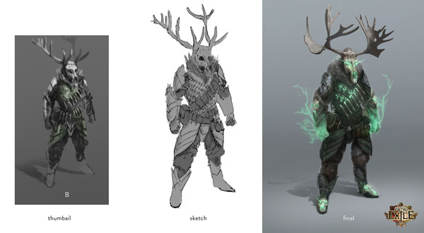
What is your creative process like?
My work flow can vary quite a lot depending on what I’m working on. All jobs start with finding the mood and tone of the work by finding suitable references and possible textures I want to use. For most jobs, I will start with a bunch for quick dirty thumbnail sketches. Then I, or the art director, will pick one or a couple that I will work a bit more on. When the basic layout and design is there I will start creating the actual painting.
Setting the mood and gathering resources
Setting the mood and gathering resources.
Here and there I will have to do a second round of reference and texture hunting here if I feel something is missing from what I gathered earlier. Sometimes there might be something that needs to be created in 3D software; this is when I do that as well, or if I need to, take photos of something.
Sketching and Block-Out Stage
Sketching and blocking out the design.
It’s just important to get all that done before you start painting. It will slow you down a lot if you realize you’re missing some important reference or don’t know how something should look when you’re doing the actual painting. When painting, I usually start with the basic shapes, then add details and color as I go. How this is done is very different depending on the subject matter.
Painting detailing and tweaking
Painting, noodling details, and final tweaks.
What programs and tools do you use in creating your work? Anything you're especially fond of that you'd like to recommend to readers?
Adobe Photoshop and a Wacom Cintiq are my main tools, but I’ve used other software over the years as well, like ArtRage and Corel Painter. ZBrush is another favorite, but I seldom have the chance to use it. I use SketchUp to set up quick scenes with tricky perspectives. I’ve used both Autodesk 3ds Max and Maya when working for different game studios, but I don’t consider myself a good 3D artist. I want to learn Modo as I don’t enjoy using either Maya or Max, and Modo has left me with a good first impression with its reasonable price tag.
I have a Samsung Galaxy Note 10.1 with Sketchbook Pro that I use for quick thumbnail sketching. It’s nice not to have to sit at the desk all the time and I can save the sketches in Dropbox or Google Drive so I can access them directly on my work computer. And I always carry a Moleskine sketchbook and some pencils with me; not that I sketch in it very often, but you never know when you need it.
Character concept painting process
Character concept painting process.
For how long have you worked professionally?
It’s been my only source of income since 2005. So it’s almost 10 years now. I did some smaller jobs and other illustration related work, such as Technical Illustration, for industrial giant ABB as early as 2001, but I usually count 2005 as the year I went pro.
Ice bridge concept
What's your typical workday like? What's the "day-in-the-life" of a freelance concept artist?
I usually start the day around 9 am by going through my e-mails and deal with any business related stuff that needs taking care of. After that I try and do some quick warm up sketches to get going and then I try and get as much work as I can done before lunchtime. After lunch I usually go for a walk to clear my head and get some air. Then I get back to work and sit glued in front of the Cintiq until about 6 pm, then it’s family time. If I have a lot of work I will usually go back to work some time around 9-10 pm and work for as many hours extra I need, but preferably not later than 1 am (though sometimes it can’t be avoided).
Small village concept
How about your work space? Can you give us an insight into how and where you work?
I have an office in our apartment. It makes it easier when I have jobs that require me to pull long shifts. It’s quite large and bright, with good space for all my reference books, comics and geeky toys. It’s in a good location in Stockholm and just a couple of subway stops away from all my local clients.
Alexs workspace
Alex's workspace.
When working with companies like EA or Stardoll, did you work in-house? What was the experience like at such different companies?
Yes, most of my career I have worked in-house. I spent five years employed at the Oslo-based game developer Funcom, working mostly on the game Age of Conan and its expansions. After that, my wife and I felt like moving back to Sweden and Stockholm. I felt a bit disillusioned by the AAA games industry and wanted to try out new things.
I ended up at Stardoll, which probably isn’t one the high points in my career. I did some backgrounds for the dress up game, but most of my time there I was part of a team that was supposed to take the company into the future with new products for new platforms. This didn’t really work out and most of the games we tried to do on ended up in the trashcan. I was never really happy working there, but I made a lot of good friends.
After a bit more than 1.5 years I had had enough and moved on. I got an offer from an old friend to come over to Electronic Arts and work as a art director for a small team. Sadly the game we worked on got canceled even before it got revealed, so I can’t even talk about what it was. The team was disbanded and merged into different departments within EA. I left and started my freelance career.
Concept work from Age of Conan
Do you have a preference between in-house and remote work?
It’s hard to say what I prefer. It’s really nice to work in-house as you get the chance to be a bigger part of the project. You can have a bigger influence on a multimillion dollar project that way. You also have a nice steady paycheck; senior concept artists actually have decent salaries. So you can have a pretty good life that way.
The downside is that you never know if you’ll have a job if the project runs out money, misses some milestone, or sells poorly after it’s released. Chances are you’ll probably end up becoming a work vagabond, having to move between different cities and countries for work. Which can be great for a time, as you’re still young and don’t have a lot of baggage. It gets harder the day you have a family.
Space station concept
So how does freelancing compare?
With freelancing, you can pretty much decide where you want to be located. Of course it helps if you’re located in a city where you can have a client base, but you don’t need to do that. You also might be getting jobs where you have to go away and work onsite for some months, but it’s never so long that you have to move. You also get a lot more time to do your own work and you decide what type of work you want to do. Working in-house you never know what type of project you’ll end up doing next. You decide what to do with your time. If you don’t like a client, you don’t have work with them again.
The downside is that you can’t be sure when you’ll be getting jobs and if the jobs are the type of jobs you want to do, and if you’ll be able to pay rent. It can also become a very lonely job as it can go months between actually meeting anybody.
At the point where I’m now in my life I’d say I prefer freelancing. I’ve been lucky and have never really had to worry about not getting enough work so far. I also recommend any potential freelancer to save money so you won’t have to worry about not working for some months here and there.
Small cottage concept work
Do you enjoy working with a team of artist and designers? Or is your preference for solo work (possibly touching base with others) to bring a project to completion?
I don’t know if a concept artist ever really does real solo work. Most of the time you’re just a part of the production chain. It’s really great and very inspiring to work within a team of concept artists. There’s no better way to develop yourself as an artist. Most of the time when you’re working within a game studio the concept artists will be sitting in a room or in a corner together and really not having to deal too much with anybody else than the art directors.
Rob square concept
Sure they’ll be giving pointers about their designs to various 3D artists and maybe they have to work together with a level designer at times, but they are usually quite isolated from the rest of the development team. They will also have a quite different schedule than the rest of the team as their workload will be heavier towards the beginning of the project and ease off towards the end when the rest of the team will be crunching.
Working as a freelance concept artist is sort of teamwork as well, most of the time visualizing some other person's idea. I’ll have daily contact with at least an art director or VFX Supervisor. Some jobs you get more freedom with, but there’s always some sort of feedback. Illustration work is a bit more solo work, but I haven’t done any for some years now. I guess what I’m trying to say is that I like both working within a team or sitting by myself, as long as the job is fun.
Viking ship concept
Let's talk about matte painting. What is your process for sourcing reference for a matte painting and how much of the content of a finished piece is stock imagery/photograph/generated versus a full painted portion?
In a matte painting it’s probably somewhere around 30–40% of the work that is actual painting. It’s a hard kind of painting though. It almost has to look more realistic than real life, so there’s a lot of painting with a 1 pixel brush on images that are usually very high in resolution. Most of the time you get a lot of HD photography and 3D renders from your client. Then you have to blend all of this together, paint everything that’s missing, make the lighting in the scene work all over, and add details that make it look real. You also have to mind your layers so the Compositor that’s going to take over after you’re done can add all of the life and movement the image needs to make it feel real. So you have to plan your work very well before starting.
Matte Painting Process
You've also worked on TV commercials. How did you get involved with each company that you worked with?
TV commercials are pretty much like small movies. A lot of the VFX studios that work on the big movies also work on commercials. For some of them it’s even their bread and butter. So once you’ve established a relation with a VFX studio, there’s quite a big chance that the job they call on you to do is for a TV commercial. I mostly work on more visual commercials that needs quite a lot of visual development and concept art, but sometimes I get called upon to do a matte painting or a storyboard.
Concept work for a tv commercial
Concept work for a TV commercial.
Working as an art director, what do you find to be the most challenging? Do you enjoy taking on a leadership role, or would it be your preference to work within the design team rather than as a manager? 
I guess the office politics and dealing with upper management is the most challenging part of being an art director. I don’t mind the leadership role but it’s not something I’ve ever really striven for. I like working with the team and inspiring other artists, but it can be a bit hard when they’re not achieving what you expect from them.
Landscape concept
Can you break down the role of an art director for me?
The role of the art director can vary quite a lot from game studio to game studio depending on how many artists are working within the team and what team set up there is. In bigger teams, the art director won’t have any managing duties as there is usually a bunch of specific lead artists doing that and producers and/or development directors keeping each department running. Then the role is mostly setting the style for the game overseeing that everything keeps in line with that, which is done through a lot of review meetings and late nights.
But in a smaller team the art director might have the role of lead artist as well, and then you have to plan the workload and tasks for the art team for each milestone. That ends up being a real time sink and takes a lot of creativity away from the job. There’s, of course, a lot less art to review then. In a big team, the whole art team will probably consist of anything between 50 and 100 artists, a small team might only have about 5 to 10 artists.
Harbor city concept
What words of advice do you have for aspiring entertainment artists and concept artists?
You have to work really hard. You have to be among the best to be able to get the jobs that you want. During your formative years it has to be your only passion, so no time for other hobbies. Once you’re working in the industry it can be quite good to do other things from time to time though. You will  always have to learn and keep up to date with trends in the industry and the latest software; your work will get old fast otherwise. It’s never going to be a 9 to 5 job.
Your work will be criticized all the time and you seldom get any praise. Everyone is expecting you to be good. So I advise you to leave those big artist egos at home, or else your career will be short.
Winter castle concept
Many thanks to Alex for taking the time to share his work, experience, and influences. Getting a peek at how concept artists work within entertainment art is quite a treat considering how terribly busy they tend to be and how often projects are under wraps until they're published. Quite a bit of useful information and inspiration for consumers, enthusiasts, and artists aspiring to be a part of the industry.
For more of Alex's work (especially if you want to dive into the details of his concept art in a larger format), check out the links below:

Split Toning Colour Pictures in Photoshop: Theory and Practice

Split toning involves tinting the shadows of an image in one colour and the highlights in another colour. Although mostly applied to black and white images, this method can quite successfully be used on colour images. Before you decide to use this technique though, knowing a little colour theory is helpful.
Colour Wheel
The Colour Wheel
The artist's colour wheel (or circle) is  a visual representation of colour theory. It is a great tool to use when you’re combining colours. Commonly, as with our example above, the colour wheel is split into 12 colours based on Isaac Newton’s Red, Yellow and Blue (RYB) model. Newton split sunlight (white) into red, orange, yellow, green, cyan and blue; then joined the two ends together to show how the colours progressed into one another.
Certain colours are more pleasing together than others. The ones that we recognise as being particularly pleasing are known as Colour Harmonies, and they are where two or more colours have a fixed relation on our colour wheel.
One of the first things we learn about colour in school is that there are three primary colours: red, yellow and blue (as in our explanation above).
Primary colours
The primary colours, red, yellow and blue
Our secondary colours would then be green, orange and purple as they’re the result of mixing two of our primary colours together.
Secondary colours
Secondary colours are made by mixing primary colours
Tertiary colours are made by mixing primary and secondary colours together; you get the idea!
Colours opposite each other on the colour wheel are known as complementary colours. Blues and orange/yellows work particularly well with split toning.
Complimentary colours
Complementary colours are colours that sit opposite (or near enough) each other and work well together
Analogous Colours
Analogous colours are generally found in nature
Analogous colours are often found in nature. They are next to each other on the wheel and complement one another well.
Other schemes that work well together are triadic, where you draw a triangle on the colour wheel and the tips are placed on the colours you’d select to go together; Tetradic and Quadratic. Again, imagine the shape over the wheel and where the edges meet, those are the colours you’d choose, moving the shape around the wheel to get different schemes.
The colour wheel can be split into warm and cool colours.
Warm colours are said to ‘advance’ or ‘come closer’; think of warm colours in a room, they tend to make it feel more snug and cosy, don’t they? Cool colours, then, are said to do the opposite and appear to ‘recede’. They make us think of the sea and sky; big open spaces. There is a biological basis for these sensations of near and far when we see colour, basically depending on where wavelengths of light focus in the eye, but that's a little outside the scope of this tutorial. And then there are then cool and warm hues of each colour, but if we start to go into that my head may frazzle! Exploring colour really has no end of interesting things to learn about.
With the fascinating complexity of colour now established we’ll stick with the basics: how can pairing colour change the feeling of a photograph? Getting the balance right between warm and cool is important when choosing your colours for split toning. Think about what mood your photo conveys. Do you want to create the feeling of wide open space, or something more intimate? Balance your two colours accordingly, giving slight precedence to the one which reflects the mood you’re going for. Understanding what colours do and how to use them can really help you add to your photographs and create great results.
You can read two great methods of split toning using Photoshop in Peter Sawyer's 2011 tutorial 2 Split Toning Techniques in Adobe Photoshop.
If you’re shooting in RAW, however, things are even easier. Open your camera RAW image in Photoshop, and follow along below:
If you want to split-tone a greyscale image (or grayscale going forwards as Photoshop uses the American spelling), click your HSL/Grayscale tab and click Convert to Grayscale where you can make further adjustments to the mix as you wish. If you’re split-toning a colour image ignore this step and proceed to the next one.
convert to grayscale
Convert your image to grayscale
Advertisement
Click on the Split Toning icon.
split toning tab
Use your split-toning tab to choose your hues
You’ll see a hue and saturation bar for both your highlights and shadows, as well as a balance bar. Pick colours for each based on what we know about colour theory; try two complimentary colours. I want to try blue for shadows and yellow for highlights here so my sliders will now look like this:
The balance bar will favour highlights if you slide it to the right (so yellow in this case) or shadows to the left (blue in this case). Try different hues together and play with the saturation strength; I tend to favour the ‘less is more’ approach with this. A subtle touch can go a long way to creating mood in your image.
Split toning is very versatile, I’ve seen it used to good effect with everything from landscapes to portraits to architecture. In particular, it can create a fabulous moody atmosphere to a picture, warm it up or cool it down.
Split Toning Sharon Legg
This makes great use of the warm part of the spectrum [photo: Sharon Legg]
This photo makes great use of the warm part of the spectrum. Even though there are definite blues and purples in there, the predominantly yellow/cream colours tip the balance. We’re also brought into the picture by the vignette darkening the edges, which creates a feeling of closeness, and focuses the viewers eye on the centre of the frame.
Split Toning Sharon Legg
By contrast to the last example, this picture uses hues from the cool part of the spectrum [photo: Sharon Legg]
The cool blues and greens here and work really well. The white and yellow of the flowers helps keep some of the balance against the cool tones.
When split toning a black and white or greyscale photo, the colours you choose are equally important in conveying your intended mood.
Split toning for greyscale
A SOOC shot compared with a split-toned version
When compared side by side with the straight out of camera image, you can see that the split-toned image creates a moodier, more atmospheric feel I wanted. I used blue to cool off the shadows and yellow to warm up the sky. In contrast, adding a reddish hue to shadows will really warm up a picture and is very effective in autumnal shots.
Finally, if you are working on a series of related images - say a wedding, a portrait sitting, or a photo story, for example - adding a very subtle but consistent split toning to the selection can help bring a feeling of continuity and cohesiveness to your series. In your larger body of work, split toning can be a valuable to for creating a personal style.
I hope you’ve found this tutorial useful, and that it’s given you a better idea of what split toning is. A little bit of applied colour theory and some basic technique can be a powerful tool for emphasing the an emotional affect in your images.

Experiment With Color in Adobe Illustrator to Create an Abstract Rose Illustration


Final product image
What You'll Be Creating
I had a bouquet of yellow roses on the table and decided to draw it. Without a clear picture in mind I usually experiment a lot with colors, gradients, and transparency. In this tutorial I am going to highlight a few tricks that I use when drawing with Adobe Illustrator.
First I take a couple pictures of the bouquet with my smart phone and sketch the flowers that I like. I draw a sketch using the Pencil Tool (N) with a fine Stroke Weight of around 0.1 pt. This thickness is convenient because you see the lines, but they don't get too thick no matter how much you zoom in, and they don’t distract you.
Sketch of a rose
I decide on the dimensions of the picture and outline the composition. I leave the contours of the flowers grouped separately though, because I will need them later, unlike the other lines of the drawing.
Outline the composition
When you decide on the background, it’s better to take the color two shades darker than you want. In Illustrator it’s much easier to set accents by using bright/light colors than by adding shadows. Otherwise the picture would lack depth and clear colors.
Add a background
To outline the shapes with color, I normally use Radial Gradients. They can be a combination of several colors, but always with a transparent edge (Opacity: 0%). At the center I used Opacity: 50–60%. Because of the transparent edge color it will blend gradually into the background. In Illustrator it’s much more convenient to use radial gradient than the built-in Photoshop effects (Effect > Photoshop Effects > Blur)
Gradients on background
Using yellow gradients I emphasized the roses. The rose in the middle is the brightest one, so I made its center darker, because that’s where the most contrasting shadows and brightly lit petals will be. Gradient > Opacity: 58%, Transparency > Hard Light.
Use yellow gradients on the roses
I emphasized the objects I created during step 2, grouped and shifted them a little, and put them on the top of the orange gradient. Because of this shifting I unexpectedly got a more intense color that works well.
Create an intense color
I put the photo of the flower next to my drawing and began drawing shadows using a cold blue color and experimenting in the mode Transparency > Hard Light. This way the blue will only add light shades/nuances.
Use the photo of the flower
I applied a light yellow gradient over the flower, saved the settings, and began drawing details of the petals, giving them the texture of soft petals.
Draw details of the petals
I’m experimenting with colors again. When you don’t have a clear picture in mind and you’re trying this and that, don't forget Transparency > Saturation. It’s one of the most interesting ways of playing with color and can produce unexpected effects.
Try adding saturation
In order to separate the rose from the background, to make the light around it different from the color of petals, I used gradients again. Using the Eraser Tool I cut a hole in the form of a rose. I applied a gradient in the mode Transparency > Normal—this mode is perfect when you need to smooth out the transitions between colors and make them less contrasting.
Apply gradients to smooth transitions
I decided to make the lower part brighter, leaving the left upper corner the darkest part of the picture. For lightening I used a gradient, again a radial one (Gradient > Radial). Why not a linear gradient? Even in this case, when only a small part of the gradient is left in the picture, the line is round, not straight. A linear gradient with a straight line of this size would draw too much attention.
LIghten the composition with a radial gradient
I created an object (Transparency > Hard Light, Opacity: 20%), which produces an impression of a thin layer of glass. In order to liven it up and to create fantastic flora, I cut out twigs in it using the Eraser Tool.
Add a thin glass layer
Using half-transparent objects (Opacity: <50%) of violet and lemon colors I marked the light and the dark parts of the rose.
Mark the light and dark parts of the rose
One of my favorite tricks is creating luminous sparks. Set the gradient to radial (Gradient > Radial), and set the sliders to the center, so that there is a large transparent edge. This way, there will be a clear, bright sphere at the center. This is how I make sparks. Now you can draw triangles and other simple forms, which will have sparks at the centre.
Add sparks
For drawing the ice petals I used a cold color palette gradient. I drew the contour, leaving the veins of the leaves out.
Draw the ice petals
You can create a brush for adding some decoration. I created a brush which looks like beads; I made several sets in different colors. Decorative brushes like this give a picture a creative touch.
Use decorative brushes
To create a beads brush like this, first draw several circles of various sizes and align them. Don’t draw too many if you are going to use this brush a lot. The more elements there are in a brush, the more difficult it will be for your computer to calculate it, the quicker your file will get overloaded, and the more likely it is that your computer will slow down and hang.
Group the objects and drag them with your mouse to the brushes. A panel will appear, and you should click Art Brush. Then in the next panel/menu you can leave everything unchanged. Your brush is ready.
Create an art brush
I marked all the created objects, except for the background, grouped them, and selected them. Then using the Eraser Tool I cut the illustration in pieces, erasing some fragments. This is another interesting trick that I discovered once and have been using since. I use it in difficult moments or when I want to give my picture an interesting touch or an unusual effect. Try adjusting the opacity slider, trying out different modes, or playing with shifting to different sides.
Create fragments
Here's another interesting trick I discovered once and have been using ever since. You can use parts of a picture to create a fantastical filling-up effect. You should switch off the contour and switch on the filling (color), then just delete the unnecessary parts.
Fill effect
I made the rose more transparent, and drew the orange reflected light from the main rose. Now the ice rose silhouette is ready, and it’s not overladen with details.
Ice rose silhouette is ready
I selected the gradient I created earlier to lighten the composition, and partly erased it with the Eraser Tool. There is now a feeling of lively clutter in the blue background.
Partly erase the gradient
If the color is too homogeneous, you’d better liven it up with a couple of strong accents of another color. I took the lively orange of the rose and used it to emphasize the dark rose stems.
Add strong accents of another color
Using bright colors I emphasized the edges. It’s better to draw highlights at the end, because they adorn a picture a lot, but if you draw them at the beginning they can distract from your work.
Add highlights
In this tutorial I showed you some tricks to experiment with colors in Illustrator. I hope this helps you find new inspirations and color combinations while you are drawing, and that it enables you to make your drawings more diverse. My goal is always to bring more fun to the process of drawing illustrations, to escape perceived boundaries, and to try to inspire others to do the same.


Copyright @ 2013 Krobknea.

Designed by Next Learn | My partner