1. Create a Sketch
Step 1
First I take a couple pictures of the bouquet with my smart phone and sketch the flowers that I like. I draw a sketch using the Pencil Tool (N) with a fine Stroke Weight of around 0.1 pt. This thickness is convenient because you see the lines, but they don't get too thick no matter how much you zoom in, and they don’t distract you.
Step 2
I decide on the dimensions of the picture and outline the composition. I leave the contours of the flowers grouped separately though, because I will need them later, unlike the other lines of the drawing.
2. Background and Highlight
Step 1
When you decide on the background, it’s better to take the color two shades darker than you want. In Illustrator it’s much easier to set accents by using bright/light colors than by adding shadows. Otherwise the picture would lack depth and clear colors.
Step 2
To outline the shapes with color, I normally use Radial Gradients. They can be a combination of several colors, but always with a transparent edge (Opacity: 0%). At the center I used Opacity: 50–60%. Because of the transparent edge color it will blend gradually into the background. In Illustrator it’s much more convenient to use radial gradient than the built-in Photoshop effects (Effect > Photoshop Effects > Blur)
Step 3
Using yellow gradients I emphasized the roses. The rose in the middle is the brightest one, so I made its center darker, because that’s where the most contrasting shadows and brightly lit petals will be. Gradient > Opacity: 58%, Transparency > Hard Light.
Step 4
I emphasized the objects I created during step 2, grouped and shifted them a little, and put them on the top of the orange gradient. Because of this shifting I unexpectedly got a more intense color that works well.
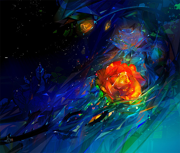
3. Drawing the Rose
Step 1
I put the photo of the flower next to my drawing and began drawing shadows using a cold blue color and experimenting in the mode Transparency > Hard Light. This way the blue will only add light shades/nuances.
Step 2
I applied a light yellow gradient over the flower, saved the settings, and began drawing details of the petals, giving them the texture of soft petals.
Step 3
I’m experimenting with colors again. When you don’t have a clear picture in mind and you’re trying this and that, don't forget Transparency > Saturation. It’s one of the most interesting ways of playing with color and can produce unexpected effects.
Step 4
In order to separate the rose from the background, to make the light around it different from the color of petals, I used gradients again. Using the Eraser Tool I cut a hole in the form of a rose. I applied a gradient in the mode Transparency > Normal—this mode is perfect when you need to smooth out the transitions between colors and make them less contrasting.
4. Some Background Decorations
Step 1
I decided to make the lower part brighter, leaving the left upper corner the darkest part of the picture. For lightening I used a gradient, again a radial one (Gradient > Radial). Why not a linear gradient? Even in this case, when only a small part of the gradient is left in the picture, the line is round, not straight. A linear gradient with a straight line of this size would draw too much attention.
Step 2
I created an object (Transparency > Hard Light, Opacity: 20%), which produces an impression of a thin layer of glass. In order to liven it up and to create fantastic flora, I cut out twigs in it using the Eraser Tool.
Step 3
Using half-transparent objects (Opacity: <50%) of violet and lemon colors I marked the light and the dark parts of the rose.
Step 4
One of my favorite tricks is creating luminous sparks. Set the gradient to radial (Gradient > Radial), and set the sliders to the center, so that there is a large transparent edge. This way, there will be a clear, bright sphere at the center. This is how I make sparks. Now you can draw triangles and other simple forms, which will have sparks at the centre.
Step 5
For drawing the ice petals I used a cold color palette gradient. I drew the contour, leaving the veins of the leaves out.
5. Decorative Art Brush
Step 1
You can create a brush for adding some decoration. I created a brush which looks like beads; I made several sets in different colors. Decorative brushes like this give a picture a creative touch.
Step 2
To create a beads brush like this, first draw several circles of various sizes and align them. Don’t draw too many if you are going to use this brush a lot. The more elements there are in a brush, the more difficult it will be for your computer to calculate it, the quicker your file will get overloaded, and the more likely it is that your computer will slow down and hang.Group the objects and drag them with your mouse to the brushes. A panel will appear, and you should click Art Brush. Then in the next panel/menu you can leave everything unchanged. Your brush is ready.

6. Finishing Touches
Step 1
I marked all the created objects, except for the background, grouped them, and selected them. Then using the Eraser Tool I cut the illustration in pieces, erasing some fragments. This is another interesting trick that I discovered once and have been using since. I use it in difficult moments or when I want to give my picture an interesting touch or an unusual effect. Try adjusting the opacity slider, trying out different modes, or playing with shifting to different sides.
Step 2
Here's another interesting trick I discovered once and have been using ever since. You can use parts of a picture to create a fantastical filling-up effect. You should switch off the contour and switch on the filling (color), then just delete the unnecessary parts.
Step 3
I made the rose more transparent, and drew the orange reflected light from the main rose. Now the ice rose silhouette is ready, and it’s not overladen with details.
Step 4
I selected the gradient I created earlier to lighten the composition, and partly erased it with the Eraser Tool. There is now a feeling of lively clutter in the blue background.
Step 5
If the color is too homogeneous, you’d better liven it up with a couple of strong accents of another color. I took the lively orange of the rose and used it to emphasize the dark rose stems.
Step 6
Using bright colors I emphasized the edges. It’s better to draw highlights at the end, because they adorn a picture a lot, but if you draw them at the beginning they can distract from your work.


