How to Use VSCO Cam's Grid and Journal to Create a Polished Photography Portfolio

VSCO Cam is a well-known name in the world of smartphone photography, with a polished app that allows you to shoot and edit photos on the go. For some time now they've also given you the option to publish your images online using VSCO Grid, and have recently updated their app to include a new feature: Journal. These along with other changes mean that VSCO Cam is now more useful than ever as an editing and online portfolio-building tool, and not just for images shot on your smartphone.
In this tutorial I'm going to show you how to use VSCO Cam's Grid and Journal features, and give you some idea of why you might want to use them to build an online portfolio. 
Note: I'm using what is currently the newest version of VSCO Cam, on iPhone. If you're using an older version of the app (or an Android phone) some of the features I'm going to cover may not be available. You will still be able to use VSCO Grid, but Journal, the web uploader and other features may not be accessible to you.
VSCO Grid is essentially a photo-publishing and social platform. Like Instagram, you can upload images, add descriptions, follow other photographers, and so on. Unlike Instagram, VSCO's portfolio sharing features are accessible from more than just your phone—you can create your own URL to share online, and access lots of your account's features from your desktop. Also unlike Instagram, VSCO Grid is all about quality photography showcased in a beautiful format. 

An example of a VSCO Grid viewed on desktop
This is my VSCO Grid home page. Check out that layout! 

VSCO's new Journal is another step towards a more sophisticated portfolio-building tool. Unlike the Grid, which is all about sharing stand-alone images in a feed, Journal lets you take multiple images, arrange them into a series, and add text. It's a simple way to publish photo essays or diary entries online.
There are hundreds of photographers much more talented than me using VSCO Journal. Take a wander through VSCO's Community showcase to see some incredible examples. 
Both Grid and Journal are completely pared-down when it comes to customising the way your account looks. This isn't a limitation, though, because they've polished the design and typography so you don't have to. This simplified approach takes the hassle out of setting up an online portfolio and publishing your images. I've not come across an easier way to get your photos online and looking great.
You can also use VSCO's sharing tools in addition to your own full online portfolio. With a large community behind them, you're guaranteed to find inspirational photographers to follow, as well as get exposure on your own images. VSCO's emphasis is on sharing beautiful photography, with none of the clutter, spam, hashtags and self-promo-woes of similar apps like Instagram. You could use it as a daily photo diary and keep your larger bodies of work separate. 
And, let's say you're not interested in taking photos with your smartphone. VSCO's recent changes seem to be moving away from being a smartphone-only app, though you'll still need to download the latest version of the VSCO Cam smartphone app to get set up. Once that's done their web uploader lets you bypass using your phone entirely and upload photos from your desktop (as well as sync them to other devices) so if you're looking to share film scans or DSLR snaps, you don't need to go reaching for your phone.
In short: VSCO Cam is a polished app with an emphasis on creating and championing excellent photography, and the VSCO Grid and Journal are continuations of this trajectory. They've got a strong vision for how they think photographs should be displayed online, and they've done a great job of making the process simple and the results beautiful.
Alright, enough chatter. Let's take a look at how to set up your account and publish your images to VSCO Grid. 
The first thing you need to do is download the most recent version of VSCO Cam app to your smartphone. It's available on iPhone or Android. If you want to learn how to use VSCO Cam to take and edit your photos, check out two of my previous tutorials on the topic: 
I'm going to assume you've got some images ready to publish. All you need to do to get started is create a VSCO account. Open the app's side menu bar and tap Sign In to create an account. You'll need to supply an email address and choose a URL for your public account. Verify your email address, add a profile picture and bio, and you're ready to start posting photos. 

VSCO Grid viewed from an iPad
Here's what my VSCO account looks like when viewed on iPad. 

Posting photos to VSCO Grid is an incredibly quick process. Open the app, navigate to your image library and select the image you want to share. Tap Share to Grid and enter a caption. Then tap the tick icon at the top right of the screen, and you're done!

How to share an image to VSCO Grid
Select the image you want to share and then choose Share to Grid from the menu at the bottom of the screen.

There's one drawback—you can only select and post one photo at a time. If you're planning to set up your VSCO Grid and add a backlog of images, this might take a little while. 
If you forgot to add a caption to your photo when you posted it or want to make a change to an existing caption, navigate to your VSCO Grid feed and tap to select the relevant image. From there you can either tap on the caption to amend it, or tap the circle icon at top right to open all the editing options. This is also where to go if you want to delete an image from your VSCO Grid. 

How to edit a post on VSCO Grid
How to navigate to your VSCO Grid feed, as shown on iPad

That's really all there is to it. Take a look around the Grid to get yourself familiar with how it looks and works, then start publishing! 
Now that I've taken you through the VSCO Grid, let's move on to their newest addition: Journal. As I mentioned earlier, Journal is designed to let you create photographic series, essays or diary entries, with multiple images and the ability to add longer paragraphs of text. It's another simple but powerful tool that puts your photography (and writing) at the forefront, with a sleek and polished design and lovely typography. 
You use the same account to add posts to either Grid or Journal. If you haven't already set up an account, do so as outlined above. 
Before you make a photo essay, keep in mind that if you're using images from elsewhere (say, shot with DSLR) you'll want to make sure they're the correct size before you import them to VSCO Cam. Your phone may scale images down—VSCO's website can tell you more about that. Think also about how your images will be arranged. Are they all the same width and height? Do you want to place images side by side, and if so, do they line up neatly? As great as VSCO Cam is as a smartphone app, it's easier to edit your images on a computer to make sure they're the right size and ratio, then import them to your VSCO library.
With that out of the way, let's get started. Journal is similarly easy and intuitive to set up. Open the mobile app and (making sure you're signed in to your VSCO account) navigate to the side menu and tap your name.

VSCO Cams iPhone side menu bar

Then tap the plus icon at the top right. This opens a section at the top of the screen that lets you create a new Grid or Journal post. 

How to post a Journal in VSCO Cam

Select Post to Journal.

VSCO Journal new post page

You'll be prompted to enter a title, subtitle, and cover photo. These will appear on your Journal home page, where all your Journal entries are listed.

Adding a new Journal post on VSCO Cam
Here's what the title page looks like before and after adding details. 

Once you've entered those details and tapped the tick icon you're ready to start organising your journal entry. You'll see a pretty sparse blank page, ready to be filled.

The VSCO Journal new post page
Told you it was sparse! Tap the plus icon to get started.

When you tap the plus icon there are two options: add a block of text, or add an image. 

VSCO Journals add new image or text icons
These icons represent a new image or new piece of text to add to your Journal entry. 

All you need to do to create your diary entry or photo essay is add and arrange images and text in whatever order and combination you'd prefer. 
You can also add captions to images, tile multiple images side by side, or rearrange the order of your entry by inserting new content between existing blocks. Tap on an image in your draft to add another image next to it or to add a caption.

How to add tiled images and captions to your VSCO Journal post
These four icons let you add an image to the left or right, add a caption, or delete the image from your Journal draft.

The process is simple, but at times Journal's navigation can feel a little abstract and counter-intuitive. The icons are almost too minimal, which caused me some confusion. The best way to get used to it is to jump in and start creating drafts. You'll want to have a steady internet connection at this point, as I hit a few error messages when not on WIFI. Be sure to save your draft by tapping the tick icon at the top right of the screen. 

VSCO Grids save and publish icons
Tap the tick icon to save your post. Very important! 

When your entry is ready to be made public, toggle the slider at the top left from Draft to Published. Once you've published your first Journal entry your VSCO account will be updated to show links to both the Grid and the Journal.
We've looked at both tools now, so you've got some idea of how they work and how they're different. You've now got the ability to post standalone images to your VSCO Grid, and construct detailed photographic essays using VSCO Journal. There's no other app that I know of that gives you both these options in such a polished package. 
There's really no secret to using VSCO's tools to share your images and find inspiration. You don't need to worry about hashtags, followers, sharing, comments, trending topics, reblogs or anything like that. You can follow photographers you like (their photos will show up in the app's Home feed) and other photographers can follow your work. You won't know if they do though, and you can't comment on photos or interact with your followers. You can link to your website or contact details in your bio. And that's all there is to it! 
It's impossible to predict what features VSCO may add in the future, but it's clear that their focus is on creating a platform that embraces what they love about photography. They give you all the tools to create a simple online portfolio and connect with other artists and photographers, minus the spam and self-promotion. It's a simple and effective way to publish your images online, without the hassle of setting up your own website.

6 Easy Tips for Making Realistic Digital Paintings

To paint art realistically is to make it almost real. Hardly poetic, I know, but for many beginners the journey to realism is full of confusion and disappointment. 
Realism is the oxygen of digital art. It breathes life into your work by associating it with things we already know. We connect to it because we see ourselves in it. So it's no wonder that so many artists spend a lifetime trying to master realism in all its beautiful glory.
In today's article, we'll tackle a handful of useful tips to help you incorporate different realistic elements into your digital paintings. Whether you're just starting out or are a little more experienced, have a go at these time-saving techniques for more realistic art.
One great way to instantly add realism to your digital paintings is to apply textures to them. You can easily do this by incorporating photo textures into your work.
Photo textures are parts of photographs that you warp and manipulate to blend into your painting. This technique is especially great for achieving the perfect texture for clothes, skin, details in nature, and general grit and grunge. 
In this incredible example by Johnson Ting, he creates an Astronaut Illustration that is out of this world. Pay special attention to how he uses small bits of photos to add authentic textures to his piece. 

Astronaut Illustration by Johnson Ting

Remember Bob Ross? King of giant afros and "happy trees"? For over a decade he famously painted beautiful oil landscapes on his hit TV show, The Joy of Painting. He achieved incredibly realistic details by using simple materials, including a fan brush to paint all the foliage for his signature trees. 
You too can achieve realism by equipping yourself with a wide range of textured brushes in Photoshop. You can find these brushes online or even create your own by following our series of tutorials dedicated to creating Custom Brushes in Photoshop.
Want to see how it's done? Learn how to apply different brushes for realistic texture by following these tutorials below. 

Harness the Elements Art by Monika Zagrobelna

Studying Ambient Occlusion is like stumbling across the holy grail of techniques. If you're already familiar with painting in grayscale then you probably know this common equation:
One grayscale base + colors set to different blend modes = an almost finished painting.
And what is more frustrating than understanding light and shadow? Sure, there are plenty of close seconds, but the magic is always in the lighting. 
We were already impressed by Photoshop's ability to convert gray tonal values to a dynamic colorful piece. But with Ambient Occlusion, you simply apply a universal lighting scenario that cuts your painting time in half. Maybe even more. By the time you're finished converting your black and whites to color, the painting is almost complete. No more relentless tweaking long after you've already applied color. Or making up for holes and mistakes in your original setup. 
Many of our instructors here at Tuts+ swear by this technique, including myself. Check out how I used this method to paint a Surreal Ramen Bowl Illustration in Photoshop. Absorb this process, and you'll dramatically change your workflow. 

Ramen Bowl Art by Melody Nieves

If you're not confident in your painting skills, don't worry, they'll grow with time. But one great alternative to achieving realism is to turn your focus to color. 
Even though it's tempting to paint with bright, vivid colors, limit your color palettes to colors found in nature. Take swatches from photographs and test these values in your own paintings. Soon you'll see that you don't have to be the best painter in the world to make your art that much more realistic.
You can also study natural color palettes to understand how to paint people. Because of the makeup of our bodies, painting skin for instance is more involved than just using different shades of brown. 
In this illustration by Alice Catrinel Ciobotaru, you'll notice how even shades of purple show up in her simple lips tutorial. Study more about the human body to notice these small changes in color, and then try out some natural color palettes for yourself. 

Lips Tutorial Art by Alice Catrinel Ciobatru

If you forgot to paint with different brushes or you can't be bothered with gathering photo references, there's always this one simple fix. Use a quick filter of Noise.
To do this, add a New Layer (Control-Shift-N) and fill it with a light gray color. Go toFilter > Noise > Add Noise and adjust the Amount to 15%.
Set the layer to Overlay and bring down the Opacity to 30%.
This effect allows you to add grit in a matter of seconds. Just make sure you're not too heavy-handed with the noise, because you definitely don't want to ruin your painting efforts. 

Add a Noise Filter for Texture

Every artist goes through a couple of portrait paintings in their lifetime. Not only are they great for developing technique, but you can also experiment with different lighting setups. 
The best way to study light is to study photographs. Do a basic Google search to learn more about different types of lighting including: 
  • Rim Lighting
  • Back Lighting
  • Ambient Light
  • Different Combinations of Light
While I was painting this Dapper Cat, I took a moment to experiment with how another light source might bounce around the painting. This additional light, the orange light source, became a magical detail that pushed my portrait forward and gave it more character.
Try out your own studies and discover how this lighting technique adds life to your work. Experiment with different colors and you'll instantly surprise yourself with what works best. 

Dapper Cat Tutorial Art by Melody Nieves

As with many things in life, if you crack the simple formulas you can adapt your work for greater success. So the next time you browse the work of your favorite artists, don't just sit there in awe. Study it. Search out their process. Pick it apart―not in critique but for techniques. Notice how they're always the same? Soon enough, you'll see how each artist found the process they liked best and stuck with it. 
They've found their formula. So now find yours.
I wish you much success on your digital painting journey. Keep up with Digital Painting 101 for more essential tips and tricks in navigating the waters as a beginner. Good luck!

How to Create a Glowing Metal Text Effect in Adobe Photoshop

by 

Final product image
What You'll Be Creating

Using patterns with different glow and texture settings can make creating interesting, detailed effects a fun and simple job. This tutorial will show you how to use the duplicate with transformation technique to create a piece of 3D text, and then use a bunch of different layer styles to achieve a glowing metal text effect. Let's get started!
The following assets were used during the production of this tutorial:
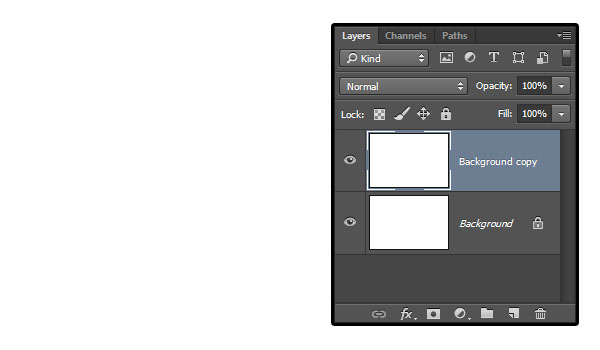
Create a new 1260 x 850 px document, and duplicate the Background layer.

Duplicate the Background Layer

Double click the Background copy layer to apply the following layer style:
Add a Gradient Overlay with these settings:
  • Check the Dither box
  • Blend Mode: Soft Light
  • Opacity: 85%
  • Style: Radial
  • Scale: 150%
  • Check the Reverse box
  • Click the Gradient box to create the gradient

Gradient Overlay

You'll need to click below the Gradient bar to add Color Stops. Then, for eachColor Stop you have, you can click it to select it, and modify its Color and Locationvalues below.
Here are the values used from left to right:
  • Color: #212121Location: 0
  • Color: #656667Location: 72
  • Color: #646565Location: 100

Gradient Editor

Add a Pattern Overlay with these settings:
  • Pattern: webtreats_black_leather.jpg

Pattern Overlay

This will style the leather-textured background.

Leather Background

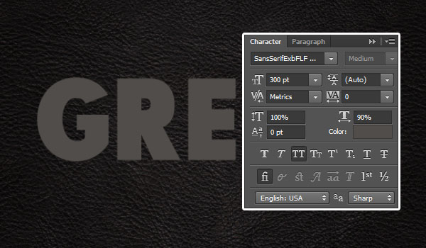
Create the text in All Caps using the font Sans Serif Exb FLF. The Size is 300 pt, the color is #504d4a, and the Horizontal Scale is 90%.

Create the Text

Duplicate the text layer, change the copy's Fill value to 0, and duplicate it.

Duplicate Text Layers

Duplicate the original text layer, and drag the copy below it.
Go to Edit > Free Transform (Command-T), and then hit the Right Arrow Keyonce, and the Down Arrow Key once to move the copy layer 1 px to the right and1 px downwards.
Then hit the Return key to accept the changes.

Move the Text

Press Option-Command-Shift-T (Alt-Control-Shift-T for Windows) nine times to duplicate the layer with the transformation to create the 3D extrusion.

Duplicate the Text with Transformation

Select all the text layers below the original text layer, and go to Filter > Convert for Smart Filters. Rename the smart object's layer to 3D. Then duplicate it, and change the copy's Fill value to 0.

Convert to Smart Objects

Double click the 3D layer to apply the following layer style:
Add a Bevel and Emboss with these settings:
  • Technique: Chisel Hard
  • Size: 10
  • Gloss Contour: Cove - Deep
  • Check the Anti-aliased box
  • Highlight Mode: Linear Light

Bevel and Emboss

Add a Contour with these settings:
  • Check the Anti-aliased box.

Contour

Add an Inner Shadow with these settings:
  • Distance: 0
  • Choke: 10
  • Size: 5

Inner Shadow

Add a Gradient Overlay with these settings:
  • Use the CSP True Sky Blue gradient fill.

Gradient Overlay

Add a Drop Shadow with these settings:
  • Distance: 20
  • Size: 20

Drop Shadow

This will style the main 3D layer and add the gradient coloring. Once you're done styling the rest of the layers, you can get back to this one and try different gradient fills if you like.

Styled 3D Layer

Double click the 3D copy layer to apply the following layer style:
Add a Bevel and Emboss with these settings:
  • Technique: Chisel Hard
  • Size: 15
  • Uncheck the Use Global Light box
  • Angle: 30
  • Altitude: 50
  • Check the Anti-aliased box
  • Highlight Mode - Opacity: 0%
  • Shadow Mode - Opacity: 50%

Bevel and Emboss

Add a Contour with these settings:
  • Contour: Cone
  • Check the Anti-aliased box.

Contour

Add an Inner Shadow with these settings:
  • Distance: 0
  • Choke: 10
  • Size: 5

Inner Shadow

Add a Gradient Overlay with these settings:
  • Blend Mode: Overlay
  • Style: Reflected
  • Angle: 60
  • Use the faucet 30 gradient fill

Gradient Overlay

Add a Pattern Overlay with these settings:
  • Blend Mode: Overlay
  • Opacity: 90%
  • Pattern: metal_2-512px.jpg
  • Scale: 75%

Pattern Overlay

This will add more depth and detailing to the 3D part.

Styled 3D Copy Layer

Double click the original text layer to apply the following layer style:
Add a Bevel and Emboss with these settings:
  • Size: 14
  • Uncheck the Use Global Light box
  • Angle: 76
  • Altitude: 69
  • Check the Anti-aliased box
  • Highlight Mode: Vivid Light
  • Color: #ffe1c9

Bevel and Emboss

Check the Contour box and use the default values.

Contour

Add a Texture with these settings:
  • Pattern: metal_2-512px.jpg
  • Depth: 50%

Texture

Add a Stroke with these settings:
  • Size: 2
  • Position: Inside
  • Blend Mode: Linear Light
  • Fill Type: Gradient
  • Style: Reflected
  • Angle: 90
  • Use the stove pipe 50 gradient fill

Stroke

Add an Inner Shadow with these settings:
  • Blend Mode: Color Burn
  • Color: #123c6b
  • Opacity: 55%
  • Distance: 0
  • Size: 60
  • Contour: Cove - Deep
  • Check the Anti-aliased box

Inner Shadow

Add an Inner Glow with these settings:
  • Blend Mode: Vivid Light
  • Noise: 15%
  • Color: #f4d9c0
  • Size: 14

Inner Glow

Add a Satin with these settings:
  • Blend Mode: Color Dodge
  • Color: #9a9a9a
  • Distance: 48
  • Size: 39
  • Contour: Cone - Asymmetrical

Satin

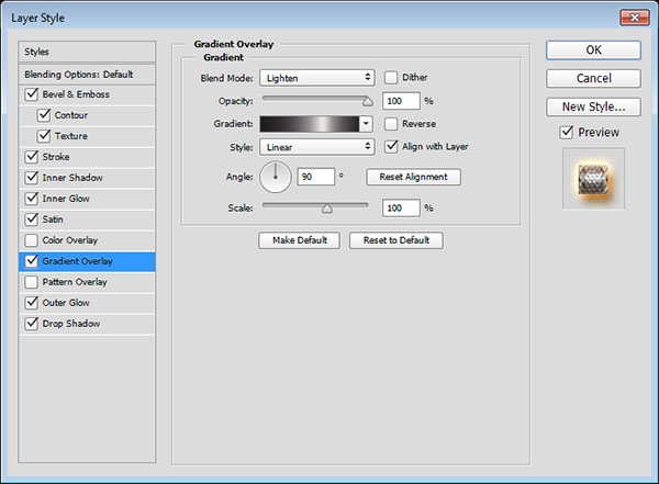
Add a Gradient Overlay with these settings:
  • Blend Mode: Lighten
  • Use the stove pipe 100 gradient fill

Gradient Overlay

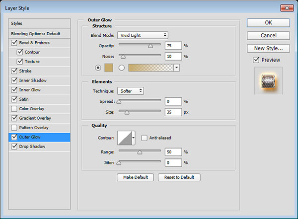
Add an Outer Glow with these settings:
  • Blend Mode: Vivid Light
  • Noise: 10%
  • Color: #c6ab6a
  • Size: 35

Outer Glow

Add a Drop Shadow with these settings:
  • Color: #8d5411
  • Distance: 10
  • Size: 10

Drop Shadow

This will style the main text.

Styled Text Layer

Double click the first copy text layer to apply the following layer style:
Add a Bevel and Emboss with these settings:
  • Size: 1
  • Check the Anti-aliased box
  • Highlight Mode: Vivid Light
  • Shadow Mode: Color Burn
  • Color: #74460f

Bevel and Emboss

Add a Contour with these settings:
  • Contour: Rounded Steps
  • Check the Anti-aliased box

Contour

Add an Inner Glow with these settings:
  • Blend Mode: Vivid Light
  • Noise: 30%
  • Color: #f3d8aa
  • Source: Center
  • Size: 62

Inner Glow

This will intensify the glowing effect in the center of the text.

Styled Copy Text Layer

Double click the second copy text layer to apply an Inner Glow effect with these settings:
  • Blend Mode: Vivid Light
  • Opacity: 55%
  • Noise: 30%
  • Color: #d5ad89
  • Size: 14

Inner Glow

This will intensify the glowing effect at the edges.

Styled Second Copy Text Layer

Place the Texture Stainless Steel With Light-deviant image on top of theBackground copy layer, resize it as needed, then change its layer's Blend Mode toSoft Light.

Place Texture Image

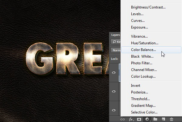
Click the Create new fill or adjustment layer icon at the bottom of the Layerspanel and choose Color Balance.

Add Color Balance Adjustment Layer

With the Tone option set to Midtones, change the values to -35-1+10, and check the Preserve Luminosity box.

Color Balance Settings

In this tutorial, we created a simple leather background, and added a couple of copies of the text we're working on.
Then we copied the text with a transformation to create the 3D part, and converted it into a smart object.
After that, we styled all the layers we have, to achieve the textured, glowing effect, using a bunch of different layer styles with different settings and values.
Finally, we added a simple texture to the Background, and used a Color Balance adjustment layer to enhance the coloring of the final result.
Please feel free to leave your comments, suggestions, and outcomes below.


Copyright @ 2013 Krobknea.

Designed by Next Learn | My partner