How to Create a Fantasy Landscape Photo Manipulation in Adobe Photoshop


Final product image
What You'll Be Creating

In this tutorial you'll learn how to create a fantasy landscape combining different photos. You'll also learn advanced techniques of blending and different techniques of adding lights to your scene with custom brushes and different Blending Modes.
I'll show you how to get beautiful color tones and how to work with layer styles to create a glow around objects. Let's get started!
Download the following photos to create this tutorial:
Photos of "right sky", "left sky", "knight", "orb" and "aura" are attached to this tutorial.
Open Adobe Photoshop and go to File > New... (or press Control-N on your keyboard) to create a new document. 
Set Width to 1400 pxHeight to 2100 px and Resolution to 300.

New document settings

Grab the Paint Bucket Tool (G). Pick  #c2c5c7 color and fill the background with it.
Download all stock photos attached to this tutorial. Open the image named Upper Mountains and drag it into the document you've just created. Double-click on the new layer and name it "upper mountains".
(If you don't see the Layers panel, go to Window > Layers.)
In the image below you can see how your photo manipulation should look so far.

Progress

Usually objects in the background look brighter and objects in the foreground look darker. Because of that, you will lighten the upper mountains in this step.
Add a new Curves adjustment layer on top of all layers and set it as shown below. 
You want to adjust only the layer below (upper mountains) and not the rest of the image. To do so, create a clipping mask from it by clicking on the button This adjustment clips to the layer in the bottom part of the Curves panel.

Curves settings

Download the image named "upper waterfall" and drag it into your photo manipulation. Place it on top of all layers and name it "upper waterfall". To blend it properly with the rest of the image, you need to hide the sky. 
It would be really time-consuming to use the Lasso Tool (L) for masking, so you'll use Channels instead.
First, make all layers except "upper mountains" invisible. The simple way to do it is by holding Alt on your keyboard and clicking on the eye icon to the left of the "upper mountains" layer. See the image below. 

Layers visibility

Make sure the "upper waterfall" layer is active by clicking on it. Open the Channelspanel. If you don't see the panel, go to Window > Channels.
Right click on the Blue channel and select the option Duplicate Channel... to create a new channel (Blue copy).

Blue channel

Click on the new channel and press Control-L on your keyboard to activate the Levels panel. Set Input Levels to 177; 1,00; 230

Levels settings

Grab the Brush Tool (B). Select a round brush and set its Hardness to 100%. SetOpacity to 100% and pick black. Paint over the waterfall to get the same image as below.

Mask

Press Control on your keyboard and click on the channel to activate its mask. After that, make the RGB, Red, Green and Blue channels visible and Blue copy invisible.

Channels visibility

Inverse the selection. Go to Select > Inverse
Go to the Layers panel and click on the layer upper waterfall. With the mask still active, click on the button Add layer mask. You can find this button in the upper part of the Layers panel. The sky on the waterfall layer disappears.

Progress

Download the image named "lower waterfall" and drag it into your photo manipulation. Place it on top of all layers and name it "lower waterfall".
Add a layer mask to this layer. Grab the Brush Tool (B). Select a round brush and set its Hardness to 0%. Set the Opacity to 50% and pick black color. Paint over the edges of the image to blend it with the rest of your photo manipulation. 
In the image below you can see where you should paint. It's highlighted with cyan.

Where you should paint

After you're done, your photo manipulation should look like the one below.

Progress

Download the mist brushes listed at the beginning of the tutorial and install them into Photoshop. (Feel free to use any other free mist brushes you find on the internet.) 
Add a new empty layer on top of all layers, and name it "mist". Grab the Brush Tool (B) and select one of the brushes you've just installed. Lower its Opacity to 30%and pick a very light grey color. Paint mist on the valley. Be careful not to overdo it; it wouldn't look realistic.
In the following image you can see how much mist you should paint.

Where you should paint

Add a new Hue/Saturation adjustment layer on top of all layers, and set the Saturation to -30. (You can find the button Add new fill or adjustment layer in the upper part of the Layers panel.)

HueSaturation settings

In this step you will retouch some parts of the trees which look bigger than the rest of the forest. In the image below you can see which part should be retouched.

Retouching

Add a new empty layer on top of all layers and name it "retouching". Grab theStamp Tool (S). Set its Opacity and Flow to 100%. Press Alt on your keyboard and select some trees as your source. Clone them over the leaves. 
You should get something similar to the following image.

Progress

Download the image named "right sky" from the beginning of the tutorial, and drag it into your photo manipulation. Place it on top of all layers, and name it "right sky".
You need to do two things to blend it properly with the rest of the image. First, change its Blending Mode to Multiply and lower its Opacity to 20%.

Layer order

Second, add a layer mask to the "right sky" layer. Grab the Brush Tool (B). Select a soft round brush and set its Opacity to 50%. Pick black color and paint over the harsh transition between the sky and the rest of the image.
In the following image you can see where you should paint. It's highlighted with cyan.

Where you should paint

Download the "left sky" image listed at the beginning of the tutorial, and drag it into your photo manipulation. Place it on top of all layers, and name it "left sky". 
To blend it properly with the rest of the image, change its Blending Mode toMultiply and lower its Opacity to 20%, as you did in the previous step.
Add a layer mask to "left sky" and paint over the harsh edges to blend it even better. Use the same setting for the brush as in the previous step.
After this step, your photo manipulation should be similar to the one shown below.

Progress

In this step you will increase the contrast of the image to create a more dramatic atmosphere. Add a new Brightness/Contrast adjustment layer on top of all layers, and set the Contrast to 50.

BrightnessContrast settings

In the following steps you'll focus on adding more interesting light to create more dimension in the picture.
Add a new empty layer on top of all layers and name it "light on trees". Grab thePaint Bucket Tool (G). Pick a mid grey color (#808080) and fill the layer with it. To blend it with the rest of the image, change its Blending Mode to Overlay.
Grab the Brush Tool (B). Select a soft round brush and set its Opacity to 15%. Pick white color and start painting over the tops of the trees where light would hit.
In the picture below you can see how the layer light on trees should look. The image on the left is in Normal Blending Mode to give you the exact idea. The image on the right is with the layer set on Overlay Blending Mode.

Where you should paint

In this step you will add even more light. Add a new empty layer on top of all layers, and name it "yellow light". Change its Blending Mode to Soft Light to get the effect you want.
Grab the Brush Tool (B). Select a soft round brush and lower its Opacity to 5%. Pick a bright color (e.g. #f5e260) and paint light roughly as shown in the following image. It's important to not to overdo it to get the most realistic result.
The image on the left shows where you should paint. I set the layer on Normal Blending Mode and put a black background under to show it better. The image on the right shows the result of this step with the "yellow light" layer set on Soft Light Blending Mode.

Where you should paint

The photo manipulation would look better if it's brighter. Add a new Curvesadjustment layer on top of all the layers, and set the Curve as shown in the picture below.

Curves settings

To add even more dimension to the photo manipulation, you will darken the cliffs in the foreground in this step.
Add a new Curves adjustment layer on top of all the layers, and set it as shown below.

Curves settings

You want to make only the foreground darker, not the rest of the image. To do so, grab the Paint Bucket Tool (G) and fill the layer mask of this adjustment layer with black color. After that, grab the Brush Tool (B). Select a soft round brush, set itsOpacity to 80%, and pick white color. Paint over the cliffs. In the following image you can see where you should paint.

Where you should paint

After this step your photo manipulation should be similar to the one below.


Download the sun ray brushes listed at the beginning of the tutorial and install them into Photoshop.
Add a new empty layer on top of all the layers, and name it "sun rays". Grab theBrush Tool (B) and select one of the brushes you've just installed. Set the Opacityof the brush to 30% and pick a very bright yellow color (e.g. #fffcb5). Paint sun rays over the horizon.
As in the previous steps, it's very important to paint just a few strokes to get the most realistic result.
In the pictures below, you can see where you should paint the sun rays. In the left image, I put a black background under the layer "sun rays" to make the rays more visible and to give you a better idea where you should paint.

Where you should paint

In this part of the tutorial, you will place all the remaining elements such as the knight and orbs into your photo manipulation.
Download the image of the knight listed at the beginning of the tutorial, and drag it into your photo manipulation. Place it on top of all the layers, and name it "knight".

Where to place knight

Download the orb listed at the beginning of the tutorial and drag it into your photo manipulation. Name the new layer "orb" and place it on top of all the layers. 
To blend it better with the rest of the image, you'll add some glow to the orb. Make sure the layer orb is active by clicking on it. Click on the Add layer style button. It can be found in the bottom part of the Layers panel.
Check the option Inner Glow and set it as shown below.

Inner Glow settings

After you're done, check the option Outer Glow and set it as shown below.

Outer Glow settings

In the following image you can see how the orb looks with and without this layer style.

Progress

In this step you'll add two more orbs to the background.
Right click on the layer orb and select the option Duplicate layer... Name the new layer "orb 2". Press Control-T on your keyboard to activate the Free Transform and resize the orb to the same size as you can see in the preview. Hold Shift while doing it to have the same proportions. Press Enter to apply the changes.
To create the impression that the orb is far in the background, it needs to be brighter. In this case you can simply do it by lowering its Opacity to 80%.

Progress

Duplicate the layer orb one more time. Name the new layer "orb 3", and resize it to the size of the third orb as you can see in the preview.
Lower its Opacity to 70% to blend it well with the rest of the picture.
In the following image you can see how your photo manipulation should look so far.

Progress

The biggest orb should be slightly brighter and less contrasted. To fix that, add a new Brightness/Contrast adjustment layer right above the layer orb, and set it as shown below.
To adjust only the orb and not the rest of the image, create a Clipping Mask from this adjustment layer.

BrightnessContrast settings

Download the image named aura listed at the beginning of the tutorial, and drag it into your photo manipulation. Place it on top of all the layers, and name it "aura".
To blend it properly with the rest of the image, change its Blending Mode to Screen. Grab the Move Tool (V) and move it on the biggest orb to create a nice aura around it.

Adding aura

To blend the orb even better with the rest of the image, add some gentle mist in front of it. 
Add a new empty layer on the top of all layers and name it "mist 2". Grab the Brush Tool (B) and select some of the mist brushes you installed in the previous step. Lower its Opacity to 30% and pick a very light yellow color (e.g. #fffcdd). 
Paint some mist in front of the orb. In the following image you can compare how the photo manipulation looks before and after this step.

Result of this step

In this last part of the tutorial, you will focus on adjusting colors and contrast to create a more interesting atmosphere.
To add greenish tones to your photo manipulation, add a Gradient Map adjustment layer on top of all the layers, and set it as shown below.

Gradient Map settings

To blend it properly, change its Blending Mode to Exclusion and lower its Opacityto 30%.
In this last step you will make your photo manipulation a bit darker. To achieve that, add a new Curves adjustment layer on top of all the layers, and set it as shown below.
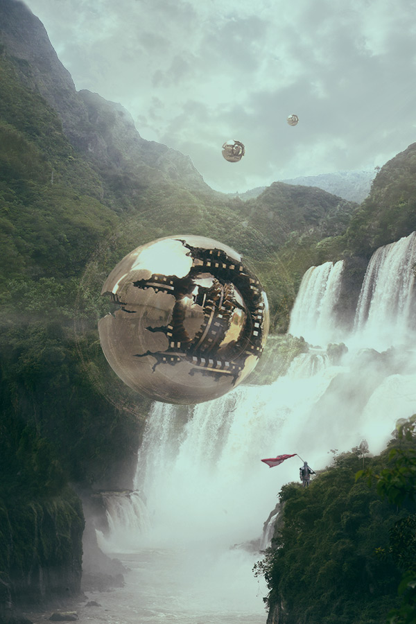

Congratulations! You've just finished your fantasy photo manipulation. You've learnt how to:
  • use Blending Modes to create interesting light
  • work with custom brushes to easily create special effects
  • apply layer styles
  • use advanced techniques of blending
Let me know if the tutorial was useful and inspiring for you in the comments below!

A Freelancer’s Guide to Insurance

What kind of insurance do you need as a freelancer?
The answer can vary widely, depending on what type of business you’re in, what kind of clients you have, how much equipment you have, your financial situation, where you live, and a range of other factors.
Although I can’t tell you specifically what’s right for you, what I can do is lay out the options available to you, and give some examples of when each type of insurance could be useful.
So that’s exactly what I’m going to do in this tutorial. You’ll learn about different types of insurance, from professional liability insurance to property insurance, health insurance, and even specialized things like tax investigation insurance. By the end of the tutorial, you’ll have a clearer picture of the options available to you and how to choose between them.
But first, a word about risk.
Whenever you go into business, there’s a risk that something could go wrong. There are lots of risks, in fact, from a leaky roof destroying your equipment to a critical tweet getting you sued for libel.
Before you decide what type of insurance you need, the first step is to understand what risks you are exposed to. When you’re buying insurance, after all, what you’re really doing is transferring risk. You pay a premium, and in return the insurance company agrees to take on the risk of the lawsuit, the leaky roof, or whatever that policy covers.
I wrote a whole series about risk management for Tuts+, so check that out if you want to understand more about the topic. The super-condensed version is:
  • Understand all the risks you face.
  • Prioritize them in terms of likelihood and impact.
  • Come up with strategies for managing them.
Insurance is one strategy for managing risk, but it’s not the only one. You may choose to avoid the risk (by not engaging in a particular risky activity, for example), reduce the risk (perhaps by introducing more safeguards or contract clauses to make problems less likely to occur), or accept the risk (if it’s an item with low scores for “likelihood” and “impact”, and you’re OK just living with it).
When you’ve listed all your risks, prioritized them, and come up with strategies for managing them, then you’ll have a much clearer idea of what you need insurance for. Now you just need to understand what types of insurance are out there, and how they work. That’s what we’ll look at next.
There are so many different types of insurance out there, and the terms can be confusing. To make things worse, there are often several different terms for basically the same type of insurance. And to make things even more confusing, they’re often called different things in different countries.
So in this section, I’ll demystify some of the terminology, explaining how each one works and when you might need it.
Note that sometimes the types of policy given in “Also known as” may differ slightly in their details or levels of coverage. For example, a public liability insurance policy in the U.S. may protect you against lawsuits from the public, but not from vendors or investors—a general liability insurance policy often provides broader coverage. But I group them together because they cover essentially the same type of risk.
Indemnity insurance, errors and omissions insurance.
Essentially, this type of insurance covers your mistakes. More specifically, it covers you against the expensive consequences of your mistakes, and potential lawsuits from angry clients. If you provide incomplete or shoddy work, fail to meet your contractual obligations, or provide a negligent service, you may get sued. This policy covers you up to a certain amount; as usual with insurance, the more coverage you get, the higher your premiums.
All freelancers should at least consider this type of insurance. Even if you only work with small clients and there doesn’t appear to be much money at stake, things can go wrong.
If you’re a wedding photographer or videographer, for example, you may get sued by an angry couple if they’re not happy with the results. If you’re coding or designing a website, you could be liable if the site doesn’t work as advertised and the client loses money as a result.
If you’re a designer, you could get sued if you use an image that’s subject to copyright. Remember that “HOPE” poster that became an unofficial symbol of Barack Obama’s campaign in his first run for the U.S. Presidency in 2008? It was also the subject of a compensation claim from the Associated Press.
Business liability insurance, commercial liability insurance, public liability insurance, or various combinations of the same words (e.g. commercial general liability insurance)!
This covers things like an injury or property damage to someone else—it’s sometimes called “slip and fall” insurance.
This is particularly important if you have a lot of face-to-face contact with people, or have a lot of equipment or a commercial property.
For example, if you’re a photographer, and your light stand topples over and hits your portrait subject on the head, you’ve got a problem. If you’re a web designer and frequently invite clients over to your studio to work on a project, you could be liable if one of them gets injured on your premises.
Some general liability policies also protect against things like libel claims, so it’s also worth checking into it even if the above scenarios don’t apply. And some large clients may require you to have it.
This is a broad category covering damage to your business equipment. You may already have homeowners insurance, renters insurance, contents insurance or other policies that cover your stuff, but be careful: sometimes personal insurance policies don’t cover equipment used for business activities. Depending on your policy, you may need to at least let your insurance company know, or perhaps take out an entirely new policy for equipment you use for business.
As freelancers, we all have some equipment, even if it’s just a laptop and a phone. Think about what you’d do if that equipment got damaged or destroyed, and how you’d manage the risk. Of course, the more you rely on expensive equipment, the more worthwhile an insurance policy will be.
This is the same vehicle insurance that you’re used to from your personal life. At the most basic level, it covers you for damage you cause to other people or property while driving. Comprehensive policies also cover things like fire and theft.
As with property insurance, you need to check whether you are covered by your existing policy if you use the vehicle a lot for business. You need to inform your insurance company, and may need to pay an additional premium or take out a specific business policy. Don’t assume you’re covered by your personal auto insurance.
I’m sure you know this one already. If you get sick, the insurance pays for private medical care.
Unless you live in a country with a comprehensive state healthcare system, this one is a must for freelancers. Company employees often get it as a benefit of employment, but freelancers don’t, so this is a major expense. It can be expensive, but it should definitely be a high priority for you to take out as soon as you can afford it. Otherwise, a single stroke of bad luck can put you out of business. Medical expenses are the number one cause of personal bankruptcy in the U.S.
Income protection insurance
Health insurance may cover your medical expenses, but what if you’re left unable to work for a long period of time? Your income will dry up, and you’ll be in serious financial trouble. Disability insurance provides you with some regular payments if you’re unable to work because of injury, illness or other incapacity.
Honestly, this one is impossible to predict. Even if you’re young and healthy and not engaged in particularly risky work, the worst could still happen. So it’s worth at least considering this type of insurance. Also consider how fragile or secure your general financial position is, and how you’d cope if your income dried up. For more information on this, see my recent tutorial on dealing with illness as a freelancer.
Workers’ compensation
If you employ other people in your business, this form of insurance provides coverage for any injuries they may suffer, giving them medical care and compensation for lost income while they’re unable to work.
If you’re a solo operator, of course, this one doesn’t apply to you. But if you start to expand and take on employees, it’s important to ensure they’re protected. In many jurisdictions, it’s a legal requirement, so be sure you know the rules where you live.
Tax protection insurance
Tax can be a complicated area for freelancers. We have to declare income from a range of different sources, add up our expenses accurately, claim the right deductions in the right areas, and lots more. If you get audited or investigated by the tax authorities, it can be a painful and sometimes expensive process. Tax investigation insurance offers protection against the costs of dealing with a tax inspection.
Anyone can get investigated, of course, but consider how complicated your affairs are. If your situation is simple and you keep good records, an investigation may be relatively painless, and this insurance may not be necessary for you. But the larger and more complicated your business and financial affairs become, the more costly it could be to deal with an audit. If you’d have to pay an accountant lots of money to help you sort the mess out, it’s probably worth considering insurance.
So now you understand some of the main types of insurance available to you as a freelancer, and you’ve seen some situations in which you might need each kind.
The next step is to get clear on your risks, if you haven’t already. Understand clearly what risks you’re exposed to, and then you can decide whether insurance is the right option for managing some or all of those risks.
Then shop around for the right insurance product for you. In some countries, there are particular policies aimed at freelancers, or brokers that specialize in helping freelancers. In other cases, you may have to go with something aimed more at small businesses.
It’s well worth checking professional associations to see if they offer any insurance benefits. Often they are in a position to negotiate favourable rates for their members. For example, as a British freelance writer, I am a member of the Society of Authors (which costs £95 a year), and so I qualify for their special insurance offers for members. I can get tax protection insurance for just £12 a year, public liability insurance for £16 a year, and discounts on lots of other types of insurance. Bargain! See what’s available in your country and your industry.
If you find that the premiums are too high, even after you’ve compared several different providers and checked professional associations, then return to the risk management series, and consider if there’s any other way you can deal with the risk effectively. Insurance, after all, is not the only risk management strategy. But you do need to have some strategy in place. Reduce the risk, avoid it, accept it, or transfer it. Just please don’t ignore it.
Graphic Credit: Insured icon designed by CO. Department of Health Care Policy and Financing from the Noun Project.

Create a 3D Cafe Sign Using Adobe Photoshop and Filter Forge


by 
Final product image
What You'll Be Creating
Finding the right textures for a 3D artwork can sometimes be a bit of a hassle. Filter Forge is a great Photoshop plugin that comes in handy in such cases, with more than 5,000 Texture Filters that have different presets, settings, and options to control the textures' appearance. This tutorial will show you how to use a couple of those filters to create a simple 3D cafe sign. Let's get started!
The following assets were used during the production of this tutorial:
Create a new 750 x 1000 px document. Pick the Ellipse Tool, create a 435 x 435 px circle, and then duplicate the Ellipse 1 layer and rename the copy Frame.
Create the Main Ellipses
With the Ellipse Tool still active, change the Frame shape's Fill in the Options bar to None, the Stroke Color to a light gray, and the Stroke Size to 30 pt. Then click the Set shape stroke type icon and set Align to Outside.
Frame Stroke Options
Create another 50 x 50 px circle and rename its layer Hand.
Pick the Rounded Rectangle Tool, set the Radius to 35, and create a 250 x 250 pxrounded rectangle. Rename its layer Plate.
Creating the Hand and the Plate
Pick the Rectangle Tool, and create 737 x 15 px rectangle. Rename its layer Wall, and then duplicate it twice. Rename the first copy Ceiling and the second copy Edge.
Creating the Rectangle Layers
Finally, add the text in the center of the big ellipse using the font Nexa Rust Script L 0. The color and size don't matter since we'll be able to modify them when we convert the text into a 3D mesh.
Create the Text
For each shape layer you have, select it, and then go to 3D > New 3D Extrusion from Selected Path. For the text layer, select it, and then go to 3D > New 3D Extrusion from Selected Layer.
Create the 3D Layers
Select all the 3D layers you have, and then go to 3D > Merge 3D Layers, and rename the merged layer 3D Scene.
Merge the 3D Layers
To access the 3D mesh settings and properties, you’ll need to open two panels: the3D panel and the Properties panel (both found under the Window menu).
The 3D panel has all the components of the 3D scene, and when you click the name of any of those, you’ll be able to access its settings in the Properties panel. So make sure to always select the tab of the element you want to modify in the 3Dpanel before you change its settings in the Properties panel.
Select each of the Mesh tabs in the 3D panel, and change the Extrusion Depth values in the Properties panel as follows:
  • Ellipse 1: 50
  • Frame: 55
  • Text: 25
  • Hand: 500
  • Plate: 50
  • Wall: 1000
  • Ceiling: 1000
  • Edge: 50
Change the Extrusion Depth Values
Change the Texture Mapping to Tile for each of the WallCeiling, and Edgemeshes.
Change the Texture Mapping
Select the Frame mesh tab, and then click the Cap icon at the top of the Propertiespanel. Change the Bevel Width to 7%, and the Contour to Half Round.
Do the same for the Text mesh tab, but set the Bevel Width to 10% instead of 7%.
Adjusting the Cap Settings
One way to position the 3D meshes in the scene would be by changing theirCoordinates values. So click the Wall mesh tab, and then click the Coordinates tab at the top of the Properties panel. Change the Y Rotation Angle to 90, and the Z Rotation Angle to -90.
Change the Coordinates Values
Another way is by using the Move Tool's 3D Modes and 3D Axis.
So if you select the Move Tool, you’ll find a set of 3D Modes for it to the right of theOptions bar.
When you choose one of those, you can then click and drag to perform changes (on the selected element in the 3D panel). You can also use that to work with the 3D Meshes you have.
As for the 3D Axis, the arrows at the ends of the axis move the mesh, the part below them is used for rotation, and the cubes are used for scaling. The cube in the center is used to scale the object uniformly. All you need to do is click and drag the relevant part.
The Move Tool 3D Modes and 3D Axis
Use the Move Tool and the Coordinates values to move and place the 3D meshes around in the scene, as well as the camera view, until you get a result you like.
Moving the 3D Meshes and Placing them in the 3D Scene
Click the Ellipse 1 Front Inflation Material tab in the 3D panel, and then click theDiffuse texture icon in the Properties panel and choose Edit Texture.
Edit the Ellipse Texture
This will open the texture file. Create a new layer on top of the shape layer, and then go to Filter > Filter Forge > Filter Forge 4.
Select the Grainy Wood filter, choose the 9th preset, and click the Apply button.
Grainy Wood Filter
Once the texture is applied, add a Levels adjustment layer, and change the Gammavalue to 0.90.
Save the file (File > Save) and close it (File > Close) to go back to the original document.
Levels Adjustment Layer
Change the Shine value to 90, the Reflection to 10, and the Roughness to 5.
Ellipse Mesh Material Settings
Select the Frame mesh's Front Inflation Material tab, click its Diffuse texture icon, and choose Edit Texture.
Create a new layer on top of the shape layer, and then go to Filter > Filter Forge > Filter Forge 4. Select the Super Brushed Metal filter, choose the 9th preset, and click the Apply button.
Save the file and close it, and repeat the same steps to apply the same texture to both the Frame mesh's Back Inflation and Extrusion Materials.
The Super Brushed Metal Filter
Select all the Frame mesh Material tabs, and change the Shine to 80%, theReflection to 21%, the Roughness to 23%, and the Refraction to 1.100.
Frame Mesh Material Settings
We won't apply any texture to the text. Instead, we will apply a color fill, and you can choose any color you like.
To do so, select all the Text mesh Material tabs, click the Diffuse texture icon, and choose Remove Texture.
After that, change the Shine to 89%, the Reflection to 35%, and the Roughness to5%. Choose a Diffuse color you like—the RGB values of the one used here are (13010112)—and change the Specular color to (898989).
Text Mesh Material Settings
Select all the Hand and Plate mesh Material tabs, and then change the Shine to80%, the Reflection to 21%, the Roughness to 23%, and the Refraction to 1.100.
Hand and Plate Mesh Material Settings
Deselect the Plate Inflation Material tab, click the Diffuse texture icon, and choose the Frame Extrusion Material from the list.
As for the Plate Front Inflation Material, edit its texture separately to apply the same brushed metal texture. This way you won't need to edit the UV values.
Hand and Plate Textures
Select the Wall Extrusion Material tab, click the Diffuse texture icon, and chooseEdit Texture.
Go to Filter > Filter Forge > Filter Forge 4, choose the Brick factory filter, and select the 11th preset.
Brick Factory Texture
Click the Settings tab, and change the Color 1 of bricks to #EDECEA, and theColor 2 of bricks to #EAEAEA. Then click the Apply button.
Once the texture is applied, save and close the file to go back to the 3D scene.
Brick Factory Filter Settings
Click the Diffuse texture icon again, and choose Edit UV Properties.
Edit UV Properties
In the Texture Properties box, you'll need to play around with the Scale or Tilevalues to get a result you like.
This basically controls how the texture is applied to the wall mesh's extrusion, and how it's tiled vertically and horizontally.
Texture Properties Values
Change the Shine value to 90%. Then select the Bump folder icon, and choose theWall Extrusion Material texture from the list. If needed, edit its UV Properties to match those of Diffuse.
Add the Bump Texture
Edit the Ceiling Extrusion Material texture to apply the Wall1 - AngelBlame filter.
When you choose the filter, click the Settings tab, check the Seamless Tiling box, and click the Apply button.
Wall1 - AngelBlame Filter
Add a Hue/Saturation adjustment layer, and change the Saturation value to -75. Save and close the file.
HueSaturation Adjustment Layer
Once again, you'll need to adjust the UV Properties for this texture. Try different values until you like the result you get.
Ceiling Texture UV Properties
After that, select all the Ceiling and Edge Material tabs, apply the Ceiling Extrusion Material texture (from the textures list), and change the Shine value to 90.
Ceiling and Edge Material Settings
Click the Infinite Light 1 tab in the 3D panel. Then, in the Properties panel, change its Intensity to 80%, and its Shadow Softness to 30%.
Then, pick the Move Tool, and move the light around until you get a result you like.
Infinite Light Settings
Click the Environment tab, and then click the IBL texture icon, and choose Replace Texture.
Load the Art Gallery Background image, and change the Intensity to 40%.
Environment Settings
Click the Add new Light to Scene icon at the bottom of the 3D panel and chooseNew Point Light.
Add New Point Light
Place the light on top of the sign and slightly behind it, and then change its color to (248245237), its Intensity to 30%, and its Shadow Softness to 10%.
Check the Light Falloff box, and change the Inner and Outer values depending on how you'd like the light to fade out.
Point Light 1 Settings
You can take a bit of time to move the lights around and change any of their settings, until you're satisfied with the outcome.
Move the Lights Around
Move the camera around until you get an angle you like. Then select the Scene tab in the 3D panel, and choose Hidden Wireframe from the Presets menu in theProperties panel.
Hidden Wireframe Preset
Click the Current View tab, and then change the Depth value to 5. Start trying different Distance values until you get the focus on the sign, and the blur on the surrounding areas.
Once you're done, click the Scene tab again, and choose Default from thePresets menu.
Adding Depth of Field
After the scene is ready, you might need to make some changes on any of the meshes you have.
For example, you can select the Frame mesh tab in the 3D panel, and click the Edit Source button in the Properties panel to modify the frame shape options.
Frame Mesh Edit Source
When the frame shape file opens, change the Stroke Size to any value you like. Here, it is set to 5. Save and close the file when you're done.
Change the Stroke Size
You can see how the 3D frame is updated in the 3D scene as well. This applies to the rest of the 3D meshes, and comes in handy when you decide that you want to change a 3D mesh's settings after you have the 3D scene ready.
Updated Frame Mesh
When you're done working on the 3D scene, go to 3D > Render. The rendering might take a while, but you can stop any time by pressing the Esc key.
Render the 3D Scene
After the rendering is finished, add a Gradient Map adjustment layer using a Black to White gradient fill, and check the Dither box. Then, change the adjustment layer's Blend Mode to Linear Burn, and its Opacity to 30%.
Add Gradient Map Adjustment Layer
This will enhance the coloring of the final result.
Final Result
In this tutorial, we used a couple of different shape tools to create the main shapes that will be a part of the 3D scene, and then we converted those shapes into 3D meshes.
After that, we modified some of the Mesh and Cap settings for the 3D meshes, and used the Coordinates values and the 3D Axis to move those meshes around and place them in the 3D scene.
After the meshes were placed, we started using some Filter Forge filters to create the textures and apply them to the different materials, as well as to adjust the settings of those materials.
Finally, we worked on the lighting, added depth of field, and rendered the scene. Then we added an adjustment layer to enhance the coloring of the final result.
Please feel free to leave your comments, suggestions, and outcomes below.


Copyright @ 2013 Krobknea.

Designed by Next Learn | My partner