Create Beautiful Wedding Invitations Using Adobe InDesign and Typekit


Final product image
What You'll Be Creating
Adobe has recently released a new update for its InDesign CC software. With continued enhancements being made to Typekit, namely making the syncing of fonts in Creative Cloud more slick and seamless while you work, it’s a great time to try out CC if you haven’t already. You can make good use of the fantastic typography features available in the program, and apply them in the state-of-the-art design environment set up for you in CC.
In this tutorial you’ll learn how to create a small ornate wedding invitation step-by-step (below), and use some of the most stunning typefaces at your fingertips in CC and Typekit.


final invitation
I’ll also make some recommendations for typefaces you can use to create all sorts of different invitation styles. Whether you want to create something formal, vintage-inspired or kitsch, there’s an invitation style here for you.
Wedding invitations come in three standard sizes:
  • Large: 6 3/8 in x 8 7/8 in (162 mm x 226 mm)
  • Medium: 5 1/2 in x 7 1/2 in (140 mm x 191 mm)
  • Small: 4 1/2 in x 6 1/4 in (114 mm x 159 mm)
Each size fits snugly into a standard-sized envelope. Invitations can be portrait or landscape, so it’s really up to you how you would like your invitation to look.
Let’s start by creating these custom sizes in InDesign. You can create all these sizes in InDesign to save for future use.
Open InDesign. In the welcome window select New Document, or go to File > New > Document. Set the Intent to Print, keep No. of Pages as 1, and uncheck Facing Pages.
From the Page Size drop-down menu select Custom... and type Wedding Invitation - Small under Name. Set the Width to 114 mm and Height to 159 mm. Click Add.
Type again into the Name text box, this time Wedding Invitation - Medium. Set the Width to 140 mm and Height to 191 mm. Click Add.
Create a third and final Custom Page Size by typing Wedding Invitation - Large under Name and setting the Width to 162 mm and Height to 226 mm. Click Add.
Click OK.


custom page size

We’ll first create an example of a small-size wedding invitation. So, back in the New Document window, select Wedding Invitation - Small from the Page Size drop-down menu, and keep the page orientation as Portrait. Set the Margins on all sides to 7 mm and set the Bleed on all sides to 3 mm. 
Click OK.


new document

In this tutorial, we’ll create a small-size invitation step-by-step. Jump to the end of the tutorial to see some font and style recommendations for a medium- and large-size invitation too.
Open the Layers panel (Window > Layers) and double-click on the default Layer 1 name to open the Layer Options window.
Rename the layer Background and click OK.


layer options background
Select the Create New Layer icon at the bottom right of the Layers panel and rename this second layer as Border. Click OK.


border layer
Create a third layer and rename this as Typography. Click OK. 


typography layer
Lock the Typography and Border layers by clicking once in the blank square to the left of the layers’ names in the Layers panel. Click once on the Background layer to ensure you’re working on this layer.
Open the Swatches panel by going to Window > Color > Swatches. We’re going to create a new set of swatches for use on our invitation design.
Select New Color Swatch from the drop-down menu, accessible from the top-right corner of the Swatches panel.


new color swatch
Ensure the Color Type is Process and select CMYK from the Color Mode drop-down menu. Set the sliders to the following values: C=7 M=5 Y=6 K=0, and rename the swatch as Light Cream. Click OK.


light cream
Repeat the process above to create two more new CMYK swatches:
  • Navy: C=92 M=77 Y=42 K=44
  • Silver: C=25 M=20 Y=20 K=0


navy
silver
You could pull out the silver-colored elements onto another layer and ask your printer to apply metallic foiling, but in this example, we’re just going to use a light-grey CMYK colour to get a similar effect.
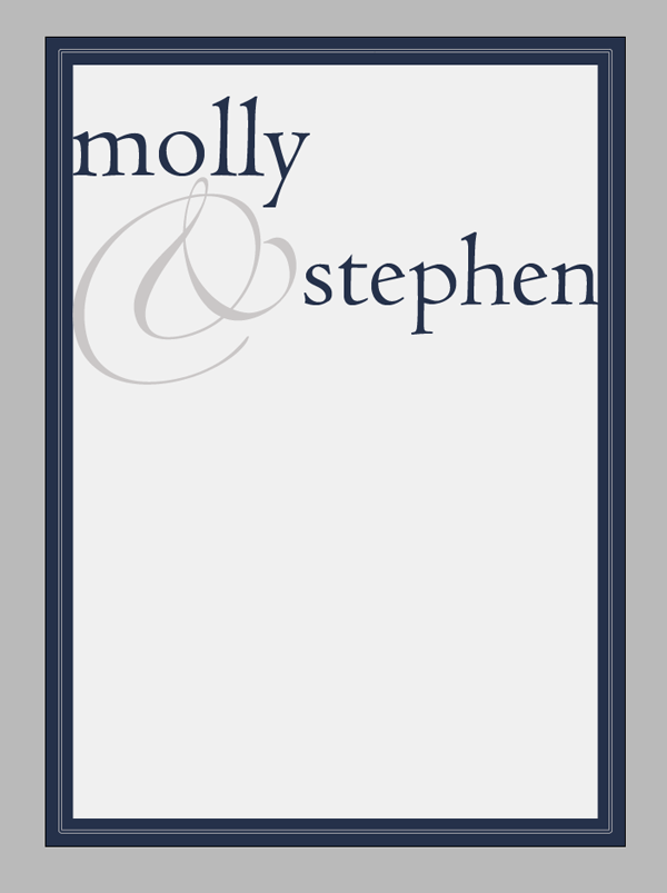
Remaining on the Background layer, select the Rectangle Tool (M) and drag to create a frame that extends to the edges of the bleed on all sides of the page. From the top control panel, set the Stroke Color to [None] and the Fill to Light Cream.


cream background
Lock the Background layer.
Unlock the Border layer.
Select the Rectangle Tool (M), as before, and drag to create a frame 120 mm in Width and 165 mm in Height. Center it on the page.
From the top control panel or the Stroke panel (Window > Stroke) set the Weight to 24 pt. Set the Fill Color to [None] and the Stroke to Navy.
Hop up to the top menu and select Object > Corner Options and set the Size to 3 mm and Shape to Rounded on all sides. Click OK. 


corner options
navy border

Remaining on the Border layer, select the Rectangle Tool (M) and drag to create a frame 109 mm in Width and 154 mm in Height. Place centrally on the page.
Set the Fill to [None], Stroke to Silver, Weight to 2 pt and Type to Thin - Thin. Go to Object > Corner Options and set the Size to 0.3 mm and Shape to Rounded on all sides.


silver border
Lock the Border Layer.
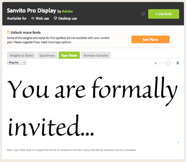
Select the Type Tool (T) and navigate up to the top left corner of the screen. Click on the drop-down menu next to the default Font name in the Character Formatting Controls panel. You’ll see that InDesign CC offers you the option to Add Font to Typekit. 
If you click this it will take you to the online Typekit Library. Here you can browse from the hundreds of fonts available and choose to sync them to your Creative Cloud. When creating formal, ornamental invitations, you want to set the search criteria to Decorative (for Classification) and Desktop Use (under Available For).


typekit selection
Look for something that has a classic, elegant look, and that looks great at both small and large scale. Typefaces which have ornamental characters, like a fancy ampersand (&) will give you lots of flexibility when designing your invites.
Here are some of my recommended Typekit picks for wedding invitations:
Sail by LatinoType


Sail
Kinesis Pro 3 by Adobe


Kinesis Pro 3
Sorts Mill Goudy by The League of Moveable Type


Sorts Mill Goudy

Sanvito Pro Display by Adobe


Sanvito Pro
All of these typefaces will look fantastic on formal invitations. But there are a whole bunch of great fonts available already in Adobe InDesign CC which will work well on your wedding invitation too...
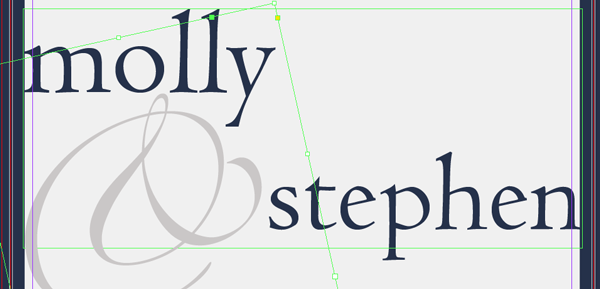
In this example, we’re going to use two fonts already available to us in InDesign CC, Zapfino and Centaur MT Std. 
Back in your InDesign document, unlock the Typography layer in the Layers panel.

Select the Type Tool (T) and drag to create a text frame 104 mm in Width and 45 mm in Height. Center the frame on the page at Y position 12 mm. Type name of bride (paragraph break) name of groom. Highlight the groom’s name and set the text alignment to Align Right. 
Highlight all the text and set the Font to Centaur MT Std Regular, Size 60 pt, Leading 72 pt and Font Color to Navy.


names on invite

Select the Type Tool (T), as before, and drag to create a square text frame about 60 mm in diameter. Put your cursor into the frame and set the Font to Zapfino. 
Open the Glyphs panel (Window > Type & Tables > Glyphs) and select a swirly, ornamental & from the characters available. Double-click on the symbol in the panel to insert the glyph.


glyphs panel
Adjust the Font Size to 70 pt and Font Color to Silver. Switch to the Selection Tool (V, Escape) and hover your cursor to a corner of the frame until a rotate icon appears. Grab and rotate the frame a little to the left until it fits snugly between the bride’s and groom’s names.


ampersand
Gorgeous!


invite

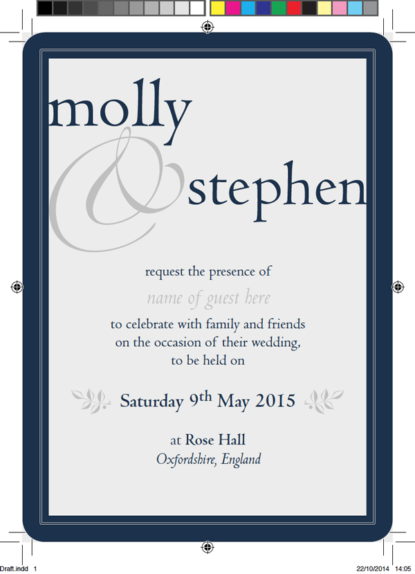
Select the Type Tool (T) again and drag to create a large text frame 104 mm in Width and 67 mm in Height. Position this below the text frames you created in the previous two steps, at around Y position 71 mm.

Type:
request the presence of
(paragraph break)
name of guest here
(paragraph break)
to celebrate with family and friends 
(paragraph break)
on the occasion of their wedding, 
(paragraph break)
to be held on
(paragraph break x 2)
Day Date Month Year
(paragraph break x 2)
at Venue
(paragraph break)
Location

Highlight all the text and set the Font to Centaur MT Ltd, Size 14 pt and Leading to 16.8 pt (Auto). Adjust the text alignment to Align Center, and the Font Color to Navy. 
Highlight name of guest here alone and set the Weight to Italic. Adjust the Size to 21 pt, Leading to 25.2 pt and Font Color to Silver. Adjust the Leading of the line below it to 23 pt to even the text out.
Highlight the Day Date Month Year alone and adjust the Weight to Bold and Size to 15 pt. You can also pull out the name of the Venue in Bold too.
Finally, highlight the Location and adjust the Weight to Italic.


main text

To add a final flourish to the invitation, select the Type Tool (T) and create a small square text frame about 12 mm in diameter. Insert a decorative glyph from the selection under the Zapfino font in the Glyphs panel (Window > Type & Tables > Glyphs). Here I chose a decorative leaf glyph.


glyphs panel
Set the Font Color to Silver and Size to 14 pt. Position the frame to the left of the date text. You can rotate the frame a little to the left until you’re happy with the position.


leaf glyph
Once you’re happy, select the text frame and Edit > Copy and Edit > Paste. Right-Click (Windows) or Control-Click (Mac OS) > Transform > Flip Horizontal this second text frame. Position it on the right side of the page in a mirrored position.


leaf glyphs

Your design is complete, as quick and simple as that!

final design

To export your invitation ready for print, go to File > Export and select Adobe PDF (Print) from the Format drop-down menu. Under the General options, select Press Quality from the Adobe PDF Preset drop-down menu.


export to PDF
Under the Marks and Bleeds options (scroll through the options from the left-hand side of the window) check All Printers Marks and Use Document Bleed Settings.


marks and bleeds
Click Export.


exported PDF

To create a Photoshop mock-up of your invitation, place a JPEG version of the invitation in Photoshop, layered on top of a rustic wooden texture, like this one from Photodune.


final invitation

There are loads of beautiful, ornate fonts available in InDesign CC and Typekit. Here are some extra font suggestions for creating other invitation styles.

For a vintage-inspired invitation, why not try Engravers LT Std to give a classic twist to headers? For this medium-size invitation, I contrasted soft colors, like silvers and pastels, with a Rich Black (try C=75 M=68 Y=67 K=90 to give your black a deep, inky quality).
Also used on this example, for the lower section of text, is New Century Schoolbook LT Std, set in All Caps and with Tracking set to 210.

The decorative flourishes are characters taken from the Centaur MT Std glyph set, set in coral and silver swatches.


elegant invitation

For a more kitsch invitation which has a more friendly, approachable look, try using Sail (available in Typekit), set in All Caps, and arrange on a curved path (use the Ellipse Tool (L) and Type on a Path Tool (Shift-T) to replicate this effect).

For this large-size invitation, I adjusted the Page Orientation to Landscape, which gives you more room to the left and right of the page to add playful colored sections. A color palette of gold, pale pink, dark grey and white gives a warm, chocolate-box appeal to the design.

The decorative characters are taken from the Zapfino glyph set. There’s really no need to create or download custom graphics, because many typefaces have fantastic decorative characters automatically included as part of the glyph set.


playful invitation

I hope you have fun creating your wedding invitations!
Being able to choose from such a wide range of typefaces using InDesign CC and Typekit really means you can have huge flexibility over the look and style of your designs.

If you have any other fonts you like to use for formal invitations that aren’t mentioned here, please share them in the comments below!

How to Create Custom Smoke Brushes in Adobe Photoshop

Final product image
What You'll Be Creating


Smoke trails are elegant, beautiful, and amazing to watch. Thin wisps of smoke dancing through the air reveal just how fluid our atmosphere really is. The effect is deceptively simple, and the dynamics of it are dizzyingly complex. 
Recreating believable smoke in a digital environment is no easy task. However, capturing the practical effect is a much easier prospect. In this quick tip, I'll share a technique that I use to create stunningly beautiful custom smoke brushes in Adobe Photoshop.
The most important thing to remember during this project is safety! Open flames are dangerous, and you should take every precaution to be able to extinguish the fire if things get out of control. Keep a cup of water nearby to douse the lit matches and a fire extinguisher at hand too, just in case!
The materials for this project are very simple and probably already found in your house:
  • A small but flameproof surface, like a metal cake pan
  • Matches (or a lighter)
  • Cotton swabs
  • Clothespin
  • Petroleum jelly


Basic materials for the smoke project

Take a cotton swab and coat one end with the petroleum jelly. This becomes the wick of our project. The petroleum jelly will create a very hot flame that will be sustained for much longer than just a match. It will also produce much more smoke.


Dip the cotton swab into the petroleum jelly

Pinch the clean end of the cotton swab in the clothespin to hold it vertically. Place both on the fireproof surface. I used an inverted cake pan. This way, any scorching that happens will be on the bottom of the pan, and won't make our cakes taste funny!


Place on a fireproof surface like an inverted cake pan

Set the pan somewhere with a very dark background and a controllable light source. You can see my setup here. I have a black backdrop hung across the back wall of the room. The light is positioned behind the wick, off to one side, and pointing upwards. I found this to be the best position to illuminate the smoke without interfering with its movement. After a few test shots, I added the reflecting umbrella to keep the light from spilling out onto the backdrop.


Lighting Setup
Here's the same setup with the light turned on and the rest of room darkened.


Light controlled setup
Even if you don't have the same photographic light equipment, you can make do with a darkened room, a black sheet, and a strong flashlight.
Before lighting the wick, work with your camera settings. It is highly unlikely that your camera's auto setting will work, as the camera will say the scene is too dark, and the flash will ruin the shot. Instead shoot on Manual without a flash. I found that a shutter speed of 1/100, aperture of F/5.0 and ISO 500 worked really well for my setup. The release mode should be set to Continuous to capture as many frames as possible. Here's a test shot with those settings. It is very dark, but the smoke will stand out nicely!


Camera set to Manual 1100 F50 ISO500

Now it's time to carefully light the wick. If you are using matches, be sure to have a cup of water handy to drop the lit match into.


Carefully Light the Wick
Allow the wick to burn for a few moments to work up a full head of flame.


Let the wick burn for a few moments
Extinguish the flame by gently blowing it out, and behold the beautiful smoke tendrils!


Extinguish the flame to get the full smoke effect

Now! Shoot it now! Quickly compose the shot to capture the smoke against the black background. Try to keep the light and wick out of the frame. Then hold down the shutter release to get as many frames as you can until your buffer fills up. The wick will continue to produce smoke for about 30 seconds to a minute, which should allow plenty of time to capture several shots.


Beautiful Smoke Tendrils
Repeat the process as many times as you want to produce more smoke photos. Be sure to dispose of the spent wicks in the cup of water to prevent the smoldering coals from accidentally igniting anything else.
Now that we are done playing with fire, it's time to process those smoke images and turn them into a useful digital resource!
Open one of the photos in Photoshop. Even though the smoke appears to be gray, there is some color information present. Photoshop disregards color when creating a brush, so it is best that we do the same. Add a Black & White Adjustment Layer to desaturate the image.


Remove color information

Add a Levels Adjustment Layer and pull the outer handles inwards to touch the edges of the histogram chart. This will increase the contrast of the image and ultimately create a stronger brush effect.


Levels to increase contrast

Add a new layer just above the background layer and name it Edge Treatment, and then use the Brush (B) with black paint and a large, soft tip to make certain the edges are all completely black. In areas where the smoke touches the canvas edge, reduce the brush Opacity and gently fade the edge to black. This will prevent the custom brush effect from producing sharp edges when used. Use this opportunity to also paint out any stray marks that might disrupt the brush.


Fade edges to black

Photoshop's custom brushes interpret black as positive pixels and white as negative, so the image needs to be black on white, not white on black. Add an Invert Adjustment Layer above the others to completely reverse the black and white values.


Invert the black and white

Photoshop will not define a brush as long as the targeted layer is an Adjustment Layer, so click on the Background layer to make it active and go to Edit > Define Brush Preset. Give the brush a name in the dialogue box and hit OK. Now this new brush will be available for you at the bottom of the list of Brush Presets.


Define the Smoke Brush

I fully encourage you to follow along with this technique and learn how to create your own custom resources from practical effects. But If you don't have the time to do it yourself, I'm including a full set of my custom smoke brushes for you to use here!
Download the attachment for this tutorial and unzip the CustomSmokeBrushes.abr file. Then go to Edit > Presets > Preset Manager. In the Brushes section, use the Load button to navigate to the downloaded file.


Adding our brushes to the Preset Manager
This will add 15 custom new smoke brushes to your Brush Presets.


High Resolution smoke images

Now go be amazing! Take these smoke brushes and use them to create any manner of smoke-filled digital designs. Smoke is an easily recognizable natural element that can be pushed and warped into almost any form, and smoke effects add a sense of dynamic energy to a scene. So use them in fun and creative new ways.


Smoke Illustration

Can't get enough custom creative brushes in Photoshop? Hungry to learn more about how to use custom brushes in photo manipulation projects? Check out my profile of courses and tutorials here at Tuts+ and find all that, and much more!

Creating your own library of digital resources pulled from real-world practical effects is a skill that will pay off exponentially in the future. Instead of searching stock sites for interesting textures, try creating some for yourself! I'd love to see them in the comments below.


Copyright @ 2013 Krobknea.

Designed by Next Learn | My partner