If you're familiar with the Arabic script as it is taught today, i.e derived from the round scripts, you may find some of the letters are quite different from what you know. Just as a reminder, I am distinguishing between letters, of which there are 28 in Arabic, and letterforms, of which there are only 18 because many letters share the same letterform with different arrangements of dots.
You'll notice that I'm not setting down forms so much as principles, over which form can be interpreted with great freedom. It's very much like the structural part of a building, which is invisible from the outside but, if sound and well-proportioned, contributes more beauty than the cosmetic additions. This simile is all the more relevant when you know that the script we're working with is called handasi هندسي in Arabic, which means both "geometric" and "architectural".
Basic Elements
To begin with, let's define the parts of a letter. If we really boil it down, we can think of the Arabic script as made up of identifying shapes issuing from a baseline that runs like a thread through any text, only disappearing momentarily when letters don't connect. Some of these shapes are constant: they are the body of the letter. Another set of shapes is only present when it is not connecting to a letter following it: they are the tail.The body shapes are as follows:

Finally, the loop or circle, which can in some cases be lifted off the baseline.
The tails have various relationships to the baseline:

The 18 Letterforms
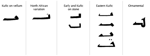
In the diagrams below, I examine the essential shape of each letterform and then provide samples of this letterform as found at different periods and in different mediums. This essential shape is like our invisible structural part, the nuts and bolts inside a construction, or like the stick figure used when drawing people: it is not the outer shape of the letter, so don't copy it thinking that is the original letter. The period examples I provide are examples of outer shape, and they are there to give you a better feel for the letter.The reason Kufic is difficult to teach except by apprenticeship is that unlike cursive scripts, there isn't a definite single form for each letter, which I can show you and say "this is it, memorize it": we need to interiorize the subtle essence of each letter. This is why I'm showing a range of forms. In the same way, you might look at members of the same family and positively feel what makes them look alike, but be incapable of pinning it down on paper.
Please note that I am not attempting to identify the styles and periods with scientific precision, firstly because the scarcity and confusion of resources makes it impossible to do so with any honesty, and secondly because that is quite irrelevant to your purpose, which is to become intimate with the letters. The concerns of a calligrapher are not the concerns of a historian. If I simplify, it is because it is more helpful to do so.
And now let's examine the letterforms. I'm not following the graphic or numeric orders, but grouping similar shapes together.
Alif ا
The Alif, the primordial letter, is a single vertical stroke or, when constructed, a tall rectangle. It is non-connecting, so it only attaches to the letter before it. I show in grey how the letters connect, and the bolder line is the baseline, of which we must always be mindful; the Alif always stands on the baseline. The width of the Alif defines our measuring unit.As for height, in this chart, it is five units high, but this is merely the height I chose as a starting point for the illustrations in this lesson: the Alif sets the proportions for the whole alphabet, and the calligrapher sets the proportions of the Alif. How to do this skillfully will be our work in subsequent lessons. In all cases, however, only two letters are as tall as the Alif, and no letter is ever taller.


Bâ' ب , Tâ' ت , Thâ' ث
In contrast to the Alif, which is the quintessential vertical, Bâ' is the quintessential horizontal. Its head is a simple tooth, but when isolated or final, it stands out with its long flat tail (at least as long as the Alif is tall, but can be stretched without limits, or compressed slightly at need). The height of the tooth is also a matter of decision, but in all cases it is no higher than notches, loops, or boxes. Bâ' always sits on the baseline.Although I speak of the Bâ', this letterform applies equally to the letters Tâ' and Thâ'. Bâ' has a single dot underneath it ب ; Tâ' has two dots above ت ; Thâ' has three dots above ث. Their exact placement is not strictly regulated, but depends on aesthetics: when the letter connects, they stay close to the tooth, but when the flat tail is present, they can take any position along the tail that pleases the eye.

Nûn ن
When connecting, Nûn is a tooth, just like the previous letterform, but characterized by a single dot. But instead of a flat tail, this tooth is attached to a bowl—as a matter of fact, you could say the Nûn is the bowl.The two forms shown below reflect the deep transformation this letterform underwent: the earliest forms of the Nûn show that the bowl was an open angle, rather than the wide open round or square bowl that characterizes it today—although it always did, and still does, drop beneath the baseline.

Out of context, the early form, as well as some of the historical examples below, look very much, to modern eyes, like a Râ. But this confusion is clarified by seeing the two letters side by side in their proper context. When the Nûn is square, the Râ looks more like a triangle that sits on the baseline (see Râ' for more details); when the Nûn is oblique, with three sides clearly defined, the Râ only has two.
This may be a good time to point out the relational aspect of our study of letterforms: we are attentive not to each form as if an absolute given in a void, but in relation to the other letterforms, so that if we modify one, we know how to modify others so that the alphabet as a whole works harmoniously.

Lâm ل
This is one of only two letters that are as tall as the Alif, and it is basically an Alif attached to a Nûn (or a long tooth with a bowl). It therefore also has an earlier and a later form.

Yâ' ي
Yâ' is an unusual letter in that its body, which is the upper half of a loop, seems less important than its tail, which has several possible shapes. It started out as a returning tail, but often that folded underneath itself again to create an S shape. Later the S started opening up in a parallel evolution to the bowl of the Nûn, so that in some styles it is identical to it.All three tails, however, can be used at any time without any ambiguity. This gives the Yâ' much creative potential: it's so recognizable that you can push it quite far. Note that when connecting, the body becomes a tooth, with two dots underneath.


Râ'ر , Zayn ز
Râ' is said to be "half a Nûn". This makes sense both in the early and later form: in the beginning, Râ' is essentially a very small angle sitting on the baseline, while Nûn, as we've seen above, is the same shape but its angle drops lower, below the baseline. In the early manuscripts this gives Râ' the appearance of being folded onto itself to form a triangle.In fact, it looks like a Dâl to modern eyes, but that letter, at the time, was boxed, and completely distinct. The Râ' opening up coincides with Nûn doing the same, so the letters never have the same appearance in the same text—but the design of the one is always based on that of the other.


Sîn س , Shîn ش
The Sîn is made up of elements we are already familiar with: three teeth, the last of which flows right into a bowl. It can even be said that it is made of two teeth plus a whole Nûn (the last example on stone, below, shows this strikingly). Sîn س is unpointed (no dots) while Shîn ش has three dots.
Their repetition can also look monotonous, and to remedy that, many creative solutions have been used, the simplest of which is to vary their height. Typically the middle one would be the regular tooth height, with the first tooth slightly higher, the last slightly lower. In Eastern Kufic this was stylized into a pure triangle with spaces outlining the teeth. Other ornamental solutions have focused on the central tooth, making it higher to create symmetry.

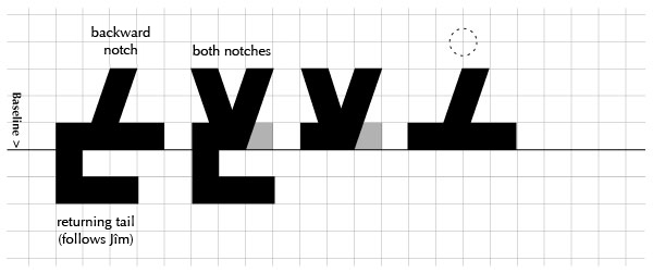
Jîm ج , Ḥâ' ح , Khâ' خ
This letterform is characterized by the forward diagonal notch, with a returning tail. Jîm ج has one dot below (or inside the tail, as by the time dots were in use, that had opened up), Ḥâ' ح has no dots, and Khâ' خ one dot above (or before the notch, depending on which is more suitable).
Second, the connection with the previous letter does not always take place on the baseline: we often see letters attaching to the notch itself. This creates a secondary baseline above the main one.
Finally, the shape of the notch finds many interpretations. It can never be a vertical, which would be a tooth, but it can become a short open box, or a quarter of a circle (convex or concave), or any combination thereof. The notch can also jut out under the baseline (as in the Eastern Kufic examples), which is a good way of breaking the monotony of an excessively flat baseline.

Ayn ع , Ghayn غ
This is quite an interesting and subtle letter, as we can infer from the diversity of forms it took across history. We know that the body of the connected Ayn is a pair of "antennae" which are none other than the two diagonal notches back to back, and I posit that its unconnected form is (in essence) the backward notch, the counterpoint of the Jîm's forward notch.Only its writing, with a reed, inevitably leads to a curved shorthand, and the curve became the norm. In the same way, the "antennae" ended up connecting because it was faster to write the whole thing in a single stroke, and that closed shape became the norm, without fully eliminating the older one.
Ayn has a returning tail that matches Jîm's, and shares its letterform with Ghayn غ , which has a dot above.


Mîm م
The Mîm is the loop par excellence. It is a pure circle, which often did not even have a tail, and early on only sported a very short one. It is the only letter that can be centered on the baseline (interrupting it), although it can also sit on it. It is never, however, lifted from it. We can say that in contrast to Ayn, Mîm always has two points of contact with the baseline. Like the Ayn, however, its backbone is centered, and all that may go with it.

Fâ' ف
Fâ' is a loop on a tooth, with a flat tail (which is styled after the Bâ's tail). Though it can be equally lifted off the baseline or sitting on it, you can feel the presence of the tooth, and what this means is that Fâ's "backbone" is both visible and off-centre, to the right of the letter.

Qâf ق
The body of Qâf is identical to Fâ' in every way, except that it has two dots instead of one. The distinguishing factor between the two is the tail, which often is mistakenly assumed to be the same. In fact the Qâf's later form has a bowl, which curves under the baseline in complete contrast to the Fâ's flat tail. Its earlier form was even more distinct, and somewhat similar to Yâ's doubly-returning tail.

Wâw و
Wâw is simply a Râ' with a loop. In the earlier form, this means it sits on the baseline, with the loop so close that the overall silhouette is a rounded triangle, when it's not pushed altogether into a circle. In the later form, the loop-on-tooth is more evident, which implies that like Fâ', Wâw has a visible backbone on the right—but unlike it, Wâw's loop is always on the baseline, not raised.

Hâ' ه
The last of the looped letters is unique in that, when it connects, it is essentially two loops around a tooth. Being so distinct, it matters not at all whether these two loops, which usually become two openings in a unified shape, are arranged vertically or horizontally or even diagonally, in a rounded, square or triangular shape, and whether the tooth is still visible, juts out or not.At least one example below even has one loop above and one below the baseline. When not connecting, it is like a Fâ' without a tail, but with the tooth often extending above the height of the loop. In fact this is often a prominent feature of this letter in this position.


Dâl د , Dhâl ذ
In Kufic, Dâl is the smallest of the boxed letters, but it is still much larger than we are used to seeing it in the round styles. It can extend horizontally to a great degree, but as it is nearly identical to the Kâf, it is wise to keep it shorter, perhaps no longer than an Alif's height, since the Kâf is no shorter than the same measure. Dâl has a hook that is usually diagonal but can be interpreted vertically or in a number of creative ways. Dhâl ذ is differentiated by a dot over the hook or body.

Kâf ك
Early on, the only difference between Kâf and Dâl was the fact that Kâf connects. It then underwent more development than Dâl, particularly in the hook, which took on much more importance (in the rounded scripts, the hook of the Dâl would disappear completely, while that of the Kâf would become its most salient feature).We also find that in non-connecting Kâfs, the lower line extends more, elegantly balancing the height of the hook, and is treated, design-wise, like a short, flat tail. Note that the relatively new form of the Kâf, where it looks like a Lâm ل with a hamza ء, is unknown in Kufic.


Sâd ص , Ḍâd ض
Sâd is a closed box with a bowl and a tooth, though the latter doesn't necessarily follow the height and design of the other toothed letters in a script. In fact this appendix lost importance with time (in rounded scripts it is always present, but diminutive) and is sometimes altogether omitted. It is never, at any rate, as prominent as that of Ṭâ', our next letter. Ḍâd ض is differentiated by its dot.

Ṭâ' ط , Ẓâ' ظ
Ṭâ' is a box with an Alif or long tooth attached, and the one letter other than Lâm to be as tall. It originally had no tail at all, and only ever acquired a short, token one, much like Mîm's. Its twin, Ẓâ' ظ, is recognized by the one dot, which is always before the long tooth, over the body.

Lâm-Alif لا
It is not possible to study the letters without looking at the "29th letter", which is the well-known ligature Lâm-Alif. When Alif follows Lâm, they obligatorily form a new glyph that is essentially an X joined at the baseline. The triangle which is formed is made to match the height of the looped letters, and the arms are as tall as the Alif.

Exercise
This is a lot of material to take in, and you shouldn't expect to memorize it all at once. Keep it as a reference to return to, and gradually it'll just seep in, particularly as we work with the letters in upcoming exercises.Your exercise in preparation for the next lesson is simply to look closely at old Kufic manuscripts and inscriptions (there are plenty available online, but focus on historical ones) and to use this guide to identify the letters. Sketch as many of your findings as possible, an essential practice to help you register the letterforms and prepare to create them.


