Human Anatomy Fundamentals: Drawing Characters Consistently

Final product image
What You'll Be Creating
As a comic artist, one of the comments I get the most is: "I don't know how you're able to draw the same character over and over again so that they're recognizable!" Even artists who are reasonably fluent in drawing humans can still find this challenging, which is why I put together this final lesson.
This is the next stage in learning to draw people: being able to draw a person repeatedly, and from different angles, without losing their likeness. It's not an essential skill for all illustrators, but anyone making a story book, or a comic book, or any such project where characters are recurrent, will feel the need for it.
An easy way around it, often used in animated series and older comics, is consistent clothing, i.e the same person always wears the same thing and has the same hair style. This feel old-fashioned and even childish by now, but it's still very common in some manga, and aspiring artists emulating that get into the bad habit of relying completely on hair and clothing to identify people.
What, then, does one do when a character needs to change their outfit? Or in the situation below, different time periods meaning different clothing and hair style, and even the eye colour has changed, yet this is the same person.
Consistent features trump changing secondary trappings
This lesson is not concerned at all with such secondary identification factors. Let us look at how to draw characters as if they were real people, and the first step, obvious as it may sound, is to know what they look like.
Do you know what characterizes your character's features? Or are you drawing generic eyes, noses, and face shapes? This first part doesn't require drawing skills, only being able to really see them in your mind's eye. It's perfectly okay, in the beginning, to base your characters on people you know, while the generic features in your mind get replaced by the diversity of reality.
Think of a close friend, someone you can visualize clearly. Can you describe the shape of their nose? Eyes? Mouth? Is their chin protruding or weak? Are their earlobes attached or detached? Odds are you cannot, because you have a general picture of them in mind, but the details break down when you try to look at them closely.
This is easy to change, as you just need to start paying attention to individual features by themselves. Next time you see that particular friend, look closely, and write down what you see. I did say write down, not draw. We cannot keep a grasp on what we can't name. By describing the identifying features that you see to yourself, you make their distinctiveness conscious, and then you know what you're drawing. You can do that in your own head at any time and anywhere, looking at people around you, and it doesn't stop at a person's face, as we'll see below.
Describing what one sees to oneself
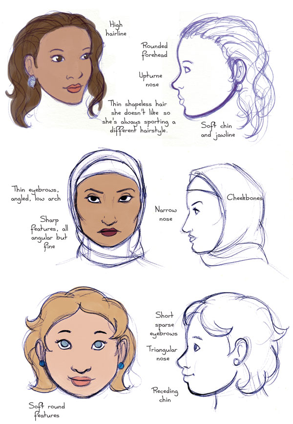
The face is naturally where we look for the most amount of details to recognize a person. We have covered this a great deal in Advanced Facial Features. You can use the diagrams from that tutorial, showing different shapes of eyes, noses, lips and faces, to put a name to what you see in real people—and of course you'll find there are even more shapes out there.
If you have an old magazine at hand, you can scribble the descriptions right on the photos, as below, training your eye to see them at a glance. It's particularly useful to compare the faces of people of the same gender and age that way, as even if they look alike at first, there are always clues that make them unique. (Bonus points if you try this with people of another ethnicity. The ugly old myth that "all X look alike" is nothing more than unwillingness to look.)
Identifying differences
Photo by Andrea Pavalleno
Later on, when you create your own characters, you'll notice that there's no such thing as a generic nose any more, and that you actually can no longer draw without being specific in your drawing...
Below are three secondary female characters in my comic. Their very different features betray equally different personalities. Guess who's easygoing, who's a princess and who's a tough cookie?
Three different characters
While your work may not call for close-ups of hands at all, if it does, then don't neglect this body part, which we have already looked at in detail. Remember male and female hands don't look alike, and further than this, we do tend to be able to recognize the hands of our friends and family. Long fingers, short fingers, fine hands, coarse hands, work-damaged, carefully manicured...
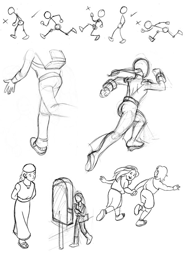
Hand references
Have you ever found yourself recognizing someone in the distance by how they stand, or how they walk? Posture is another big clue for identification. We're constantly told we should stand straight, so we may tend to always draw people who stand straight, but in reality there are many degrees of posture. We each have our signature posture, like the characters below, who each stand differently.
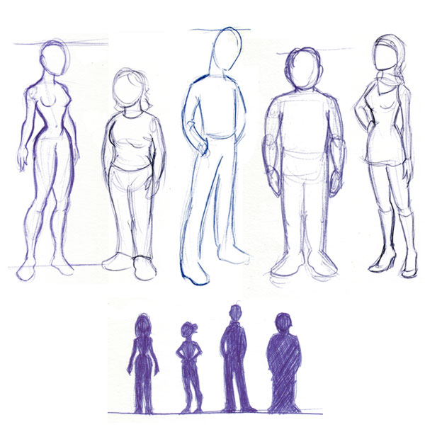
Different postures
Note that this is about a person's style, not about a costume. You're not designing one outfit that this person will wear all the time, unless they're in a uniformed profession (policeman, priest) or have a reason to make such a fashion statement. In my comic Malaak, one character, Adrian, always wears the same T-shirt and scarf, accentuating his odd personality... but then we discover there's a reason for it!
But while in real life few people wear the same thing day in, day out, most people do have a distinct dress style, and that is something that very much matters in a character. This dress style not only creates consistency, but also conveys much of the character's personality and/or situation.
Students may have a limited wardrobe, while fashion-conscious young women may never be seen wearing the same thing twice. Shy people wear unremarkable clothing, whereas exuberant people get away with the oddest or most visible things. Men usually have a far less diverse array of clothing and colours than women, and so on.
There's plenty of inspiration for designing a dress style, so just observe people around you. A good question to start from could be: Does this person dress for looks or practicality? Do they want to be noticed, or to blend in?
My main character Malaak was raised modestly, and dresses prettily but in a way that doesn't stand out. In contrast, her friend Zeina, who loves attention, always wears something unusual and eye-catching, with good taste decidedly optional. On the other hand Yeraz is an archaeology student by day and trains in Wushu by night—sporty outfits dominate her life at the moment!
Dress styles of three characters
My characters' personalities even show through what they dress up as for Halloween...
Happy Halloween
Create a reference/character sheet for a real, existing person. Your grandma, your best friend, a teacher—anyone whom you can enroll for this, and safely stare at and sketch for a while (or take various pictures of for reference).
Do it as if you needed to instruct someone else on how to draw that person accurately. Observe, and take note of all that is distinctive about that person: the many details of the face, hair, general silhouette and posture, and dress style, but also essential personality traits, so that your imaginary assistant knows what facial expressions would be in character.
Since this is your first exercise of the sort, don't worry about going overboard with the details. It is with practice and experience that you start cutting down on them effortlessly. Do have fun doing it! As an example, I made this reference sheet of a friend whom I was using as model for my character Adrian. There are many distinct details about him, foremost of which is his almost constant poker face.
Reference sheet of a friend
Now do the same, but designing your own character. There is no "correct" way of going about it; you could start with features and derive personality from them, or the other way round, or design the person to go with a certain dress style or role. What's important is that by the time you're done, you know your character's features as if he or she were a real person!
Note: Please do not emulate the "character sheets" found on art sites consisting of a single drawing of the character and a wall of backstory and irrelevant details. The purpose of these documents is to know what characters look like to the last detail, not what kind of tea they drink. A good ref sheet is a priceless aid you create for yourself; I pull out all of mine every time I'm working on my comic. Even though I know my characters like old friends, they help me stay true to them even as my style evolves.
Once you're fully aware of what is distinctive in your character, it's time to make sure you can draw these traits. This is where, to the question "How can I make my character look right all the time?" the answer is too often "You need to learn to draw."
It may sound harsh but really there's no way around it; if one hasn't attained a certain fluency of drawing, if one can't draw simple shapes from different angles, then one cannot realistically expect to succeed in this much more advanced stage. I really do understand the desire to start drawing more exciting stuff (i.e people) straight away, but patience, perseverance and practice are the only road to lifelong results.
Use a willing friend again, or if not possible, gather pictures of a celebrity, as they'll be easy to find from many different angles. Focus on just one feature at a time, sketching it from different directions. This needn't be onerous, as you'll notice that some angles are a bit repetitive, and that you can get a good grip on a feature if you have it from front, side, three quarters, above and below. For instance, I started by studying Samuel L. Jackson's nose:
Study of Samuel L Jacksons nose
Then, Audrey Hepburn's face contours:
Study of Audrey Hepburns face contours
In this way you build up an understanding of these features as 3D shapes. Feel free to reduce them to simpler geometric shapes if you have trouble at first. And don't forget to compare different features under similar angles. For instance, how do different eyebrows look when seen in extreme perspective? Are they still distinct or do they start to look the same? I tried, and found that they still retain individuality, even though the shape of the arch fades with perspective.
Study of eyebrows seen from above
By now you will be sufficiently drilled to carry on with your own practice, filling in your own gaps depending on your own purposes. One could write thousands of pages describing every detail of the wonder that is the human body, but I believe that past a certain amount of theory, all one really needs is to observe life and to practice—neither of which ever come to an end! I hope these lessons have been enjoyable and helpful to you, as we conclude our Human Anatomy Fundamentals series here.

Human Anatomy Fundamentals: Additional Tips


Final product image
What You'll Be Creating
In this penultimate Human Anatomy lesson, we'll look at some things that didn't fit into the main lessons but are very useful to know.
Below you can see how the muscle lines joining the arm to the torso look when the arm is in different positions. They are the same with females, where the pectoral line simply flows into the outline of the breast.
Details of the arm and shoulder
  1. The underarm line always tucks in under the pectoral line, but is in front of the back line if that is visible.
  2. The trapezius line goes behind both the neck and the deltoid line.
  3. When the arm is held out, the biceps line is entirely in front, overriding both deltoid and forearm. Note how it flows into the pectoral line, even if their connection is not visible (it can be, in muscular or sinewy bodies).
  4. When the arm is raised, the trapezius line is still behind and can altogether disappear if the deltoid is very bulky. Note how that muscle bulges in this position—even if not big, it remains a mass, and it is displaced in the movement, not compressed into oblivion.
  5. In this position, the pectoral line tends to disappear (it can still be hinted at with shading, just not a sharp line). Even breasts (depending on their size) tend to lose much of their outline in this position.
  6. The dotted lines hint at the position of the muscles underneath. The two inner lines indicated here are both in front. Don't confuse the outer line with the line of the back (1), which can never cross in front of the arm; here it is a muscle that is pulled out slightly when the arm is raised.
The elbow is a hinge-like joint, which results in a peculiarity: it is pointy when bent, and hollow when extended. The diagram below details what happens:
Details of the elbow
  1. The ends of two bones (or condyles) are prominent in the bent elbow, so the "point" is actually double, and looks different from different angles. In this profile view, there is a prominent point on the lower side, but there is also a bump (1) that would catch the light.
  2. When the arm is bent in this position, the prominent point seen previously appears more distinct, almost sticking out. The bump, on the other hand, is now lower, forming a blunter point. Comparing these two positions, remember that the pointier bump is always in line with the underside of the forearm.
  3. If you look down at your elbow from this position, this is what you see: not a point, but more of a wedge, that sticks out more inside the arm.
  4. With the arm extended, the bumps disappear (except to the touch), but the bone structure creates hollows instead. Depending on hand position, they can look distinct as shown here...
  5. ... or the arm outline can flow into the hollow as in this example. These are simple solutions that look right, but it's useful to study the changes in a mirror!
Below are the four main steps in walking. In a full walking cycle, which is mostly of interest to animators, you would see eight of them as they are repeated on the other side; for our purposes it's enough to have these in mind.
Deconstructing the walk
  • The most expressive is step 1, but if you're drawing several people walking, you don't want them to all have the same step; that's when the less expressive steps come in handy.
  • In the walk, the spine is upright. Bending forward means walking faster, but there is a limit—a walking person doesn't bend as much as a running person, because they would topple over!
  • Note also, in the walk there is always at least one foot on the ground, and a brief moment (in step 1, called "contact") where both feet touch the ground.
  • The hand reaches its furthest backward position in 1, its furthest forward position in 4. Shown above is an average amount of swinging, but this can vary and be exaggerated for a cartoonish effect.
  • The hands swing opposite to the movement of the legs: right hand is forward when right leg is backward, and so on.
For the run, I'm showing five steps as it's more dynamic, plus a sixth that is really step 1 but on the opposite side.
Deconstructing the run
  • 1 and 4 are the most expressive, while 2 (sometimes called recoil) appears almost static. 3 feels slow, and 5 is confusing on its own—is that person jumping or running? So even more than in the walk, one has to choose carefully which step to draw, and save some of them for when diversity is needed.
  • In the run, the inclination of the spine depends on speed. The diagram shows an average run, reasonably fast. A jogger would be more or even completely upright; a racer can be almost horizontal, especially in a cartoonish style that exaggerates everything. Notice also there is more swing from left to right than while walking: the chest opens to one side in 1 (R), then the back is turned to us in 1 (L).
  • In contrast with the walk, there's never more than one foot on the ground, and in step 5, both are off the ground.
  • A change in level is much more noticeable than in the walk. Step 2 is also called the "down", because that's when the head is lowest; step 4 is the "up" for the opposite reason.
  • Note that step 1, when the foot first touches the ground, is when the hands reach their outer limit—that's the furthest they get from the body. The exact distance depends on how fast and/or dramatic the run is!
  • The hands still swing opposite to movement of the legs.
A question that sometimes comes up is: "How do I simplify the features with distance?" There's no hard rule, as the style of drawing is a factor, but as a matter of reference, here is the hierarchy of loss (or addition) of detail that works for me with my style. These images are extracted from my comic book, and I show them in colour because sometimes, colour on its own can define features in a subtle way when lineart needs to be omitted.
Level of detail for various scales
  • Images 3 and 4 are the scales that come up the most for me, so they show the average level of detail: the features are well defined, including the lower lip, with extra lines possible for more definition when appropriate (eyelids, nostrils, expression lines when needed). Note how, for this character, the eyebrows and beard are not defined with lines, because he's fair and they're supposed to be a "five o'clock shadow".
  • 2: Go up one level, and the facial hair is still not outlined, but has acquired detail in the colour itself. The eyebrows, however, can no longer be unlined colour, since the eyes and nose have more definition; they would look painted on the forehead!
  • 1: This is the maximum detail I use in this particular style. The lineart defines everything there is to define, even the bruise, which would otherwise look like an ink stain rather than the slight swelling it really is. Normally shading would come in as well, and would be particularly detailed here, as opposed to vague shapes in the smaller scales.
  • 5: Going smaller than the normal scale, I lose all detail in the nose except the end of it, where the nostrils are no longer distinct. The lower lip may or may not be indicated. The eyes could be mere dots at this scale, depending on how intense I need the expression to be (dots are much less expressive). The facial hair is now really hard to distinguish from the skin tone, which is fine because it would be in real life too from this distance!
  • 6: This is the smallest I would go before leaving the face altogether blank. The features are now basically just dots for the eyes, with eyebrows (even though their colour makes them almost invisible here) and a line for the end of the nose. The mouth is not shown unless it's wide open to scream, and even then lips would not be drawn. Were this a female character, I would omit the nose as well, to preserve the delicacy of the face, and maybe indicate the lips with a red shape instead.
An additional tip, if you happen to draw digitally, is to keep the same pencil size throughout your virtual sketching. When drawing on paper you don't even have to think about it, you just know when you can't draw the same level of detail, and it becomes largely instinctive to just input what you can. The limitations of the tool and of your sight automatically help you draw the right amount of detail. You then ink your pencils (on paper or digitally) with pens of varying thickness, yes, but the level of detail you're working with is correct. People who draw and ink digitally sometimes fall into this annoying pitfall: as they zoom in and change the size of the brush at will, they completely lose sight of the overall scale, and end up drawing far too much detail, or drawing too coarsely. Awareness of this is a mark of know-how!
I won't go into great detail about folds, since it's not strictly speaking anatomy, but I expect that you want to draw people with clothes on, so let's look at some basics!
Folds around bulges tuck and crush folds
Bulges: In places like the shoulder muscle or a bent knee, the fabric forms lines that wrap around the roughly round mass. The lines mostly occur around the armpit, and their direction is such that they follow the contour lines from the armpit to the "point" of the shoulder (even if it's not visible, you can find it with your fingers: it's a condyle again).
Tuck folds are what happens inside bent joints like elbows and knees, but also when bending at the waist. The fabric forms a kind of pocket surrounded by lines that behave like bulge lines, shaping themselves from the point of the bent joint towards the crook of it. The examples above show how this can be drawn very simply, but you must bear in mind and show the deeply "sculpted" quality of the fabric when it is scrunched like this. It's very much like a mouth, a hollow between two bulging lips.
Crush folds are an accordion effect, for instance when pulling back one's sleeves. They result in a lot of parallel folds, and may be the easiest to draw! The trick is not to make them too regular—randomness looks better and more natural. In fact you should always make sure that folds of the same kind have a natural difference between them. Then they will look right, which is to say they won't attract attention to themselves!
Folds on the torso
Back: When fabric hangs loosely or semi-loosely, it catches on whatever is prominent and hangs from there. On the back, this could be the shoulder line, but it can also be the peaks of the shoulder blades, depending on how the person is standing and which sticks out most at the time.
The male torso is relatively flat, and adding folds to that is not always necessary—in fact you may find that sometimes they may make the character look as if he's so thin that his T-shirt is hanging off him. When a belt is present, however, that creates some movement in the fabric, particularly because belts usually come with shirts, which are crisp and have crisp folds.
The first consequence of a belt, shown here, is the fabric bulging out a bit just above the belt. This is inevitable, as movement pulls the shirt out from under the belt, and then it can't reinsert itself tightly, so it sits there like a pseudo muffin top. This gets much worse if the person has completed some strenuous movement that pulled out more shirt material from under the belt.
Second, even if the shirt is stretched and flat when the person is standing up, sitting down has a slight crunching effect, so one or more horizontal folds form in the abdominal area, between chest and belly (see the example in the red shirt).
Finally, as shown in the last example, if the shirt or garment is loose enough, the fold lines can be vertical as the fabric hangs off the shoulders and "rests" on the belt or sash, if present (it'll hang off all the way to the ground if not).
Folds on the female torso
The female torso obviously has breasts, and fabric catches on the nipples to create a very different look. Close-fitting tops in modern fabrics, which tend to be more or less stretchy, produce a horizontal fold between the breasts as the fabric is more stretched there. To what extent the breasts themselves are molded varies from not at all to quite a bit, but the garment should never look painted on.
When the fabric hangs more freely, as natural fabrics do, the fold lines hang from the nipples down. There is no molding of the breasts: their presence is evident from the amount of folds (more than on a male torso, see example) and the fact that the abdominal area is all in the shade.
Seen from the side, there's always some folding movement from the nipple around the bottom of the breast as that too is pulled.
Folds in the lower body
In the crotch area, the pulling point is between the legs, and folds start there to wrap around the pelvis and where it joins with the thighs. You can't not indicate folds there, but it gets awkward if they're overdone and catch the eye too much, for obvious reasons. A couple of lines suffice, but remember two points: the lines don't start smack between the legs (that would look like a wedgie) but actually at the fold between groin and thigh—basically at the bikini line. Also, they normally curve up towards the waist, but if a leg is lifted, even slightly, they curve down around it. See the two examples above and how the folds have different directions, and how that is linked to the leg position, as opposed to the basic diagram that shows a person standing upright.
The knees, we have seen, work like the elbow, with a tuck fold. With pressed trousers, that would be all, you'd only get a sweeping uninterrupted line from waist to foot. But most people in daily life wear things like jeans or work trousers, and after a while, these show permanent folds at the knees: a pocket effect in front, as the fabric there gets permanently stretched from all the sitting, and lines in the back, an imprint of the tuck folds. The back lines, at least, should be hinted at. If the jeans are tight, then the shape of the knee is visible as a bump in front in any case.
Drape folds
Drape folds are easy to figure out because they are gravity-dependent, and gravity always pulls things down. If a fold hangs on one point, for instance a hip bone, it will go straight down. If it hangs on two points, for instance the two shoulders in the case of the shawl, its center is pulled down in an arabesque shape. The only work remaining is then to make the lines look a bit random and natural. Note that in the skirt diagram, most folds on either side are straight down because they hang on one hip bone; but at the front, you get fabric that hangs between these two hip bones and that obeys the arabesque shape rule, however subtly. When belted, as in the example on the right, anywhere the belt presses the fabric is a hanging point, so you get vertical drape folds all around.
One last thing to remember about folds is that the amount of folds depends on the amount of spare fabric. In other words, the tighter the clothing, the fewer folds you'll see, and those will be at the joints and smaller than usual. The "second skin" outfit of my superheroine below is such a case, but note that the few indications of folds, however discreet, save the costume from looking merely painted on.
Minimal folds
Walk/run: Sketch people (or even just the basic skeleton) walking and running, with a varying forward bend, and more or less ample arm movements. What speed do they evoke to you? How much can you exaggerate before it just looks wrong?
Practice walking and running
Folds: Dedicate a sketchbook to sketching folds, and organize them by type of material. Cotton, silk, leather, wool, all have a signature way of folding (or not folding, in some cases!) Building up such a collection is a priceless work of observation, as well as being right there as a reference when needed.
Practice folds
As much as we've tried to cover in these lessons, the human body in its incredible variety of shapes and movements can yield endless more observations. Think of something—a detail, posture or movement—that was not covered, and make it a focus of observation for a week, sketching and taking notes. You have all you need to take it on from here!


Copyright @ 2013 Krobknea.

Designed by Next Learn | My partner