Most
of your Word documents are likely set in standard, drab Times New Roman
or Calibre typography, perhaps with the occasional cheesy Word Art
thrown in for variety. Yet Word actually includes a number of text
effect tools that give you everything you need to make beautiful art
from your words.
In this tutorial, I’ll show you everything about you need to create
the text effects you want in every modern version of Microsoft Word,
using its advanced type and formatting features. Once you’re done,
you’ll know the tricks that I used to make Word templates that were
featured in Microsoft’s Art of Office site.
Let’s get started.
Setting Up a New Page
Start by creating a new document by either clicking File > New, or pressing the Ctrl+N shortcut. To set the properties like the page orientation and the page size, jump into the Page Layout ribbon. Setting your page layout.
If you plan to print your document and you already know the final
paper size, it is important to set it as a first step. Why? Microsoft
Word lets you to easily scale any object, but
some properties, like the outline width, remains unchanged. Font size
also
stays the same during the resizing, and has to be updated manually.
Working in
the final paper size right from the beginning helps save time in the
future.
There are two things you need to know about the Page Layout ribbon before we set the final page size values. First, the Size
dropdown menu contains only the paper sizes which are possible to print
with the currently selected printer. In other words, you cannot set an
A3 paper size when your printer can only print up to A4 documents. To
fix that, you can jump to the File > Print menu, and change the printer to a different one for a second, for example the Microsoft XPS Document Writer which is a "virtual printer" that only saves files locally to your computer. Choosing an alternative printer.
Don't print anything, but once you've chosen a different printer, go
back (using the left arrow in the top left corner), open the ribbon Page Layout > Size again, and the list of the available sizes should be much larger now. A full list of page sizes.
Then, the other thing worth noting is that the drop-down menus for Margins, Orientation and Size may not be enabled all the time. If you have a Text Box placed and selected inside the document, some Page Layout options will be disabled. I'm specifically pointing this out, because we will use Text Box objects all the time, and jumping to the Page Layout ribbon and seeing those options disabled can be quite frustrating. Faded page layout buttons when selecting a text box.
Now, you know how to always be able to set a page Size to A4
and Orientation to Landscape. Your page is now setup the way you'll want for your custom word art, and you'll know how to tweak it again next time. Choose page orientation
Changing the Font and the Font Size
Now, it's time to add your text and start tweaking it. Type anything
you want, select the text, and pick the font and size you want. Most of
the text effects look best in large sizes, so do not be afraid to
use either the Increase Font Size button, the Alt-Ctrl-: shortcut,
or the font size dropdown menu to make the text really big. If the maximum
value of 72 pt is not enough, you can type in any number you want, for example
250 pt (only type the number). You can also use non-integer values, such as 198.5 if you want to get the largest possible text without wrapping. Tweaking your extra-large fonts
What Is Kerning?
When a type designer creates a font, every letter has its own width
set to make sure the gaps between the letters are even. This works fine
in most cases, except for the combination
of letters with less "rectangular" shapes, like "V" and "A". Thus, type
designers add “kerning” features, which defines that those two
letters when placed next to each other will have the gap smaller (or
bigger). In a perfect world, an application uses this kerning and
everything looks fine. Well,
in a perfect world. Kerning adjusts the space between letters depending on their shape.
If you only need to know one thing about kerning, remember this—it
should be always enabled, but it is off by default in Microsoft Word. To
turn it on, open the Font dialog (Ctrl+D) Advanced tab, and check Kerning for fonts X points and above. When you check this checkbox, a current font size is filled into the edit box, but you probably want to change it to 1 pt instead—just to make sure it will be really enabled all the time for
any text. For more information about the kerning, see Quick Tip: Typography Skills, Basic Kerning. Set your font kerning.
It is important to know that the kerning has to be enabled this way
also for every Text Box in the document. If you accidentally or on
purpose delete everything in your document
(Ctrl+A, Delete), the kerning is again turned off.
Standard Text Effects in Microsoft Word
Before we start adding our own text effect, let's briefly take a look what Word offers us in the Text Effect and Typography dropdown menu on the Home ribbon.
There are 15 pre-defined text effects with different outlines, fills,
shadow effects, and some of the presets also include 3D effect. The
colors of those presets always reflect the selected color theme. Traditional Word Art in Word.
You can jump to the Design ribbon and select a different color scheme from the Colors dropdown menu. Jump back to the Home ribbon, open the Text Effects and Typography dropdown menu, and it should look a little bit different. A slightly different set of Word Art
This is nice, but unfortunately there's no way to adjust those
presets. The items in this list cannot be edited or deleted, and you
cannot add new presets. Those 15 presets can be helpful
if you need a nice looking header and you only have two minutes of your
time, but you will learn nothing new about the text
effects just by using them.
Text as a Body Text vs. Text Box
The text can be placed in a document in a two different ways. The
usual way is to create a new document and start typing - we can call
this text a "body text". While the text effects can be added to
this body text quite easily, they are limited and thus using a body text
is not preferred option.
The second way is to use a Text Box object and write into this text box. To insert a new Text Box, select Insert > Shapes > Text Box, and draw a new text box the same way you draw for example a rectangle. Adding a Text Box
The text placed inside a text
box has several advantages. It can be moved around the document freely without
any restrictions (even off the document or over the margins) and it can be
rotated. Moreover, some additional text effects like the 3D rotate options are
available.
If you do not like the default appearance of the text box—especially
the white fill and the black outline—both can be easily set to none on
the Format ribbon. Use the Shape Fill and the Shape Outline dropdown menus. Tweaking your text box
To select a text box with no fill and no outline, click over the text which will show the text box
borders as a dotted line. Clicking over this dotted line to select a text box should be easy now.
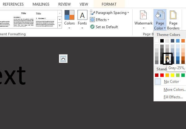
Changing a Page Background
The standard white paper color may seem a little bit boring for our
text effect, and it may be a good idea to set it to a different color.
Go to the Design ribbon, and from the Page Color dropdown
menu, select some dark gray color. As for any other color
dropdown, the first two columns with grays are still the same, but the
eight columns on the right side change depending on the chosen color
palette. After changing the background, the black text inside the text
box is almost invisible now, but that is fine, we will fix it in a
minute. Change your page background
The Almighty Format Pane
The Format ribbon allows us to format the text box as well as
the text itself. There are dropdown menus for the text fill, outline,
and all the other possible effects, and there are submenus and submenus
and submenus. It is definitively not an easy way to tweak the effects,
and we only have access to the limited number of presets and options.
There is
a better place to adjust the setting—the Format Pane.
The Format Pane is an essential pane for setting all the
advanced options, yet there is no standard way how to display this pane.
In short, every "More…" item on the Format ribbon (More Lines, More Gradients, More Textures) opens the Format Pane,
but since we have the Text Box inside our document, we can as well right click
the text box border and select Format Shape. The formatting panel in Word
Before we move on, remember there is only one Format pane,
but the content of this pane changes depending on the selected content. It is
different for the text box, for a body text, and for an image. I say it to
prevent any confusion, because the name of this Format pane also changes, it
can be Format Shape, Format Text Effects or Format Picture. Because this will
be our base station for setting all the effect, it is a good habit to keep this
pane open all the time.
Setting the Fill and the Outline
With the background color set and a Format Pane still opened,
select the text box, type in any word, for example “Effect”, keep the font to
Calibri and set the size to 72 pt. In the Format Pane, select Text Options,
open the Text Fill settings and change the Text fill from the Solid Fill to the
Gradient Fill. From the Preset Gradients dropdown menu, select a yellow top
spotlight. This will create a subtle shading, as if there was a light source
shining from the top. Tweaking your text fill in Word
To make the text a little bit more interesting, we will also add an outline. Change the Text
Outline from the No Line to Solid Line, raise the Width to some bigger number,
for example 3 pt, and change the Color to white. Adding your text outline
The outline is nice, but too
strong. We can open the Compound Type dropdown menu and select Double, which
will split the outline into two, one visible over the text, and one outside the
text. To get rid of the ugly joins, change the Join type to Round instead of the default Bevel. Tweaking your text outline
All we need to do now
is to increase the Transparency to make this outline less visible. A value
around 60% seems to be just fine. Setting Transparency
Adding Some More Effects
With the text box
still selected and the Format pane still opened, switch to the Text Effects
tab. As a first effect, we will add a simple drop shadow below the text. Open
the Shadow effect properties, and from the presets dropdown menu, select Outer:
Offset Bottom. Because the page background color is quite dark, the effect is
quite subtle, which is fine, and probably does not need any additional tweaking. Adding a shadow
If you want, you can
also try to add a Reflection effect. Select any preset, but increase a Blur
value to make the reflection less visible and not too distracting. Adding Reflection
In just few steps, we have a nice looking text effect and we can call it done. Your finished, customized Word Art
Advertisement
Sharing the Document - .docx vs .pdf
When sharing your
document with your friends, you can choose between two main formats. The Word
native .docx, or Adobe Acrobat .pdf file. The document saved in .docx format
keeps the effects fully dynamic, but depending on the used effects, the other
side often needs to have the latest version of Microsoft Word installed.
Otherwise, the document can look different (and most likely ugly).
The biggest advantage
of the document saved in a .pdf format is that it will look exactly the
same on
every device, in any application. However, you lost the ability to edit
the
text effects, and probably also the ability to edit the text. Microsoft
Word
can export as well as import the .pdf files, but the edibility of the
text with the applied effects is in most cases lost. For more
information, please read How to Edit PDF Documents in Microsoft Word.
To save the document
in the .docx format, simply hit the save button—it should be the default
format. To save the document as a .pdf file, select File > Export >
Create PDF/XPS, then choosePDF in the filetype drop-down when saving the file. Export your text in PDF format
Conclusion
We have only scratched
the surface of the text effects in Microsoft Word, but you should have a solid
knowledge of the Word basics needed for the future effects. Here is a list of
the main takeaways:
When possible, set
the paper size as a first step. Resizing the objects afterwards can bring
unexpected complications.
Most text effects look best in very large sizes.
Always be sure to enable kerning when working with text in Word.
There is a
difference between the "body text" and the text placed inside the
Text Box. For text effects, text placed inside the Text Box is preferred.
The Format Pane is the
best place to change any formatting—make sure to have this pane
visible all the time.
Share your creations
in Word .docx format to keep the edibility, or Adobe Acrobat .pdf format to
make sure everything will look the same at all times.
Enjoy
creating your own text effects using these steps, and leave a comment
below if you have any trouble making your own text effects in Word!
Unknown
Lorem ipsum dolor sit amet, consectetur adipisicing elit, sed do eiusmod tempor incididunt ut labore et dolore magna aliqua. Ut enim ad minim veniam, quis nostrud exercitation.
Medical Disclaimer
The information on this site is not intended or implied to be a substitute for professional medical advice, diagnosis or treatment. All content, including text, graphics, images and information, contained on or available through this web site is for general information purposes only. Krobknea makes no representation and assumes no responsibility for the accuracy of information contained on or available through this web site, and such information is subject to change without notice. You are encouraged to confirm any information obtained from or through this web site with other sources, and review all information regarding any medical condition or treatment with your physician. NEVER DISREGARD PROFESSIONAL MEDICAL ADVICE OR DELAY SEEKING MEDICAL TREATMENT BECAUSE OF SOMETHING YOU HAVE READ ON OR ACCESSED THROUGH THIS WEB SITE.