
Learn how to create a graphic style that you can apply to live type or any vector object. The result is reminiscent of the patches on school sports jackets, and can be achieved with a few simple strokes and effects in Adobe Illustrator.
1. Set Up the Document
Step 1
Create a new document using the Basic RGB preset. Now create a set of four swatches: a light and dark red, and a light and dark blue. You can of course use any color combination you like, but to make it simpler, I’ll be referring to red and blue throughout the tutorial. Here is the RGB breakdown of the swatches I’ll be using:

Draw out a rectangle the same size as the artboard, and fill it with the dark blue. Lock this rectangle by going to Object > Lock > Selection.
Make sure you have your Appearance panel open, as this will be the command center for this tutorial.
Step 2
I’m using the font “Ballpark Wiener,” which can be found here. Another good retro font is Mascot. Type any word, and scale it to 200 points. As with many script fonts, you may have to kern between certain letter pairs, so the letters connect.

Step 3
Keep the text selected and remove the fill from it. This is the same thing as giving it a fill of [None].

2. Add Strokes and Effects
Step 1
With the text still selected, go to the Appearance panel and click the Add New Fill icon at the bottom. From the swatches drop-down menu, choose the Medium Blue from your palette.

Step 2
Click Add New Fill again, this time using a a linear black-to-white gradient.

Step 3
Open the Gradient panel and adjust the angle so that it goes from black at the bottom to white at the top.

Step 4
Select the gradient fill in the Appearance panel. Go to the Effect menu and choosePixelate > Pointilize. Enter a Cell Size of 4.
Double-check your Document Raster Effects settings under the Effect menu. They should be set to Medium or High.

Step 5
Click the Opacity of the gradient fill in the Appearance panel and change theBlending Mode to Overlay. Set the Opacity to 30%.
Step 6
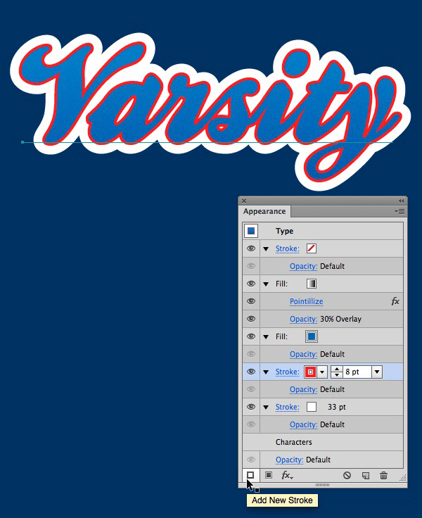
Keep the type selected and click the Add New Stroke icon on the Appearance panel. Set its color to white, and the point size between 20 and 30.

Depending on the letters and font you’re using, you may have to increase the point size further. You want the white to fill in all the spaces between the letters as well as thecounters of individual letters.


Step 7
Add a new stroke, and set its color to Red. Change the stroke weight to about 8 pts.
Step 8
Keep the new red stroke selected in the Appearance panel and go to Effect > Path > Offset Path.

Set the Offset size so that the red stroke sits just at the edge of the white stroke.

Step 9
We don't want the red strokes overlapping, so to fix this, go back to the Effect menu toPathfinder >Add. This will apply the Add function as a live effect, which is different than using the Pathfinder panel, which would alter the paths and make them uneditable.

You should now see both the Offset Path effect and the Add effect in yourAppearance panel.

Step 10
Keep the red stroke selected in the Appearance panel and click the Duplicate Selected Item icon at the bottom of the panel.

Step 11
Select the new stroke (the one on top) and change its point size to 1 and its color to white.

Step 12
Click to open the Stroke panel inside the Appearance panel. Change the Cap style to rounded, and tick the Dashed Line checkbox. Enter a dash of 2 points and a gap of 2points. This will make the white stroke look like stitching. You don't have to fill in the rest of the fields, because the dash and gap will repeat.

Step 13
Duplicate the red stroke by selecting it and clicking the Duplicate Selected Item icon at the bottom of the Appearance panel. Change its color to Dark Red, and change itsstroke weight to 3 pts.

Step 14
Click the disclosure triangle of the dark red stroke in the Appearance panel if you don't see the effects applied to it. Click Offset Path to change the settings. Change the offset to 23 pts.

Step 15
Click to bring up the Stroke panel of the dark red stroke. Add a dashed line with a dash and gap of 0.5 pt. This will be the stitching that affixes the patch to the jacket.

Step 16
To add some dimension to the blue fill, select it and go to Effect > Stylize > Inner Glow. Set the Blending Mode to Screen, the Opacity to 90% and the Blur to 2 pts. Tick the Edge radio button.

Congratulations, You're Done!
Now you can open the Graphic Styles panel and click the new style icon to create a Graphic Style. You can now use this style on any live type or vector object.


