We'll be creating a relatively generic sedan. It won't be too flashy, which is ideal for recycling many times over on the same illustration (useful if you're making a city scene!). But even though it'll be generic, it wouldn't hurt to see some reference images; maybe there are simple design elements from actual car models that you can incorporate into your car graphic.
Make sure you have already gone through the isometric pixel art character tutorial; it covers necessary basics for the illustration style, and we'll use the character created in that lesson as a sort of yardstick for the car.
1. Volumes
We'll start with the main shapes of the car, mostly rectangles at first and then some more interesting shapes.Step 1
We'll be making a pretty average size car. So it should be wider than two of our characters, of course, as at least two should be able to sit side by side in it, and the length should be around twice the width. So let's make a rectangle to represent the footprint.
Step 2
The corners will not be straight and pointy, so let's round them up a bit.
Step 3
Select and copy the rounded rectangle and then fill it with black.
Tip: you can change the opacity percentage by pressing numbers on your keyboard while the move tool is active. Pressing 2 equals 20% opacity.
Step 4
Once you have lowered the filled rectangle's opacity, paste the original rectangle right over it, leave it in a new layer, and move it up 4 px. We got the car's shadow done already; remember to update it if at any point you change the dimensions of the car.
Step 5
Now duplicate the car body's bottom line and place the copy 10 px higher (remember you can do this by selecting it, then pressing Alt-Shift-Up Arrow) or adjust this height as you see fit; keep your character around on another layer so you can check size against it whenever you want.
Step 6
Let's join those two rectangles and remove the background lines till we get this sort of flying brick!
Step 7
We'll give the car a rear bumper that projects out a little bit by selecting the top two corners and moving them down a pixel (and across two)
Step 8
Now add a rectangle to where you'd want the windows and windshields to start projecting up.
Step 9
Draw a diagonal line (1:1) from the leftmost corner of this new rectangle, and duplicate it so that two parallel diagonals project out of the brick shape. These lines will meet at the top with a new 2:1 line, which will be the car's roof.
Step 10
Now on the frontmost corner of the new rectangle we'll need another pair of lines to define the windshield. They won't be diagonals like the first lines, however, because windshields almost always get narrower as they go up, so they'll be 1:2 lines.
Step 11
Let's join these windshield lines to get the complete outlines for the front windshield. Delete the leftover pixels inside these outlines.
Step 12
Now we need another 2:1 line for the top outlines of the windows.


Step 13
Finish the top of the car by adding a rear outline (with a rounded corner) and one vertical line on the window to separate the front and back.
2. Tires
Now we arrive at a pretty new element: a circle.It's relatively easy to turn a front view flat element into the isometric view by setting a vertical skew to 26.5˚.
Doing that would result in this:

But we'll do our tires in a different way to have more control over the aesthetics and less jaggedness, and end up with very round looking tires.
Step 1
Let's use the character to set a few heights. The bottom line here is the floor level, the middle line is the car body's bottom line, and the top line will be the top of the tire. Next to people, tires usually go up to about mid-thigh level, so these will be a little big but they'll work alright.
Step 2
Now let's add two vertical lines to have a square. Delete the rest of the pixels (it's fine to keep the bits of the middle line to make placement easier later on).
Step 3
Here in red is the circle I'll be using; it maintains mostly straight lines so it will look quite clean but still round enough.
Step 4
Time to add the tires to our car. Here's my placement suggestion.
It's useful to move these elements around with the arrow keys while on a different layer, to find where you think they'll look best. Once they're on the sweet spot, you can merge down.
3. Details & Color
We've got most of the main lines finished already, so it's time to start filling in all the blank areas with details and color!Step 1
Let's finish up the tires. The tire rubber should be thicker, so add an extra row of pixels all around the inside of the circle like this:
Step 2
Fill the inner blank circle with grey or whichever color you might like for rims.
Step 3
Usually antialiasing is to be avoided in isometric pixel art, but I think at such a tiny scale exceptions can be made. In this case, the antialiasing helps significantly to make the pixels in the middle of the rim look like a concentric circle. That's about as much detail as we can add to such a small element.
Step 4
To finish the tire I added an extra pixel of antialiasing to make the rim look less jagged, and I also added a couple of pixels as highlight for the tire rubber:

Step 5
To do the windows, you could try adding highlights and reflections or try showing more details of the interior. There may be many ways to approach them. The style I use I think manages to achieve the window effect without much work.Fill the window areas with a dark aquamarine or blue color.

Step 6
Now add some lighter detail with a brighter shade of the aquamarine/blue, as if the light only manages to hit whatever is up close to the glass (the dashboard, the wheel and the door edges) leaving the rest in obscurity. No need to worry about so much detail here.
Step 7
Let's add the car color!Here's a pretty bold choice:

Step 8
We'll only use the front part of the line that goes through the middle of the car. Select it and copy it many times below it; we'll make the headlights, grill and other details with these pixels.

Step 9
Fill the pixels between these new lines with white or some light color that will stand for the headlights.
Step 10
Now we add the grill, cutting through the middle of the big white area we just made. The grill will be a dark grey, just a bit lighter than the outline color.
Step 11
Now the bottom line will make the fog lights and the license plate. Go ahead and remove the unnecessary black and white pixels.
Step 12
To finish those details we'll lower contrast on the lines around the white pixels, making them a dark shade of the car color, but quite a bit brighter than the usual outline color.
Step 13
Now that most of the "face" of the car is finished, it's a good chance to smooth out some of the corners, as we get closer to the final look.
Step 14
Add highlights where you think necessary (reference images might help).I think highlights right next to the edges help to convey a metallic look, so I applied them to most of the edges.

Step 15
And here I'm adding a new lighter shade on some select areas that I want to pop out a bit more.
A big highlight area over the hood I think helps bring out the volume of the car and make it look metallic.


Step 16
Now let's add a couple of little car door handles. They'll simply be two lighter pixels right over two darker pixels.

Step 17
Optional minor detail: lower the contrast for the rear roof line:
Step 18
Let's add some rear view mirrors!They'll be like this:

Find them a nice spot and place them.


Step 19
And that's pretty much it for your car!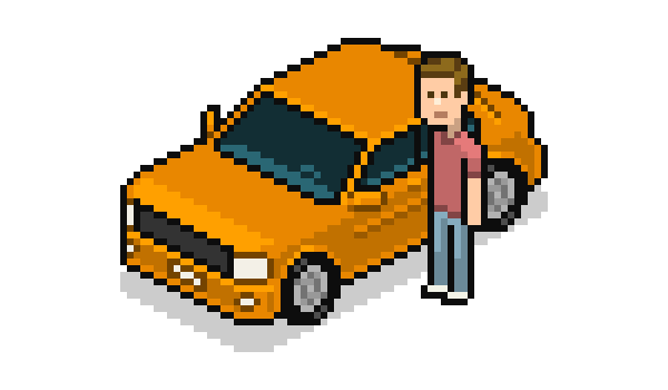
4. Variations
It's very easy to make different color versions of your car! You can go to Image > Adjustments > Hue/Saturation… to easily find other colors you might like. Apply the changes only to the proper car areas, and edit the colors individually if necessary.
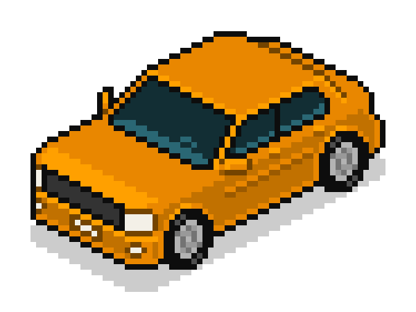
Your Vehicle Is Done!
I hope you're happy with your car(s)!It wouldn't be too difficult to turn that sedan into an SUV or a compact car. Add some racing stripes or other accessories, and your inventory could keep growing!


