In this tutorial you’ll learn how to create your own cover for a fictional fashion magazine, with a glamorous winter feel. We’ll explore how to use layer images and text to create a dynamic, three-dimensional design, select and apply typography effectively and appropriately, and account for practical issues like pricing and binding.
You’ll need Adobe InDesign for this tutorial, and we’ll also be hopping over to Photoshop to do some image editing.
1. Create a New Print Document in Adobe InDesign
In this tutorial, we’ll be creating a magazine at a standard US size, 8 3/8 inches by 10 7/8 inches, although we’ll be working in millimeters throughout.It’s important to note that we will be creating a front cover design only in this tutorial. If you are intending to prepare a final magazine cover for printing and binding, you will need to double the length of the document to accommodate a back cover, plus add an extra amount specified by your printer to allow for the width of the spine.
Step 1
Open InDesign. In the welcome window, select New Document, or go to File > New > Document. Set the Intent to Print and No. of Pages to 1, and uncheck Facing Pages.From the Page Size drop-down menu select Custom... and type
US Magazine into the text box at the top of the window that appears. Set the Width to 213 mm and the Height to 276.5 mm (this equates to 8 3/8 in by 10 7/8 in). Click Add and then OK.
Step 2
Back in the New Document window set the Top, Bottom and Left Margins to 8 mm, and the Right Margin to 4 mm. Set the Bleed on all sides to 3 mm.

2. Create a Layered Cover Image
To create the effect shown below, where the magazine title crosses behind the image of the woman, but remains in front of the background of the photo, we’ll need to split the image using Photoshop.
Step 1
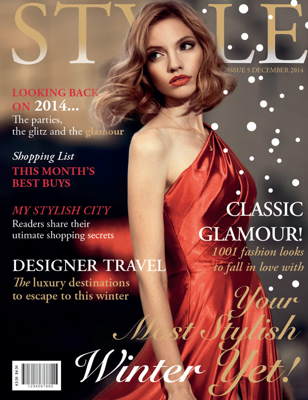
Save two copies of your chosen cover image on your computer. One version of the image we’ll keep as it is (save with ‘original’ in the filename), but the other image we’ll be editing to separate the image of the woman from the background of the photo.Open Photoshop. File > Open the copy of the image you’re going to edit. Here, I’ve used this glamorous shot of a woman in a red dress.
Duplicate the Background layer to keep an intact copy of the image while you work. Switch off the visibility of the original Background layer.
What we want to do is to roughly cut out the image of the woman, and move it onto a separate layer. Select the Polygonal Lasso Tool (L) from the Tools panel (Window > Tools) and magnify the image to 300%.
Set the Feather to 30% from the top control panel and use the Lasso Tool to roughly create a path around sections of the edge of the woman, as shown, spilling into the background. Draw a little more carefully around the hair.


Step 2
Return to InDesign. Open the Layers panel (Window > Layers) and double-click on the default Layer 1 name, to open the Layer Options window. Rename the layer asBackground Image and click OK.
Go to File > Place and select the original, non-edited cover image. Click Open. Select Fill Frame Proportionally from the top control panel to arrange the image nicely in the frame.

Step 3
Create a second layer by selecting the Create New Layer icon at the bottom right of the Layers panel. Double-click the default layer name as before, and rename the layer asForeground Image. Click OK.Select the Rectangle Frame Tool (F), as before, and drag to create an image frame that extends across the whole page, right up to the edge of the bleed on all sides.
Go to File > Place and select your edited image, the version without a background. Click Open, and then Fill Frame Proportionally as before, making sure the size of this image exactly matches the proportions of the background image.
Here, I’ve switched off the visibility of the Background Image layer to show you how the Foreground Image layer should look.


3. Create a High-Impact Magazine Title
Step 1
Return to the Layers panel and Create a New Layer, renaming it asTypography Behind. Grab the layer in the panel and move it to sit below the Foreground Image layer and on top of the Background Image layer.
Select the Type Tool (T) and drag to create a text frame about 205 mm in Width and 48 mm in Height. Sit this at the top of the page, as shown, positioning the frame closer to the right-hand margin than the left-hand, to allow a bit of space for where the magazine will crease once folded.
Type the name of the magazine into the text frame and set the Font to Adobe Garamond Pro Regular, Size 174 pt, All Caps, and Tracking to 20. It’s fine for some of the text to disappear behind the woman’s head, but you can insert a few extra spaces or increase the kerning between characters that sit directly behind the image, so that some parts of the letter can appear, visually constructing the whole title for the reader.
Set the Font Color of the title to [Paper].

Step 2
Select the text frame and Edit > Copy and Edit > Paste in Place.Open the Swatches panel (Window > Color > Swatches) and select the New Swatch icon. Create a new CMYK Swatch, a lovely gold color, C=20 M=31 Y=65 K=0.


Step 3
Remaining on the Typography Behind layer, select the Type Tool (T) and drag to create a small text frame. Position this just below the magazine title, to the far right of the page.Type in the issue number and date, setting the Font to Adobe Garamond Pro Regular, Size 13 pt, All Caps and the orientation of the text to Align Right. Set the Font Color to C=20 M=31 Y=65 K=0.

4. Build Up Typography on Your Cover
If you look at examples of fashion magazine covers, you’ll notice that they are often crammed with sub-headings and article teasers. However, the cover will rarely look over-crowded. This is because the central image draws the eye, creating a central focus to the design. The text is also likely to be set in the same font and/or a complementary color palette.Step 1
Remaining on the Typography Behind layer, select the Type Tool (T) and drag to create a text frame about 87 mm in Width and 34 mm in Height. Type a sub-heading and a short description, as in the example below, and set the Font to Adobe Garamond Pro. Position the text frame below the magazine title, in the top left-hand corner of the page, resting the left edge of the frame against the left margin.Select different sections of the text and vary the Font Size from 22 pt to 31 pt, and also vary the weight from Bold to Regular. Set the sub-heading in All Caps, and highlight individual words or phrases in [Paper] or C=20 M=31 Y=65 K=0.
Add two new Swatches from the Swatches panel, a bright berry red, C=9 M=96 Y=81 K=2, and a darker red, C=23 M=97 Y=85 K=18.


Step 2
Introduce two more text frames on the Typography Behind layer, positioning them on the left-hand side of the page, resting against the left-hand margin.Maintain the Font as Adobe Garamond Pro, but experiment with varying the Color and Weight (Bold, Italic, Regular, etc.) of the text. Keep the sizing within a range of 21 pt to 23 pt.

Step 3
Create a New Layer in the Layers panel, sitting above the Foreground Image layer, and rename itTypography in Front. 
Position one of the text frames to the right-hand side of the page, resting the right edge against the right-hand margin. Align the top edge of the text frame with the fourth text frame down on the left-hand side of the page.
Try increasing the Size of the sub-heading in this text frame to 40 pt, so it stands out a little more than the other sub-headings on the cover.
If your text is going to extend across the image of the woman, try setting the Font Color to [Paper] to allow it to really contrast and stand out.

Step 4
A common tactic used on magazine cover designs is to introduce a second typeface to draw attention to a particular article in the issue. This should contrast against the other typeface, e.g. be more ornamental or decorative, but still complement the overall style of the cover.In this example, I’ve used Snell Roundhand LT Std, which has a glamorous aesthetic.
Remaining on the Typography in Front layer, select the Type Tool (T) and drag to create a text frame about 158 mm in Width and 67 mm in Height. Position this in the lower right corner of the page.
Type "Your (paragraph break) Most Stylish (paragraph break) Winter Yet!" Set the text in Snell Roundhand LT Std, Bold Script, and the Font Color to C=20 M=31 Y=65 K=0.
Set the first line of text to Size 60 pt, Leading 72 pt, the second line to Size 69 pt, Leading 61 pt, and the final line of text to Size 83 pt and Leading 83 pt. Highlight "Winter" alone and set the Font Color to [Paper].

5. Let It Snow!
We can add this final flourish to our cover to make it look particularly wintry, perfect for magazine issues being published in the winter months.Step 1
Create a New Layer in the Layers panel, sitting above the Typography in Front layer, and rename itSnow.Select the Ellipse Tool (L) and, holding down Shift, drag to create a small perfect circle about 3 mm in diameter. Set the Stroke Color to [None] and Fill Color to [Paper].
Now simply select the circle shape with the Selection Tool (V, Escape) and Edit > Copy, Edit > Paste repeatedly. Adjust the size of some of the circles, while holding Shift, to make the snow appear more natural.
Dot the circles around the right-hand side of the cover, allowing just a couple to cross in front of the woman and the magazine title. Be reasonably sparing and try not to obscure any of the typography.

Step 2
Your cover design’s looking fantastic! Great work!
Select the Rectangle Frame Tool (F) and drag to create a small rectangular image frame about 34 mm in Width and 20 mm in Height. Set the Fill Color to [Paper]. Position the frame in the bottom left-hand corner of the page, resting against the margins.
Once you have a barcode image prepared, go to File > Place and Open your image, before arranging proportionally in the frame, leaving a little more room to the left-hand side of the frame.
Select the Type Tool (T) and create a small narrow text frame. Type the price of the magazine in whichever currency or currencies are appropriate, and set the Size to 8 pt.
Select the text frame and Right-Click (Windows) or Control-Click (Mac OS) > Transform > Rotate 90 degrees CCW. Position the text frame at the left-hand side of the barcode frame.

Step 3
As recommended at the start of the tutorial, you should expand the Width of your cover to accommodate for a back cover and a spine before exporting for print (try using the Page Tool (Shift-P) to adjust the page size easily). If you’re using the cover for a digital (ePub) version of your magazine, you can maintain the page size as it is.If you’re producing a hard copy of your magazine, you can export the cover to PDF for printing. Go to File > Export... to open the Export window. Select Adobe PDF (Print) from the Format drop-down menu. Name the file and click Save.
In the Export Adobe PDF window, select Press Quality from the Adobe PDF Preset drop-down menu.