
Pre-Tutorial Reading
Before we dive too deep into the tutorial, I want to provide you with some information to help you understand not only brush-lettering construction, but also its origin and some other details. Also, this tutorial relies heavily on previous learned techniques in myScript-Lettering tutorial. Just about every technique explained in that previous class will be used throughout this tutorial.
To begin, there are a wide variety of ways one can create some brush-lettering. It all depends on the style, tools used, letterforms being created, etc. The word "Brush-lettering" is fairly broad and that literally means, "lettering created with a brush". With that said, Roman Capitals, other serif letterforms, and even sans-serif letterform can all be formed with a brush. So, technically, they can all be considered brush-lettering.
Brush-lettering dates back centuries to when the Romans and Greeks were forming their letterforms. But, back then, I'm sure it was just called "writing" or "handwriting" and not necessarily brush-lettering.
Brush letterforms (specifically brush script) became widely popular in the 1800s and early 1900s when sign-painting was needed for nearly all advertising needs, storefronts, etc. It was widely used because of its speed and functionality. Why was brush script so fast compared to other letterforms? Generally (depending on the sign-painter), the lowercase and uppercase brush script could be written in one to four strokes of the brush. Serif, sans serif, slab serif, etc., all required a couple of extra strokes to form just one letter.
That same construction is still used to this day because the tradition was passed down through apprenticeships. What's really cool is that all sign-painters have their own quirks and techniques to make their brush script. That means that nearly every brush-script letterform looks completely unique (if painted/drawn by hand that is).
Now, back to this tutorial—we won't be focusing on forming letterforms with a paintbrush since that requires many years of practice (and a master to apprentice with)to perfect. Additionally, we have the ability to create brush-letterforms without the need of a brush!
So instead of paintbrushes, we will be using brush-pens, which will create the same effect and construction as a regular brush. These modern-day tools help speed up the time it would generally take to create a brush-script letterform. Since we're using a pen, there's no need to get out paints, paint thinner, dixie cups, etc.
Have any other questions regarding brush-script or brush-letterforms in general? Feel free to leave a comment below. Now, let's get started!
1. Preparing the Tools You Will Need

- Tracing paper OR Marker paper (either will be fine since they're transparent and will allow you to trace your lettering)
- Tombow Brush Pen OR Copic Marker (both allow you to create brush lettering)
- Pencil
- This PDF
- Optional: If you do indeed want to do this tutorial with a paintbrush, I highly recommend a Mack 6 Lettering Quill and some Tempera paint.
We're going to refine our lettering, so lots of tracing paper is necessary. Since we'll just be drawing letterforms, grab your favorite pencil, eraser, sharpener, etc. Anything you need to help you draw.
Download the attached PDF for your viewing pleasure. My advice is to print it out (you have the option to trace basic brush-strokes later on) to have it in front of you while completing this tutorial.
2. Practicing Basic Strokes
Before we begin creating any letters, we need to understand the construction of brush-letterforms. In this section, you will learn about proper angles, speed, proportion, stroke endings, and much more.
As for how to hold/use the pen, I can't exactly say there is a "right" and "wrong" way of holding the brush-pen, because honestly, it's all up to you to determine just how you like it. Whether you're left- or right-handed, the process below will work for anyone. I'm left-handed so I just work right to left to prevent smearing. Through trial and error, as well as practice, you'll find what works best for you.
Alright, let's get to it!
Step 1
Using the downloadable PDF I provided and your Tombow Brush-Pen or Copic Marker, let's begin by tracing over the thick brush strokes. These strokes will help form every single one of your letterforms. They're generally going to be the downward strokes (when you bring the brush-pen downward and apply pressure).
Notice with the thick strokes that towards the bottom of the stroke, the weight tapers and gets slightly thinner. Why is that? That tapering allows the connections of your letterforms not to get too heavy when joined with another stroke.

Step 2
If you're feeling comfortable with your thick strokes, let's move on to drawing the thin strokes. These thin strokes are the upward strokes of letterforms (when you bring the brush-pen upward and apply very little pressure).
Let's now practice by tracing the thin strokes over and over until you get a good grasp on angle and speed. The weight on your thin strokes can taper ever so slightly depending on your letterforms. When you begin forming letters, just pay attention to the heavy/thicker area and begin to distribute the color (the combination of both positive and negative space) if it gets too heavy.
Try drawing from top to bottom as well as bottom to top for an extra challenge. Maintain the same consistency, spacing, and weight throughout.

Step 3
Moving forward, the next continuous stroke you'll draw is the oval shape. Begin at the top or the bottom, whichever you prefer. Start by tracing the guide page provided, and then try some on your own to really nail down the muscle movements your hand and arm make.
This stroke can be a bit tricky, since your brush should never leave the page—it's one continuous stroke. Essentially, it's just a matter of determining when and how much pressure to apply to form your thicks and thins.

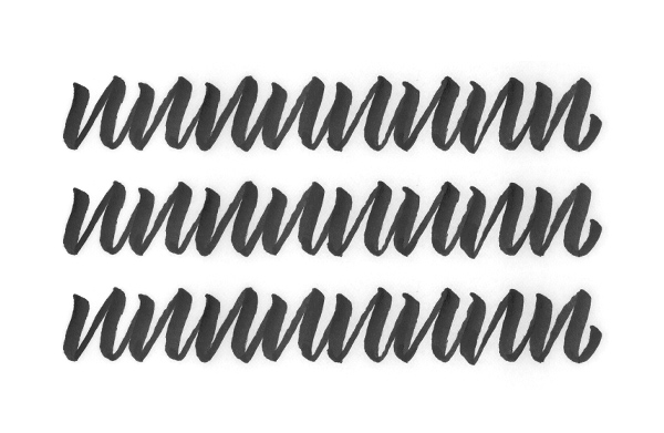
Step 4
The last practice stroke we will be completing is essentially a lowercase "n". This basic letterform combines the knowledge you just learned about thick and thin strokes. The only difference here is that you have to be aware of the stroke connections.
Recall when I mentioned the tapering of the thick strokes—this is essential when connecting strokes to maintain an even weight. Additionally, notice where the exit stroke of the first "n" is connecting to the following "n" next in line. If you look closely, you'll see that the exit stroke is connecting fairly high and very smoothly with the vertical stroke of the following "n". Use this knowledge from here on out with all your letterforms. Make sure your connections are smooth and begin near the entry stroke of the letterform next in line.
3. Roundhand Brush Script
Alright guys, after you've practiced enough of your basic strokes, I think you'll be ready to apply those techniques to a finished brush-script piece. We're first going to create a roundhand brush-script, then move onward to a more angular brush script. The wonderful thing about learning both types is that you'll be able to see just how easy it is to make minor edits to the slope, angle, speed, etc., of your lettering to make it appear more unique and give it variety. Let's now begin some basic roundhand brush-script.
Step 1
Just as we did in the previous Script-Lettering tutorial, we're going to write down a bunch of phrases/quotes that we might choose to draw. I recommend something that resonates or has meaning to you because it then becomes more personal and enjoyable to draw. I am going to select the words, "New York City", because in a short while, I'll be moving there—it seems fitting for me to draw this at this time. But, for you, select something that means something to you. Have fun with it!

Step 2
Now that we have our phrase selected, let's move onward to conceptualizing some lockups for that type. Using a pencil and paper, quickly sketch out as many ideas as you can to somehow fit the words together nicely. Maybe you could use an alternating baseline, flourishes, etc.—anything and everything you can think of to form a nice composition.
Remember: sketch small and fast—this way you save time and create a wide variety of options without taking into consideration how all the letterforms look. Later on we will finesse the letterforms to appear exactly how you want them. For now, we're just worried about composition and forming the "skeleton" of our lettering.

Step 3
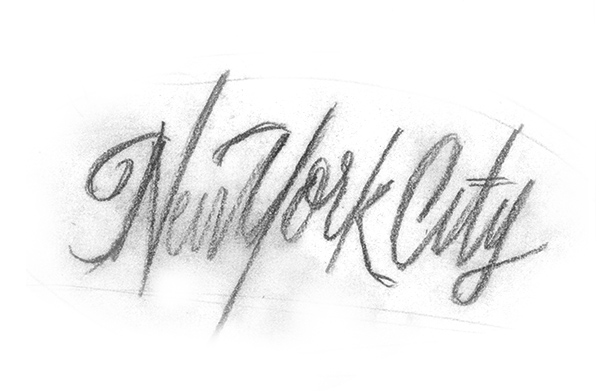
After conceptualizing some type lockups, select one of them that you think is working best to move forward with. Next, use a copy machine or scanner and enlarge that piece of lettering so you can fine-tune the details. For the lettering I selected below, I scanned it into the computer and enlarged it enough to fit on a 8.5" x 11" piece of printer paper.
The enlarged piece of lettering you just created is considered the "skeleton" or the framework for what's to come. We will be using this as a guide when we begin using the Tombow Brush-Pen.
Step 4
Now that your skeleton (framework) is good to go, let's throw a piece of tracing paper on top and get to work. Begin by redrawing your lettering with your brush-pen. Pay attention to angle, letter-spacing, overall color, stroke endings, etc.

Step 5
Next, we will begin to refine, refine, refine until perfection. At this point, take your previous lettering and place another piece of tracing paper on top. Try to fix things that might be bothering you. For me, I'm trying to develop an alternating baseline with the letterforms as well as fix some kerning issues. I'm looking to make this piece more lively and give it some flow.

Step 6
Continuing further, keep tracing and retracing your letters until you reach a solid foundation. Fix your kerning issues and angles (so they're all uniform and consistent), and make sure your connections are smooth and high-waisted. Keep drawing the phrase over and over until it's ready to move onto the next stage: pencil.

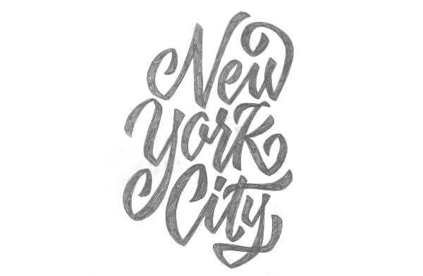
Step 7
We've now reached the point where we can take our brush-drawn lettering and begin redrawing the lettering with pencil to perfect connections, stroke endings, and any other problem areas. As you can see with the below photo, I'm still working out some kerning issues from the previous step.

Step 8
We've reached the end! I've fixed a lot of the minor problem areas and finessed the lettering to my liking. Begin to fill in your finished piece of lettering with pencil so you can truly see the positive and negative space. If need be, begin to trace your lettering once or twice more until it reaches its final stage.
From the process .gif below, you can see that lettering sure is a long and lengthy process to really perfect. These things take time!


4. Angular Brush Script
Let's now begin the same basic process/concepts, but instead of rounding our connections, we're going to make them very flat and angular. For this piece of lettering, you may either utilize the same phrase as before, or choose a new one. But I'll be using "New York City" again so you can see just how easy it is to create an entirely different piece of lettering while utilizing exactly the same tools.
Let's get started!
Step 1
Beginning in exactly the same way as before, quickly sketch out various ways to draw your phrase. When you draw your letterforms very quickly, sometimes unique characteristics with your letters can occur, things you wouldn't normally draw when you're slowly thinking about what you're drawing. Jot down as many lockups as possible before selecting a final to progress further with.
Again, don't worry about what it looks like—we'll make it look more polished and complete through the process.
Step 2
After conceptualizing type lockups, select one of them that you think is working best to move forward with. Next, use a copy machine or scanner and enlarge that piece of lettering so you can fine-tune the details. For the lettering I selected below, I scanned it into the computer and enlarged it enough to fit on a 8.5" x 11" piece of printer paper.
Let's now use this skeleton and complete the same process as we did with the roundhand brush-script.

Step 3
Just as you did before, get out your Tombow Brush Pun or Copic Marker and begin tracing your skeleton. This time, pay attention to the connections and angles of the joints of your letterforms. We're going to be making them harsher and flatter this time around.

Step 4
Moving onward, take your Step 3 lettering and begin tracing on top of it to correct any mistakes you have made. This time, I'm fixing the angles, slope, connecting points, and stroke endings to be flatter and more drastic.

Step 5
I believe we're nearing the point where we can continue further with pencil. Trace and retrace your brush-lettering until you're happy with where it's heading. If the composition, spacing, color, etc., are looking good, let's begin redrawing with pencil!

Step 6
At this point, you should have an early rough pencil sketch with filled in letterforms to see how the color is working throughout. You know the drill—keep redrawing your phrase to perfect the problem areas. As you can see in the below sketch, I'm fixing kerning issues, alternating my baseline again, and correcting some stroke endings/angles.
We're almost there! Keep on redrawing. It'll be worth the patience and persistence, I promise!

Step 7
This is it! Begin to redraw your lettering more precisely and cleanly because you're coming in for the home stretch.
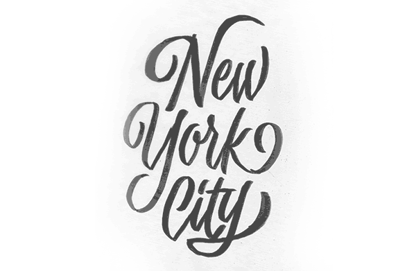
Alright guys, there we have it—a finished piece of lettering. After many edits, I think I've achieved an even color, nice composition, and consistent angles and stroke weights.
But I think I'm going to take it one step further to make it a bit more "custom" in the next step.
Step 8
Taking the lettering you just finished, you can do as I've done below and remove a bit of weight from the entry and exit strokes of your letters. I've made minor "cuts" into the lettering to remove a bit of weight and lighten the load on these rather heavy brush-strokes.
Seeing the whole process from start to finish is always cool. I've provided a .gif for your viewing pleasure. You should now be able to see the start and finish of your lettering project—always a treat to see the progress you've made!

But wait, the lettering in the "What You'll Be Creating" photo is white on black? True! If you're wanting to do the same with your lettering, all I did was invert the colors in Photoshop. If you're inverting a white piece of paper with black lettering, it'll make your lettering white and paper black!
Conclusion
Brush-script sure is a challenge! It took me a good while to grasp the ins and outs. Don't get discouraged if you're lettering isn't turning out the way you want it to. After a good amount of practice, you'll be well on your way to creating some jaw-dropping custom brush-script lettering. If you have any questions at all, feel free to post below and I'll be able to help you out. Good luck!

.webp)


