In previous lessons we have picked up clues as to what makes up the consistency of a script. We learned the anatomy of the letterforms, and how they relate to each other. We also learned how to proportion and space a script harmoniously and in a way that respects the hierarchy of letters. Now we're going to use all this to design a script.
Introduction
The Interrelationship of Letters as a Design Basis
As a warm-up exercise, here are two sets of letters, from Early and Eastern Kufic respectively, with some blanks. Your task is to draw the missing letters, inferring their shape from the other letters, as they are made up of parts that can be found in them.
Refer to the chapter on Anatomy of the Letterforms for the specific parts making up each letter if you need a refresher. See solutions.jpg in the downloadable folder for the answers.

This is a practical reminder of how interrelated the letterforms are. The building blocks of the alphabet, the bodies and tails, are few in number, and in theory it's enough to design them to have the full alphabet. In practice, I don't recommend working on them as disembodied parts. What we can do instead is work on a core group of letters that together contain all of these building blocks. I chose seven letters for this core group, Group 1:
These letterforms feature all the basic shapes, including some minor ones I didn't mention earlier:
- Alif for itself plus the basic design element (more on this below)
- Bâ' for the tooth and flat tail
- Dâl for the box and hook
- Nûn for the bowl
- Wâw for the loop and half-bowl
- Jîm for the notch and returning tail
- Finally, Mîm for an optional specialized loop and short or undefined tail
Group 2 then follows. It is mostly derived from the above, with only a few elements that still require designing:

The grey parts here were designed in Group 1, with the corresponding letters indicated. The black parts are not yet done.
- Ayn takes its returning tail from Jîm, but we need to create its body (in medial and isolated forms).
- Kâf is quasi-identical to Dâl, unless we want to give it a distinct hook. Note also Kâf has a slight tail when isolated, as shown here.
- Final Hâ is the loop from Wâw, with an optional tooth, but its distinctive medial form needs designing.
- All three possible tails for the Yâ' are already done (the returning tail can emulate that of the Jîm, or the flat tail of the Bâ', according to preference), so we are left only with its unusual head (which is a tooth that connects at the top rather than on the baseline, so it may be modeled like a loop open below).
The remaining letters, Group 3, are entirely derived from those we already designed:

This makes it all look so simple! The truth is, the basic process is simple, but "the devil is in the details". As we design a set from scratch below, you will see how many design decisions have to be made, and how tricky some letters can be.
Calligraphy vs. Typography
Although it looks as if we are designing a typographic font, we are only overlapping with that process as far as our calligraphic needs go. Typography and calligraphy overlap, but neither contains the other, as their goals and media differ.
Typography is concerned with large amounts of text, mechanically (or digitally) reproduced, that needs to be highly legible as well as attractive; it requires great visual and technical expertise. If we were creating a font, we would have to anticipate and design hundreds of character combinations, so as to create a system that would look good in shape and spacing when used at any size, by anybody. Really good fonts take years to create, but are still limited somewhere, as improvisation is not part of their nature (and is irrelevant to their purpose).
In contrast, a calligrapher's set, such as we're creating, can be this simple because we can adjust and improvise on the spot, according to our specific uses, and not worry about planning for every possibility at its inception. The set can evolve with time, and we can break our own rules in places.
It can be said, therefore, that the significant aspects of a set of letters created for calligraphic purposes are:
- They can be loosely created, to be solidified according to context (something that can only be achieved in a limited way, and with great difficulty, in typographic fonts).
- They must be easy to reproduce by hand (a concern that doesn't exist in typography, which is by definition for reproduction not-by-hand). With increasing skill, this becomes less and less of a limitation, but the beginner will find that working with a grid and clear geometric shapes is the best way to achieve this.
- The set shouldn't be boring! This may be the trickiest part. We design with consistency in mind, but this can fall into repetition. When these letters are strung together into words and sentences, will the result be musical or mechanical?
Step-by-Step Creation of a Script
With the above in mind, I will demonstrate a process of designing a script based on our three groups. I am working on gridded paper and will only transfer the letters to software when they are finalized.
Working on paper is much more enjoyable than working digitally, but it is also the only way to really learn calligraphy (or typography for that matter). There is just no substitute for drawing the letters in the physical world until they become second nature. The serious practitioner will not limit his or her practice to sitting in front of a screen.
For this process, you only need three tools: gridded paper (I use an A3 pad, but you can also print the attached A4 grid), a pencil and, optionally, a circular template. This tool is more convenient for small curves than a compass, and the one in the picture also doubles as a short ruler. However, I did most of the sketching freehand as I find it less distracting, and only used the ruler/template to draw finalized letters so I could see them better.

Step 1: Setting the Proportions
As described in Proportions and Spacing, we must decide on proportions before we work on forms, but we can always come back and adjust them. I have in mind a set that has the tall elegance of Eastern Kufic but is rounder and softer. I actually start with loose preliminary sketches, looking for the essence of the set I want to make:

Preliminary sketches are helpful and even essential. Doodle freely, perhaps starting off with a historical letter you like and wandering from there, until you strike upon something you like. Your first idea is seldom the one with the most potential or that will give you the most enjoyment to work with, so taking the time to sketch freely can save you from giving up and starting over halfway through a set.
Tentatively, I set my proportions as follows, with an extra tall Alif of 16, tall teeth and loops of 6, and a box of 3 units high.

I tried opening up the space inside the box to make it higher, but didn't like the result at all, and it also meant I'd have to open up the space inside the loops, but I want these tall and narrow. It's personal preference, therefore, that keeps the box so low. Because the Alif is so tall, the box looks particularly long, but that can be adjusted in context so it's not a worry.
Step 2: Basic Design Element
Proportions play a large part in the look of the script, but now we have to address forms. Whether simple or elaborate, the letters in a set will share a specific sense of form, a consistency of curves, angles, ornamental details if any.
There is no one right way of determining the forms that define your set. You can start by designing one letter, and derive the rest from it; you can create a grid into which you constrain each letter (an example of specifically created grid is the one used forLED numbers); you can start with a single design element, and let it reverberate through the entire script.
The latter method is what I'm doing here. I have in mind this serif (Arabic: tarwîs) to head my Alif:

It is a simple shape formed of two quarter-circles, one with a diameter of 4 units (abbreviated ø4), and a smaller one with ø2. I tried it with smaller circles (the one in the middle) but the effect was weaker. I don't know yet what other shapes I may derive from it, but I can do a lot with quarter-circles of various sizes, so there is a lot of potential.
Step 3: Letters of Group 1
Alif
With the serif at the top of my 16-unit rectangle, the Alif takes shape:

I like the look of it, but I fancy giving it a foot when isolated, for a sophisticated touch. It has to be harmonious with my basic design element, but not, of course, be the same, so I'm already facing a small design challenge.
What I do is go by the historical look of the foot (examples in medallion), but adapt it to my fledgling system by using two circles to create it. They are both ø2, as I tried with ø1 but the result didn't look right.
Bâ' for Tooth and Flat Tail
I sketch these two elements separately before putting the letter together:

- The Alif and tooth are often related and share the serif. This is not necessary—for instance, Eastern Kufic has slanted teeth that could not be designed the same as the vertical Alifs— but in this case it could be a good solution. So I first try to top the tooth with the serif, but I dislike it instantly. The tooth is much too tall for my taste, in a gangly way.
- Positioning the serif as close to the baseline as possible looks much better to me, and cleverly gives the tooth a forward-slanting look without actually modifying its verticality. The problem here is that it is now 4 units high, and would force me to revise my system of proportions!
- I try to compromise, making it slightly higher to see if I could get away with that height, but the result is not worth the compromise.
- Can I make the teeth 3 units high to level with the boxes? Here I attempt this by constructing the serif using smaller circles, scaling it down. It doesn't look good.
- Keeping the original serif at this height means losing the lower arc and ending up with this shape. Not what I want in this set! The one viable solution is still 2, so I'm going to have to revise my proportions.
- As for the flat tail, I first try it with the same serif, flipped and rotated into a horizontal position. It's rather dashing, but I don't really want it to compete so much with the body of the letter, and I'm also concerned with overusing this serif shape.
- A simple curve is appropriately understated, but it feels too round for what I have in mind.
- Now I try to reuse the foot of the Alif, but it looks weak, and also I'm not looking to emulate the round script's Bâ', which ends by lifting the tail so the letter is symmetrical (ب). I'm rather a fan of the bold flatness of the original flat tail, and I want to keep it horizontal.
- Again a simple curve, but concave. This is much more interesting. It is a reflection of the Alif's foot, but not so obvious, as it only has one curve. It's understated but has the slight edge I'm looking for to balance out all my curves.
- These last two sketches test more elaborate shapes with this concave curve, but the results look like shark fins and rather funny.
In the end, the chosen tooth is 2, with 6 for a tail, and this is my Bâ'.

The design of the Bâ' messed up my system of proportions, so I have to revise it before I go on. The tooth is now 4 units high, and the box can't be changed from 3. The loops cannot stay at 6 in these conditions, as that would create too many levels in the text.
Fortunately, I can sort this out by sacrificing their neck. If the loops sit directly on the baseline, they are 4 units high, like the tooth, without losing their tall silhouette. My new and final proportions are thus:

Dâl for the Box and Hook
Boxes can be open or closed, and their left end varies because it carries the identifying features of each individual letter.
What they all have in common is an upper right corner that needs attention. In a set that is not of purely square construction, this angle needs to be at the very least angled or rounded in harmony with overall design.
This is one of the features of Dâl that need designing, the others being the hook and "tail" of this letter. It doesn't actually have a tail to speak of, but its lower stroke needs to terminate elegantly. The simplest way is to treat the lower stroke like a flat tail and terminate it the same way.

- This is one way of rounding the upper right corner, using a circle of ø2. The inner upper angle must also be rounded, here with a circle of ø1.
- Changing the size of the circles changes the character of the angle. This sketch uses circles of ø4 and ø2, double the size of the previous sketch. The right side of the box is now one large curve from baseline into upper line, and this gives much more motion, as if the letter were leaning forward. In addition, the circle of ø4 is the module for our basic design element which reverberates throughout the set; therefore this corner would reflect the shape of the letter preceding it, which is a nice effect. I will try both these constructions on the final letter before choosing one.
- To terminate the lower stroke, I use the curve already seen in Bâ', and feel it's just right, as anything more elaborate should be left for the hook. This first hook attempt is simply our serif, flipped and rotated into a horizontal position. Note the alignment of its curve with the curve on the lower stroke, a pleasing continuous movement.
- I try the same serif upright, but find it much too bulky, not to mention repetitive (since all toothed letters and Alifs will already be displaying it).
- The same, flipped backward: same bulk issue, and I don't like this cliff-like straight line at all.
- Finally I try the shape used as the Alif's foot, flipped and rotated, but this looks weak.
My final choice for the hook is 3, which has a nice relationship with the lower curve while at the same time contrasting with it in size in a pleasing ratio of roughly 2:1.
This first Dâl shows corner construction 1, with the smaller circles.

This one uses construction 2, which is much more dynamic, and I also made it half as long (8 rather than 16). I'm pleased with the result, which is well balanced with a forward thrust.

Nûn for the Bowl
The bowl requires particular attention, as it recurs in so many letters and sets the level for other descenders. It's best to give this job to the bowl, rather than to the returning tail, because it is more complex, so that it is easier to adapt returning tails to its level than the other way around.
The rule that descenders should be on the same level is not of course cast in stone, and half-bowls often evade it, but it should only be broken in a studied way, so I will endeavor to stick to it.

- While I generally love the circular potential of the Nûn, I know from experience that it's best explored when the letter is used on its own. When the letter is part of a set and needs to have an evident tooth, and for the bowl to work for other letters, a circular effect is both difficult and unsatisfactory.
- Here I'm limiting the circles to the bottom half, and trying to finish the upward stroke elegantly. The result is unsatisfactory on many counts. First, the evenness of the tail, ending in the same thickness as it started, looks uncouth. Second, I constructed it around a dot that's too large—it's not wrong, as we are free with the size of dots, but it looks wrong; I prefer to keep the dot's diameter equal to the general stroke width of 1. Finally, the stroke ending doesn't work here at all.
- Working around a smaller dot, I shift the circles so they're no longer concentric (the circles used are shown on the right). This creates the line width variation so the stoke ends in a point right on the baseline. I could leave it there, but feel I can do more: a half-size version of the serif, mirroring the tooth. My first attempt is on level with it, but lowering it to break the symmetry further works out much more nicely. This gives a slightly ornamental feel, and as it will only come up with the bowls in a text, the result shouldn't be too frilly.

My final Nûn, drawn with the template to get more accurate circles, shows the descender level is 2 units below the baseline.
Wâw for the Loop and Half-Bowl
I start looking into the half-bowl, as it derives from the bowl I just worked out.

Anything less pronounced than the bowl is suitable, so I could go as far as the full bowl without its finishing serif, but after trying different circles I hit upon a curve that's neither too big nor too small, and that comes to rest on the same descender level. Because I used the tooth in my sketch to see more clearly where the baseline was, I have inadvertently designed the Râ' by the same token.
Moving on to the loop:

- Shaping the loop, I find myself repeating the process I went through for the angle of the box. This option, with smaller circles, looks too square for what I have in mind. (I sketched with the neck because it slipped my mind that I had to sacrifice it. It makes no difference, however.)
- This option using the larger circles is exactly the mirror image of the box angle, and it looks just the way I want it. There's something sharp about it, but it is softened by the curve.
- I'd like it to be slightly less basic, so I add a peak made up of the same concave curve that's been cropping up. Although it adds height, it doesn't mess up my proportions because it's not a substantial part of the letter. In a text, it will just ensure the leveling is not clinical, without interfering with it.
- Just to see how it looks, I try to make the peak convex instead. Definitely not!
In assembling the final Wâw, I try again the different half-bowls I explored, but am confirmed that the one I settled on works best.

Jîm for the Notch and Returning Tail

Jîm gave me a lot of trouble, mostly because I couldn't make up my mind whether I wanted to stick to the diagonal notch, or to let my shapes dictate a design. It took a while to settle on the solution at bottom right, which reuses the serif in yet another position and so as to create a semicircle.
One of the reasons I settled on it is to give the letter the required height of 4. Some of the other shapes I liked are only 3 units high, and while that would align it with the boxes, it would make it look quite small in proportion to other letters—boxes have length to make up for their low height. Also, from the corner of my mind I'm thinking of the Ayn, and I'm aware that this semicircle will allow me to tie in those two related letters without making it too obvious.
As for the tail, I started sketching quite an open one (towards the top), based on the bowl, and then realized it was too deep and I needed to bring it back up to 2 units below the baseline. Shifting the circles resulted in an angle where the tail returns, which has a much more edgy feel, more in tune with the overall theme—too many circular curves start looking too saccharine very quickly. I like the tail both with and without the little ornamental serif, but decide to keep it, at least provisionally.
Mîm for the Alternative Loop and Short Tail

- I try to see if I could use the Mîm's characteristic centering on the baseline with the stretched height that I set for my loops. I don't like the resulting shape at all, and the absence of straight lines makes it alien to the rest of the set.
- Would it be worth having the Mîm's height different from the other loops and aligned with boxes, to keep the centering while giving it a more sightly shape? The resulting perfect circle has no echo anywhere else.
- Here I'm trying a possible tail. Mîm has an unsubstantial tail that can be quasi-absent or elaborate, provided it cannot be confused with a tail that belongs to another letter. This tail attempt is the smaller version of my serif, but it looks very odd, connected to this round shape with only a hairline.
- I give up on centering the Mîm and make it sit on a flat baseline while preserving its symmetrical appearance. The shape is more acceptable. For the tail, I return to the shape used for the foot of the Alif. They work well together, the letter looks like a Mîm, and it's visually consistent with the rest of the set so far.
- I try another body shape, that of the rest of the loops, which have a "backbone"—but in order to tone down this feature, which is usually un-Mîm-like, I don't give it a peak. This also works well with the tail, and is more closely aligned with the general feel of the letters, while retaining a sense of how the Mîm stands out.
- I try one more possibility, the same body shape but with a tail derived from the flat tail, as I did in Dâl. Early Mîms have a super-short version of the flat tail, so I wanted to see how that would look in my system. It's visually interesting, but it's not so obvious that it is a tail—it changes the body shape and the letter becomes ambiguous.
I retain 4 and 5 for the time being. They both work, and their final test will be context.
This completes group 1, which looks like this:

Step 4: Letters of Group 2
Ayn

- I try an open curve for the Ayn at first, with the two tails (with and without serif), but the height is not right so I have to abandon it.
- I use the inner semicircle already present in the Jîm to design the head of the isolated Ayn (right). Note that I don't use the whole Jîm head and flip it; that would make the rear of the letter heavy, and I'm keen on giving it a forward motion. Also, Ayn is never written as a reversed Jîm, even though on a "skeletal" level they are opposite notches. I suspect this is due to the same intuition that letters always look forward, not backward, so the visual weight of both these letters is always on the left. In any case, I complete the head with this in mind, making sure the curve points down into the baseline curve for a nice alignment. The medial form is not particularly original, but it comes naturally and reuses the same semicircle, so the relationship is clear.
Kâf
We know how closely related Kâf and Dâl are. Yet I shrunk the length of the Dâl to make it more distinct, so I mean to do something similar here by modifying the hook into an elegant tapering curve.

Sketches 1 and 2 test different sizes of hooks, and also the two different treatments for the corner of the box (it's always good to double-check an earlier decision still works).
The final shape I settle on in 3 is intermediate in size, and I also pushed it in slightly so the tail would jut out to signal the isolated form. The hook of the Kâf, always skinnier than the main lines of the letter, does not break the system of proportions because the substantial part of the letter is its body, which is the box.
Yâ'
The final Yâ' is a breeze to adapt, being mostly derived from shapes we already have. Its isolated form is another matter.

- Two of Yâ's three possible tails are instantly there, based on the returning tail and bowl I've already designed. The head is a loop without baseline.
- There's no need to include all three tail options in a set. In fact you only really want one, but out of curiosity I try a solution for the S-shaped tail, which logically is a small Dâl. In itself it is quite interesting, but it doesn't match the overall feel.
- Isolated, the letter needs a head, and that's more of a challenge. This is a first attempt at giving it a bit of a neck, but the result is alien to the set.
- Sticking to the overall shape in 1, I simply make the head taper, which requires me to drop the loop shape and use an Ayn instead. Interesting look, but again alien.
- I wonder if it would work better with an S-shaped tail. It does seem to be a better tail for the isolated form, but it's too different.
- I combine the bowl with the S-shape, using the Ayn head with a bold neck. Finally it works. The feel is right and the letter looks good. The serif making contact with the body is not a concern here: in hand-drawing this, I can frankly cheat a little and leave a small gap between them for aesthetics, and the eye won't be able to tell the geometry has been slightly altered.
Hâ'
This is again a breeze, as the loop is already done, and reflecting it results in a perfect medial Hâ'.

Here's our finished Group 2:

Step 5: Letters of Group 3
All the elements we need are now worked out, so this group will not take long.
Fâ'
Loop + flat tail.

Sâd
Box + bowl. However, there is the matter of Sâd's "tooth". It is optional, but I'd like to include it. As it's not a full-sized tooth, despite its name, simply sticking our serif there won't do.

- A simple curve similar to the loop's peak is not very satisfactory.
- Here I do use the serif, but at its normal height (rather than on top of the letter) and I like the result. Being absorbed by the upper stroke, it doesn't stand out as itself, yet creates a good-sized shape to close off this long box.
- Retaining the lower curve of the serif, I reduce the upper curve so it flows right into the line, for a smaller tooth. I'm not convinced; my choice is still 2.
Qâf
Loop + bowl: Like Yâ', Qâf makes contact with the small serif. I try raising it higher to see if that's a solution, but it doesn't look right. In the end, after checking that the negative space thus created is sightly enough, I decide to give it the same treatment as Yâ'.

Sîn
Three teeth + bowl. While they can be level, arranging them in decreasing height is too aesthetic a solution to pass up.

- The difference in height is here 1 unit each time, so the angle is pronounced and the first tooth is 2 units higher than the first.
- Here the difference is a 1/2 unit, for a softer effect and less of a break of the levels. I retain this solution, although I may use the first on occasion where it would look good in context .
Lâm
Alif + bowl.

Tâ'
Alif + box. I give the lower left angle a little tail ending to add interest.

Râ'
Tooth + half-bowl: I already designed this earlier as a by-product of the Wâw.

Here then is Group 3 completed:

Step 6: Testing the Script
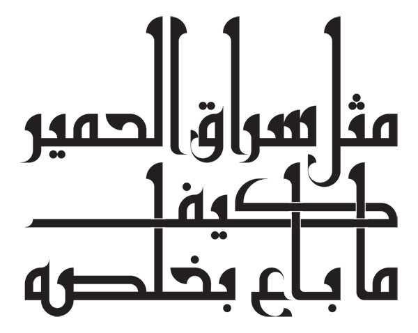
Now it's time to put the letters together in some sort of sentence, and see if the set looks good in context! We'll also see how we can intervene at this level to make it look even better. For this purpose I found a Lebanese proverb that contains all the body and tail shapes of the script: متل سراق الحمير كيف ما باع بخلصه (which means: "Like the donkey thief, whatever price he sells will be a profit").
Here's how it looks with the letters put together as they are, with regular spacing. This is the stage where you look for anything glaringly out of proportion, or a shape that clashes with the rest. In this case you'd have to revise the offending letter(s) and try again.
To my eyes this passes muster; I'd thicken the extremely thin strokes on the bowls, but that's not a structural change so I can do it on the spot.

I then made some changes to the composition, the spacing and the letterforms themselves, looking for the most pleasing result for this specific context:

The distribution of the words is different, as I isolated كيف on one line but, as it is a low, strongly horizontal word without verticals, I spaced the lines above and below it as if it weren't there, and made it weave through the verticals instead. Furthermore I made several small adjustments that are not immediately noticeable, but contribute to the cohesion and beauty of the composition. They are highlighted here:

- Pushing the bowl of the Lâm down made it possible to bring the next word closer. Its proximity, and the way the bowl now points up into it, create a relationship between them.
- I also pushed the foot of the Alif just below the baseline. I don't know if it will always look better this way, but here it's definitely superior to the alternative, and adds movement.
- The Alif's serif was flipped to mirror that of the Lâm, a classic device when these two letters are paired.
- Kâf was stretched (kashida) so that the important bits of the three letters of كيف are closely framed between two verticals (they may not read as smoothly if a vertical separates any two of them).
- Instead of a sharp angle, I kept the curve of the foot at the base of these Alifs, and introduced a smaller curve inside the angle. Note how the concave curve on the baseline stroke of the Ayn repeats the curve of the Alif, and the negative space between them is precisely the shape of the Alif's foot used elsewhere! This is another relationship.
- Instead of connecting Sâd and Hâ' with a straight baseline, the bowl of Sâd was modified to be more substantial and made into a swooping connection that livens up the baseline—and supplements the otherwise lone descender of Ayn, so the composition now seems solidly planted on two supports.
Looking at it again now, there remains a bit I'm not so pleased about, the empty space below the word الحمير. More experimenting may be needed before I'm fully satisfied!
Exercise
Time to create your own set of letters! This is a substantial assignment, but at the very least, aim to design the letters in Group 1. You can even pick a sentence and design what you need just for that.
If you're up for the full job, you can follow the process outlined here, or diverge from it—there are no real rules for this, but I think this may be the easiest way to go about it for a first time. All you need is a pencil and gridded paper; A3 is comfortably large, but the downloadable folder includes an A4 pdf grid you can print out instead.


