Today I've got something special prepped in a form of a quick tip tutorial. In the following minutes we are going to look at how we can create a set of smooth graffiti-inspired line icons using Adobe Illustrator’s basic shapes and some drips of the Direct Selection Tool here and there.
1. Create a New Document
Assuming you have Illustrator up and running, press Control-N to create a new document (File > New) and set it up using the following settings:
- Number of Artboards: 1
- Width: 480 px
- Height: 280 px
- Units: Pixels
And from the Advanced tab:
- Color Mode: RGB
- Raster Effects: High (300ppi)
- Align New Objects to Pixel Grid: checked

2. Set Up a Custom Grid
Since our icons are quite tinny we need to set up a custom Grid by going to Edit > Preferences > Guides & Grid. From there, simply make sure that both the Gridline Every and Subdivisions options are set to 1 px so that everything is super-precise. You will want to enable the Snap to Grid option (View > Snap to Grid) as it helps you better position elements onto the Artboard itself.

Quick tip: You can find more about the Grid and how it works by reading these two articles:
3. Separating Objects on Different Layers
Since each icon is composed of a number of different elements, I usually separate them by using a series of labeled layers. Then when I start working on a particular icon I lock all the other layers so that I can make sure that I won’t accidentally get parts of one icon on top of another one. As you can see from the image below, I currently have eight layers, each labeled using short keywords so that I know exactly what I’m working on.

4. Defining Our Colors
Seeing as our icons are line-based, the composition will rely on the relation between the background color and the one used for our objects. In this particular case I went with a yellow (
#F9DF74) and orange (#EDAE49) combo, which not only makes the icons look warm but also makes the little details pop.
Besides the two colors, I also applied a bunch of highlights and shadows by using full white and black shades with different Blending Modes and Opacity levels:
- Overlay: 30% for white
- Darken: 8% for black

In case you’re wondering why I didn’t go for a brighter tint of yellow for the highlights and a darker shade of orange for the shadows, well the answer is somewhat simple. If I need to change the two main colors to something else, I won’t need to start playing around with different shades for the highlights and shadows as the tricked out white and black ones will almost always do the job. But that’s a scenario where the designer has a lazy morning and needs to come up with a quick solution.
5. Consistency and Attention to Details
Probably the most important thing you should be aware of when using this style is consistency. If your first icon’s main lines end up having a Width of 4 px then you should apply the same thickness to all the other ones, thus making the pack uniform. The same rules apply to smaller detail lines, highlights, shadows and all the other composing elements that you feel could be adjusted and fitted to some of the other icons.
So let’s take the first icon, the spray can, and see how it’s built, as all the other ones will follow almost exactly the same pattern.
Step 1
Assuming you’re on the right layer, grab the Rounded Rectangle Tool and create a30 x 58 px shape with a Corner Radius of 1 px. Color the object using
#EDAE49and then flip its fill with its stroke (Shift‑X), giving the stroke a Weight of 4 px. You can expand the shape by selecting it and then going to Object > Expand > Fill & Stroke.
Step 2
Create another 30 x 4 px shape with a Corner Radius of 2 px, color it using the same orange tint (
#EDAE49), and then position it on top of the previously created object, making sure to center the two using the Align panel.
Step 3
Using the Ellipse Tool (L) create a 20 x 10 px shape, flip its fill with its stroke (Shift‑X) and then give it a Weight of 4 px. Expand the shape and then cut it in half so that in the end you’re left with only the top section.
Step 4
Add a soft highlight by creating a 16 x 4 px white rectangle which we will position towards the top section of the bulky ellipse we just created, making sure to send it underneath. Once you have things in place, simply select the white shape and change its Blending Mode to Overlay, lowering its Opacity to 30%.

Step 5
Create the spray cap using the Rounded Rectangle Tool and then start adding some details to the can itself, by playing around with different types of lines (thicker, thinner, longer, shorter). Also don’t forget to add the little paint drips on the right side of the can, using the Rounded Rectangle Tool.

Step 6
Finish off the spray can icon by adding the two diagonal highlights. To create them, simply grab the Rectangle Tool (M) and draw two white rectangles that have the same height (60 px) but different widths (6 px for the thicker one and 1 px for the other).
Change their Blending Mode and Opacity levels to the default values that we’ve chosen, and then create a clipping mask using a rectangle that has a smaller width and height (18 x 46 px) compared to the inside of our spray can’s main body.
6. Use Variations of the Shapes You Already Have
If you recall, a few lines ago I told you that you should always pay attention to consistency. Well since all the other icons are based on the same 4 px Stroke Weight value, you could create the remaining ones by making six copies of the spray can’s main shape (the one we created in step 1) and adjusting the Width andHeight values for each of them. Keep in mind this will only work if you didn’t expand the shape. If you did expand it, just create another one, and then adjust the copies using the values provided below:
- Sponge: 20 px Width / 44 px Height
- T marker: 14 px Width / 50 px Height
- Paint bucket: 44 px Width / 48 px Height
- Marker refill: 36 px Width / 48 px Height
- Broad marker: 12 px Width / 52 px Height
- Narrow marker: 8 px Width / 48 px Height

7. Add Repeating Details to Each of the Icons
Since every icon will have some highlights, shadows and detail lines, simply add them and play around with some of the details that need to be adjusted due to the width or height of the shape. This should be a fun process of exploration and imagination which I hope you get involved with, as it will help you understand how these kinds of icon packs are built.
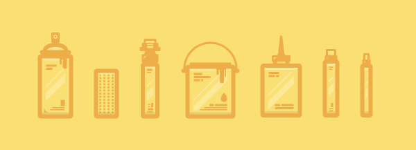
8. Add Characteristic Features to Each of the Icons
Once you have added the repeating features it’s time to add the ones that set each icon apart. For the T marker it’s the thicker/taller top section that holds the tip, for the paint bucket it’s the round handle and lid, for the refill it’s the cone-like tip, and for the last two markers it’s the wider/narrower tips. Again, try and play around as I’m sure you will get something really cool in the end.
Grab Your Digital Cans and Start Drawing!
Assuming you went through all of the above quick steps, you should now be able to build a killer set of graffiti icons ready to be used on any hipster Artboard.


