In this tutorial we are going to look at the process behind creating a comic page. We will focus on how you can break down the idea of your comic into a visual script, and making it easy and fun to read by using different types of panels and perspectives.
Working in Adobe Illustrator we can create a fast and flexible workflow by using clipping masks to create our comic panels, and the Effect menu to make wavy panels in no time.
1. Creating a Storyboard
When you have a character and an idea of what you want to tell, it might be tempting to just dive in and start drawing. If you take extra care planning the story and the structure of the comic, you will avoid drawing yourself into a dead end.
Step 1
It is hard to make a comic without having something to tell, so the first step is to come up with some sort of series of events. Storytelling is a whole art form all on its own and I won't delve into it deeply here, but you will get some tips on how you can organize your ideas and turn them into a visual story.
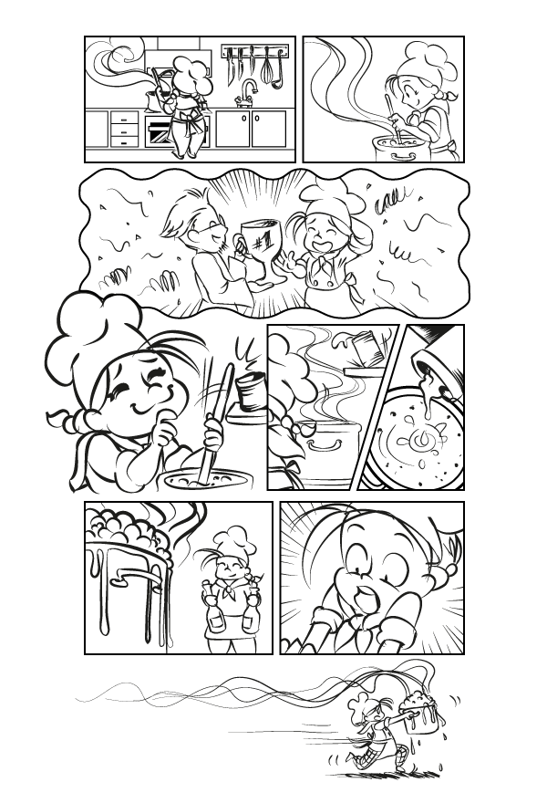
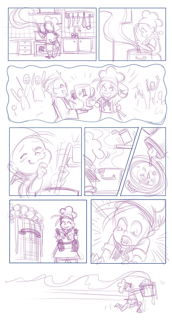
For this example I will be using my little chef character from a previous tutorial, to tell a short, slapstick kind of comic. I want to portray her as a cheery but clumsy character, so she will have several mishaps in the kitchen but will do her best to get everything together.

I start by coming up with a list of things that could go wrong for her, thinking about how one thing can lead to another. For this step I just doodle a bit and scribble down whatever comes to mind on paper, but if typing digitally works better for you then go ahead and use a writing program instead. The important thing is that you feel comfortable and just brainstorm ideas.
Step 2
Once you have some good ideas going, try to arrange the events while thinking of the pace of your story. Different pacing works for different types of stories. Some might start with an intense hook and then slow down. If you are making a longer story, there are many resources online on how to construct a story with classical models for drama. For my story, it will have a peaceful start but build up to a chaotic scenario, one thing going wrong after the other.
Script Example
- Show the setting is a kitchen.
- Show the chef cooking.
- She fantasizes about winning a prize.
- She accidentally knocks something into the food.
- She goes to get something, the food bubbles and smokes.
- When she returns the food is smoking heavily and she is shocked.
- She takes the pot and runs away with it.
For this tutorial I will only cover the first page of the comic. Although it is short and simple, I still write down a script for myself. It does not need to be anything fancy, and can in fact just consist of a list of actions. I still take the time to write it down, though, to clarify what I will actually be drawing.
Step 3
Having a written script, however simple, will be a handy reference for this next step. Now that we have written down all the actions we need, it is time to turn words into pictures. Try drawing the actions from your script using simple stick figures. Do not worry about making it look good—what is important is that your story can be understood in pictures just as well as in written form.
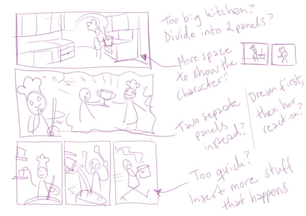
At this stage it often becomes clear if you have missed some necessary details in the script, or if something only works in text and not visually. The script is not law, so feel free to go back and forth between sketching and writing to adjust what does not feel right. I like to scribble a lot in this phase and add comments on the side.
Usually I make the pages of the storyboard very small. If I have many pages to lay out, it gives me a good overview. Some people prefer to do their storyboards in the size of the finished comic. You might want to try it that way too, to see what works best for you.
2. Choosing the Right Kind of Panels
Once we know how our story goes, let us focus more on the look and feel we want it to have. Comics come in a wide range of formats, from newspaper comic strips and graphic novels to online comics scrolling almost endlessly. For my comic, I will be going for something a bit longer than a strip comic, but it will probably not need more than a couple of pages. A vertical or horizontal page are equally fine choices, but I will be using vertical.
Step 1
All over the world there are different styles of comics, not only in the drawings but in the layouts as well. The empty spaces between the comic panels are commonly referred to as 'gutters', which are often used in Western comics. Having one or several panels without gutters creates a different type of layout, which is often used in Japanese comics (manga).
The shape of the comic panels can vary a lot as well. It does not have to be the usual squares and rectangles. Having a circular, star shaped, or wavy panel can give a different feeling or give information to the reader. For example, the wavy panel is often used as a way of saying that what is happening within the panel is a fantasy, dream or memory, and not part of the present narrative.

Also the size of the panel can change the atmosphere of the comic. Having a very long panel with lots of space can make the pace feel slow. Having several small panels next to each other can make it feel as if things are happening fast.
Step 2
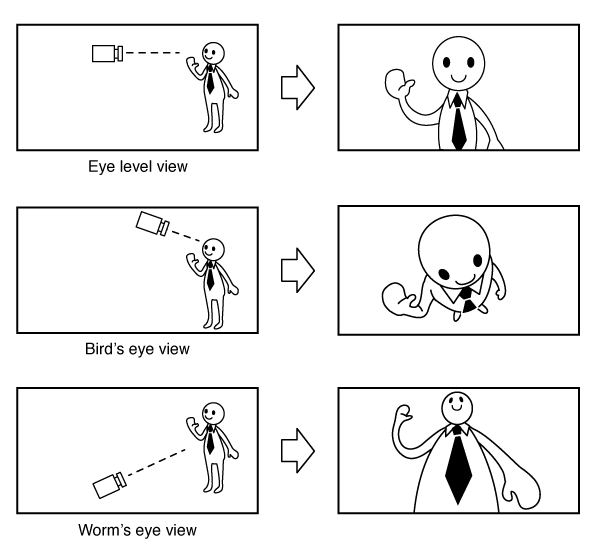
When drawing the content within the frame, think of it as if you are a camera operator. Depending on which angle the camera is filming from, whatever is in the frame will look a certain way. Keeping the camera at a low angle is called worm's eye view and is often used to make characters seem powerful. An angle from above is called bird's eye view. Using it makes a character appear smaller and more vulnerable.
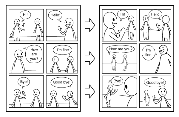
There is an expression called "talking heads" for comics where characters are talking a lot and the panels are just basically that, talking heads. For strip comics it is not unusual for the panels to look very similar, with just one or two characters talking.
When making longer narrative-focused comics it might be good to move the "camera" around a bit more. Close-ups, full body shots and using the bird's/worm's eye view can change things up a lot, even if it is just two characters talking to each other.
Step 3
No matter what type of comic you are making, clarity is key. The reader should not be confused about in which order the panels should be read or what is happening. While you do want the to vary the angles, you do not want to confuse the reader on which characters are talking and from where we are seeing.

A great tool here is the "180-degree rule". It is often taught in film theory, but can be applied to comics just as well. It is an imaginary line that the camera will not cross. That way the camera can move around from one side to the next without us losing track of which character is which. The left character will appear on the left side every time, even if the camera is in front of or behind them.

While this is called a rule, it does not mean that it can never be broken. See it more as a tool to help you and not something you always have to follow.
3. Using Clipping Masks for Comic Panels
I have made a sketch for a comic page, and it is time to start with the layout properly. Even after planning out how you want to layout your comic, when drawing it for real you still might want to change things. For this, a good way to keep your workflow flexible is working with clipping masks. Here I will walk you through how clipping masks work in Adobe Illustrator, and how they can be used when creating comics.
Step 1
I start by opening a new document in Illustrator, with the A4 size preset. From the File menu I choose Place to import my sketch onto the Artboard. You might notice the large X shape over the image. This is to show that the image is linked but not embedded in the document. That means that if you should move the image source file, Illustrator cannot load the image.

Step 2
Just below the top menu you can find some option buttons for your imported image. If you click the Embed button, Illustrator will make the image a part of the document. This increases the document size a bit, but for long projects it comes in handy.

Step 3
Using the Rectangle Tool I place the page and panels out as placeholders. I choose no fill and a blue colored stroke. The blue is to separate the panels more easily when I start inking.

Step 4
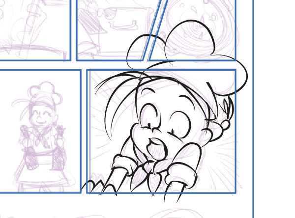
Since I have the sketch to follow, I can just dive into inking how I feel like. This panel with the shocked expression seems fun so I go at it first. Using the Brush Tool, I import my ink brush from my previous tutorial, and start inking with long, lively strokes. Since we are going to use clipping masks, it does not matter if the lines are overlapping the borders. This makes the inking easier and more fun, since it means less constraints.
Step 5
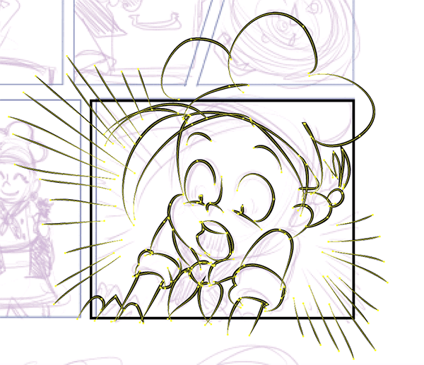
Once the inking is done I select all the panel content vector paths, not including the frame border. Then I group them by pressing Command-G. I deselect the group, either by pressing Command-Shift-A or by left-clicking somewhere outside the selection.
The frame border will be our clipping mask, but we also want the frame to show as a black stroke. Since clipping masks are transparent, the black stroke of this frame will not be visible. Therefore we will select the frame by itself and make a copy by pressing Command-C.
Step 6
From here we add the panel content group to the selection. With everything selected, we right-click and choose Make Clipping Mask from the dropdown menu.

Step 7
From here we paste the frame border we made a copy of earlier, by pressing Command-F. This pastes the frame border on top of everything else and we have a finished panel.

Step 8
What is really neat is how you can modify the comic panel quite easily by using clipping masks like this. With the Direct Selection Tool, drag-select one of the anchor points of the mask.

Drag-selecting ensures that you are selecting both the transparent clipping mask and the black frame border at the same time. Now you can drag the anchor points to change the appearance of the frame. The hidden parts of the inked panel will show accordingly.
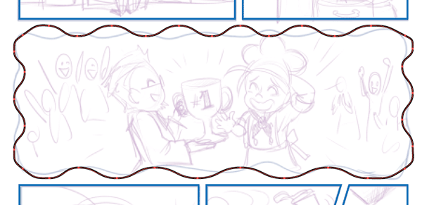
Step 9
Now we try another panel. This one has a wavy border to show that it is a fantasy taking place. With Illustrator there is an easy way to achieve this effect. Start by having a rectangle shape at first. Add some more anchor points to every side. I added five on each long side and two on each short side.

Step 10
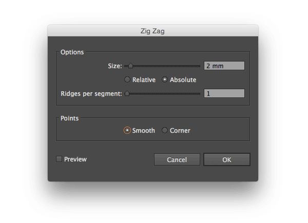
While having the rectangle selected, go to Effect > Distort & Transform > Zig Zag.

From here you will reach the options menu. You can play around with the settings for different results. These are the settings I chose for my panel.
And this is the result. Notice how the vector path still has the rectangle shape. If you want to manipulate the shape of the panel more, it can be useful to only have a few anchor points to work with.

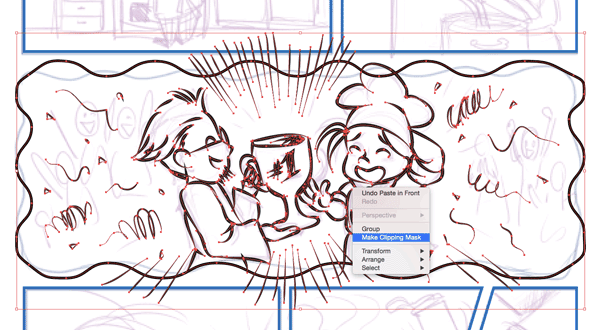
Step 11
To use the wavy shape as a clipping mask, we need to turn the effect we created into a vector path. We do this by choosing Object from the top menu, and then going to Expand Appearance while having the panel still selected.

Now we have a wavy vector path we can use as a clipping mask.
Step 12
Time for inking again! Just like last time, feel free to ink without thinking about staying within the border. When you are done, group everything inside the panel together with Command-G, or right-click and choose Group from the dropdown menu.
Make a copy of the frame border to paste on top later. Then select both the content group and the frame border. To make a clipping mask, right-click and choose Make Clipping Mask. You can also press Command-7 for the same result.
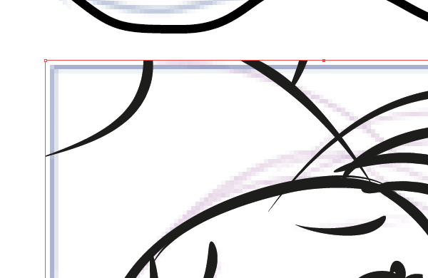
Step 13
Top the panel off by pasting the copied frame border on top of everything with Command-F. You will notice that once you have made the clipping mask, the whole panel becomes like a new object. The individual strokes of the drawing cannot be selected unless you use the Direct Selection Tool.

Double-clicking the object using the clipping mask will take you inside it. Here you have full access to modify the artwork again. For example, I thought that the lines were a bit too thick in this panel, so I just double-clicked the clipping mask, selected the artwork group and lowered the stroke weight a bit from the Stroke panel.

Step 14
This panel uses a square clipping mask, but I changed my mind and want it to be an isolated panel. I want to have the character overlap the above fantasy panel a bit. I think this will make it even clearer that she is daydreaming.

Select the clipping mask with the Direct Selection Tool. Start adding points with the Pen Tool where you want to modify the clipping mask.
This way you can keep shaping the mask however you like. Since we are just working with lines and not white color, this panel and the one above interfere. To make our character overlap the panel above, we need to change that panel's clipping mask a bit as well.

You can modify the clipping mask by using the Direct Selection Tool directly, as in the previous example. Another way is to double-click the object, which will take you to an isolated Clip Group. Here you can modify the mask without worrying about affecting artwork from other panels.

In Conclusion
In this tutorial we have gone over some common techniques used in comics, such as the 180-degree rule and the bird's and worm's eye view, to make it look more interesting.
Using various kinds of panels, we can give different feelings to our comic, and working in Illustrator gives us the opportunity to use clipping masks which we can modify to our liking.
While there are no set rules in comics, it can be nice to have a couple to lean on in the beginning. As you continue to make comics, you will see that a lot is trial and error, but also that some techniques are common for a reason.


