
Before starting, we need a word, or a sentence to work on. For this purpose I chose the expression: عيد سعيد (Eid Sa'eed).

Its exact translation is "Happy Holiday", and it can be used in the same way, as a non-denominational seasonal greeting.
For a bit of cultural context: the word eid used on its own does not actually refer to a specific holiday but to any holiday of any confession, as well as birthdays, anniversaries and so on. Eid el-Fitr is the celebration that concludes the month of Ramadan; Eid el-Milâd is Christmas; eid sanawi is an anniversary.
It is, then, a nice multipurpose subject to work with, that could result in a greeting card design, for instance. But I have no idea, ahead of writing this lesson, what I will end up with. Let us then go together through the creative process that follows.
1. Looking for the Composition
The first thing I do with my chosen sentence is write it down to see what I'm working with. How many letters do I have? What rough shapes are they? Are there any repetitions? Does anything stand out?
What is immediately clear is that the two words are made up of the same letters, save the added س in سعيد. There is strong pattern potential. I make rough sketches, below, aligning the letters that are in common (upper left was a quick sketch to see the latent shapes in the words, though that didn't lead anywhere.) The ي and د are exactly the same, but ع has two different forms (initial and medial), although I may be able to constrain it to initial in both words. I could play on their sameness, with س as the wild card, the variation.

A repetitive pattern serves to amplify such an idea, so I look into that. Why don't I have an even design of the word عيد, with the س interpolated in a different style or colour to read سعيد where appropriate?

I like this idea a lot. It would look great not just as a card or a larger print, but also as wrapping paper, for instance. There is much I could do with it. So I'm going to go ahead with it. This was easy—it can take much sketching and mulling to get hold of a good composition. The next step is to turn this idea into a fully detailed design.
2. Working Out the Style
I need to decide on the style I want to write عيد in, as a standalone word.
I briefly look into making it perfectly symmetrical, as it's just within the realm of possibility with the letters I have here, but I decide that it would be too constrained. ع and ح can be made symmetrical quite naturally, this being their nature (see Anatomy of the Letterforms), but د really is not structured the same way.
Also, while I am fond of symmetry, it is visually more interesting to work with "symmetry BUT". By which I mean a design that is only just asymmetrical. That gives it a twist, a visual tension that adds interest, like spicing up a dish. My sketching then takes this direction.

At this point I pick up some of my calligraphic references for inspiration. I flip through books looking for an interestingly-shaped ع or د that could give me a starting point. Instead I stumble upon a really interesting س :

What strikes me in this letter is the long, flowing tail, something I have not encountered before. I can see my interpolated س underlining the word with this long, elegant tail. So it's settled. I want to use it as a starting point, and design the word عيد around it. It's the reverse of what I had thought I would do, but that's not unusual. A creative process is never linear—you have to be open to sudden changes of direction, backtracking, or different ideas that come out of nowhere along the way.
The short sample text I have does not contain all my letters, only د . But that's more than enough as I'm not looking to copying the letters, only to get a feel for the overall style, and from there construct the word from the inside.

I sketch the letters I see in the sample, and repeat them looking for a construction method. In the bottom right sketch, I have worked out a grid for drawing the letters, based on classical angles: 45º and 60º.

How did I work out the angles, you might ask? I am using my sketchbook's square grid, which in this case is subtle and made up of the dots you can see on the page. The trick is a handy one: on a square grid (for instance on graph paper), you can draw a 45º angle by joining the corners of the squares, and a 60º angle by joining the corners of every other square.

It's now time to get down to the actual drawing.
3. Drawing the Design
The process from here on could be done entirely digitally, using Adobe Illustrator or similar, and then printed or used on screen. However, that is uninteresting. I'm going to use some old techniques to create this pattern entirely by hand.
Step 1
To begin with, since the style I chose involves very precise angles and alignments, I am drawing it on graph paper, which is a much more detailed version of my sketchbook's dotted grid.

This is my construction sketch, transferred to the graph paper for more precise construction. Below is a close-up; you can see that I decided to have 4 squares as my height, and a distance of 3 squares between peaks, in addition to the angles I've already defined. What we have here is that all the lines facing the source (i.e the start of the line of writing) are at a 60º angle, and all those facing the end are at a steeper angle of 45º, and that in itself has already created consistency throughout.

Step 2
I then define the thickness of the line as shown below, which is measured horizontally. Diagonal measurements are complicated and it's too easy to get mixed up, so we always measure on the horizontal or vertical, by projecting lines.
Here the line thickness, measured this way, is 1.5 squares, which is also the width of the space between letters. I did this on the central letter, the ي first as it is a tooth and therefore our starting reference. Then I applied this to the other two letters, as even though their shape is different, they are (in this style) articulated on a basic stem that is identical to a tooth.

Step 3
Now for the detailing of the د. This letter is here triangular in shape, but it has an inner space separating the stem from a triangular foot. I need to define the space, and let the foot result from that.
As this is an innerspace (see Proportions and Spacing), I want it smaller than theletterspace, marked 1 below. Let's halve it and make it 3/4 of a square (this is not hard to find on the graph paper). Having added the horizontal line that defines the thickness of the baseline, I mark this distance at the base of the د innerspace (2), then at its mouth (3).

Step 4
I then join these points, but I stop the line where it intersects the side of the letter. This is the completed د. As you can see at lower left where there are light pencil marks, I'm toying with the idea of chopping off this excessively sharp foot. If I do, the cut line will still follow the overall logic I'm working with, and be at a 60º angle.

Step 5
For the ع, I'm allowing a slight departure from the system, because this letter is so shaped that it would look far too constrained if I adhered to it rigidly. Line 1 does carry on the pattern of 45º lines, but line 2 simply connects the two points that need connecting. Note that this part of the letter is above the overall "bâ-height", so it does advertise itself as being "above the norm".
From the tip of this upper part I then drop an "orthodox" line to find the end of this letter's baseline, and the ع is completed.

Here's how the word عيد looks now.

Step 6
All that remains is the س. Here is a detail from my sketches again, showing how it is inscribed in a triangle.

Step 7
The point of the triangle is not the beginning of the letter, so I should not use that to determine spacing. Instead, repeating the measurement for the letterspace, I draw the shorter side of the س.

Step 8
Now I draw a 45º line through the point where the previous line cuts the top of the baseline. Where that reaches the 4-square height, that is the peak of the letter, and from there I drop one last line to define the longer side of the س.

Step 9
All that's left now is to create the innerspaces, through a process similar to what we did with د, except I make them even smaller, a quarter of the original letterspace. This is necessary because here د and س occupy the exact same space, but س has an extra space and extra tooth.

Step 10
Finally, I draw in the tail freehand. Notice that even as I chopped off the pointy end of the د I mirrored this with a similar cut in the س.

Step 11
Now to ink this so I can see better.

Step 12
I still have the dots to place. I am really free with their size and placement, so I try some possibilities in pencil before finalizing. In order to place them in a good alignment, I extend a line from the side of the ي as a guide.

Drawing is done! I can now move on to the making.
4. Executing the Final Piece
Step 1
I cut out the word and glue it to card or rigid paper. It has to be strong but still easy to cut. (A glue stick is ideal for this, but I don't have one lying around.)

Step 2
Using an art knife with a fresh blade, and a metal cutting edge, I cut out the word. It is easier to cut the dots (and curves in general) if you turn the paper as you cut, rather than try to turn the knife much.

This is now a stencil I can use to draw the motif on a piece of watercolour paper, and repeat it as required. Remember to only draw the س every other time!

Step 3
All that is left now is the colouring. I paint عيد in violet, loosely, as the design is quite sharp and precise and I'd like to soften that a little.

Step 4
The interpolated س follows in eye-catching red.

Step 5
For the dots, I use gold gouache.

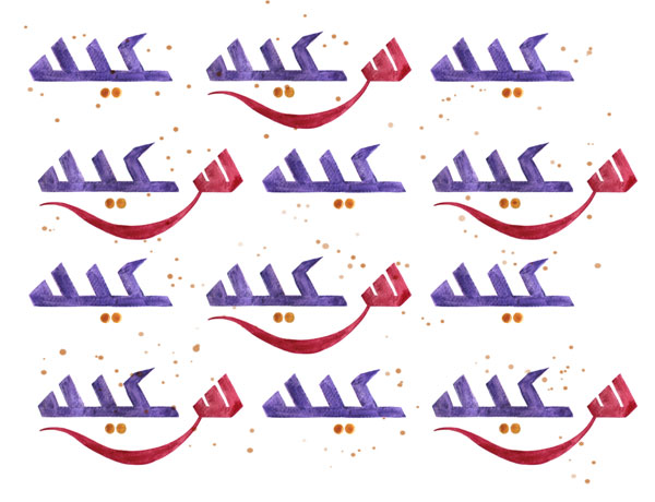
Here's how the composition looks now...

Step 6
I toy with the idea of filling the empty space with a subtle arabesque pattern, as seen in some historical patterns (see Introduction). But I feel it would take away from the fresh simplicity of this pattern, and in any case my taste is more contemporary, so I go for a contemporary equivalent: spatters!

Here then is my final pattern. It called on both old and new knowledge, with a good dose of thinking outside the box.
Exercise
This course has hopefully provided you with the tools to start your own exploration of Arabic calligraphy as a creative discipline. It's now your turn to create something of your own, but remember this is only the beginning. This is a vast and deep field, where there are no shortcuts. Don't feel self-conscious about your early designs, because the only way to get better is to make a lot of mistakes. The more you give to it, the more you get back!

.webp)


