
Today we’ll create a drawing using a relatively rare technique: applying white ink to black paper.
This way of using art supplies can be a real challenge for an artist, and this challenge conceals a great range of possibilities. For example, the white color can be used to create an inversion look, so that what would usually be black turns white and vice versa. Or you can use the white ink to highlight the areas of your drawing that are supposed to be spotlit in real life.
I've decided to depict a perch because it’s a common, well-known fish. It is also very beautiful and balanced in its proportions, so it won’t be too difficult to draw even if you don’t have a vast experience with fish. If you feel that you need more information about fish anatomy, I’d recommend a great tutorial on this subject: How to Draw Animals: Fish and Sharks.
What You Will Need
- Black paper (it may be smooth or textured, as you prefer)
- A pencil (HB or B type)
- An eraser
- White liquid ink
- A thin nib on a nib-holder
- Small container for the ink (if the neck of your ink bottle is narrow and doesn't allow you to dip the nib directly into it)
- A paper towel or napkin for wiping the ink from your nib
- A brush (mine is a thin, natural squirrel brush)
If you have a set of thin white color ink liners, you can use them instead of the ink and nibs. However, I don't recommend using an ordinary gel pen because the strokes it creates are too thick for the desirable level of detail, at least in the case of relatively small A4 paper.

1. Understand the Shape
Step 1
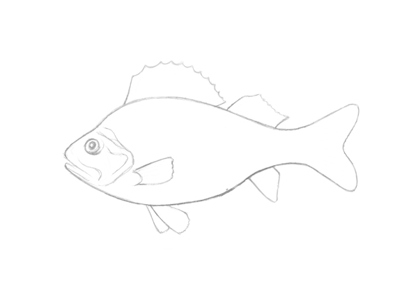
I will use a pencil sketch drawn from a real live perch instead of a photo as a reference material, because my main goal for this artwork is to achieve a stylized but expressive look, based on the observations and impressions of this beautiful scaly model. Also, I'd like the drawing to have a distinct resemblance to a real fish. It takes some mental practice, so I need to consider my future steps beforehand with the pencil sketch.
Let’s have a look at the sketch. This fish has an elongated but compact body, narrowing to the end, where the tail fin is. The head with the gill cover accounts for approximately a quarter of the length of the fish. The gill cover is in a way the transition from the head to the body and consists of several relief folds.
Step 2
If we observe the contour of the perch’s spine (that means, the upper part of body, because this word may also refer to the backbone), we can see that it creates a small deepening on the border between the end of the skull and the beginning of the body, and also it changes direction from upwards to downwards after reaching its peak—the middle spikes of the front dorsal fin.
The lines are smooth and soft, except the spikes on the two dorsal fins, front and back. There are some other types of fins, such as the pectoral fin (on the fish’s side); ventral (under the body in the front), anal (under the body, before the tail) and the tail fin. These fins also have spikes, but they are not so thick, and they tend to fork near the end of the fin.

Step 3
After I’ve got the main impression of the shape, I proceed to the value observation.
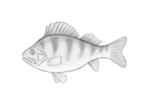
The darkest area of the fish body is the upper part with seven vertical stripes. Each stripe is distinct, but its contours tend to be a little diffuse and lighter than its core. The middle stripes are the thickest and the longest.
The belly of the perch is very light, almost white, and the transition between the shady and the light areas is quite smooth. And it’s necessary to leave a light reflex line that is parallel to the dark spine shape—it will create a more real, three-dimensional look.
The value information is very important for us, because we’ll be using the white ink for creating dark and shady areas. That’s the point of this artistic inversion.
2. Draw With White Ink
Step 1
With the pencil I outline the main contours of the fish, observing my sketch and keeping in mind the proportions. I am also careful to compose this artwork in the right way: there must be slightly more space before the fish than behind it. This helps to make the fish more dynamic and lively.
As you can see, the outline is almost imperceptible, because of the low contrast of grey pencil strokes on the black paper. However, it works in our favor: in the end, all these lines will be invisible under the ink, and we can easily erase the remaining excess strokes.
I prefer to avoid small details in this step because it leaves enough space for improvising, training the artistic vision and achieving a vivid, expressive line in the ink part. When an artist just traces the pencil lines with ink mechanically, it's evident, and it's not the look I'm aspiring to.

Step 2
If you’re not familiar with this technique, you'll probably ask yourself how this white ink looks on black paper. Trying your materials beforehand is a very useful process for preparing the artistic mindset.
Take a piece of black paper and draw something, for example, parallel lines. Here are my samples.
The first square contains dots; I varied the pressure and tilt of the nib, so some dots came out smaller than others. As you can see, many layers of dots can create an interesting effect.
The second square is for simple diagonal hatches. You can try different kinds of pressure on the nib (from light to really hard) and observe which one you like most. Maybe you’ll even find some interesting effects that will become a part of your style.
In general, all the processes of the next steps will be based on these two types of drawing, simple parallel lines and dots.

Step 3
After the pencil outline is created, I dip the nib into ink and draw the contour of the fish with medium pressure, just above the pencil strokes. To achieve the lively artistic effect, I break the line in several places. I’ll join it and make it thicker in the next steps, but now I’d like to accomplish the drawing gradually.

Step 4
I add dots to the spine, blending them with the contour line, and also mark the stripes. The stripes are less filled with the dotwork because it’s necessary to leave the spine border as the darkest area of the figure.

Step 5
I add thin hatches to the fins, because it helps to separate the spikes visually. I also define the eye and add thin parallel strokes to the head to emphasize the volume.

Step 6
I add a steady and even dotwork to the head and the eye.

Step 7
I continue with the dotwork, spreading it to the upper part of body. The stripes get an additional layer of dots. And don’t forget to leave the reflex line untouched!

Step 8
I mark the belly with short strokes (and these strokes don't intersect the contour line). The bottom part of the fish is light, as we remember, but it also has subtle shadows to show its dimensions.

Step 9
I add thin hatches to the head (rounded strokes near the eye and the mouth), and mark the gill cover. Also it’s time to start drawing the scales. Scales are small, round, close-fitting elements. The perch has a small area of scales on its 'cheeks', so I add some thin, rounded lines to trace them. The gill cover doesn't have any scales.

Step 10
I continue drawing the scales on the body. The closer my strokes are to the belly, the more faltering and thin I draw my lines, because the belly is light and delicate. Creating scales is the most time-consuming part of the work here, but it’s also very meditative.

Step 11
I draw the rest of the scales. The ones closer to the tail fin are smaller than those on the main body.

Step 12
I dip my squirrel brush into the ink, dab it with the paper napkin to remove excess ink, and draw a smooth contour of the figure. I also emphasize the most prominent parts of the drawing, such as the pectoral fin, spikes and gill cover.

Step 13
It's time to set aside the brush and take the nib again. I place an additional layer of dots and small hatches onto the spine and stripes area. They are supposed to look more marked out.

Step 14
I add thin strokes to all the fins just to mark the spikes on all the fins and doubling points on the tail fin.

Step 15
I feel that the highlight I’ve left on the fish's back looks too unnatural, so I add a layer of dots and thin strokes to blend it with the dark areas.

Step 16
I come back to the fins and add dots and tiny hatches in places between the spikes to create fullness and volume.

Step 17
I add lengthwise hatches to the upper part of the head and the spine, so it looks more three-dimensional because of this cross-hatching.

Step 18
I fill the belly area of the fish with small dots. They seem to be sparse and almost invisible in comparison with the whiteness of the upper part, but such details change the general look of the drawing greatly.

Step 19
I mark the shadow that casts the side (pectoral) fin and expand the dotwork to the middle part of the fish body.

Step 20
I add one more layer of dots to the spine and stripes, and also make the tail fin more prominent with the additional touch of dotwork.

Step 21
I emphasize the thin line of the dotwork near the belly’s contour, so the fish shape seems to have more volume because of the untouched black line between the thick contour of the fish and the dotwork area.

Step 22
I make the bottom parts of the dorsal fins more white with the delicate dotwork, so the bases of the fins are now blending into the spine contour.

Step 23
I evaluate my drawing. It seems almost complete, but there are some details that can make it look better. For example, I add several more thin strokes to the head and draw a thin line that is parallel to the upper border of the side fin, to distinguish it from the body.

Step 24
The area of the bottom part of the head and the small transition from the head to the body seems a little empty, so I add some small dots to the scales. Now I feel that the artwork is complete. If there are some visible pencil strokes that are coming out of the silhouette, they can be removed with the eraser.

Your Drawing Is Complete
Now you have a unique hand-drawn fish, created using an unusual, expressive technique. This artwork can become a great decoration for your workspace or even a splendid gift for your friend.


