In this tutorial I will take you through the steps to create an animated bouncing ball that you will be proud of!
We are going to create a ball that bounces up and down. Our bouncing ball will be a cycle, which means is that the first frame of our animation is also the last frame of our animation. We can repeat the same bit of animation over and over again, and it can play infinitely.
1. Draw the Ball Poses
In the case of our bouncing ball, the first frame will be pose 1, and the last frame we will call pose 2. When we complete our animation, it will loop when played back.
Step 1
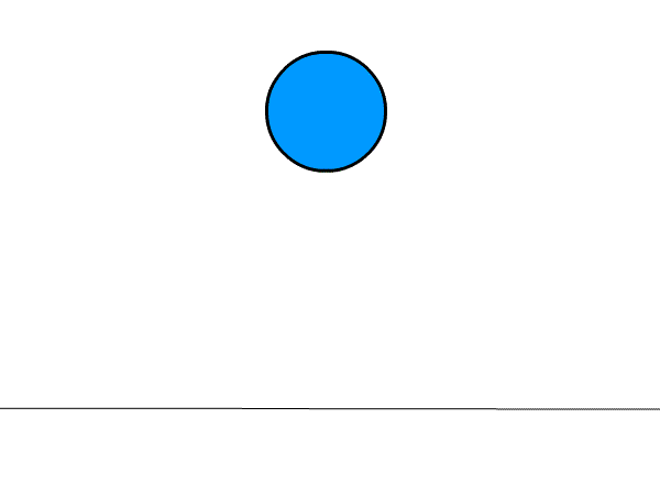
Start by drawing a floor line about an inch from the bottom of the page. This will ground our ball.
Step 2
Sketch in your ball—it doesn't have to be a perfect circle. I like to work sketchy and rough when I animate. Let's draw our ball about a centimeter from the top of the page. This is pose 1. The ball is above the floor, ready to fall and bounce!
Step 3
Now let's draw our ball in the second position. This is pose 2. The ball is on the floor ready to bounce back to pose 1! You can see the light image of the previous frame so you will get a sense of placement in relation to the previous frame.
Step 4
Let's go back and add an in-between between pose 1 and pose 2. In-betweens are the animation frames in-between our poses. In-betweens give the illusion that one pose smoothly transitions into the next pose.
The in-between that we are drawing in this step is for the action between pose 1 and pose 2. When I animate, I like to favor the frame that I am drawing toward. So the animation drawing of our ball is not exactly in the middle, but rather a little closer to pose 2 than pose 1.
Step 5
Next, add an in-between between pose 2 and pose 1 to give the appearance that the ball is bouncing back up to its original pose!
Let's take a look at our animation so far. It looks good, but something is missing. It feels flat.
Step 6
To give our bouncy ball a bit of elasticity, we can add a slightly squashed ball frame right after our pose 2 frame. I left in a light image of pose 2 so you can see the squashed frame in relation to pose 2. Make sure you keep the mass of the ball the same—as the ball squashes down slightly it gets a little fatter on the sides, thus keeping the mass of the ball the same.
That's much better! Adding the squashed ball frame gives the ball more bounce.
Step 7
Our ball is looking good, but it's still missing something. Let's add a stretched ball after our squashed ball. In the slide you can see how the stretched ball is positioned in relation to our last drawing. Notice how the mass is kept the same by stretching our ball and making it more elongated, and the ball is thinner on the sides.
Now our ball is looking bouncy and more like an elastic rubber ball. Very good!
Here's a look at our progress. I have labeled pose 1 and pose 2 and highlighted the in-betweens in green.
Step 8
Let's add another in-between to smooth out the action as the ball bounces back up to pose 1. The more in-betweens an animation has, the slower and smoother the action.
Step 9
As the ball nears the top position, add one more in-between to slow and ease out the action. This will make the motion more realistic. As a bouncing ball bounces up and reaches its highest point, it will slow slightly as it fights gravity before the ball starts its fall back to the ground.
I have labeled pose 1 and pose 2 and highlighted the in-betweens in green and our last two in-betweens in blue.
And now let's look at our animation. That is a great-looking bouncing ball! I think we are just about done! But first…
2. Clean Up and Color Our Ball Animation
Step 1
It's time to sweeten our animation and clean it up! I like to work rough when I animate. Now that we are happy with how our animation is looking, let's ink over the top of our rough line and give it a nice, clean black outline.
Nice! Look at all of our frames together. Now that's a nice-looking bunch of cleaned-up frames!
Here's our animation. That looks great! Good job! Only one thing left to do...
Step 2
Let's color our ball! Color all of your ball images. Blue is my favorite color, but you can make your ball any color you want. Go for it!
Very good! Keep going until all the ball frames are colored.
Good job!! Nice Animating!
That's a great bouncing ball! This looks awesome! In just a short time you have created an animated bouncing ball that has weight and mass. A bouncy ball that you can be proud of. Keep animating—the sky's the limit!
Millions go purple on Spirit Day in a stand against bullying and to show their support for lesbian, gay, bisexual and transgender (LGBT) youth.
Observed annually since 2010, individuals, schools, organizations, corporations, and public figures wear purple, which symbolizes 'spirit' on the rainbow flag.
In this tutorial we're going to create a cute purple mascot for Spirit Day. In most of my tutorials you can see me using Blend Modes to create shading. This isn't the most natural way, though, so this time I've prepared something for fans of a more traditional approach. I'll also show you how to shade colorful fur without having to switch colors all the time.
Tutorial Assets
In order to complete this tutorial, you may find it easier to use the following recommended resource:
Create a New File. Use your favorite sketching brush (here: Sketch Detail from my set) to draw the general shape of your creature. The smaller it is, the easier it will be for you to keep it simple.
Feel free to sketch a lot of these shapes and then choose the most promising one
Step 2
Add other general details, keeping the form in mind. When you're done, copy the sketch.
Step 3
Create a New File with 1500 x 1500 resolution.
Step 4
Paste the sketch into the file and resize it (Control-T) to fill the canvas. Lower theOpacity to make the sketch barely visible.
Step 5
Create a New Layer. Sketch the details of the creature using the layer below as a guide.
Step 6
Delete the first sketch, then lower the Opacity of the other. Create a New Layer and add all the details. This is supposed to be line art, although it doesn't need to be clean.
2. Plan the Color Scheme
The most important thing about painting with colors (as opposed to painting with Blend Modes) is planning the color scheme. You need to find out which colors your picture will be built of before you even start painting it.
Step 1
Create a New File. Pick the brightest, most saturated version of the main color of your creature (1). Then make three versions of it, each a bit darker and less saturated. These will be the main colors of your creature, created with a neutral lighting.
You don't need to use exactly the same shades
Step 2
Now make the Hue of your main color warmer (slide it towards warm colors) and less saturated. Then make the shade you've created even less saturated. These will be the colors coming from the main light source.
To create the reflected light color, make the main Hue colder and also less saturated. It should be a bit brighter than the darkest shade in the scheme.
Step 3
We need to prepare a separate scheme for every bigger color accent in the picture. The scarf will be rainbow-colored, so first we need to prepare all the colors of the rainbow:
Step 4
Copy the set twice.
Step 5
Select two sets.
Step 6
Press Control-U to change the Lightness of the colors, all at once.
Step 7
Now repeat the step for the last set to make it even darker.
Step 8
Copy both schemes and put them in the main file. Lock the layer to keep it from being edited.
3. Paint the Base Colors
Before we even consider the light source, we should color the creature according to a neutral lighting. This way we'll get a soft, non-dramatic effect.
Step 1
Lower the Opacity of the line art and lock the layer. Create a New Layer. Use a hard brush (like my Ink) to draw the basic outline of the creature. Use the darkest shade of the scheme.
Use the Magic Wand Tool (W) to select the area outside of the creature, and then invert the selection (Control-Shift-I). Create a New Layer and fill it with color. Now you can remove the outline.
Step 2
Create a New Layer. Right click it and select Create Clipping Mask. Select the second darkest shade and paint all over the creature, avoiding the edges. Use a brush like my Sketch Detail (hard, but with Transfer on).
Step 3
Switch to a brighter shade and do the same as before, this time avoiding the edges of the previous shade.
Step 4
Create a New Layer. Use the Eyedropper Tool (I) to pick a color and draw the hairs in its area. Use the same brush as before, but keep changing its size to give variety to the fur.
Step 5
Draw hairs at the borders of shades to create a furry kind of blending.
Don't be afraid to come into bright areas with a slightly darker shade!
When you're done, you should be able to see the fur without the line art.
Step 6
Create a New Layer. Use a hard brush (like Ink) to draw the scarf, eyes, and nose.
Step 7
Create a New Layer and make it a Clipping Mask. Paint the colors of rainbow on the scarf, using the darkest part of the scheme.
Step 8
Switch to the middle part of the scheme and paint a texture of the scarf with it.
4. Set the Lighting
Step 1
Use the base color of the scheme to paint over directly illuminated areas. Feel free to use relatively big patches of color, with single hairs at the borders.
Step 2
Switch to the darker of the warm shades and draw big clumps of fur in the illuminated area.
Step 3
To keep the balance, let's go back to the scarf. Use the brightest set to illuminate it.
Step 4
Return to the brightest shade of the fur scheme and draw very subtle, single hairs in the brightest area.
Step 5
Now use the cold shade to illuminate the area on the opposite side of the light source.
5. Paint the Details: Nose and Eyes
Step 1
As we're coming to the end, we need to work on the details to make them fit the rest. Paint the nose, making it shiny with a bluish shade.
Step 2
Use a soft brush (like my Soft) to draw a glow at the lower right side of the eyes.
Step 3
Create a New Layer and paint dark blue smudges on both eyes.
Step 4
Add smaller, white smudges in the middle.
Step 5
Use the Eraser Tool (E) to paint a reflection. Don't make it too detailed!
Step 6
Create a New Layer and paint a reflection of the fur at the bottom right of the eyes.
Step 7
Erase the upper side with a soft brush. You can use a Layer Mask to fully control the process.
Step 8
You can draw the eyelid's edges around the eyes.
Step 9
It's another opportunity for a shine!
6. Enhance the Lighting
Step 1
Create a New Layer below all the others. Fill it with 50% bright gray. Then create another layer and paint a white glow with a soft brush. This kind of background utilizes more shades than a classic white one, so it's easier to get proper shading with it.
Step 2
Merge (Control-E) all the layers of the creature except the scarf, eyes, and nose. Make sure that these elements can stand on their own.
Step 3
Go into Quick Mask Mode (Q). Grab a soft brush and paint the areas of the scarf that seem to be in shadow. Click the scarf layer.
Step 4
Go out of Quick Mask Mode (Q) and invert the selection (Control-Shift-I). PressControl-U and Colorize the shadow, making the selected area of the scarf darker and more purple.
You can use the same technique to brighten the illuminated part of the scarf.
Step 5
Go to the merged layer of the creature. Use a Quick Mask to select the areas you'd like to brighten.
If you want, you can use an Adjustment Layer to make it editable.
Step 6
The creature has uniform color, but what if we wanted to make some parts white? There's no need to paint the colors anew. Just select the areas you want to have white:
And lower their saturation, giving them also a warm shade.
Step 7
Then just brighten the area, adding another Adjustment Layer. You can use the same selection by Control-clicking the mask next to the previous adjustment layer.
Lower contrast of white fur is perfectly normal—don't try to make its shadows black!
Step 8
Let's add markings on the fur. Draw them with a Quick Mask.
Then use a chosen Adjustment Layer to give them the proper color.
Use a Layer Mask next to the Adjustment Layer to blend the markings with the fur.
7. Add the Final Touches
Step 1
Turn off the white glow to see the edges better. Use white to brighten the white fur at the edges and to make it shiny.
Step 2
You can use an even brighter version of the brightest shade to stress the edges of the purple fur.
The same applies to the cold shade.
Step 3
Prepare a background that will make the creature look perfect. If you want to create a shadow like this, use Filter > Blur > Motion Blur on a sketchy shadow.
Step 4
Now, the last trick. Select the area around the creature.
Step 5
Go to Filter > Blur > Gaussian Blur. Use the Radius that looks the best to you.
We're Done Here!
It was a lot of hard work, but I hope you enjoyed this tutorial. If you paint your own creature with this technique, please share it here—I'd love to see it!
Medical Disclaimer
The information on this site is not intended or implied to be a substitute for professional medical advice, diagnosis or treatment. All content, including text, graphics, images and information, contained on or available through this web site is for general information purposes only. Krobknea makes no representation and assumes no responsibility for the accuracy of information contained on or available through this web site, and such information is subject to change without notice. You are encouraged to confirm any information obtained from or through this web site with other sources, and review all information regarding any medical condition or treatment with your physician. NEVER DISREGARD PROFESSIONAL MEDICAL ADVICE OR DELAY SEEKING MEDICAL TREATMENT BECAUSE OF SOMETHING YOU HAVE READ ON OR ACCESSED THROUGH THIS WEB SITE.


.webp)


