Hand Lettering: Scripts, Swirls, & Flourishes


Final product image
What You'll Be Creating
Alright guys, this tutorial is probably my personal favorite because of my love for script lettering and its ability to communicate a wide variety of messages. In this tutorial you’re going to learn the basics of informal (also known as casual) and formal script lettering.  By the end, you will have a grasp of stroke weights, contrast, kerning, flourishing, speed, angle, and other techniques that are used to develop script lettering.
Let’s tackle the script lettering first, and then move forward into flourishing. We'll cover the basics to begin, and then we’ll add on the embellishments and other bells and whistles so that your typography stands out from the rest and appears more “custom”. After all, that is what “lettering” is all about: custom and unique hand-drawn typography! 
Before we actually begin this tutorial, I want to provide you all with some much-needed information that will help your overall understanding of the below methods.
I highly recommend you look into my previous two classes before beginning this one, since this material is for an intermediate level letterer. A good knowledge of typography sure is useful! Those classes can be found here: Hand Lettering: Letterforms at Their Core and Understanding Types of Type.
So, what exactly defines "script lettering"? Script, cursive, calligraphy and other terms are all used interchangeably. Script essentially refers to letterforms that are joined together by a single movement of the hand. But, in this case, since we're drawing, it will be the buildup of pencil strokes. It will consist of many, many strokes that will be made to develop and refine the letterforms... rather than completing the letterforms in one movement as you would with calligraphy.
Now, some of you may be wondering, what's the difference between formal and informal script lettering? Formal script is connected back to the good old days of penmanship when it was actually a thing, beginning around the 16th century and onwards. Sadly, penmanship is a dying art due to technology. Public schools (here in the US) don't even require cursive as part of the curriculum any longer!
Anyway, back on topic, scripts such as Roundhand, Spencerian and Copperplate are all considered formal script because of the construction and methods to form the letters. All of them were written with a pointed nib and ink. These letterforms had a specific slope, angle (around 50+ degrees—it varies between penmen), speed, etc. If you're wondering where you can see such wonderful penmanship, The Declaration of Independence was written in Copperplate script! The Coca-Cola logo even contains some characteristics of Spencerian script.
On the other hand, we have informal script, which is much more flexible. It has some roots within formal script, such as letterform construction, but it has the ability to be completely unique from its origin.The overall speed, composition, color, size, and other factors vary with informal script. Altering the width, angle, size, contrast and other characteristics of a letterform can create unique informal script letterforms.
If you have any questions regarding script during or following this tutorial, feel free to ask! I'm always willing to share more knowledge with you.
Now, let's get to it!
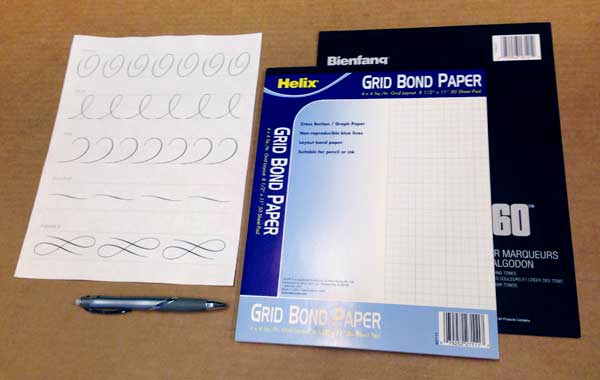
  1. Tracing paper
  2. Graph paper
  3. Pencil
  4. This PDF (for when we tackle flourishing)
We're going to refine our lettering a lot! So, lots and lots of tracing paper is necessary. Since we'll just be drawing letterforms, grab your favorite pencil, eraser, sharpener, etc. Anything you need to help you draw.
Download the attached PDF for your viewing pleasure. My advice is to print it out (you have the option to trace flourishes later on) to have it in front of you while completing this tutorial!
ScriptLettering-Tools
We're going to begin by understanding basic shapes and strokes that create formal script letterforms. For this whole portion of the tutorial, we're going to focus on drawing the word "design" (all lowercase). This word has a large combination of basic strokes that you can later utilize for formal lettering pieces.
Utilizing the strokes in this word and understanding their formation will provide you with the understanding to draw nearly any letter/word, since they're all comprised of the same basic strokes.
I provided some gifs so you can see a breakdown of each stroke that composes each letterform. Mastering these strokes is the key to success! Let's get started.
Prepare a piece of graph paper for this portion of the tutorial! Let's create our baseline, cap-height, and x-height for our letters to sit within. Start in the middle of the page and add a dotted line to form the x-height. Next, from the middle, count out three squares upwards and draw a line. Then, three squares downwards and draw a line. 
Boom! You've now got yourself your cap-height, x-height, and baseline.
ScriptLettering-Guide
From here, we need to establish an angle/slope for all of our letters to follow. Begin drawing angled lines (around a 45 degree) angle every one or two squares. Once you're done, it should look something like the below photo.
ScriptLettering-Slope-Guide
Alright! Now that you have your graph paper ready with your guides, place a blank piece of tracing paper over the guide you just created.
Let's now begin constructing the "d" of  the word design. The lowercase "d" contains two strokes. One is an oval shape (this forms the bowl of the "d") while the other is the stem. Begin forming the oval shape up to the x-height of our graph paper. Then, add the stem, which will extend to the cap-height. It should look something like the below photo.
ScriptLettering-Formal-d
Moving onward to the "e", you'll notice this letterform utilizes the same oval shape. Pay attention to the slope/angle of the "e" and match it to the angle of the "d" you just drew.
ScriptLettering-Formal-e
Next, let's tackle the "s". This letterform is probably the most difficult to master due to its complex structure. A little tip to watch for: the bowl of the "s" should appear round and not too flat. Additionally, the top of the "s" structure actually extends above the x-height. This is to balance the negative space and weight of the letterform compared to the others. It would appear rather small in scale if the top of the "s" just met with the x-height.
ScriptLettering-Formal-s
Alright, now that we've practiced that complex "s", let's draw a much easier letterform: the "i". This is essentially a half stem (similar to the stem of the "d" but about half the size). For a successful "i", pay attention to the distance of the tittle (the dot of the eye) and the stem. If it's too far, it'll have too much negative space around it. Watch the negative space created by the distance of the tittle and you'll be golden.
ScriptLettering-Formal-i
Continuing onward, this "g" shouldn't be too difficult. It's almost an upside-down "d" in terms of size and structure. One thing to pay attention to is the change in weight in the descender of the "g" as it extends upward towards the "n". This form should be a piece of cake after some practice. It contains yet another oval shape for the bowl of the "g" and a stem to form the descender.
ScriptLettering-Formal-g
This is it! The last letterform in our word, the "n". The structure of this letterform is comprised of two strokes. One short stem (connected to the g, in this case) and a second stem connected to the first.
ScriptLettering-Formal-n
And here is our completed word, "design", below. Again, these basic strokes you drew within this word can be used for all other letters/words. Just keep practicing and you'll begin to understand the structure even more! It's all about practice!
ScriptLettering-Formal-complete
Notice anything strange about the completed word? The kerning between the "g" and "n" appears a bit more open than the rest of the letterform pairings, right? With formal script, a slightly larger space is needed to accommodate the joining stroke. You want all your letterforms to connect gracefully with a coulĂ©e (French word, meaning to flow) join rather than an abrupt join.
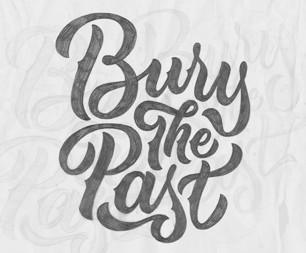
Taking what you know about formal script, let's now apply those basic techniques to draw some informal lettering.
For this entire tutorial we’re going to draw and redraw the same phrase over and over. Now, it's entirely up to you to decide what your phrase should say. But, you’re more than welcome to use the same phrase as me, which is: Bury The Past.
So, if you’re not using the above phrase I provided, take this time to brainstorm a phrase or search for one within song lyrics, movies, etc.
ScriptLettering-Phrase
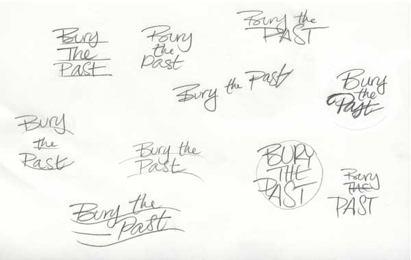
Just like most lettering projects, we'll start out in the conceptualizing and brainstorming phase. We’re going to begin drawing out comps for the typography to really reach its full potential. The best way to quickly sketch out ideas is to utilize shapes, arcs, lines, etc., for the type to live in or follow. Just like the below example, sketch some ideas out to help you decide which layout would be best for your chosen phrase.
For this stage of the process, it's great to begin working small so you can quickly get all your ideas onto the page. Then, later on, increase scale for fine-tuning those letterforms.
ScriptLettering-Concepts
Next, after you've sketched out some varieties, select one of those that you think is working best to continue working further on it. At this stage, I like to scan that piece of lettering into the computer and enlarge it to begin working on a larger scale.
So, either scan it into the computer and print it out, or just redraw the lettering at a larger size, whatever method is easiest for you.
ScriptLettering-Selected-Concept
Once you've got your large-scale lettering good to go, you can now refine even further. Be prepared to draw and redraw your lettering. At this stage, we're trying to fine-tune your kerning, negative space, connections, and overall composition. Once you refine, refine, refine, you're going to have a finished "skeleton" of your lettering.
ScriptLettering-Informal-1
Next, we're going to continue to refine and add contrast to the lettering. This is the stage where you can take the lettering in any direction you'd like. For me, I'm leaning towards a really fluid and brush-like feel. I want to incorporate a nice rhythm and distinctive style, adding on some "spurs" to the vertical strokes.
Take this time to begin adding weight to your lettering. This is where you decide if you'd like your lettering to have a high contrast or low contrast between the thick and thin strokes.
ScriptLettering-Informal-2
Again, we're just going to continue refining the letterforms until perfection. At this point, I'm continuing to add weight as well as paying attention to the kerning, negative space and connections between letterforms. As you add weight to your lettering, all those variables will change! Open up the space between the letterforms if the areas get too dark with the extra weight you're adding to your letters.
ScriptLettering-Informal-3
You might not notice many differences between the previous step and this one. But if you look closely I'm altering the kerning and placement of certain letterforms. As you can see, on the previous image I made notes to myself to open up the kerning. Additionally, I drew angled lines to make sure all the letterforms follow the same angle throughout. Make more adjustments and refinements to those letterforms until the color (overall positive and negative space) and composition are working fluidly.
Take this time to redraw letterforms that might need more adjustments. You might need to tweak the spacing or connections, or make corrections if they're all not following the same angle.
ScriptLettering-Informal-3
This is the final stage of my lettering! I've fine-tuned the letters enough to have an even color throughout, nice balance, rhythm, and an even composition as well.
Take this time to cleanly redraw the letterforms until completion. After many stages of redrawing, we've got ourselves a nicely composed group of letters!
ScriptLettering-Informal-4
ScriptLettering-Informal-Process
Looking to take your lettering further on the computer? Need a better grasp of the Pen Tool in Illustrator? In a future tutorial, I'll be using this piece of lettering to progress further into vector format. Stay tuned!
Before we begin this section of the tutorial, I want to provide a few rules and things to remember. First and foremost, flourishing doesn't automatically make your lettering better, nor is it needed in every lettering piece that you complete. Use caution when deciding the appropriate time to add flourishing to your next lettering piece.
Next, another important rule to remember is to add flourishing from the exit and entry strokes of your letterforms. Ascenders and descenders are perfect places. But make sure you do so naturally instead of forcing it to happen.
Last thing to note before we get started: flourishing is something that needs to be balanced and refined, just as you did above with your lettering. Flourishing creates positive and negative space, so of course you need to balance those positive and negative spaces you create with your flourishes. Balance is key to flourishing.
We're going to begin practicing basic flourishing strokes. Download the provided PDF and print it out to view the basic strokes. We're just going to focus on the strokes themselves. Once you nail down these techniques, you can then apply them to your lettering.
Let's begin drawing the Spiral flourish. Place a blank piece of paper over your printed PDF. Begin tracing the spiral flourish until you've nailed down the muscle movement your arm and wrist perform. Once you've practiced tracing it over and over, try to draw it without tracing!
ScriptLettering-Flourish-Spiral
Let's now do the same with the next flourish stroke, the loop. Place a new piece of paper over your printed out reference sheet and begin tracing the loop stroke. Practice until you feel you can take it on without tracing.
The key to perfecting this stroke is balancing the positive and negative space created by the overlapping lines. Additionally, make sure heavier and more weighted portions of the stroke cross over the light-weight portion of the stroke. Never allow two heavy strokes to interact because that creates an eyesore of extremely weighted positive space. Again, here it's all about balance!
ScriptLettering-Flourish-Loop
Next, let's tackle the tail stroke. This isn't a correct term, it's just my way of classifying this particular stroke. Anyway, feel free to begin tracing just as we have before. If you feel that you have a good grasp on this stroke, practice drawing multiple strokes one after another. Pay attention to scale, contrast, and of course, consistency!
ScriptLettering-Flourish-Tail
Continuing further, we'll be practicing the s-curve. It may seem simple enough, but watch the subtle change in weight as well as the subtle change in height. Just as we did before, practice this stroke over and over until you've got a good grasp on the technique.
ScriptLettering-Flourish-SCurve
Lastly, let's practice the figure 8 stroke. This is one of the more complicated strokes because of the need to balance everything as well as paying attention to stroke intersections. Just as with the loop, make sure you watch the weight of the strokes as they intersect. Practice drawing a few of these by tracing or practicing freehand!
ScriptLettering-Flourish-Figure8
Apply these techniques to your next lettering piece!
You may have noticed in my Bury The Past piece, it has a exaggerated s-curve flourish extending off the exit stroke of the lowercase s. This is what I mean by applying flourishing "naturally" instead of forcing it. The simple s-curve flourish balances the negative space and fits everything nice and tight to create a much better overall composition.
Bury the Past finished composition
It's definitely difficult, right? Practice and repetition are the keys to success! Keep tracing, keep drawing, keep refining and you'll see your progress, I promise you. Script lettering is something that definitely takes years of practice to fully grasp all the ins and outs, so don't get discouraged. If you have any questions at all, feel free to post below and I'll be able to help you out. Good luck!

Hand Lettering: Understanding Types of Type


Final product image
What You'll Be Creating
At this point, after practicing the concepts in Letterforms at Their Core, you're ready to start moving on to bigger and better things!
This tutorial will help you understand the various kinds of typography that exist all around us, such as the typography you see in books, billboards, store signage and everything else in between. You'll gain a great amount of knowledge to help you decipher typography characteristics and what their usage is in this day and age.
Additionally, since this is a beginner class focused around lettering and typography, I will be using some terms you may not know. Here is a list of terms you may want to read up on just in case you're not sure what they are:
One last thing to note about this tutorial before we get too much further: this tutorial is about drawing letterforms, and it includes a lot of info about "why" we do certain things when it comes to typography. This tutorial is more of a guide to provide you with the basics and the understanding, while still allowing you to grow and practice on your own. If I provided you with the exact dimensions of little details and provided every little bit of information, I feel you wouldn't learn and grow as much on your own. Lettering is all about practice and persistence.
With that said... Ready? Let's get started!
Luckily, not many tools are needed this time around, since we're basically just going to be drawing. Here is a very small list to help you begin:
  • Pencil (whatever your favorite pencil may be—no specific brand is needed)
  • 8.5" x 11" paper (no specific brand is needed—standard copy/printer paper works great)
  • Eraser
  • Sharpie or any thick black marker/pen
  • Ruler
  • Printer (not required, but is certainly useful)
  • Download PDF
Types-of-type-tools-prepared
Let's go ahead and print this PDF out (or preview on whatever viewing device you please) for our reference throughout this entire tutorial. We're going to view these faces as we grasp and understand each style of typography.
Why are we using HEAO? Well, those four letters are the perfect combination of vertical, horizontal, diagonal, and curved strokes. Those four basic strokes make up every single letterform imaginable. So focusing on those basics will give you a great start to help you draw the remaining 22 letters in the alphabet.
Here is the list of typefaces we will be studying. These are some standard faces that nearly every computer already has preloaded onto it (except Old London—you might have to download that elsewhere if you'd like it for future reference, but don't worry, it's free!)
  1. Helvetica (sans-serif)
  2. Times New Roman (serif)
  3. Rockwell (slab-serif)
  4. Snell Roundhand (script)
  5. Rosewood (decorative)
  6. Old London (blackletter)
  7. Courier (monospace)
Types-of-type-HEAO-reference
We're going to set up a "guide" or template to use throughout this tutorial. This page will contain the cap-height and baseline your letters will rest on throughout this tutorial.
All you need is a blank piece of 8.5" by 11" paper. Begin by measuring out 3" from the bottom right-hand corner and making a mark. Do the same on the opposite side of the paper and connect the dots!
Types-of-type-guide-page-one
Now that we just created the baseline, let's form our cap-height. From the baseline you just created, measure out 2" and make another mark in the bottom right-hand corner. Then, do the same on the bottom left-hand side. Connect those dots and you've got yourself a finished guide page that we'll be using the rest of this tutorial.
Types-of-type-guide-page-two
Gather all your materials to draw letterforms. That will include paper, pencil, eraser and pencil sharpener (if needed). Let's begin by drawing and understanding the structure of sans-serif letterforms.
With your "reference sheet" in front of you, study the weight, contrast, negative space, and every little detail about the letterforms. Study exactly how that letterform is composed.
Have your guide page in front of you with a blank piece of paper on top. We're going to use the guide page to allow our letterforms to fit within the 2" space we created with the cap-height and baseline.
Guide page
It may sound silly, but what makes an H look great? What makes the H look proper? Well, the answer is, consistent vertical strokes (the same weight) as well as a slightly thinner horizontal stroke to connect the vertical strokes.
If you've been studying typography for a while, you'll notice the little details such as a .5 millimeter difference in weight on the horizontal crossbar. Why is the crossbar nearly a hairline smaller than the vertical strokes? Because the H needs to feel balanced and not overweighted where the strokes meet. With the tiny hairline difference, the H becomes more pleasant to the eye and not an eyesore when being read at small sizes. Those little details are not only necessary for type design but lettering as well.
Keeping all that in mind, draw two vertical strokes with the same width and a crossbar with a hairline difference. The width of the H is up to you if you'd like to explore—but for this tutorial, we'll make it similar to our reference sheet.
Sans-serif-H-process
Next, let's tackle the letter E. Just as you did with the H, study its characteristics. Pay attention to the little details! If you look close enough, you can notice the middle crossbar is shorter than the top and bottom crossbars. Why is that? The middle crossbar is just a tad shorter to help balance and evenly distribute weight across the entire letterform. It essentially helps open up the negative space within the E so it doesn't feel so heavy. Additionally, just like the H, the crossbars are a hairline thiner to aid the overall weight as well. Keep these things in mind when drawing connecting horizontal strokes and vertical strokes!
So, draw one vertical stroke and three horizontal strokes to form the E. Make sure that middle crossbar is a bit shorter in width too!
Sans-serif-E-process
Now that our E is complete, let's move on to the A. Again, study how the A is composed. What makes it feel balanced? What happens if the crossbar is raised? You can test that out in your own drawing, but I think you'll find it looks rather odd, doesn't it? The crossbar is optically centered so the negative space within the counterform is equal to the negative space just below the crossbar.
How do you know what angle to draw the vertical strokes? Well, you don't really know, because that's all dependent on the width of the letterform. If you want a really thin A, your angles will be incredibly steep. On the other hand, if you want a wide A, your angles will be more moderate.
Draw two angled strokes that meet in the middle. Then, add that crossbar and it's good to go! Use the below gif to understand how I've formed the A with each stroke.
Sans-serif-A-process
Alright, we've made it pretty far! Let's finish off this sans-serif combination with the letter O. Let's study the reference sheet once more and understand just how that O was created and balanced. You can see that the north and south (vertical) points of the O are ever so slightly thinner in weight than the east and west (horizontal) points. Why does the counterform of the O taper like that? That tapering is yet another balancing act to make the weight easier on the eyes when read within a word or sentence.
If you read through the Letterforms at Their Core tutorial, you know the curves of the O extend above and below the baseline and cap-height.
Sans-serif-O-process
That's a lot of information in a short amount of time. There's tons of practice involved with making your strokes the proper angle and your curves nice and smooth—don't fret, it all comes in time! Just keep practicing! Repeat Steps 1 to 5 if you think you need the practice. If you're not satisfied with the way your letterforms are looking, remove your paper from the guide page and begin again!
Sans-serif-HEAO-final
Before we begin, I want you to study these letterforms for a bit longer. What makes a serif letterform different from a sans-serif? Well, a serif typeface has serifs! Whereas a sans-serif has no serif. Hence, the word "sans", which means without in French.
Additionally, there is contrast in these letterforms. Some strokes are thin while others are thicker. Why is that? If you think back to how these letterforms were first created, the thicks and thins are implied by the direction and angle of the pen or chisel. For example, if you're pulling your pen downward towards yourself, generally the pen will release more ink since pressure is being applied. On the other hand, if you're dragging the pen left to right or downward to upward, the stroke will be thinner, since the pressure isn't being applied.
A serif is the finishing stroke of the letterform which generally projects outward of the stroke. So, to simply things, just think of drawing sans-serif letterforms, but then adding serifs afterwards. You'll see what I mean by the process below.
Begin by studying the weights of the strokes in the H. Let's draw a sans-serif H to start off.
Using that previous "sans-serif" H, let's now add the serifs. They don't extend too far from the stroke so keep them about a quarter inch or less. It's all up to you! The key is to make sure your serifs are consistent and similar across the entire letterform, as in the image below. And the last thing to notice, the crossbar is much thinner in weight, so be sure to translate that in your drawing as well.
Serif-H-Proces
Let's move on to the E. Again, begin by drawing a sans-serif E (except keeping in mind the weights of the crossbars are much lighter), then adding the serifs afterward. The only difference with the E is that the serifs don't extend left and right like the serifs on the H. Instead, the serifs extend downward and upward on the various crossbars.
Serif-E-Proces
Unlike the sans-serif A, this serif A has more of a pointed apex rather than flat (it is technically flat towards the top, but so tiny it's almost not noticeable! That flat apex makes all the difference though). Again, start by drawing a sans-serif A but making sure the left stroke is thin and the right stroke is thick. Once you have that done, add on the serifs towards the bottom of the angled strokes and it's complete.
Serif-A-Process
Getting the curves of the O is probably still pretty difficult. It all just takes repetition and practice, so keep at it! Pay attention to the weight, width and contrast of this letterform. Unlike the sans-serif O, this letterform has much less weight on the north and south curves (that weight is created by the pressure of the pen when drawing an O).
Serif-O-Process
And with that, you've got a finished serifed HEAO!
Serif-HEAO-final
Slab-serif letterforms are pretty explanatory. Essentially, just think of a sans-serif typeface with "slabs" on either end of the strokes rather than the thin tapering serifs like the previous serif letterforms we just did.
The only thing to remember with slab serif faces is that the slabs are generally the exact same weight as the crossbars (which means they're about a hairline thinner than the vertical strokes).
Beginning with the H, let's start by drawing another sans-serif H. Next, just add those slabs to the tops and bottoms of the vertical strokes. Pay attention to the weight—it may just be a hairline, but it makes all the difference!
Slab-Serif-H-Process
Move on to the E whenever you're ready. Just as you did before, start with the sans-serif and add some slab-serifs! Just notice there is no slab on the middle crossbar of the E. There's no slab because if one did exist, it would consume all the negative space within the letterform and feel way too heavy.
Slab-Serif-E-Process
Alright, you've got this A. No explanation needed really! It's nearly identical to the sans-serif A. The only difference? That's right, slab-serifs. Add 'em on and you're good to go!
Slab-Serif-A-Process
Now, anything with a curve generally doesn't have a slab attached to it, unless it's a curve such as a P, R, B, etc., that connect to a vertical stroke. Anyway, for this O, decide on a good width (obviously try to match our reference sheet—unless you're trying something unique and different!) and begin drawing (almost) a perfect circle. Simple as that!
Slab-Serif-O-Process
Here's our completed Slab-Serif HEAO!
Slab-Serif-HEAO-final
Let me throw out a little disclaimer before we get into this section. Script lettering is another subject in itself. I'll be writing a separate class for script letterforms for you to truly grasp the dos and don'ts of script. We're going to focus on a few minor details of script, based on the typeface Snell Roundhand, to give a little intro into script lettering.
Things to note while practicing: script lettering was generally done with some sort of calligraphy tool like a fountain dip pen, oblique pen, etc. That is something to remember when trying to understand the thicks and thins and other characteristics. Additionally, with a script style of lettering it's usually only the first letter within the word that's capitalized, not the entire word. I've only kept the HEAO capitalized to remain consistent with the other styles of typography we're learning.
Keep that all in mind when practicing the below steps. Let's get started!
Beginning with the H, and all the other letterforms for that matter, we're going to keep a constant angle of about 45 degrees. Let's start by drawing the nice fluid 45-degree left-hand stroke of the H and do the same with the right-hand stroke. As I said above, the thicks and thins are determined by the pen. When a pen is pulled down, more ink is released, causing the thicker stokes. Knowing that, for this H, pay attention to the thin weights near the top and bottom of the stroke, and notice how it begins to get heavier in the middle.
Add that crossbar and teardrop terminals and this H is complete! (Note: the additional "swash" stroke on the left-hand stroke of the H is optional. More details and info about the "extras" will be covered in another tutorial)
Types-of-type-Script-Process-H
If you take a look at this script E, you'll notice it's rather odd looking. Definitely a unique letterform. And the best part about it is that it's formed in one single stroke of the pen.
To form this E, begin a bit below the cap-height, curve upwards toward the top-right and bring it around counterclockwise and downward toward the about the center of your 2" space on your guide page. Once that's complete, curve outward and down towards the bottom left and circle around to the top right while still keeping that curve below the crossbar-line. This gif will help you understand the process a bit more.
Types-of-type-Script-Process-E
If you compare the right-hand stroke of the H and the right-hand stroke of the A, they're exactly the same! (other than minor weight differences where the stroke begins).
With that said, begin with the right-hand side of the A (that's just my preference) and essentially draw what you've already done with your H. Next, finish it off by drawing the thin stroke at that same 45-degree angle. You have the option to add the teardrop terminal or leave it off entirely.
Add that crossbar and it's good to go!
Types-of-type-Script-Process-A
The script O should feel pretty similar to drawing a serif O. The only difference here is the 45-degree angle and varying weights.
With that in mind, begin the O just a tad below the cap-height and maintain the thick strokes on the left and lower-left-hand side as well as the right and upper-right-hand side of the O.
The exit stroke where it extends outside of the O is another optional stroke. I'll teach you more about flourishing, swashes, etc., in a later tutorial.
Types-of-type-Script-Process-O
Here's our completed script HEAO!
Types-of-type-Script-Final
What makes a decorative letterform decorative? Essentially, it's just the extra bells and whistles that are added to the face to give it an extra appeal. For example, in the Rosewood typeface we're dealing with on the reference sheet, the drop shadow, diamond shape, and divided color make this "decorative". If all those extra things weren't included, this would just be a normal slab-serif typeface.
So, as far as teaching you this style goes, there's not much I can teach since it's totally up to you how you want to embellish your type. A great website to see tons of decorative styles would be Typefight.
Decorative-HEAO-process

Let's begin by using our slab-serif letterforms once again. The only difference with these letterforms is the width of the overall letterforms and the brackets within the slab-serifs. So, draw out each letterform, H, E, A, and O. You've done it multiple times now so it should be easier this time around!
Decorative-HEAO-Outline
Now that you've got your basic letterforms drawn, it's time to embellish. To do so, we're going to use the same direction shade that Rosewood uses, but let's change it up a bit and make a small drop shade rather than a large drop shadow. So, essentially draw an extra line around each letterform on the right and bottom sides.
Decorative-HEAO-Drop-Shade
Instead of copying the exact style of Rosewood, let's fill in the letterforms with a light pencil shade to make them a light grey value.
To finish it off, let's give our type some "spurs". Essentially, let's add a small triangle on whichever side of the letterform you please. I drew mine on the left.
Decorative-HEAO-shaded
To add even more, let's add the circle with two pointed triangles on the north and south of the circle. Repeat that across all the remaining letterforms and I think we can call it a day.
As I said before, this entire process is totally up to you! You have creative freedom to embellish your typography however you'd like.
Decorative-HEAO-with-shapes
Black-letter forms are another beast to tackle in a separate class, but I'm still going to provide some basics to get you started in the right direction!
To understand how they're formed, you need a bit of history. Black-letter is also referred to as Gothic Script because it's a form of calligraphy. It was used very widely in Europe for nearly any kind of document/book since everything was written by hand until the invention of printing by Johannes Gutenberg.
There are a wide variety of styles of black-letter forms. The capitals you will be practicing are of a more "modern" approach to the black-letter characters formed in the early 12th to 17th centuries.
Obviously, by the look of these characters, you can tell they're pretty complex, with lots of vertical, angled, and curved strokes. To understand how they're formed, you need to know what tools were used too. A simple broad-edged nib that produces a straight line of ink is the utensil of choice. If you'd like, you can purchase the Pilot Parallel Pen for practice. But, since this class is about drawing letterforms, let's begin drawing rather than writing.
Beginning on the H, let's form the first left-hand vertical stroke. Draw that stroke, keeping in mind the thin weight towards the top and bottom and the thicker weight in the middle. It starts thin and gradually gets thicker because of the weight implied by the broad-edged nib and maintaining the 45-degree angle.
Next, let's form the bottom horizontal stroke. It should now look almost like an "L".
Continue further and add the second vertical stroke that eventually connects into the base of the horizontal stroke you just created.
Lastly, add that curve to finish off this H. Additional extra strokes that extend off the letterform are optional, but I included the process in the gif for your reference.
Black-letter-H-process
Moving onward to the E. This should be relatively easy for you if you completed the Hand Lettering: Letterforms at Their Core tutorial.
Begin by forming a half circle (the bowl of the E). Next, let's add the vertical stroke that's just a tad to the left of the center. Watch the weight as it connects into the bowl.
Next, add the "crossbar" or the horizontal stroke of the E towards the top. It'll connect to the vertical stroke you just created. Watch the weight again. Make sure it doesn't get too heavy at the top.
Lastly, let's form the last horizontal stroke that sits just above the center of the E. Let's first draw that thin vertical stroke down the center of the E. Then, connect the second horizontal crossbar directly to that thin vertical stroke we created. The finished letterform will look something like this.
Black-letter-E-process
Moving onward with the A, let's start with the right-hand vertical stroke. Pay attention to the weight once again, as it gets thinner to thicker from top to bottom.
Next, add the 45-degree angle stroke to complete the structure of the A. Then, add that crossbar.
Now here is where you have the choice to add all your embellishments. I say we add the curved stroke from the top of the A to the crossbar.
Black-letter-A-process
With the O, this should be relatively simple as well if you've mastered your curves from the previous class. The only difference is the flat start of the stroke on the left-hand side of the O.
So, begin by drawing the first left-hand curve, and next, add the right-hand curve to complete the circle. Keep in mind the top-left needs to be flat instead of round like the rest of the letterform.
Lastly, let's add the one left-hand vertical stroke on the inside of the O. Again, you have the choice to draw the extra thinner lines. It's up to you what you do with these letterforms!
Black-letter-O-process
To really understand the forms and structures these specific letterforms take, it's best to write them with a broad-edged nib and understand your thicks and thins that are created by the angle and direction of the pen. Gothic script (black-letter) is an art form in itself. I highly recommend practicing that before beginning to draw the forms because it'll help your eyes and hand compose the letterforms on paper without writing the forms.
Here's the completed black-letter HEAO!
Black-letter-HEAO-final
To be honest, I've never drawn monospace lettering for a client. It's not as appealing as the rest of styles you're now capable of, but it's still something to add to the knowledge base! You either have never seen this style of typography or barely at all. The reason is that monospaced fonts were used with the first computers and their terminals. Those computers had very limited graphical capabilities so a fixed width (monospace) typeface was needed.
Usually, every letterform within a typeface has different widths. For example, a "W" is much wider than a "J". But with monospace letterforms, those widths would be the same.
With that said, certainly pay attention to the overall widths of your monospaced letterforms. Make sure they're all equal!
With these letterforms, they're pretty similar to the slab-serif face we created earlier. Only difference? That's right, rounded slabs, as well as consistent width of every letterform.
Draw those vertical strokes, add a crossbar, throw on the slab-serifs, and you're good to go!
Monospace-H-process

Same as the above, prepare this E by drawing a vertical stroke and attaching three crossbars just as we've done many times above. Lastly, add the rounded-slab-serifs and it's complete.
Pay attention to consistent weight, as if this was the very first exercise you completed during this tutorial. 
Monospace-E-process

Again, same process as before. The only difference with this A is that a small exit stroke has been added to the top-left. Other than that, follow the same processes we've already practiced. It consists of two diagonal strokes, a horizontal stroke (for the crossbar) and the rounded slabs.
Monospace-A-process
Let's finish this O and we'll be done! Extend the curves just slightly above and below the guidelines of your "guide page" you have underneath. Draw those curves and make sure the width is the same as your previous letterforms.
Monospace-O-process
Now, you've got yourself a completed monospaced HEAO!
Monospace-HEAO-final

Practice, practice, practice. Some of those first initial drawings might not look how you want them to, and that's OK! I started in the exact same place. Just like anything in life, it all takes practice and patience. Give it time and effort, and you'll be great.
If you need any help or have questions regarding the material above, feel free to comment. Good luck!


Copyright @ 2013 Krobknea.

Designed by Next Learn | My partner