Salvattore touts itself as a jQuery Masonry alternative
with one important difference: it uses CSS configuration instead of
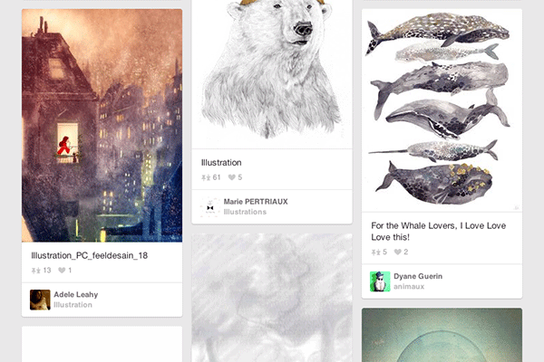
JavaScript. These kinds of grids can be seen all over the web, probably
most famously on Pinterest. Today, we will use Salvattore in combination with Twitter Bootstrap 3 to make a responsively awesome flowing grid structure.
Getting started: What You'll Need
First, you'll need to grab the Salvattore JavaScript library (minified or source).
Next, you'll want to link up Twitter Bootstrap's CSS. Instead of
downloading and hosting our own copy, we'll borrow this directly from
NetDNA's BootstrapCDN.
Once this is complete, you're ready to get started with configuring Salvattore!
Next, you'll need either an external stylesheet or a <style type='text/css'> tag in your header. Most of our work will be done in the stylesheet. Note: you must include type and rel attributes for Salvattore to work properly.
A Quick Bootstrap Grid Primer
Twitter Bootstrap provides a powerful, flexible grid structure which focuses on bottom-up media queries. Let's take a look at a common row of columns.
1
2
3
4
5
6
7
8
<divclass="row">
<divclass="col-xs-12 col-md-4"></div>
<divclass="col-xs-6 col-sm-3 col-md-4"></div>
<divclass="col-xs-6 col-sm-3 col-md-4"></div>
<divclass="col-xs-12 col-sm-3 col-md-4"></div>
<divclass="col-xs-6 col-md-4"></div>
<divclass="col-xs-6 col-md-4"></div>
</div>
You'll notice in the above markup the pattern of col-[size]-[column number]. With available sizes of xs, sm,md, and lg, we are able to set different column sizes for different breakpoints without writing specific media queries. Take a look at this example which shows how the columns shift at different screen widths.
Bootstrap Panels
We will be creating a flowing grid using Bootstrap's panel component. The markup to create the panel is built like this:
1
2
3
4
<divclass="panel panel-primary">
<divclass="panel-heading">Panel heading without title</div>
<divclass="panel-body">Panel content</div>
</div>
Putting it Together with Salvattore Magic
Now
that we have the Bootstrap pieces we need, we're going to put it all
together with Salvattore. For now, we'll start with six empty panels;
later, we will make it all dynamic to give each panel some content.
For Salvattore to work properly, our grid container needs a data-columns attribute. Here is what our markup currently looks like:
1
2
3
4
5
6
7
8
9
<divid="grid"data-columns>
<divclass="panel panel-primary">
<divclass="panel-heading">Panel heading without title</div>
<divclass="panel-body"> Panel content </div>
</div>
<!-- repeat the panel as many times as you'd like -->
</div>
Next, we will go to our stylesheet and add the following labels via pseudo-elements:
01
02
03
04
05
06
07
08
09
10
11
12
13
14
15
@media screenand (min-width: 1px) and (max-width: 767px){
#columns[data-columns]::before {
content: '2 .col-xs-6';
}
}
@media screenand (min-width:768px) and (max-width: 991px){
#columns[data-columns]::before {
content: '3 .col-sm-4';
}
}
@media screenand (min-width:992px) and (max-width: 9999px){
#columns[data-columns]::before {
content: '4 .col-md-3';
}
}
The breakpoints we've chosen map directly to Bootstrap's media queries. Salvattore uses the::before pseudo-element and content attribute to define the classes of the columns created, and then attempts to split the elements evenly into those columns.
Making it Dynamic
We've kept thing strictly within CSS so far, but if you'd like to go the extra mile, JavaScript can offer a few goodies.
Salvattore
takes things a step further by offering appending functionality. With
these functions and a connection to an API (we're using Google's Book API to pull in books by Ernest Hemingway), we can build a dynamic grid. Here's the JavaScript we'll use:
Note: jQuery Required
First we create an append function which takes our title and content, and wraps them in our panel markup. We then use the salvattore['append_elements'](grid, [item]) function to add the item to our grid. Finally, we run the AJAX call to pull in the dynamic data.
For this to work properly, we'll want to remove all of the contents in the grid holder.
1
<divid="grid"data-columns></div>
Salvattore will fill in the columns for us.
Our final markup looks like this:
Salvattore
makes creating dynamic Masonry-style grids very easy for someone who
doesn't know a lot of JavaScript. Saying that, with a small amount of
JavaScript, creating dynamic grids coupled with dynamic content is a
breeze. Lastly, Bootstrap provides flexible class naming structure to
easily construct grids for any breakpoint.
Unknown
Lorem ipsum dolor sit amet, consectetur adipisicing elit, sed do eiusmod tempor incididunt ut labore et dolore magna aliqua. Ut enim ad minim veniam, quis nostrud exercitation.
Medical Disclaimer
The information on this site is not intended or implied to be a substitute for professional medical advice, diagnosis or treatment. All content, including text, graphics, images and information, contained on or available through this web site is for general information purposes only. Krobknea makes no representation and assumes no responsibility for the accuracy of information contained on or available through this web site, and such information is subject to change without notice. You are encouraged to confirm any information obtained from or through this web site with other sources, and review all information regarding any medical condition or treatment with your physician. NEVER DISREGARD PROFESSIONAL MEDICAL ADVICE OR DELAY SEEKING MEDICAL TREATMENT BECAUSE OF SOMETHING YOU HAVE READ ON OR ACCESSED THROUGH THIS WEB SITE.


