The inspiration behind a comic can come from many sources. It can be anything from a story idea to a certain setting, or perhaps a character. This tutorial won't go into how to write a comic script or well-rounded characters, but it will guide you through the process of visualizing your character ideas through research, experiment and refining.
By creating a character sheet, you will be properly prepared before you start drawing your comic, and you'll have a reference to help you keep the character's look consistent.
1. Figuring Out Who Your Character Is
Before we start to draw any characters, some early preparation work can help us a great deal. Figure out what your character will be about (Stoic vampire hunter? Ditzy high-school student?) and try to imagine the situations the character will be in. An action comic will probably feature the character's body in motion, while a romantic drama might focus more on the facial expressions.
Step 1
I've decided that I want to make a simple slapstick comic about cooking, so my character will be some sort of chef. I'm keeping my options open when searching online for reference images. For my purposes with the comic, I don't really need an accurate depiction of real garments worn by chefs, but picking up little details here and there gets the imagination going a lot better than if I were to come up with everything on my own.

Alright, I've found several elements I can incorporate into the look. Now for the person who is going to be wearing that look: who am I going to be drawing?
Step 2
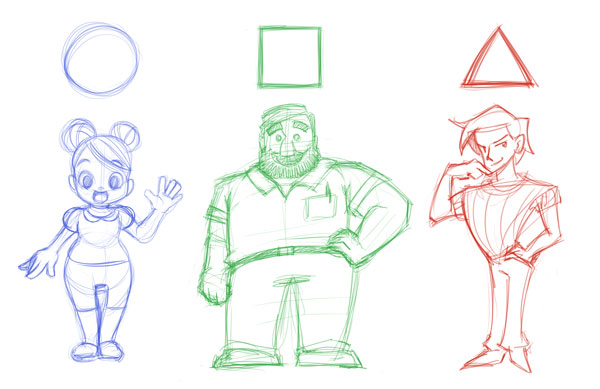
When designing characters, it's a good idea to use the three basic shapes: circle, square and triangle. We tend to perceive characters that have a lot of roundness and circle elements in their design as friendly, while characters composed with square shapes emit a sense of stability. Characters with sharp and triangular shapes have an active look, and can also look dangerous.

By mixing these shapes into one design, even more concepts can be expressed, so try out a couple of combinations for yourself. While these are not set rules, it can be a fun exercise to draw and also to analyze what shapes are mostly used to portray heroic or villainous characters for example.
Step 3
When making the initial sketches, I try out all that comes to mind, even things I think might not work. Try playing with both stereotypes and their complete opposites. When you find something you like—whether that is an entire character sketch or just a minor detail—carry it over to the next round of sketches, and keep going until you've gotten something you want to base your character on.

I prefer to sketch digitally in Adobe Photoshop, but you can use whichever medium feels best for you, be it another software program or sketching traditionally with pen and paper. To follow along later on, it might be good to have access to a scanner if you sketch traditionally, since we're going to duplicate, move around and mirror some of the sketches.
2. Create a Look
Now that we've used some of our earlier research and sketching methods, we've got a whole bunch of character concepts to choose from. When seeing these different ideas together like this, it can be a lot easier to discover what you want and don't want the character to be. Go with your gut feeling, or have others give you feedback if you feel unsure, and choose the character concept which we will now develop into a proper design.
Step 1
Since this character is not supposed to be the object of a single illustration, but rather an actor of sorts in the comic, it's important that it communicates emotions and actions well through facial expressions and body movement.
The key here is exaggeration. As a rule, it's often better to go over the top than to hold back, and then perhaps pull back a little if it gets too crazy.
Of course a lot depends on the style too, but even for more realistic comics, I'd suggest pushing the expression a bit more than you think you need to. The intensity of a sketch often gets softened after inking, coloring, adding backgrounds, effects and so on.

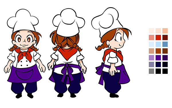
After we've come up with a decent-looking base design, we need to try it out from different angles as well. Try drawing the character from the back and side, and consider if you should make any changes to it.
Step 2
After drawing the character from the front, looking forward, we're going to save ourselves some time by making a copy of the sketch as a base for drawing the back.
If you're using Photoshop you can copy your sketch by holding the Alt key while dragging the image to the side, then mirroring it by pressing Command-T for theTransform Tool, and right-clicking and choosing Flip Horizontal from the drop-down menu. You now have a base to draw the back view drawing. The same method can be applied when creating the profile.

3. Ink in Adobe Illustrator
Step 1
We now have the main views of the character, although the three-quarter view from the front and back could be added as well, if you want to make it more advanced. I feel pleased with this design, so I'm going to do an inked version of it as well.
I start by importing my sketch file into Adobe Illustrator, by dragging the file icon onto the artboard of an open Illustrator document.

Step 2
I start by creating a simple brush for inking by making a circle—use the Ellipse Tool (L)—and dragging out one of the anchor points to the side, and then making it a sharp point by converting the handle to corner.

While having the shape selected, go to the Brushes menu, click the New Brushbutton and choose Art Brush.

Step 3
Once you've hit the OK button on the previous selection, the Options panel will pop up and you can enter a name for your brush. There are a lot of options for you to customize your brush to your liking, but for this tutorial the brush is fine just like this. The default stroke direction is starting from the thick end and tapering into a sharp line, which is just what I want.

Step 4
Since I want to change the brush size every now and then, but don't want to slow down the flow when I'm inking, I'm creating a couple of different-sized strokes from the start. When I select one, the brush will have that new size as its default until I switch tool again. As I build up more strokes of various sizes in the drawing, I can quickly select a stroke size about the size I want and just keep drawing, without having to stop all the time to input the size in numbers, or choose a size from the drop-down menu.

Step 5
I generally go about inking the same way I would traditionally, but I also take advantage of the fact that I'm working in Illustrator. So where I can, I copy and reflect elements, like the eyes, and make use of tools like the Ellipse Tool for round elements, instead of drawing every line with the brush.
You'll notice that there are a lot of lines intersecting in a sloppy way right now. We'll get to correcting that soon, but the reason we don't just end the line in place is because of the brush. The Art Brush uses a single symbol which gets stretched out along the path you draw, so our tapering effect, for example, will be wherever the path ends. That's why we need to draw the strokes a bit longer in some places, so the tapering doesn't cause the line to look cut off at intersections with other lines.

Step 6
When the inking is done it's time to clean it up a little. Start by selecting everything, and then from the top menu choose Object > Expand Appearance.

Step 7
Now the brush strokes have been turned into compound paths. From here go to thePathfinder panel and, while having everything selected, click on Divide. This will cut the compound paths into small pieces along the intersections. Now you can just select the lines you want removed and press Backspace a couple of times.

This looks a lot better, but let's go through a couple more steps to ensure that we are left with only the line art and no stray points or other leftovers from the process. Select a closed path somewhere in the drawing and go to Select > Same > Fill Color. Then copy or cut the selection onto a new layer and delete the previous one.
A good idea is to name this layer something appropriate, like "line art", and lock that layer. As a last step we will go to the Pathfinder panel once more and, still having all the line art selected, click Unite.
4. Coloring With Global Colors and Live Paint
Step 1
The last thing we're going to do is to decide on the color scheme. We're going to use global colors, as this might need to be adjusted later on when we need to put the character into an environment.
Start by making a new layer called "color" and place it under the "line art" layer. Pick out the base colors you'd like to use. They'll be easy to adjust later, so don't worry too much about getting them right from the start.

Step 2
Create new swatches for each color by clicking the New Swatch button in theSwatches panel. Double click the swatch color to get access to the Swatch Options panel. I suggest naming your colors early on to keep things organized, but what we're really after here is checking the Global box.
Press OK, and then proceed to do the same thing for the rest of the colors you'll be using for the character. If later on we want to make color adjustments, we just have to change the swatch color and everything which uses that color gets changed instantly as well.

Step 3
Select the color you want to apply, and then select all of the line art. Go to the Toolspanel and select the Live Paint Bucket. While having this tool active you can click on a closed area and it will fill it with your selected color, letting you lay the base colors quickly.

Step 4
We've now got all the base colors in place, but without any shading it looks a bit flat. To pick some nice highlight and shading colors, duplicate the palette colors on the artboard, and go to the Color Guide panel.

From the button on the top right side of the panel you can access a drop-down menu which lets you change from the default Show Tints/Shades to Show Vivid/Muted, which I think leads to nicer color picks for our comic character. From here, just modify the duplicate color palette to darker and lighter shades of the base colors.

Step 5
Now that we've got a good selection to choose from, let's start shading! This will take some more time since there is no real way to automate this step, but it's what will make the character pop.

If you want to tweak the colors a bit, a good way to go about it is to go to the Colorpanel, click the top right button, and from the drop-down menu choose HSB, which stands for Hue, Saturation, and Brightness.

Now that we've made a colored version of the design from the front, back and side view, we should have a pretty good grasp of how she'll look. But since she'll be the star of our comic, she'll need to be able to act as well, so let's have her audition a bit for us!
5. Express Your Character's Emotions
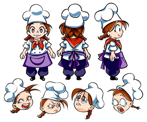
Once you feel pleased with how the character looks, it's time to focus on facial expressions and body language. Just like when we did the initial character sketching, I suggest making a lot of sketches.
Don't just draw the faces for happy, sad, angry and so on, but think of different kinds of happiness, sadness and anger. Our faces can change a lot with the intensity of emotions, and the reasons behind them. When drawing in a cartoon or manga style, there are not a lot of details, but it can help a lot to have a mirror beside you and make the faces yourself. You may catch some details you haven't thought about before.

When drawing in a more comic style, which I will be doing with my character, it can be fun to push the character's facial expression further by extending it to things like hair and clothing. Notice how the character's chef hat is "emoting" along with the character, as well as her bangs and braid.
6. Turn Gesture Drawings Into Action Poses
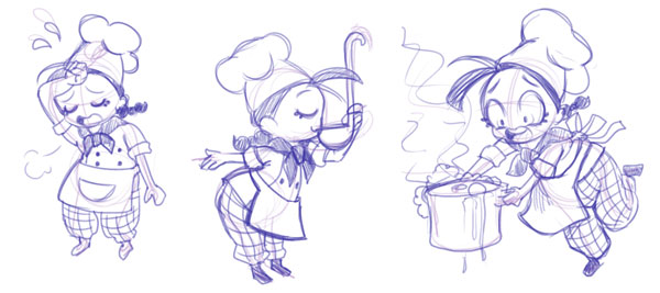
Of course, we communicate a lot using body language as well, so try out some different poses for the character too. The same thinking can be applied here: how would this character's stance show that he/she is sad or angry? How would it differ across a range of emotions, from being slightly disappointed to being devastated?
While there are a lot of resources online for both poses and expressions, it can be pretty fun to create them yourself with a mirror or a camera, or with a friend to model for you.

Return once more to the basic shapes building up your character and make some simple stick figures in various poses. Focus on creating movement in the gesture, and don't worry about accuracy right now.

Lower the opacity of the stick figure layer, and create a new one above it where you flesh out the sketches into proper pose drawings. Testing out the character like this is a good way to see if the design holds up as well in action as when you first drew it.
Putting It All Together
Let's put together our drawings in one place and see if they all look like the same character. Since this character will only make an appearance in a short slapstick comic, her character sheet won't be as elaborate as, say, a main character from a fantasy epic, but it's easy to overlook the benefits of making a character sheet before drawing your comic. I've too often made the mistake myself of assuming that I had the character's look figured out and started drawing the comic, only to find that when I'm finished and read through it, it doesn't look like the same person.
It's not bad to keep things simple, since (depending on the comic of course) you're going to be drawing this character a lot. When sketching the design it can be tempting to add a lot of tiny details, making it look great in that one drawing, but then you need to keep that detail level up through the whole comic.

Making comics is a long process with lots of steps, some of which you might have to redo a couple of times. There is no way to completely avoid that, but I hope that by going through the process of doing a thorough sketch brainstorming, studying from reality and refining your ideas early in the process, you might save yourself a great deal of headache later on, and that you will feel confident when it's time to put your character into a story.


