
In today's tutorial I'm going to show you how to create a skull with a flower crown using ink liners. A liner is similar to a gel or capillary pen, but whereas pens are roughly equal in width, liners have a very broad range of widths (from 0.02 mm up to 1 mm and more).
Drawing with liners is similar to drawing with ink and nib, but there are some important differences. For example, it's impossible to thicken the liner's line using more pressure as you can with a nib. However, one considerable advantage of using liners is their convenience. You can take a liner with you and draw wherever you are, and there's no chance of getting a black ink spot on your clothes or workspace.
What You Will Need
- Pencil (ordinary graphite one, F or HB types)
- Eraser
- Paper (of any kind suitable for drawing, but smooth texture is preferable for beginners)
- Ink liners, width from 0.03 to 0.5 mm. Here are mine:

Why the Skull?
I must confess, I love drawing skulls. It is extremely useful for understanding basic anatomy and creating realistic portraits. In addition to the literal meaning, a skull is also a common symbol. Everybody sees something personal in a skull picture. For me it’s a sign of renewal, of the indissoluble bond with nature and universe, some kind of reminder to value every moment of your life.
Firstly, if you don’t have a clear view of what skulls are like, you may start your research by surfing in Google Images, Pinterest or other great places with a huge amount of graphic information.
The skull for this tutorial is quite realistic, but I've left a small tint of stylization. I have considerable experience in drawing skulls in different foreshortened views, so I’ll make an attempt to explain how to draw a skull sketch from scratch. Of course, you can a use a real skull model from a photo. If you decide to use a photo shot, I encourage you to get one you have legal permission to use.
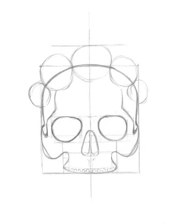
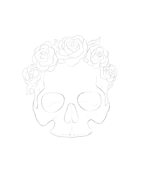
1. Sketch the Upper Portion of the Skull
I recommend using an F or HB (maybe B, if you're a fan of soft lines like me) pencil for this tutorial, because they are not very dark on the paper. Softer pencils (2B and further) are often suggested for sketching and graphic artwork, but we don't have an independent pencil illustration here, but rather an outline for future inking. Soft pencil marks are also harder to erase.
The size of paper is up to you; I'm using A4 size for this tutorial. Some artists feel more comfortable with big formats, some with small. But keep in mind that ink (and ink liners as part of this technique) is not very fast to draw with.
Step 1
The best way to get an even and proportional sketch is to begin with a central line that will divide our future skull in half. Also it’s good to start by outlining the bottom and upper bounds of the skull. We need here two top lines—one where the skull ends, and another where the crown ends.

Step 2
Let’s analyze skull proportions. I chose a skull without mandible (lower jaw) and teeth for this tutorial, because the overall composition with the floral crown on skull’s head will be more balanced, and I get more viewer's attention to the details at the top of the image, where the roses are.
The height of the skull (without lower jaw) is slightly bigger than the width, and the frontal bone (forehead) is about half of the skull. The height of the eye sockets is about the height of the nasal opening. The upper jaw forms a compact construction under the massive shape of the skull's main body. Try to think in simple geometric shapes—the main goal in the very beginning is to get a clear general view.
Remember that your sketch doesn't have to be perfectly even. A skull is also a natural object, and nature doesn't have anything ideal. If you have any doubt about your shapes, measure proportions using the central line.

Step 3
Then I’m refining details of the skull, adding temporal bone shapes and jaw details.

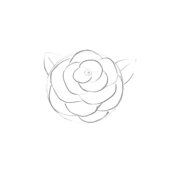
2. How to Draw a Rose
Step 1
Let's consider drawing the flowers. I prefer to depict roses, as they are a common symbol of natural beauty and life. You can draw any flowers you like, of course. I'll show you an easy way to draw a rose.
If we try to image the general shape of a rose, it likely will be an oval or a circle. I draw a round contour where soon the flower appears. And I add a couple of improvised triangles for future small leaves that are visible behind the bud.

Step 2
Suppose the center of the flower is closer to the top of the shape. It feels as if we're looking at it from above, taking into account the short distance between the object and a viewer. All the petals grow around the flower's center, making a natural multi-layer cup shape. I use simple rounded lines placed into the previously drawn circle for marking every petal. You can erase any excess pencil strokes and add new ones (or thicken the already existing ones)—this sketch is your artistic research.
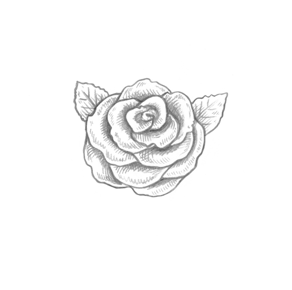
Step 3
Petals form depth, which will be shady. It's very useful to imagine where the darkest areas are. This step is more for your reference than for drawing a copy, because I'm going to erase these shadows in the next stage. The line of the original circle shape is already erased, just for convenience of visual perception.

Step 4
Flowers and roses in particular are often very delicate, and their petals have beautiful curves. I add some spontaneity and waviness to the petal forms. Leaves have small edges and jags too.

Step 5
Let's consider how the light spreads on the flower. There definitely will be some dark, intense shadows (depth between petals, cast shadows). The places where each petal bends downward will be shady too, but they won't be as dark as those of the previous category. The lightest area of a petal is between the darker parts, because it's a place where the petal bends and curves. This is just a simple preview of this concept.
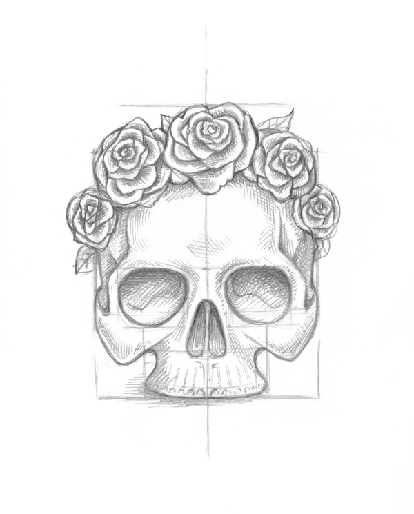
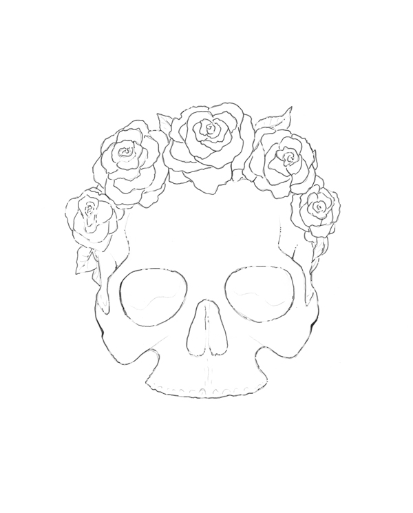
3. Add Roses to the Skull
Step 1
Now it’s time to apply our knowledge to the skull drawing and mark the place for the future crown of roses. I draw just a circle where each flower will be.
Step 2
How will the flowers look? Will they have more petals or fewer? How about leaves or twigs? It’s up to you now. If you don't want to draw roses, you can choose a different type of flower.

Step 3
Let’s think about shadows. Suppose the light is coming from the front of the skull. Accent shadows with hatching, while leaving light places untouched. Graphic art is based on light and shadow (value), so contrast is the best way to achieve an impressive result and show the volume and depth of the objects. This sketch will be useful in the near future, when I’ll be inking it.
4. Ink the Skull and Roses
Step 1
Use a light table or a window glass during the day and trace the outline of the sketch onto a clean piece of copy paper. I'm trying to draw light and accurate contour lines, because the less you erase any lines on the paper, the better the look of the final image you'll get. It's especially important to rub pencil lines very carefully when some ink strokes are on top, because you can easily erase the ink drawing, especially if the ink of your liner isn't resistant.
Step 2
Let's put the skull drawing aside for a moment, and pay attention to some useful exercises. I strongly recommend doing warm-ups before inking your artwork. If you spend only several minutes on this, your hatching will be more confident and fluent. Ink technique is complex because you have no undo button, so the preparation is very important.
I've drawn some hatching examples. Try to make some sets of parallel lines, then cross them in various directions, and add dots. Let your hand just draw, and observe the effects you get.

Dots are also a very powerful instrument in an artist's hands. Small dots make a drawing seem more delicate and sophisticated, and they're also great for blurry effects. Bigger dots are excellent for shadows. Sometimes dotwork is the best way to create a detailed texture of an object, but this method is time-consuming. A combination of different dots allows you to achieve complex effects and a very smooth transition of tones.

I prefer a mixed technique, hatching plus dots, because dots give me texture and smooth tones, and hatching allows me to achieve sharp edges and a detailed look. There is no right or wrong way to create your ink drawing—all rules are flexible and relative. You are the artist and you make the decisions. I find that observing the environment and trying to imagine everything as an ink drawing is a very useful mind exercise.
Step 3
I use a 0.3 mm liner to ink a contour. This is not a continuous type of line—it’s rather intermittent. I’ll fill the gaps later if there is artistic necessity. Now it's fine as it is—this type will look very vivid when the drawing is finished.
Step 4
Then I add dots with a 0.1 mm liner to the shaded places. You can refer to your recently created pencil sketch for finding all the dark areas.

Step 5
The next step is to refine the dot work with 0.05 mm liner dots. A combination of bigger and smaller dots can be very impressive.

Step 6
Adding a tiny hatching to the dot work makes shadows deeper and more intricate. I apply two layers of cross hatching one above another with my favorite 0.03 mmliner. On the image below you can compare the eye sockets of the skull—one has only one layer of hatching so far, and the second has two. The more hatching you create, the darker and deeper it becomes.

Step 7
Continue with detailed hatching (0.03 and 0.05 mm liners). Some delicate dot work is also appropriate. I try to leave light areas untouched or add only small and thin dots.
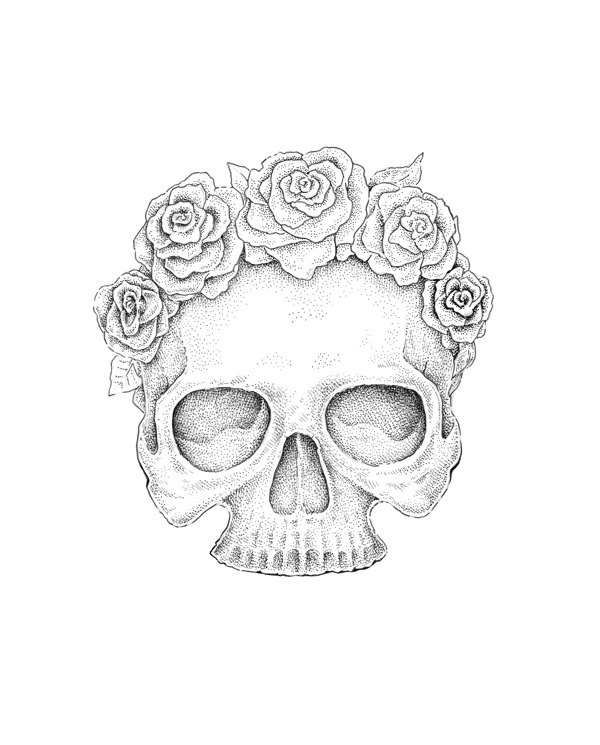
Step 8
A skull isn’t perfectly smooth—it has tiny cracks and nuances. Let’s add them.

Step 9
Now I use a quite thick liner (0.5 mm) and create a contour of the skull, flowers and all the details that should stand out, on top of the existing outline. Also I add width to the shadows that lie in the eye sockets and nasal opening. The trick here is allow some fluency in your line and mark only the darkest places.

To smooth the thick 0.5 mm lines, I add some extensions with 0.2 mm liner. Also a layer of dots and hatches. Variety of widths is our best friend!

Step 10
As I mentioned before, a skull is not an ideal smooth and seamless form. I add several seams to the nose and temple areas.

5. Scan Your Final Drawing
Suppose you would like to have your artwork in digital form—not just a photo, but a high-resolution contrast image that you can use in different ways, such as printing on a T-Shirt or adding to your portfolio. The best way to achieve that is to scan the drawing with a digital scanner.
Step 1
I prefer to use high resolution, 300 dpi (or possibly 600 dpi—for a small image it can be so useful sometimes). If your scanner allows you to generate a preview of the image, try to adjust your preferences to achieve the best result you can get. I used -35 of brightness while scanning this artwork, because my scanner is inclined to make images too bright and some important details are lost. For this type of artwork, black and white mode is a great choice.

Step 2
Open your file in Adobe Photoshop. Now we are going to dispose of all the dirt, random after-scanning stains and pencil sketch marks. Go to Image > Adjustments > Brightness/Contrast and get the most balanced result you can achieve. White paper zones should be really white unless you would like to get a slightly messy grey view.

Step 3
I chose an ordinary hard round brush of white color and cleaned some areas manually. I prefer to clean everything very carefully, and if there are some uneven and smashed dots or hatches, as in the example below, I paint them up. It’s also possible to use the Magic Wand Tool (W) to find some stray black points hiding outside the drawing and get rid of them.

Your Artwork Is Complete
I hope you've found the tutorial helpful and enjoyed the process of sketching and drawing! If you have any questions or even tutorial theme suggestions, please inform me in the comments. Thanks for your attention!


