Alternative movie posters are having a moment in the graphic design world. Designers and fans are creating their own quirky posters to advertise their favorite cult and indie movies.
In this beginners tutorial we’ll be creating a fan-art poster for indie favorite ‘Like Crazy’, and look at how you can bring an authentic fan-art style to your own poster designs. We’ll be using Adobe InDesign, and also dipping into Adobe Illustrator to create and edit graphics.
What exactly is an ‘alternative’ movie poster? Graphic designers and illustrators give a unique spin on the studio-approved artwork (and sometimes overtake the original poster in popularity and recognition), highlighting the key themes of a movie and showcasing them in on-trend matte colors and striking graphics. Take a look at the work of celebrated alternative poster designers like Brandon Schaefer and Jacob Wise to get inspired.
In this tutorial we’ll walk through the steps of creating our own unique version of a movie poster, and give you some tips and pointers for tackling your own alternative movie posters. Let’s get started!
1. Set Up the Poster Size Correctly
Step 1
Movie posters come in a range of sizes, but most countries have a set of standard poster sizes, which most posters should be designed to.
Here, we’ll be creating a poster at a US ‘Half-Sheet’ size, which is in landscape orientation, and 22 inches high and 28 inches wide.
First up, get InDesign opened up, and go to File > New > Document. Keep theIntent of the new document set to Print, and the Number of Pages to 1. UncheckFacing Pages.
Under Page Size select Custom... to open the Custom Page Size window.
Type Movie Half-Sheet into the Name box and type in 711 mm (28 in) for the Widthand 559 mm (22 in) for the Height. Click Add, and then click OK.

Step 2
Back in the New Document window, set the Margins on all sides to 30 mm and theBleed on all sides to 5 mm.

Click OK to create your new poster page.

2. Structure Your Design With Layers
Organizing your artwork into layers will help you keep different elements on your poster easy to lock, unlock, hide and edit. Layering in InDesign is good practice for organized designing, so start as you mean to go on!
Step 1
Open the Layers panel (Window > Layers) and double-click on the default Layer 1name to open the Layer Options window. Rename the layer as Paper Backgroundand click OK.

Create a new layer by clicking the Create New Layer button at the bottom right of the Layers panel, or select New Layer... from the panel’s drop-down menu (accessible from the top-right corner of the panel).
Double-click the new layer’s default name, and rename it as Color Background.

Step 2
Create a further three layers, using the same process described in the previous step, in the following order: Typography, Planes and finally, Clouds, at the top of the series of layers.

Lock all the layers except the bottom layer, Paper Background, and click the layer to activate it.

3. Introduce Texture and Color
An alternative movie poster doesn’t have the same purpose as a commercial movie poster. Fan art is about having fun, and giving a design-focussed look to the layout.
Giving movie posters for modern-day movies a retro-inspired look really helps to tap into the fan-art trend. Two ways of achieving this are to give the layout an on-trend matte texture and a vintage-inspired color palette.
Step 1
Remaining on the Paper Background layer, take the Rectangle Frame Tool (F)from the Tools panel and drag to create an image frame that extends across the whole of the page, right up to the edges of the bleed on all sides.
Placing a paper-texture image here will give the poster a lovely vintage-style texture. Here, I’ve used this image from PhotoDune, just opening it in Photoshop first and warming it up a bit to give it a more golden color, and then resaving.

Go to File > Place and select the paper image; click Open. Choose Fill Frame Proportionally from the Controls panel running along the top of the workspace, or double-click in the frame to directly select the image and use Shift to resize, until the paper fills the frame as best it can.

Step 2
Return to the Layers panel and Lock the Paper Background layer. Unlock theColor Background layer.
Open the Swatches panel (Window > Color > Swatches) and click the New Swatch button at the bottom right of the panel. Double-click the new swatch to edit it in the Swatch Options window. Rename the new CMYK Swatch as Mustard and set the values to: C=0 M=35 Y=93 K=0. Click OK.

Create a further two new CMYK swatches with the following names and values:
- Brown: C=56 M=60 Y=86 K=71
- Blue: C=59 M=0 Y=18 K=0


Step 3
Remaining on the Color Background layer, select the Rectangle Tool (M) and drag to create a rectangle that extends across the width of the page, up to the top bleed, and drag downwards to the halfway point of the page (InDesign will flag up a pink line where the center point lies).
Set the Stroke Color to [None] and the Fill Color to Blue.
With the frame selected, head up to the top menu and select Object > Effects > Transparency. Set the Mode to Multiply and reduce the Opacity to 83%. Click OK.


Step 4
Select the shape and Edit > Copy, Edit > Paste. Move the pasted rectangle below the first, on the lower half of the page. Adjust the Fill Color to Mustard.

Return to the Layers panel and Lock the Color Background layer. Unlock thePlanes layer.

4. Simple Graphics Make a Statement
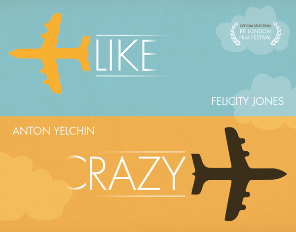
For this poster we’re going to be giving a unique spin on the poster design for theindie movie ‘Like Crazy’. The studio poster for the film pictures the stars in a romantic embrace, but we can give this a more quirky spin in our own poster design.
The film tells the story of a transatlantic young couple, one British, one American, and the problems they encounter while trying to sustain a long-distance relationship.
Let’s communicate the theme of the film with a simple graphic: a plane!
Step 1
If you feel confident using Adobe Illustrator or CorelDRAW, you can choose to create your own graphic. Here, I’ve lifted an element from this graphic from GraphicRiver, isolating a single plane image in Illustrator.

If you’re doing the same in Illustrator you can simply Edit > Copy the vector inIllustrator, and then return to InDesign and Edit > Paste directly into your document.
Position the plane vector at the top left corner of the page, and adjust the Fill Colorof the vector (from the Swatches panel) to Mustard.

Step 2
Edit > Copy and Edit > Paste the plane vector, then Right-Click (Windows) or Control-Click (Mac OS) > Transform > Flip Horizontal.
Holding Shift, drag the corner of the pasted plane upwards to make it a little bigger, then adjust the Fill Color to Brown. Position in the lower right corner of the page, as shown.

Step 3
Take the Line Tool (\) from the Tools panel and, holding Shift, drag your mouse from left to right to create a line about 245 mm in Length. Set the Stroke Color of the line to [Paper] (White). Position to the right of the mustard-colored plane, extending from the top of the tail of the plane.

With the line selected, go to Object > Effects > Gradient Feather. Pull theGradient Stops a little closer together, and flip the direction of the gradient by clicking the button to the right of the sliding scale. Click OK.


Select the line and Edit > Copy, Edit > Paste. Position below the first line, extending from the bottom of the plane’s tail.

Drag to select both white lines and Edit > Copy, Edit > Paste. Then Right-Click (Windows) or Control-Click (Mac OS) > Transform > Flip Horizontal.
Position to the right of the brown plane, adjusting the gap between the lines to match the width of the plane’s tail.

Return to the Layers panel and Lock the Planes layer. Unlock the layer below,Typography.

5. Use Clean and Vintage-Inspired Fonts
Step 1
We’ll be using just one font across the poster design: Futura Std (Light and Book). You’ll probably have Futura Std installed by default as part of the Adobe set of typefaces, but if not you can download the font or use Futura instead (which has a different selection of weights).
In your InDesign document, and on the Typography layer, select the Type Tool (T)and drag to create a text frame 110 mm in Width and 95 mm in Height.
Type ‘LIK’ and set the Font to Futura Std Light, Size 280 pt, and the Font Color to[Paper].
Position the text frame between the top set of white lines, to the right of the mustard-colored plane.

Select the text frame and Copy, Paste. Edit the text to read just a single letter, ‘E’, and position to the right of the ‘LIK’ text frame. With the ‘E’ frame selected, go toObject > Effects > Gradient Feather and pull the gradient stops closer together. You may need to flip the direction of the gradient, so that the E fades from left to right.


Step 2
Do the same for the lower part of the poster, instead typing ‘RAZY’ into one frame, and ‘C’ into the other. Apply the gradient to just the ‘C’ text frame, and allow the gradient to fade from right to left instead.

Step 3
Remaining still on the Typography layer, take the Type Tool (T) and create a new, smaller text frame. Type ‘FELICITY JONES’ into the frame and set the Font toFutura Book, Size 70 pt, Align Right and Font Color [Paper]. Position the text frame in the top half of the page, to the right side, close to the halfway point of the layout.
Copy and Paste the text frame, adjusting the text to read ‘ANTON YELCHIN’ and the alignment to Align Left, and position to the left of the layout, at the top of the mustard half of the page.

Create a final text frame, typing in ‘OFFICIAL SELECTION (paragraph break) BFI LONDON (paragraph break) FILM FESTIVAL’ and setting the Font to Futura Book, Align Center.
Highlight just ‘OFFICIAL SELECTION’ and set the Font Color to Brown and Size to22 pt. Highlight the remainder of the text and set the Font Color to [Paper] and theSize to 35 pt.
Position this text frame at the top right corner of the page, as shown.

Back in the Layers panel Lock the Typography layer and Unlock the layer at the top, Clouds.

6. Final Touches!
Your poster’s looking great!

We can now just add a couple of finishing touches to give it that extra edge...
Step 1
Open Adobe Illustrator and create a new document at any size.
You can create a very simple cloud shape using the Arc Tool (find it under the Line Segment Tool drop-down menu, in the Tools panel).


Click and drag to create a simple sequence of curves, working from left to right. Use the Direct Selection Tool (A) to edit the depth of the curves until you’re happy with the shape.

Move around in a rough oval, until you have a cloud shape like this:

Then, with all the lines selected, go to Object > Path > Join to create an enclosed shape.

Finally, select the shape and go to Edit > Copy.
Step 2
Return to InDesign and your poster document. Go to Edit > Paste to drop in the cloud vector.
You can treat the vector as you would a shape or frame in InDesign. From the top control panel, adjust the Stroke Color to [None] and set the Fill Color to [Paper].

With the shape selected, go to Object > Effects > Transparency. Set the Mode toOverlay, and reduce the Opacity to 20%. Click OK.

You can Copy and Paste the cloud a couple more times, and adjust its size, placing one smaller cloud behind the BFI text, and another just overlaying the name of Felicity Jones.
Your poster artwork is complete, and it looks fantastic. Great work!

Step 3
If you’d like to export your poster ready for sending to professional printing, go up toFile > Export, selecting Adobe PDF (Print) from the drop-down menu. Set theAdobe PDF Preset to Press Quality.

Make sure to include Printer’s Marks and your pre-prepared Bleed before you hit the Export button.

Ta-dah! Your poster is ready for printing. Congratulations!

Conclusion
Fan-art movie posters are really fun to put together, and can present movies in a completely different light to the studio-generated designs. To create your own alternative movie poster, consider incorporating some of these tips and tricks to give your poster an on-trend, design-led look:
- Use papery background textures to give the poster an authentic, retro-inspired feel.
- Consider using a limited number of colors to keep the poster design simple and striking.
- Choose strong, simple graphics to communicate the main theme of the movie.
- Keep your fonts simple, classic and legible to complement minimal designs.

.webp)


