Menus play a huge part in shaping a diner’s experience, for the better or worse (we’re aiming for the former!). Whether you’re creating a menu for a restaurant, café, or pop-up, or just simply looking for a way to wow friends or family at a special dinner party, you can easily liven up the table with these simple-to-create and trendy summer menu cards.
We’ll be using Adobe InDesign for this tutorial, and you won’t even need to download any images or graphics—the menu designs are based around strong, striking typography and a simple, summer-friendly color palette.
Let’s begin!
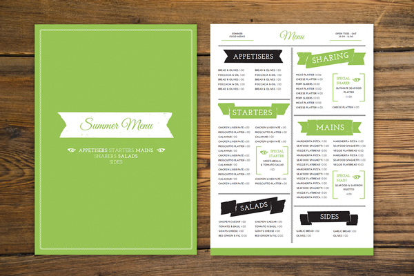
This shows the menu layout we’ll be creating—a two-sided, single page menu, at a large size (11.69 inches by 16.54 inches).
NB: If you want to create a smaller menu, you can export the final menu (see final steps, below) and resize it in Photoshop.
Front:

Reverse:

1. Set Up the Menu Document in InDesign
Step 1
Get InDesign opened up and select File > New > Document.
Keep the Intent set to Print, and up the Number of Pages to 2. Uncheck Facing Pages.
Under Page Size, select Custom... from the drop-down menu, to open the Custom Page Size window.
Type Menu into the name box, and set the Width to 11.69 in (or 296.926 mm) andHeight to 16.54 in (420.116 mm). Click Add, and then OK to return to the New Document window.

Step 2
Set the Number of Columns to 4, and reduce the Gutter to 0 mm—this splits the page (within the margins) into four even sections.
Set the Margins to different values: 40 mm on the Bottom, 23 mm on the Top,15 mm on the Right and 15 mm on the Left.
Give your document a Bleed (essential for when you send the card to print) of 5 mmall the way round.

Click OK to create your new document.

2. Create Layers to Organize Your Layout
Let’s create a sequence of layers, to help structure our design and make elements easily lockable and editable.
Step 1
Expand the Layers panel from the right side of the workspace, or go to Window > Layers.
Double-click on the default Layer 1 name to open the Layer Options window. Rename the layer as Border and click OK.

Step 2
Select New Layer from the panel’s drop-down menu. Rename the new layer asColor and click OK.


Create a final, third new layer, and rename it as Typography.

Once you have the sequence of three layers, Lock both the Typography and Colorlayers, and click on the Border layer to activate it.

3. Build a Border on Your Menu
We’re going to start working on the Reverse side of the menu (the side with the most text), which we’ll take as Page 2 of the InDesign document.
Step 1
Move down to Page 2 of the document by scrolling down, or clicking on the Page 2page icon in the Pages panel (Window > Pages).
Remaining on the Border layer, select the Line Tool (\) from the Tools panel (docked to the left side of the workspace). Holding Shift, drag your mouse downwards from the top margin, along the center line of the page (marked out by the column lines), extending it to the bottom margin.
Open the Stroke panel (Window > Stroke), and increase the Weight to 3 mm and select White Diamond from the Type drop-down menu.


Step 2
With the Line Tool (\) still selected, hold Shift and drag from left to right along the border of the top margin. Set the Stroke Weight to 2 mm and Type to White Diamond.

Select the line you’ve just created and Edit > Copy, Edit > Paste. Drag one end of the line to reduce its length to 130 mm.
Position on the left side of the page, crossing the two far-left columns, at Y position 136 mm. Copy and Paste the short line, and position on the left side again, this time at Y position 307 mm.
Copy and Paste twice to create two more short lines, positioning both on the right side of the page, at Y positions 165 mm and 329 mm.

Return to the Layers panel and Lock the Border layer. Unlock the next layer up,Color.
4. Pick a Fresh, Summery Color Palette
Your menu should look good enough to eat! Color can play a big part in how attractive the menu looks (and how optimistic people feel when they read the dishes).
Step 1
For this menu, we want to pick a single, strong color that will work well with black and white elements. Here I’ve gone for a grass-fresh green, but feel free to try out a different strong shade (why not try a sky blue, or a hot coral?) when creating your own menu.
To create the green used here, open up the Swatches panel (Window > Color > Swatches) and click on the New Swatch icon at the bottom of the panel.
Double-click the new default swatch to edit it.
Keep the Color Type as Process, and the Color Mode as CMYK. Adjust the sliders to the following values: C=46 M=5 Y=87 K=0. Uncheck the Name with Color Valuebox at the top of the window, and rename the swatch as Grass Green. Click OK.

Step 2
Remaining on Page 2 of the document, and on the Color layer, select theRectangle Tool (M) and drag to create a shape 307 mm in Width and 18.7 mm inHeight. Position at the bottom of the page, resting against the bottom, right and left bleeds.
Set the Fill Color to Grass Green and the Stroke Color to [None].

Step 3
Move up to Page 1 of the document and use the Rectangle Tool (M) again, this time to create a shape that extends across the whole page, up to the bleed on all sides.
Set the Fill Color to Grass Green and the Stroke Color to [None].

Remaining on the same page, take the Rectangle Tool (M) again, and drag to create a shape 278 mm in Width and 401 mm in Height. Set the Fill Color to[None] and the Stroke Color to [Paper].
From the Stroke panel, or from the control panel running along the top of the workspace, set the Stroke Weight to 3 mm and Type to White Diamond.

Return to the Layers panel and Lock the Color layer. Unlock the top layer,Typography.
5. Choose Fun, Legible Fonts for Your Menu
Unless you're designing a menu for a very formal restaurant, menu cards tend to be on the informal and fun side. After all, their aim is to present dishes in an enticing, exciting way to the diner!
You can have fun with color and fonts, but try sticking to this guiding rule: choose a maximum of three fonts for the text. One can be a fun, quirky display typeface (for the menu title), one a legible typeface which suits sub-headings, and a third which is a simple, easy-to-read typeface for listing the dishes and prices (a sans serif is a good pick).
For this menu design, I will be using:
- Great Vibes: for the menu title on the front and reverse of the card
- Josefin Slab: for sub-headings
- Josefin Sans: for the body text
It’s a great idea to also seek out nice symbol fonts (wingdings) for using to add graphic elements to your menu layouts. Here, I’ll also be using:
- Adhesive Nr. Seven: for easy-peasy banner graphics
- Davys: a quirky symbol font, for vintage elements
Download and install all the fonts above, and then return to your InDesigndocument.
Step 1
Back in InDesign, remaining on Page 1 of the document and on the Typographylayer, select the Type Tool (T) and drag to create a text frame in the center of the page. Set your cursor into the frame and, from the Character Formatting Controlspanel at the top of the workspace, set the font to Adhesive Nr. Seven, Size 350 ptand Align Center.
Open the Glyphs panel (Window > Type & Tables > Glyphs) so you can view the full set of symbols available in the Adhesive Nr. Seven Font.
Double-click on one of the banner glyphs to insert it into the frame.

Set the Font Color to [Paper].

Step 2
Create a second text frame using the Type Tool (T) and type in ‘Summer Menu’ (or your preferred menu title). Set the Font to Great Vibes, Size 70 pt, Align Centerand Font Color to Grass Green.
Layer the text frame over the white banner, as shown.

Step 3
Create another text frame, and position it below the white banner, centrally on the page. Type:
‘Appetisers Starters Mains
(paragraph break)
Sharers Salads
(paragraph break)
Sides’
Set the Font to Josefin Slab, varying each word between the Bold and Regularweights, and Size to 25 pt. Set the text to All Caps, Align Center, increase theTracking to 50, and Font Color to [Paper].

Step 4
Introduce a new small text frame, click your type cursor into it, and set the Font toDavys. From the Glyphs panel select the pointing hand glyph and double-click to insert. Set the Font Size to 22 pt and Color to [Paper].
Position the text frame to the left of the top line of text beginning ‘Appetisers...’.

Select the text frame and Edit > Copy, Edit > Paste, flipping the frame by Right-Clicking (Windows) or Control-clicking (Mac OS) > Transform > Flip Horizontal. Position the second hand to the right of the central text frame.

You’ve finished the Front of your menu card. Great work!

Now we can fill the Reverse side with typography...
6. Finish the Reverse of the Menu Card
Step 1
Move down to Page 2 of your document, to the Reverse side of the menu.
Take the Type Tool (T) and create a text frame at the top center of the page. Type‘Menu’ into the frame and set the Font to Good Vibes, Size 55 pt, Align Centerand Font Color to Grass Green.
To the left of the ‘Menu’ text frame create another text frame, and type in ‘Summer (paragraph break) Food Menu’, setting the Font to Josefin Slab Bold, Size 12 pt, Tracking 50, All Caps and Align Center.

Take the Line Tool (\) and drag to create a perfectly straight horizontal line (holdingShift), about 57 mm in Length. From the Stroke panel, set the Weight to 1 mm,Type to Thick-Thin and Color to Grass Green.
Position the line below the text frame you just created.

Step 2
Select both the ‘Summer...’ text frame and line, and Edit > Copy, Edit > Paste, moving the pasted elements onto the right-hand side of the page. Edit the text to read the restaurant’s opening hours (or any other information you’d like to provide).

Step 3
Create a new text frame at the top-left of the page, below the top margin, and set theFont to Adhesive Nr. Seven, Font Size to 180 pt and Align Center.
From the Glyphs panel, select a banner symbol and double-click to insert.

Repeat the step above, creating five more banner text frames, varying the sort of banner and the color between [Black] and [Grass Green]. Position as shown, at the top of each marked section of the menu.

Step 4
Over the top of each banner text frame, layer another text frame, containing a sub-heading. Set the Font to Josefin Slab Bold, varying the Size from 40 pt for more prominent sections (e.g. Starters, Mains) and 35 pt for others (e.g. Appetisers).
Set the Font Color to [Paper], All Caps, Align Center and up the Tracking to 50.


Step 5
Zoom in to the top-left corner of the menu. Take the Type Tool (T) and drag to create a text frame 63 mm in Width, just shy of the width of the first column. Type in your appetiser dishes, setting the Font to Josefin Sans, Size 13 pt, Leading 24 ptand Align Left.
Highlight the dish and set the Font Weight to Bold, setting the prices in a Light Weight.

Once you’ve set this up, you can Edit > Copy, Edit > Paste the text frame, positioning the second text frame in the second column, resting against the column line. You can then Copy and Paste the two columns of text across all sections of your menu, editing the text content as you please.

Step 6
Text-heavy menus can be overwhelming, and sometimes highlighting special dishes can give your diner something to choose quickly.
Leave some space on different sections of the page free of text (one column’s width, about seven lines high), so that you have room to make a feature of some special dishes, as shown below.
Take the Type Tool (T) and drag to create a tall, narrow text frame. Position it in one of the blank spaces on the page, to the left side of the space. Place your type cursor into the text frame and set the Font to Josefin Sans, Thin, Size 160 pt, and Font Color to Grass Green. Type a square bracket ( [ ) into the text frame.

Select the text frame and Edit > Copy, Edit > Paste, adjusting the text to a left-facing square bracket ( ] ).

Step 7
Create another text frame, typing in ‘Special (paragraph break) Sharer (or Main, Starter, etc.)’, and set the Font to Josefin Slab, Bold, Size 18 pt, All Caps, andFont Color to Grass Green. Position between the brackets, up in the left-hand top corner.
Create an additional text frame to sit below it, with text aligned center, and the Fontset to Josefin Sans.

As a final touch, create another text frame and set the Font to Davys, Size 22 ptand Color to Grass Green. Use the Glyphs panel to drop in a pointing hand, and position the text frame to the right of the ‘Special...’ sub-heading.

Step 8
Select the two square brackets, the enclosed text and the hand graphic, and Edit > Copy, Edit > Paste a couple more times to use them across the page. Adjust the text content accordingly.

The Reverse side of your menu is finished—great work!
You’re now ready to export your menu, ready for sending to print. Read on to find out how...
7. Export Your Menu for Print
Step 1
Once you’ve checked your InDesign document for spelling errors (Edit > Spelling > Check Spelling), you’re ready to Save the document and Export it to a print-ready format.
Head up to File > Export, and select Adobe PDF (Print) from the Format drop-down menu in the Export window. Click Save.

Step 2
In the Export Adobe PDF window that opens, choose [Press Quality] from theAdobe PDF Preset drop-down menu.

Move down to the Marks and Bleeds options, from the left-hand menu in the window. Check All Printer’s Marks and check Use Document Bleed Settings.

Click Export to create your print-ready file!

Conclusion
Your menu is finished and ready for sending straight to the printers! Congratulations!

In this tutorial we’ve covered a range of skills and techniques which are really useful for creating print documents in Adobe InDesign. You can now feel more confident in:
- Setting up a basic, two-sided document for print in InDesign
- Using the Line Tool and Stroke panel to create attractive borders for your print layouts
- Choosing simple, purpose-appropriate colors and fonts for your designs
- Layering color, text and simple graphics to create a modern, on-trend look to your print designs
- Exporting your hard work to a print-ready PDF format


