If you’ve recently graduated or found yourself delving back into the job market, you’ll have to make sure your resumé is up to scratch and ready to wow your future employer.
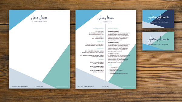
A great way to grab an employer’s attention is to create a set of branded correspondence materials that reflect your personality and look really fantastic. In this tutorial I’ll show you how to create a branded resumé, letterhead and business card in Adobe InDesign, and take a look at how you can transfer your personal branding across all the print items to create a unified, uber-professional look.

This will work especially well for creatives (e.g. illustrators, designers, artists, etc.) who want to use their CV as an opportunity to show off their layout design skills. This tutorial is quick, simple and suitable for beginners to Adobe InDesign.
Right, let’s get started!
1. Creating Your Personal ‘Brand’
It may sound a bit corny, but creating a brand identity for yourself can really set you apart from the competition when applying for that dream job, and it also gives a great first impression if you’re setting up shop as a freelancer or independent artist.
But where to begin? A good place to start is to take influences from your own work and personality to make your branding feel authentic. Are you an illustrator, graphic designer or web designer? Is your work more artistic, or more technical? Do you create lavish, detailed vector art, or are you more into minimal design? Are there any colors you are attracted to again and again in your work?
Assess your answers, and then also think about how you would want to present yourself to a client or employer. Will they be looking to employ somebody with a very creative eye who will respond to briefs with innovative ideas, or someone who will code a website in as little time as possible?
In short, your personal branding should reflect both your own work style, and also how you would like a client to assess you. So keep it authentic to you, but also give it a hefty dose of professionalism!
In this tutorial, I’ll walk you through the steps for creating a branded set of stationery for a fictional illustrator and graphic designer, Josie James. I’ll also give you some tips on how to go about developing your own brand identity that will give your items a unique look. Let’s get going...

2. Setting Up Your InDesign Document
We’ll create a full set of print materials, including a letterhead, a resumé, and two styles of business card in a single document, using InDesign’s Page Tool to resize pages as we go. Firstly, let’s set up a new document at a US Letter size, ready for creating a letterhead.
Open up InDesign, and select File > New > Document from the top menu.
In the New Document window that opens, keep the Intent of the document set toPrint and Number of Pages to 1. Uncheck Facing Pages.
Under Page Size select Letter (or ‘US Letter’) from the list of options, which is215.9 mm in Width and 279.4 mm in Height.
Under Margins, set the Top Margin to 8 mm, Bottom to 15 mm, and both the Leftand Right to 6 mm.
Set the Bleed on all sides to 3 mm.
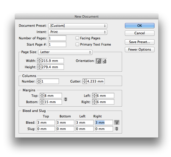
Click OK to create your new document.

3. Choose Fonts and Create a Color Palette
Before we start to design our branded materials, let’s decide which fonts are going to be suitable for use across all the items, and which colors will look great. Note that the fonts and colors have to work equally well across all three items—the letterhead, resumé and business card.
Step 1
What I think makes a great type pairing, and will work well across a range of different occupations, is a handwritten, signature-style font (or perhaps even better, to use your own signature) for your name, teamed with a minimal, paired-back sans serif font. It looks both personal and modern, and can be as minimal or fancy as you like.

For this tutorial, I’ve used the handwritten font Halo Handletter and the very legible, clean Open Sans.
Download and install both the fonts, and then return to your InDesign document.
Step 2
If you’re going to use color on your layouts, stick to a simple palette of related swatches to give your print items a professional, pared-back look.
Open up the Swatches panel (Window > Color > Swatches) and select New Color Swatch from the panel’s drop-down menu.

In the New Color Swatch window that opens, uncheck the Name with Color Valuebox and name the new swatch as Pistachio. Set the percentage sliders to the following levels: C=22 M=6 Y=43 K=0. Click Add.

Rename this second new swatch as Mint, and set the values to C=48 M=8 Y=27 K=0. Click Add.

Create a final new swatch, renaming it as Dark Blue, and setting the values to C=77 M=60 Y=15 K=53. Click Add, and then hit the Done button.


4. Create a Lovely Letterhead
Letterheads may seem a bit formal in this day and age, but you still can’t beat an old-fashioned letter if you’re looking to impress. Adorning your letters with your own branding gives an extra-special touch.
Step 1
Select the Rectangle Tool (M) from the Tools panel on the left-hand side of the InDesign workspace, and drag to create a shape 221.9 mm in Width and 32.6 mmin Height.
From the Swatches panel, set the Stroke Color to [None] and the Fill Color toPistachio.
Position the shape at the top of the page, resting it against the bleed.

Step 2
Select the rectangle and Edit > Copy, and Edit > Paste. Reduce the Height to18 mm and adjust the Fill Color to Mint. Position this second rectangle at the bottom of the page, resting against the bleed.

Step 3
From the Tools panel, select the Line Tool (\) and, holding Shift, drag from left to right to create a straight line, just a little longer than the width of the page.
Open the Stroke panel (Window > Stroke) and, from here, set the Weight to 9 mmand the Type to Right Slant Hash.
From the Swatches panel set the Stroke Color to Mint.
Position the line just running along the top of the bottom rectangle, as shown.

Step 4
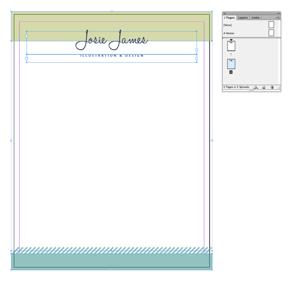
Select the Type Tool (T) and drag to create a text frame towards the top of the page. Type ‘Name’ and set the Font to Halo Handletter, Size 69 pt, Align Center, and set the Font Color to Dark Blue.
Position so that the color of the rectangle behind divides the line of text in half, centrally on the page.

Step 5
Create a second text frame and type ‘Occupation’. Set the Font to Open Sans, Semibold, Size 10 pt, All Caps, and up the Tracking to 390. Set the text to Align Center and the Font Color to Dark Blue. Position centrally on the page, just below the ‘Name’ text frame.

Step 6
Create a new, smaller text frame, and position it in the bottom left corner of the page, over the top of the mint-colored rectangle.
Type ‘Address’ and set the Font to Open Sans Regular, Size 9 pt, All Caps, Tracking 100, and Font Color to [Paper] (White). Pull out the city or country in aBold weight.

Edit > Copy, Edit > Paste the text frame and position at the same alignment, but centrally on the page. Adjust the text to read ‘Telephone Number’ and the text toAlign Center.
Finally Copy and Paste another text frame, positioning on the far-right side of the page, and adjust the text to read ‘Email’ and text to Align Right.

Your letterhead is finished! It looks simple and striking, and there’s plenty of room for you to type up your letter. Great work.

Now, on to creating your resumé, carrying over some of the elements of the branding we’ve used on our letterhead.
5. Design a Compelling Resumé
We can carry over some of the branding elements we’ve already created to the resumé, which will give your stationery a unifying theme.
Step 1
You’ll need to create a new page on your InDesign document for your resumé design.
Expand the Pages panel (Window > Pages) and click the New Page icon at the bottom of the panel to create a second page.

Step 2
Remaining on Page 1, drag your mouse across the page to select all elements except the three text frames at the bottom of the page (use Shift to deselect them), and go to Edit > Copy.
Navigate down to Page 2 of the document, and select Edit > Paste in Place, to paste the elements onto your resumé page.
Resumés can be lengthy, so let’s give the layout more breathing space by moving the top elements (the pistachio rectangle and two text frames) a little upwards, and the bottom rectangle and line a little further down, as shown below.

Step 3
To make the most of the space on the page, let’s split it into two columns. Head up to the top menu, and click Layout > Margins and Columns.
Increase the Number of Columns to 2 and the Gutter to 16 mm. Click OK.

Select the Line Tool (\) and, holding Shift, drag from top to bottom down the center of the page to create a line about 213 mm in Length. From the Stroke panel(Window > Stroke) set the Weight of the line to 2 mm and the Type to Straight Hash.
From the Swatches panel set the Stroke Color to Mint. Position the line so that it sits in the center of the page, running from below the title.

Step 4
Take the Type Tool (T) and drag to create a text frame 87 mm in Width and175 mm in Height. Position on the left side of the page, resting the right side against the column guide.
Here you can start to type up your resumé details. Start with your contact details, then a short bio, your educational qualifications and any awards or recognitions.
Highlight all the text and set the Font to Open Sans Regular, Size 10 pt, Leading 14 pt and All Caps. Adjust the text to Align Right from the Character Formatting Controls panel at the top of the workspace.
Pull out individual headings and other bits of important information in a Bold weight.

Set the headings (e.g. ‘Contact Details’) in a Mint color.
Select the text frame and Edit > Copy, Edit > Paste, positioning the second frame on the right-hand side of the page, resting the left side against the column guide as shown. Adjust the content of the text to read about your previous employment or work experience placements, and leave a little bit of room towards the bottom of the frame to list your key skills.
Adjust the text to Align Left, so that now both text frames align towards the center of the page.

Step 5
It’s a great idea to leave the reader with a concise, punchy set of skills at the end of your CV. You can pull them out and make them more prominent using a bulleted list.
Type out your list of skills, giving one line of text to each, and pull out the text in aMint swatch.
Highlight the list of skills with your type cursor, then head up to the menu at the top of the workspace and find the Bulleted List button, over towards the right side of the controls panel.

Press Alt and click the Bulleted List button to open up the Bullets and Numberingwindow. From the Bullet Characters select the Double-Angle Quotation Mark(>>). Under Character Style, select New Character Style... from the drop-down menu.

This opens up a new window, the New Character Style window. From here we can format the bullets more precisely, and save the formatting as a new Style.
From the window’s left-hand menu select Character Color, and scroll down the list of swatches until you see Mint. Click on Mint to select it. Then hit the OK button. HitOK again to return to the document.

Your bullets are looking lovely!

And that’s it—your resumé is complete, and it’s looking great!
All that’s left to do is your business card. We’re going to borrow formatting elements from the letterhead and resumé so that you can create different designs, which will illustrate how you can be flexible and creative while working within the same brand guidelines.
6. Mean Business With a Beautiful Business Card
Business cards can make a great first impression on an employer or client. Simple, clean designs look modern and striking, without being fussy.
Step 1
Remaining on the same InDesign document, create a new page by selecting theCreate New Page icon at the bottom of the Pages panel.
From the Tools panel, select the Page Tool (Shift-P) and click once onto your new page. You can either drag the sides of the page inwards to create a smaller page, or enter the following values into the text boxes in the top controls panel: Width 89 mm, Height 51 mm.

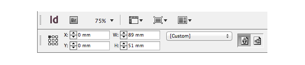
This is a standard US business card size, but you can size your card a little larger if you prefer.
Head up to Layout > Margins and Columns, and set the Margins to 5 mm on all sides. Click OK.

Step 2
Navigate back up to the letterhead and select both the ‘Name’ and ‘Occupation’ text frames at the top of the page. Edit > Copy, and then return to Page 3 of your document. Choose Edit > Paste, and adjust the Font Size of the ‘Name’ to 63 pt, and the Font Size of ‘Occupation’ to 8 pt.

Step 3
Head back up again to the letterhead page (Page 1) and select the hashed line at the bottom of the page. Copy, and then Paste the line onto the business card page. Position at the bottom of the page, just edging onto the bleed. Adjust the Stroke Color to Pistachio.

Select the line and Edit > Copy, Edit > Paste, flipping the line by Control-Clicking (Mac OS) or Right-Clicking (Windows) > Transform > Flip Vertical. Position the pasted line along the top of the card, and adjust the Stroke Color to Mint.

As simple as that, you now have a business card design that matches the branded look of your letterhead and resumé!

Conclusion: How to Create Your Own ‘Brand’ and Make it Flexible
It’s really easy to borrow different elements of your ‘brand’ look and create new business card designs. In this example, I’ve used the Rectangle Tool (M) to create a block of color, to sit behind the text, and used the Line Tool (\) to create narrow lines that meet the text from either side.


You can also vary the color to give your cards different looks. With advanced digital printing, many print companies can now provide multiple prints within one print run, allowing you to experiment with different designs without maxing out your budget. To keep the designs looking like a set, keep one element of the design the same—whether that’s the font style or the colors.
So, where to start with creating your own brand design for your stationery? Simple block colors and shapes are a great place to start—they look striking and modern, and can look really different with different color options.
Try one of these color combinations to give your designs an eye-catching look: yellow and black (tech-forward and punchy), grey and cream (subtle and professional), blues and grey (like the examples below; a neutral, design-led color choice).


Choose fonts that are contemporary, but make sure they reflect your own personality and taste.
A final tip—keep things simple and minimal to let the content of your items (the details of your resumé, your covering letter) shine; there’s nothing worse than straining your eyes looking at elaborate designs when you just want to be able to read the text.
Have fun experimenting with creating your own branded stationery in InDesign! Feel free to share your examples in the comments below.


