In this tutorial I'll show you the process of drawing a vintage camera and a cherry blossom twig, using sepia color ink liners, white ink pen and toned beige paper. I use sepia (warm brown) colored liners, not black, because it creates a harmonious combination with the paper color, and also it reflects the delicate, mild look of this artwork.
Drawing on toned paper can be a very interesting experience for an artist. It’s also convenient for fast sketching, because the color of the paper sheet is undertaking a big amount of the artist’s effort. The right choice of paper tint is an important detail here, because if you draw on paper that's too dark, it can be difficult to create obvious shadows and gain the contrast in your artwork. If the paper is too light, then it can be a problem with the definition of the highlights. However, there are no strict rules, and everything depends on your decisions.
The big advantage of toned paper is that it creates value itself, so you can leave substantial parts of the paper untouched. Also it gives you the possibility to actually create highlights, not just rely on the contrast, as in the case of traditional black and white drawings. That’s why this technique is so great for sketching and quick studies, and also very handy for large paper. It’s important to know where to stop, because your drawing won’t be so effective if you leave no blank paper.
My drawing for this tutorial is more a stylized expressive study than a strictly realistic artwork. Sketching quickly, on inspiration, depicting general forms, is an excellent exercise for improving art skills. This technique is appropriate for any supplies combined with toned paper: pencils, pens, markers, charcoal. If you feel comfortable and confident with your materials, you can even skip the preliminary pencil sketch part and move to drawing directly on the toned paper.
What You Will Need
White paper (1 sheet of ordinary printer paper is enough)
Toned beige paper (2 sheets of A4 size is the best option)
A graphite HB or F pencil
A rubber
Sepia ink liners (mine are 0.05 mm, 0.1 mm, 0.3 mm and 0.5 mm)
White ink gel pen (or white ink as substitute)
1. Draw a Pencil Sketch
Step 1
A camera is quite a difficult object to draw from memory or imagination, because it has specific proportions and details. I'll be using this stock photo of a vintage camera that I’ve found on PhotoDune. If you have a reference photo too, you're not obliged to copy closely all the features of the camera in your image. Sometimes it's enough to capture only general proportions and some details.
Firstly I draw a simple rectangle for the camera’s main shape.
Step 2
It’s necessary to find the vanishing point for correct perspective construction of the drawing. Let's imagine that our vanishing point is above the camera’s center. In the image below you can see this point on the horizon’s line.
Step 3
All the lines of the drawing will aspire to this point. I mark the dashed lines for future reference. These lines will help with drawing correct perspective foreshortening.
Step 4
I outline the inner shape of the camera, its bottom and sides. The side lines are following the dashed guides that I’ve drawn in the previous step.
Step 5
I roughly mark the prominent part of the camera. It has two trapeziform shapes, top and bottom. In my case this prominent part is slightly shifted from the center of the camera to the side.
Step 6
I find the middle line of this newly drawn shape by approximate measurements of the horizontal part, and mark it as a dashed line. Now we need to find the center of the camera lens for future steps. As I can conclude from observing the reference photo, its center is located on the middle line of the prominent part with a slight shift to the bottom of the camera. Then I draw a circle based on this central mark. You can use compasses to be sure your circle is even enough.
Step 7
I draw another circle on the external side of the existing circle, as if one shape is located inside another.
Then I add a rounded shape to depict the volume of the lens. We are looking at the camera from above, so the central part is wider and more visible, and the sides decrease in size proportionally.
Step 8
I move to the top part of the camera and draw the flash. Just look at the reference photo and transfer your observations onto the paper.
Step 9
Before we proceed to the round details on the top horizontal plane of the camera, it’s useful to pay attention to the perspective shortening of the round objects. In a simple way, the lower (or higher) the object is relative to the horizon line, the bigger will be its visible circumference. The closer the object is to the horizon, the more reduced is the shape.
Here is a rough illustration of this concept as applied to this drawing: the lower the round object is relative to the viewer's eyes, the wider is its visible circumference.
Keeping this knowledge in mind, I draw the round elements on the upper plane of the camera, and also make the sides of the camera more rounded and smooth.
Step 10
It’s time to mark the details of the camera’s front and outline the segments. I just use a reference photo plus some creative imagination.
Step 11
I continue to add small details to the body of the camera. The details make the artwork more credible and interesting as well.
Step 12
It’s not fortuitous that I left the flowers to these last steps of the sketch part. If we started with the foreground of the drawing, it would be difficult to complete the composition while matching the background with all its strict and even details.
I draw the curvy shape of the twig with circles for future flowers, and the stylized forms of the leaves.
Step 13
Cherry blossom is a simple flower form, so I'll draw it from memory. Simplistically, it's five petals and a fluffy central part. Evaluating your composition at every step of the process is important, so I feel that my drawing will be more balanced if I make the flowers of the small group a little bigger and add more leaves to the twig.
Now the pencil sketch is ready to become a basis for the ink artwork.
2. Create the Sepia and White Ink Drawing
Step 1
I trace the sketch onto the toned paper sheet, using a window glass. We need here the general shapes, because you can always use the reference photo and the pencil sketch. Pencil lines that are too heavy can damage your artwork’s look, so as you can see my strokes are very light, even assimilating with the paper sometimes. Also it’s important to pay attention to every line you draw with ink liners, so that the artwork becomes vivid and lively, instead of just tracing your basic sketch mechanically.
Step 2
Do you know how your liners work in combination with the toned paper? If it’s the first time you're drawing using these supplies, try them before touching your clean copy artwork. Using the same paper as for your future drawing is the best solution here, or at least something similar.
I've created small squares of hatching, using all sepia liners, from the thinnest 0.05 mm to 0.5 mm. Try to vary the intervals between the lines, because it’ll show some interesting effects of placing your lines closer or farther one from another. As you can see, my hatching is more frequent in the bottom part of the square than in the upper.
The white ink pen is also worth trying beforehand.
Step 3
Let’s start with the flowers and the shadow below them, because starting with the camera in this case can cause accidental damage to the foreground.
With 0.3 mm liner, I mark the main shadow areas with parallel horizontal hatching. I imagine the allocation of light in this composition as soft and mild, but the presence of shadows is obligatory. Shadows and heavy ink lines allow us to achieve the necessary level of contrast and volume.
Step 4
The flowers are closer to the viewer than the camera, so it’s reasonable to make them stand out. With the 0.5 mm liner I create the contour of flowers and leaves, and then expand the shadow area at the bottom of the camera. It creates a strong contrast in the drawing already.
Step 5
We should be consistent to get a well-balanced result, so the next step is to proceed to the side lines and outline the contours of the camera. I cover the pencil strokes with the 0.3 mm liner.
Step 6
And now I come back again to the flower twig. With 0.3 mm liner I create spots of hatching on the leaves and twig.
Step 7
The flowers are delicate—cherry blossom is usually white or light pink. They are supposed to be the lightest objects in our composition. So it’s important to leave them mostly untouched, especially in the areas of the petals' bend, so I coat the flowers with tiny, delicate as lace, 0.1 mm hatching.
Step 8
I switch again to the camera and create a textured look, similar to the texture pattern of the reference camera. I use a 0.1 mm liner, using repeatedly pairs of small and short strokes.
Step 9
I move to the upper part of the camera. With 0.05 mm liner I add tiny hatches to the vertical plane. It’s reasonable to use cross-hatching and any overlapping strokes, especially closer to the external sides of the object—it creates volume.
Step 10
The next important part is the lens. I use 0.05 mm rounded strokes and also some parallel lines on the lens, where I intend to create a shadow.
Step 11
Some contours of the camera seem too light and lost to me. With 0.3 mm liner I make them more prominent. Also add a layer of dots to the lens. As you can see, a combination of dots and rounded strokes that mirror the shape is a truly effective way to create a three-dimensional object.
Step 12
With 0.5 mm liner I outline the general shape of the objects, giving them more contrast relative to the paper tint. The shady areas need some darkening too.
Step 13
With 0.3 mm liner I add dots to the camera, where I've created a textured effect previously, and also mark the sides of the camera with cross-hatching.
Step 14
Now it’s time for real fun—the white ink! Just a little spot of it can make the drawing look very interesting and fresh. I add the whiteness mainly to the flowers, because they are supposed to be light and close to the viewer, and also some strokes on the camera’s lightest areas, to reproduce the play of light.
Step 15
I evaluate the drawing in general. Have I achieved the right contrast? It’s almost the result I imagined from the beginning, but with 0.1 mm strokes on the vertical plane of the camera and in shadows it looks better.
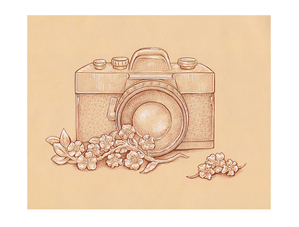
The Final Artwork
This is the completed drawing. I hope that you've enjoyed the process of working with sepia liners, white ink and toned paper. The principles of this technique can be applied to many projects and various media, and I wish you all the best in realizing your ideas! Thanks for your attention!
TDasany
Lorem ipsum dolor sit amet, consectetur adipisicing elit, sed do eiusmod tempor incididunt ut labore et dolore magna aliqua. Ut enim ad minim veniam, quis nostrud exercitation.
Medical Disclaimer
The information on this site is not intended or implied to be a substitute for professional medical advice, diagnosis or treatment. All content, including text, graphics, images and information, contained on or available through this web site is for general information purposes only. Krobknea makes no representation and assumes no responsibility for the accuracy of information contained on or available through this web site, and such information is subject to change without notice. You are encouraged to confirm any information obtained from or through this web site with other sources, and review all information regarding any medical condition or treatment with your physician. NEVER DISREGARD PROFESSIONAL MEDICAL ADVICE OR DELAY SEEKING MEDICAL TREATMENT BECAUSE OF SOMETHING YOU HAVE READ ON OR ACCESSED THROUGH THIS WEB SITE.