What You'll Be CreatingLast time we were talking about Mustelidae family,
narrowing it to bigger animals like wolverines, badgers, otters and
martens. Today we're going to take care of smaller members of the
family, including the tiniest carnivore ever, the least weasel.
Fortunately (or not), all the weasels (as we're going to call members of
genus Mustela) are very similar, so you can learn how to draw a general
weasel body and then bring in the details of one of the five species.
Five animals in one - that's pretty good deal, isn't it? Let's get
started!
What Does a Weasel Look Like?
Body Features
You've probably got a well-established image of a weasel in your mind, but let's specify it:
Weasels have long, thin, flexible body;
Long, slim neck is finished with a small head;
The snout is short and tapered;
The tail is long, stick-shaped;
Paws are small, with medium-length, non-retractable claws;
Legs are short, they enable both digitrade (fingertips) and plantigrade (whole hands/feet) locomotion.
The
arched back may conceal a bit the true shape of a weasel's barrow.
Although so straight and even back may seem odd, it's completely normal
for a weasel. Don't try to create curved barrow characteristic like in
cats or dogs - weasels are meant to look like a tube with legs, that's
not a mistake! Weasels
run using so called "bounding gait". It's quite primitive way of
locomotion, but it works very well for these slim, flexible bodies and
short legs of theirs. Bounding gait means all the legs are in the same
phase of running (pushing, stretching) at roughly the same time. In
other words, when one leg goes to inside, all of them go to inside (and
vice versa). Here comes the slower version: This was a skeleton you can use to create a basic pose for your weasel. You can easily add simplified muscle masses to it to create a body. (if you're having problems with the pose, check the importance of drawing poses.)
Head Proportions
When
drawing the head for a weasel, you can think of it as a kitten. Eyes
place below the middle line of the head circle will give your animal a
cute, innocent look. Weasel head - front viewIn the side view it's important to stress the short snout and streamline shape of the skull. Weasel head - side view
Feet
Weasels' paws are absolutely adorable! They're like little hands with fragile fingers and soft pads. When you compare them to cat paws, it becomes obvious that whole "hands", not only fingertips can be used for locomotion. Weasels'
feet are so tiny that it's better not to put too much detail in them -
they're a detail themselves! However, it's important to create a proper
shape for them. They're quite easy to draw both in plantigrade and
digitrade position: (the "thumb" isn't shown below, since it's a left
paw and it wouldn't be visible anyway) Drawing weasel paw in plantigrade and digitrade positionBut that was just a "universal" weasel. Let's take a look at the actual species!
Weasels Comparison
The Least Weasel
The
term "weasel" is usually used for the smallest member of mustelidae,
the least weasel. It's no bigger than a rat, but it's still a
blood-thirsty predator. It can be recognized by its short tail,
chocolate-brown coat and cream underside with an irregular border
in-between. The body is classically slim and long. The least weaselThe
head of this weasel was used for the template above. The eyes are big,
black and round, the nose is small, the ears are rounded and rather
flat. It's characteristic for the least weasel that the light underside
reaches the chin only. A brown patch, less or more merged with the rest
of the pelt can be observed on the sides. In colder areas the least weasel may turn completely white in winter. The least weasel - winter coat
The Stoat
The
stoat is a bit bigger than the least weasel, but very similar to it in
general appearance. The most prominent difference is longer tail with a
black tip and a straight and clear line between the colors of the fur. StoatThe
head is almost identical to the least weasel, but the light underside
reaches the mouth and creates a neat patch under the nose. The
stoat in its winter coat is called ermine. The tip of the tail stays
black, what makes it easy to distinguish from the least weasel. Stoat - winter coat
The Mink
The
mink is similar to otter in behavior and looks. It's semi-aquatic, with
water-resistant fur and slightly webbed paws. A few of color variations
of minks have been developed for fur production, but the original,
natural one is dark brown. MinkThe
head seems rounder than with other weasels, with slightly smaller eyes.
The light patch on the mouth appears on both lips for the European mink
and on the lower lip only (or not at al) for the American mink.
The Polecat
The
polecat is the origin of well-known ferrets. It's a big, heavy weasel
with interesting fur pattern - dark brown with gray or slightly blond
patches. Its silhouette is a bit stockier on the back, less tube-like. PolecatThe
head of polecat reminds me of a mini-wolverine with light snout and
cuter eyes. The black mask around them contrasts with light forehead.
The Ferret
The
ferret is a domesticated form of polecat. In the process of
domestication the look has also changed, and the ferret usually looks
lighter, less contrasting. Ferrets can also have one or more
light-colored paws, and a lot of various, polecat-unrelated color forms. FerretThe ferret can be easily distinguished by its pink nose and ear-insides. The
difference between the polecat and the ferret isn't always as clear as
shown below, but in drawing you can stick to it for clarity. Polecat - ferret comparison
Advertisement
Summary
The differences between weasels are the most easily observable when all the silhouettes are put next to each other: The same applies to the head shape:
That's All Folks!
Now
you're never going to confuse the least weasel with stoat again, and
you're one step closer to becoming an animal expert. So, what are you
waiting for? Grab a pencil and draw a cute weasel!
What You'll Be CreatingThis
piece focuses mainly on the Appearance panel, so you will only need
four rectangles and a tiny circle to create the background, the main
shape, the subscribe button, the text field and the tiny x button. You
will learn how to create pixel perfect shapes using the Snap to Grid
feature and how to cleverly use the Drop Shadow effect and some basic
blending techniques to add subtle shading and highlights.
1. Create a New Document and Set Up a Grid
Hit Control-N to create a new document. Select Pixels from the Units drop-down menu, enter 600 in the width and height boxes then click on the Advanced button. Select RGB, Screen (72ppi) and make sure that the Align New Objects to Pixel Grid box is unchecked before you click OK.
Enable the Grid (View > Show Grid) and the Snap to Grid (View > Snap to Grid). You will need a grid every 5px, so simply go to Edit > Preferences > Guides > Grid, enter 5 in the Gridline every box and 1 in the Subdivisions
box. Try not to get discouraged by all that grid, it will ease your
work and keep in mind that you can easily enable or disable it using
the Control-" keyboard shortcut. You should also open the Info panel (Window > Info) for a live preview with the size and position of your shapes. Do not forget to set the unit of measurement to pixels from Edit > Preferences > Units > General. All these options will significantly increase your work speed.
2. Create the Background
Step 1
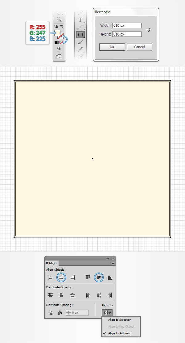
Focus on your Toolbar, remove the color from the stroke then select the fill and set its color at R=255 G=247 B=225. Pick the Rectangle Tool (M) and simply click on your artboard to open the Rectangle window. Enter 610 in the Width and Height boxes then click the OK button.
You need to center this new shape, so open the Align panel (Window > Align). Set the aligning to Artboard (open the fly out menu and go to Show Options if you can't see the Align To section as shown in the following image), make sure that your shape is selected then simply click the Horizontal Align Center and Vertical Align Center buttons. In the end your square should cover the entire artboard as shown in the following image.
Step 2
Reselect your square, open the Appearance panel (Window > Appearance) and add a second fill using the Add New Fill button (pointed by the blue circle in the following image).
Make sure that this new fill stays selected, open the Gradient panel (Window > Gradient) and simply click on the gradient thumbnail to add the default black to white linear gradient.
Keep focusing on your Gradient panel, select Radial from the Type drop-down menu then move to the gradient colors. Select the right slider and set the color at R=241 G=90 B=41 then select the left slider, set the color at R=255 G=247 B=225 and lower its Opacity to 0%. Grab the Gradient Tool (G), focus on your artboard and stretch your radial gradient as shown in the following image.
Return to the Appearance panel and click on the little arrow icon that stand for your newly added fill. Simply click on that "Opacity" piece of text to open the Transparency fly-out panel and then lower the Opacity to 10%. Move to the Layers panel (Window > Layers), open the existing layer, simply double-click on your shape and rename it "bg".
Keep focusing on the Layers panel and lock your "bg" shape to make sure that you won't accidentally select/move it.
3. Create the Main Shape
Step 1
Set the fill color at R=255 G=198 B=95, pick the Rectangle Tool and create a 335 x 220px shape. Make sure that this new rectangle stays selected, focus on the Appearance panel, select the existing fill and go to Effect > Stylize > Outer Glow. Enter the properties shown in the following image and click OK.
Move to the Layers panel and rename this newly created shape "main".
Step 2
Make sure that your "main" rectangle stays selected, focus on the Appearance panel and add a second fill using that same Add New Fill button. Select this new fill, set its color at R=239 G=145 B=72 and go to Effect > Distort & Transform > Transform.
Enter the properties shown below, make sure that you check the middle,
bottom reference point (pointed by the blue circle in the following
image), click OK and then go to Effect > Stylize > Inner Glow. Enter the properties shown in the following image and click OK.
Step 3
Make sure that your "main" rectangle stays selected, focus on the Appearance panel, select the stroke and set its color at black (R=0 G=0 B=0).
Keep focusing on the Appearance panel and simply click on that "Stroke" piece of text to open the Stroke fly-out panel. Set the Weight at 4px, check the Align Stroke to Outside button then return to the Appearance panel. Open the Transparency fly-out panel for your stroke, lower its Opacity to 50% and change the Blending Mode to Soft Light.
Step 4
Make sure that your "main" rectangle stays selected, focus on the Appearance panel and add a second stroke using the Add New Stroke button (pointed by the blue circle in the following image). Select this new stroke, set the color at R=219 G=129 B=60 and the Weight at 1px then open the Stroke fly-out panel and check the Align Stroke to Outside button.
Keep focusing on the Appearance panel, make sure that your entire path is selected (simply click on the "Path" piece of text from the top of the Appearance panel) and go to Effect > Stylize > Rounded Corners. Enter a 7px Radius and click OK. In the end your shape should look like in the following image.
4. Create the Subscribe Button
Step 1
Set the fill color at R=255 G=232 B=125, pick the Rectangle Tool, create a 235 x 45px shape and place it exactly as shown in the following image. The Snap to Grid feature will ease your work.
Move to the Layers panel, double-click on this new shape and rename it "button".
Step 2
Make sure that your "button" rectangle stays selected, focus on the Appearance panel and add a second fill using that same Add New Fill
button. Select this new fill and replace the existing color with the
linear gradient shown in the following image. Keep in mind that the
white numbers from the Gradient image stand for Location percentage. This simply means that you have to select your gradient slider, focus on the Location box (from the Gradient panel) and insert that number. You can easily add a new gradient slider for your gradient by clicking on the gradient bar.
Step 3
Make sure that your "button" rectangle stays selected, focus on the Appearance panel, select the top fill and go to Effect > Distort & Transform > Transform.
Enter the properties shown below, don't forget to check the middle,
bottom reference point (pointed by the blue circle in the following
image), click OK and then go to Effect > Stylize > Inner Glow. Enter the properties shown in the following image and click OK.
Step 4
Make sure that your "button" rectangle stays selected, focus on the Appearance panel, select the stroke and set its color at R=235 G=182 B=75. Open the Stroke fly-out panel for this orange stroke, set its Weight at 1px, check the Align Stroke to Outside button then return to the Appearance panel. Make sure that your entire path is selected and go to Effect > Stylize > Rounded Corners. Enter a 22.5px Radius and click OK. In the end your shape should look like in the following image.
Step 5
Reselect your "button" shape, focus on the Appearance panel, make sure that the entire path is selected and go to Effect > Stylize > Drop Shadow. Enter the properties shown in the top, left window (in the following image), click OK and go again to Effect > Stylize > Drop Shadow. Enter the properties shown in the top, middle window, click OK and go once again to Effect > Stylize > Drop Shadow. Enter the properties shown in the top, right window, click OK and go one more time to Effect > Stylize > Drop Shadow. Enter the properties shown in the bottom, left window, click OK and go one last time to Effect > Stylize > Drop Shadow. Enter the properties shown in the bottom, right window and click OK. In the end your "button" shape should look like in the following image.
Step 6
Pick the Type Tool (T), simply click on your artboard, add the "SUBSCRIBE" piece of text and set its color at R=139 G=94 B=60. Make sure that your text remains selected and open the Character panel (Window > Type > Character). Select the "Calibri" font, set the size at 20px and the tracking at 50. Finally, go to Effect > Stylize > Drop Shadow. Enter the properties shown in the following image and click OK.
5. Create the Text Field
Step 1
Set the fill color at R=239 G=145 B=72, pick the Rectangle Tool, create a new 235 x 45px shape and place it exactly as shown in the following image. Move to the Layers panel, double-click on this new rectangle and rename it "textField".
Make sure that it stays selected and focus on the Appearance panel. Select the existing fill and go to Effect > Stylize > Inner Glow. Enter the properties shown in the following image, click OK and go to Effect > Stylize > Drop Shadow. Enter the attributes shown below and click OK.
Step 2
Make sure that your "textField" rectangle stays selected, focus on the Appearance panel, select the stroke and set its color at black. Open the Stroke fly-out panel for this new stroke, set the Weight at 1px and check the Align Stroke to Inside button then open the Transparency fly-out panel, lower the Opacity to 10% and change the Blending Mode to Soft Light.
Return to the Appearance panel, make sure that your entire path is selected and go to Effect > Stylize > Rounded Corners. Enter a 22.5px Radius and click OK. In the end your shape should look like in the following image.
6. Create a Tiny "X" Button
Step 1
Set the fill color at R=255 G=198 B=95, pick the Ellipse Tool (L), create a 15px circle and place it exactly as shown in the following image. Move to the Layers panel, double-click on this new shape and rename it "xButton".
Step 2
Make sure that your "xButton" shape stays selected and focus on the Appearance panel. Select the existing fill, lower its Opacity to 70% and go to Effect > Stylize > Outer Glow. Enter the properties shown in the following image and click OK.
Step 3
Make sure that your "xButton" circle stays selected, focus on the Appearance panel and add a second fill using that same Add New Fill button. Select this new fill, set its color at R=232 G=125 B=58 and go to Effect > Convert to Shape > Rectangle. Enter the properties shown in the following image, click OK and go to Effect > Distort & Transform > Transform. Simply enter a 45 degrees angle and click OK.
Step 4
Make sure that your "xButton" circle stays selected, focus on the Appearance panel, select the top fill and simply duplicate it using the Duplicate Selected Item button (pointed by the blue circle in the following image). Focus on your new fill, open the existing Transform effect and replace that 45 degrees angle with a 135 degrees angle. In the end things should look like in the following image.
Step 5
Make sure that your "xButton" circle stays selected, focus on the Appearance panel, select the stroke and set its color at black. Open the Stroke fly-out panel for this new stroke, set the Weight at 1px and check the Align Stroke to Outside button then open the Transparency fly-out panel, lower the Opacity to 10% and change the Blending Mode to Soft Light.
Advertisement
Step 6
Finally, you can add a simple email address inside that text field. Pick the Type Tool (T), click on your artboard, add the address and set its color at R=139 G=94 B=60. Again, use the "Calibri" font, set the size at 15px then go to Effect > Stylize > Drop Shadow. Enter the properties shown in the following image click OK and you're done.
Congratulations! You're Done!
Here is how it should look. I hope you've enjoyed this tutorial and can apply these techniques in your future projects.
Medical Disclaimer
The information on this site is not intended or implied to be a substitute for professional medical advice, diagnosis or treatment. All content, including text, graphics, images and information, contained on or available through this web site is for general information purposes only. Krobknea makes no representation and assumes no responsibility for the accuracy of information contained on or available through this web site, and such information is subject to change without notice. You are encouraged to confirm any information obtained from or through this web site with other sources, and review all information regarding any medical condition or treatment with your physician. NEVER DISREGARD PROFESSIONAL MEDICAL ADVICE OR DELAY SEEKING MEDICAL TREATMENT BECAUSE OF SOMETHING YOU HAVE READ ON OR ACCESSED THROUGH THIS WEB SITE.