That's what we'll be doing in this tutorial. We'll gather our assets and put them together to make a neighborhood block. You'll have a small environment, but with enough time and effort you should be able to eventually make a whole neighbourhood or city!
I've written three tutorials that precede this one. You'll need the tips and lessons from them as well as the assets created in them, so I advise going through them, preferably in this order:
If you're caught up, then congrats! you're ready to start!
1. Gather Your Assets
We already have a decent number of assets from the previous tutorials. Remember to archive them; try to keep all the originals and any modified versions for any future reuse.The items we've made are quite generic so they'll work fine for duplication. Our scene could look a lot more alive and thought out if we don't settle for only the generic elements and add a handful of unique items, be it funny characters, unusual vehicles, signs, graffiti or landscaping and architectural elements.
But for now we'll mostly use what we already have.
Here's what our elements look like together:

2. Modify the Colors
Luckily for the vehicle we already have a nice variety of colors, per the last step of that tutorial:
Step 1
Duplicate the house until you have four, all in the same layer. Now we'll select the areas to change across all of them. Let's start with the roof.We had one basic color but in about four shades, so let's zoom in and select all shades. This is done with the Magic Wand Tool, leaving the Contiguous tool option unchecked. I like setting the wand at 0% tolerance because after I pick a color I make sure to reuse it in all related areas.
To select all shades you should be zoomed in. Start with one of the shades by clicking any part of the roof with the magic wand. Then, holding down Shift, you'll select more of the shades until the selection is a solid block that includes all the roof shades (but not the black, or near black, outlines).

You should end up with the houses on one layer plus another layer with just roofs, one more with walls, and another with doors.
Step 2
Now with the Rectangular Marquee Tool select one of the roofs and alter its hue, saturation and/or brightness (Image > Adjustments > Hue/Saturation…) settings to your liking. This is much easier than filling it all with a new color that might not even look as good as originally thought. If the colors you end up with are nice but the textures and contrast get a little lost, then try adjusting their brightness and contrast (Image > Adjustments > Brightness/Contrast…) or use the Color Mixer and Paint Bucket to manually get each color right.These are my roofs. They're not all that different, but then roofs will rarely have colors that aren't dark and low in saturation.

Step 3
Repeat the same process for the walls, but now taking into consideration how these new wall colors complement the new roof colors.
Step 4
And then the doors.
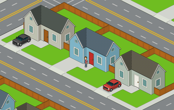
3. Map Out the Layout
I decided to use the three new houses for my block as I liked the new colors better than the original blue one.Let's go back to focusing only on one for now to make the surface layout.
Step 1
We'll need a driveway, and we'll have it line up with the small protruding section of the house. Draw a couple of parallel surface lines in a new layer like this:

Step 2
Go ahead and close that area off at the length you like with a long perpendicular line. This will define the driveway and front lawn.
Step 3
Now we'll add a few more lines for the edges of the property.
And one more line for the edge of the backyard.

Step 4
Let's add some color to our surface. It might be easier to make the foreground layers invisible for a while to add any lines or pixels missing to separate our areas. Feel free to try any shade of green for the lawn and some light grey for the driveway.
Step 5
Now what's missing is a small walking surface that leads to the front door of the house. You can make this in many shapes, but just remember to add it; the front door shouldn't lead directly to the lawn.
4. Divide and Multiply
It's time to set up some divisions between neighbors: we'll be adding a fence around the backyard.Step 1
We'll have to do it in two new different layers; one of them will be over the house layer and the other one under it.Here's the one that's over the house layer. We can start our fence with a simple L‑shaped outline, coming out of the side of the house and then lining up with the edges of the property.

Step 2
Here I've added a wood-like color and darker lines inside to denote some borders, as the fence style I've chosen to draw does have borders.
Step 3
Here I added a subtle texture of darker vertical stripes. The fence is a succession of wooden boards put together.
Step 4
We should add highlights to the usual areas: the top edges and the frontmost corner.
Step 5
And because of the style of fence I chose to make, it also makes sense to add some darker lines. Fences are usually modular, and it's a nice detail to show the seams; it makes the fence less boring. Remember to keep the seams regularly spaced.
Step 6
The two sides of the fence are facing in different directions, so they should have different lighting, lest our fence lack dimension. Keep the lighting in keeping with the house's: if the right side of the house is darker, the right side of the fence should be as well.
Step 7
Now we'll need to fence the rest of the backyard, we'll do this in a new layer under the house's layer.Since you already have drawn the fence, you only need to copy, paste and alter it and you should end up with something like this:


Step 8
Now we'll multiply the whole property. You'll want to group all layers into a folder, and then you can move the whole group while holding down Alt to make a duplicate on the fly.
Step 9
Now we should replace the copied houses with the different color houses we have already made. Simply paste them into the proper layer.Do the same thing with the cars. We already have a bunch of different colors so let's switch them up. One of the houses could be without a car to break up the repetition even more. We could have our character standing by the front door.

5. Blend in and Finish the Surface
Now we should make all elements look like part of one unified environment.Step 1
Start by removing all the unnecessary dividing lines (the lines where surfaces meet).I recommend pasting all the surfaces onto one layer, and then covering the black lines that separated them with more green.
I like to apply a similar notion to many more lines. It may be subtle but I think it's for the best: the lines where the fences from different houses meet don't need to be black, the lines in between the grass and concrete can be a dark green, the black lines in front of the driveway won't be needed, and for all lines where vertical and horizontal surfaces meet, even if they're different colors or materials, I like to soften them if they're in direct contact.

Step 2
To prettify our concrete vs. grass lines we should make these corners round:
Step 3
We can give a tiny highlight to the grass, so it looks as if it rises just a bit from the level of the concrete. This can be done quickly by selecting the dark grass outline with the Magic Wand Tool, and then moving that selection up by one pixel and finally filling the selection with the highlight green (with the paint bucket contiguous option checked off).
Step 4
We've done textures before, but have applied them manually for more precision. This precision won't matter, because we just want to make the grass look less solid, so we'll make a pattern.Draw some alternating darker (or lighter) pixels. You might want to try and see how they look when tiled before making the pattern. The pattern I'm using is as simple as‑this:

Then to apply it, you'll take your Paint Bucket and select Pattern instead of Foreground in the tool settings. Search for your newly created pattern among the pattern gallery and fill the grass area with it (contiguous should be checked off).

Step 5
We'll need a sidewalk to go all around the block. Start with an outline; it doesn't need to be far from the lawns' edges, but it should ideally be at the same distance on all sides from the lawns' edges.
Step 6
Fill with the the same grey color of the driveways and round those edges.
Step 7
And add dimension to the curbs. You can nudge the whole surface down a few pixels and then Alt-nudge it back up and fix all the pixels in between. I hope by now you know the drill: highlights on the frontmost corners, darker shading on the sides.
Step 8
The cars will need help to get to the driveways. We'll have to make ramps for them.This is the area that each ramp will use. We can start with some simple lines just to denote where the ramp will go.

Step 9
Here I made the whole ramp a slightly lighter grey, as if it's catching the light a bit more because of the different angle. I also rounded the corners and added a line to unite both surfaces. It's jagged, which isn't ideal, but we'll make it low contrast and dithered so it'll look fine.
Step 10
Here's the finished ramp. Most lines were softened in tone because the whole thing is quite flat and should barely stand out. I added dithering to reduce the jaggedness and contrasts but ideally the dithering shouldn't add too many colors; don't use the Gradient Tool.
Step 11
Copy and paste the ramp for all houses.
Step 12
Time to hit the streets: we should have some asphalt color as background. Best apply it on a new background layer.
Step 13
Add some street lines all around the block, either on a new layer or on the same one as the lawns.The should be just wide enough for cars to fit. The dashed lines should ideally be evenly spaced. The crossing lines can have different styles but two parallel lines keep things clean. Also I don't use white because these lines aren't details I want to have much strength graphically.

Done!
The block is finished. If you want to tile your block you can select all, uncheck visibility to the asphalt layer and copy all (Command-Shift-C), and then paste and align and order the layers correctly to get infinity blocks.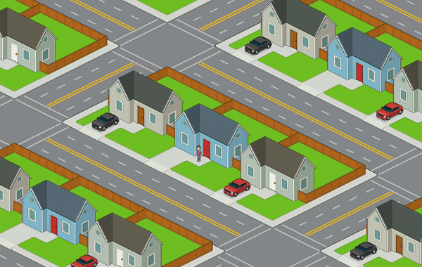
Hope you enjoy, and good luck!


.webp)

