
This tutorial was originally published in November 2011 as a Tuts+ Premium tutorial. It is now available free to view. Although this tutorial does not use the latest version of Adobe Photoshop, its techniques and process are still relevant.
In this tutorial we will combine several stock images to create an artistic, abstract portrait of a woman. Let's get started!
Tutorial Assets
The following assets were used during the production of this tutorial:
1. Prepare the Portrait
Step 1
Open a New document of 2000 x 2850 px size and 300 px resolution, with a transparent background, and then open the image of the woman and drag it there.
Pick the Paint Bucket Tool (G), hold Alt to switch to the Eyedropper, and sample the light background color from the image of the girl. Then fill the transparent background layer with this color (2nd image below).
Next grab the Brush Tool, setting the Flow to 50% and Hardness to 100%, and then select a black color. Add a Layer Mask to the woman's layer and erase her body as indicated in the 3rd image below.

Step 2
Grab the Lasso Tool (L) and draw a selection around those blue elements on her head. Try not to include her hair or skin in the selection. Copy/Paste the selected part, use Command/Control-T to rotate it properly, and place it in the erased body part (1st image below). Change its Blending Mode to Multiply—this will help you to make a better connection with the object and background. Next, repeat the same thing and cover more of the erased parts.
We've roughly cut this part with the background, so using Multiply mode may not be enough to blend it properly. So if there is something wrong and you still get, for example, bad-looking edges, use Image > Adjustments > Levels and enhance the whites (2nd image below).

Step 3
OK, repeat the same process (1st image below), but this time be more accurate and leave the blue element only—no skin/background/hair in it (2nd image below). Then place it on her skin, somewhere over her chin (with Normal Blending Mode).
We will place some more elements on her skin, so be patient. Now let's just have this one piece there.

2. Add Flowers and Color to the Composition
Step 1
Next, open the image of flowers and apply the following adjustments:
- 1st image below: change the Blending Mode to Multiply, and use Image > Adjustments > Levels.
- 2nd image below: use Image > Adjustments > Hue/Saturation (checkColorize).
- 3rd image below: use Image > Adjustments > Color Balance (Highlights).
- 4th image below: use Image > Adjustments > Color Balance (Midtones).
- 5th image below: now place those flowers above all layers and cover some of the previously erased parts.
This nicely matches with all the rest of the blue elements, so you can even make some duplicates and place them in a few other spots. This is an alternative solution that you can apply instead of copying/pasting elements from the previous steps. Basically you can use anything that has a light background and turn it into something similar to those blue flowers. The goal is to create some nice abstraction all around her.

Step 2
Now open the watercolor splat image. Drag it twice into our illustration and change the Blending Options to Multiply. Next, apply to each one Image > Adjustments > Levels and enhance the whites (1st image below). Then refer to Section 1, Step 1, using the same settings for the Brush Tool and erasing disturbing parts of the splats using Layer Masks (2nd image below).

Step 3
Open the other image of the flower and extract it with the Pen Tool or Magic Wand. Place the extracted flower into our main document. Now, to mix it properly, use the Eraser Tool with 100% Hardness and erase the whole bottom part of this plant. This is something that won't fit here (2nd image below).
Next we're going to place the flower on her hair. To do this, use the Brush Toolwith 5% Flow and 0% Hardness. Create a new layer below this flower, changing itsBlending Mode to Multiply. Sample a dark brown color from her hair (indicated with a red circle in the 3rd image below) and paint with a soft brush below the flower (indicated with a red arrow in the 3rd image below).

Step 4
OK, let's breathe some life into this flower. Create a new layer above it, hitCommand/Control-Alt-G for a Clipping Mask, and change its Blending Mode toMultiply. Now, as you did previously, sample a color from the circle (1st image below) and paint some shadows where the green arrows indicate (1st image below). Those shadows are a little bit random, so add just a touch of them.
Next create a new layer above, again hit Command/Control-Alt-G for Clipping Mask, and change its Blending Mode to Overlay. Choose a very light yellow color, like
#fff0c1, and paint on the leaves (as indicated in the 2nd image below).
3. Modify Her Face
Step 1
Now, let's move to correcting her face. The original photo was way too bright all over her skin, so I decided to bring back some of the color. Set your brush to somewhere between 4–10% Flow and 100% Hardness (please try to remember the brush settings, as we might want to use them later).
Create a new layer above the face layer, and change its Blending Mode toMultiply. Look at the comparison in the 1st image below, and then grab the Brush Tool (B) and use the Eyedropper (hold Alt) to sample some light brown color from her skin and paint where indicated (green arrows). You can see in the 1st image below (picture on the right) there is a visible tonal difference.
Next, create another new layer above, pick white color, and add a touch of light where it should naturally be (2nd image below). All in all, help yourself with a soft eraser to get a nice soft transition between brushing and skin.
If you have got a tablet, you can certainly use it here. But I painted all this with a mouse and it was fine for me. Also I'm not mentioning particular colors for painting the face, because if you get another picture, the color will vary, so you need to sample them from the image you have got.

Step 2
Now use the same technique as previously. But this time let's paint over her eyes and the blue elements on her hair. Use the same brush settings and paint on a new layer above. We need to cover up the original photo texture—that's why all the brushing is done.
Also be flexible at doing this. If you feel that those blue elements need some light blue color, just sample it from the illustration and paint. If you feel they need more vividness, just change the new layer's Blending Mode to Overlay, and either use white or very light blue and then paint on those elements. Try to play around with this, and you can get some great results.
In the 1st image below I showed you where I painted over her. And I used light blue color with layer Blending Mode set to Normal. In the 2nd image below I showed you how I painted over her eyes. They seem too photographic in the original picture, so basically what you need to do is to correct the pupil (in other words try to recreate the center of the eye with a brush).

Step 3
The next thing we're going to do is to "flatten" the tones a bit and colorize her face. By "flattening" I mean giving some more overall lightness. So, grab the Brush Tool (B) again, but this time set the Hardness to 0% and Flow to 3%. Create a new layer above all and simply start brushing with very soft white all over her face (as indicated in the 1st image below). In the 2nd image below you've got the result.
Now go to the colorizing part, and create another layer above. Change its Blending Mode to Overlay. Now use some bright yellow/green color like
#aab84b and add a nice color for example to her eyebrows/elements/hair, etc. (3rd image below).
Also you can use other colors to colorize her face like that, but remember to use bright ones.

4. Add Texture to the Face
Step 1
It's time to add a pattern to her face. Open the image of the ornament and drag it to our main project document. Change its Blending Mode to Multiply and position it on the face.
Adjust it with Command/Control-T > Warp to match the face (1st image below). Next apply two adjustments to this ornament: first Levels and then Hue/Saturation—the order matters! (2nd image below).
OK, this is starting to look really cool (3rd image below). But it's still not what we want to achieve. The effect doesn't look entirely realistic, and it now looks more as if it's "painted" on her face than really "sculpted".

Step 2
So now the first thing that you need to do is to reveal only a suitable part of the ornament. To do this, select the ornament layer, and go to Layer > Layer Mask > Hide All. Grab the Brush Tool (B) with a soft white color and paint on a mask as indicated in the 1st image below.
This still looks "painted" on her face (2nd image below), but we got rid of all the unwanted sides and now it sits better on her face. So if you're ready with this, duplicate the ornament layer, and then desaturate this new duplicated layer usingCommand/Control-Shift-U (3rd image below). Change its Blending Mode toOverlay (4th image below).
As you can see, it's now looking much better, but it still could use some corrections, especially on the sides of the face. We will cover that soon, so now let's move to the next step.

Step 3
Now we will enhance the overall shadows/lights of the face. This will also help the ornament to pop out.
Create a new layer above all, and fill it with grey color like
#737373. Change itsBlending Mode to Overlay.
Now refer to the images below:
1st) It's a base where you can start adding shadows.
2nd) Here is a guide of how to paint, and how your grey layer should look after adding shadows (the view is on Normal blending mode). But yes, since we're still on the Overlay blending mode it's not visible. So what you are going to do is to grab the Burn Tool and add shadows as indicated, and then switch to theDodge Tool and add lights as indicated. All in all your grey layer should look somewhat like this.
3rd) And that's the result of painting shadows/lights on the grey layer—hope you can get something similar. As you can see, I basically enhanced the lights on her face and the edges of her skin.

Step 4
Again repeat the previous step in the same order. Create a new grey layer set toOverlay, and paint on it with the Dodge/Burn Tool.
Pay attention to the 1st image below. You need to carefully enhance the shadows of the ornament with the Burn Tool. There will be a lot of tiny brush lines as you can see there. The light areas will require less work, but some of them will still need attention, so make sure all those convex shapes get properly enhanced.
In the 2nd image below you can see how and where the dodging/burning should be properly painted (it's just for demonstration purposes). In the 3rd image below you have the result of the applied effect.
Once you get the idea of how this works, I believe you will be able to do it with your own judgement and taste. So make sure you do not overdo anything here, and if you want to erase your move, simply paint over the messed-up place with a
#737373color of brush.
5. Continue Modifying the Blue Elements
Now grab the Lasso Tool and draw a few random shapes over the blue elements (I hope you can notice the selections in the 1st image below). To add a selection to an existing one, draw with the Shift key held.
Next, hit Command/Control-Shift-C (copy merged) and hit Command/Control-V to paste all those elements above all layers. Now as we get them all in one layer, again use the Lasso Tool and spread them all around (hold Command/Control, select a piece and move it wherever you want), as shown in the 3rd and 4th images below.
Since our background is solid and very bright, we can use a nice, simple trick to give those pasted elements some depth. Pick several smaller pieces and randomly erase their sides (4th image below). You can either use the Eraser Tool or a Layer Mask.

6. Overlap Textures and Color
Step 1
Looking cool! Now we will add some splat effects to her hair. Open the image of the red watercolor splatter, and to see everything better, temporarily lower the opacity. Then duplicate it and place both those watercolors around her hair to make them imitate hair (1st image below).
Next, use Command/Control-I (Invert) on both those layers (2nd image below). Then change their Blending Modes to Linear Dodge (3rd image below). Next go toLayer > Layer Mask > Hide All and slightly reveal their masks with a white brush. Paint mostly on the bottom where the splats look like hair (4th image below).

Step 2
Let's go further with the abstract look. Open the image of the wall and again drag it to our project using Multiply Blending Mode (1st image below).
If necessary, use Levels to enhance the light (2nd image below). This is something that will help us achieve the transparent look for the white part of the wall, and will make the yellow parts pop. Next go to Layer > Layer Mask > Hide All and slightly reveal its mask with a white brush. Paint carefully to get some nice hard-edged results of the yellow wall (3rd image below).
Repeat and apply the process to a few more spots around her head (4th image below).

Step 3
OK, now open the next image of flowers. Drop it into the document and desaturate using Command/Control-Shift-U (1st image below). Then change the layerBlending Mode to Overlay (2nd image below).
Yet again go to Layer > Layer Mask > Hide All and try to reveal the mask only on the hair where it fits best (in the 3rd image below I've indicated the part I wanted to fill). You can either use a soft or hard brush. In the 4th image below you have the result of this effect.
You can add some more of those to her hair, but try to observe when it looks the best. In the 5th image below I've indicated something that really caught my attention. Apparently those flowers made nice gaps (indicated with arrows) which suit her really nicely. So I decided to make some more of them.

Step 4
Now open the next two images of splatters. Change their Blending Modes toMultiply and place one above the girl’s head, and the second below (1st image below). We just want to create some nice variety here, so it would not be smart to put all splatters in one place. It's even better to spread them around and even add some color.
I didn't change their colors—I only enhanced the green tone and got rid of the visible paper edges by applying Levels and Hue/Saturation (2nd image below).
The next thing to do is simply use a hard Eraser Tool (E) and erase some disturbing parts of splatter (3rd image below). You can also use the Layer Mask—this is even a suggested solution, as this will let you correct these splatters whenever you want.
Try to achieve a certain shape when you erase those splatters. You can see in the 3rd image below that I experimented with that, and got a new looking splat out of the original one. And it's just by proper erasing!

7. Add Butterflies
Step 1
Now open the first image of the butterfly. Extract it with the Pen Tool (P) and paste it above all layers in our main project (1st image below). Next, sample the brown color from its wings, create a new layer above the butterfly, and use a Clipping Mask(Command/Control-Alt-G). Change the layer's Blending Mode to Multiply, select a soft brush and paint with the sampled color as indicated (2nd image below).
Pay attention to the 3rd image below now and create another layer above, change the Blending Mode to Overlay and use a Clipping Mask again (Command/Control-Alt-G). Then grab a soft white brush and paint as indicated (green arrows).
Next create another layer above, and use a Clipping Mask again (Command/Control-Alt-G). Sample a dull blue color from a spot somewhere below the butterfly (indicated with red circle) and paint a little bit on it (indicated with green arrows) with a very soft brush of 2–3% Flow (4th image below). The purpose of this action is to tonally blend the butterfly with her hair.
Finally pay attention to the 5th image below and this time again create another layer above, change its Blending Mode to Multiply and use a Clipping Mask(Command/Control-Alt-G). Sample a darker blue color from the spot somewhere below the butterfly (indicated with a red circle) and then paint under its legs to simulate shadow.

Step 2
Open the other image of the butterfly and basically repeat the same process as previously. I'll give you a fast guide what you need to do:
As shown in the 1st image below, extract the butterfly and paste it above all layers. Then use a new layer (with Blending Mode set to Multiply and Clipping Maskapplied). Sample dark blue and paint on the bottom wing to give some random shading, as shown in the 2nd image below.
Using a new layer (with Blending Mode set to Overlay and Clipping Maskapplied), sample a light blue or just pick a white color and paint on the top wing to set some light, as shown in the 3rd image.
Then, as shown in the 4th image, hold Command/Control and click on the first butterfly layer's thumbnail to call the selection, and then hold Command/Control-Shift and click on the second butterfly layer's thumbnail.
Finally, as shown in the 5th image, go to the Layers panel and add new adjustment layers above all layers. Set the Gradient Map as shown (this will automatically adjust its mask to the selection you recalled before).

8. Add the Finishing Touches
Step 1
OK, please don't panic now. The first image below may look a bit confusing, so let me just explain. Open the image of spray and drag it to our main project document. Change its Blending Mode to Multiply (1st image below). Then make it lose most of the hard edges by adding Levels (2nd image below).
Now take a look at the 3rd image below. I've indicated spots where the background of the spray texture has totally vanished, and the spray is almost perfectly blended with the project background. So go to Layer > Layer Mask > Hide All, and then paint with a soft white brush in the indicated spots (4th image below) to reveal the spray.

Step 2
Now refer to Section 5, and basically do the same thing (copy/paste the blue elements), as shown in the 1st image below. Just now our goal is to put some of those elements on her face. This creates a better effect and will also give some expression to her face.
The next thing to do is to create a new layer below all the blue elements, change itsBlending Mode to Multiply and select the Brush Tool (B). Set it to a very soft one, and then sample the skin color from her face and paint on this layer (as indicated in the 2nd image below).
If you feel the color you sampled is too light, sample it from elsewhere on her face (from a darker spot) and paint again. This is how you build up a proper shadow—it's almost always a combination of a few tones (from light to dark).

Step 3
Next, go to the bottom of the Layers panel, create a new layer on the very bottom, and then grab the Ellipse Tool (U) and create a nice big, regular circle with
#ebebeb color (1st image below).
You can see that after creating the circle we spotted some unerased parts coming from other images (indicated with green arrows). So we won't go all over those layers and search which layer needs to be masked now. Simply add a Layer Maskto the layer of the circle you just created, and erase these disturbing spots (2nd image below).
Next, duplicate this circle (Command/Control-J), decrease the Fill to 0%, and then go to the Blending Options, select Stroke and use the following settings in the 3rd image below. This will add a nice, tiny stroke to the circle, making it more complete. Finally you can duplicate the stroke layer a few times and make it bigger usingCommand/Control-T (4th image below). This will fill the blank space of our illustration more.

Step 4
We're now left with some final touch-ups, but they're pretty important. So as you can see in the first four images below, pick bright colors: pink, yellow, blue, green. Remember all those colors, as we will switch from one to another now. Set your brush as shown in the 5th image below. If you have a tablet it's a good time to use it now, because it will be much easier for you to do it with a tablet.
So as you can see in the 6th and 7th images below, paint with a very small diameter brush (like 1–2 px) and try to color the indicated areas. Switch colors when you feel like it. It's all a matter of your own taste. I basically tried to paint a larger brush over her face and smaller over her hair elements. Switch colors all the time to give more variety.

Step 5
Finally add some adjustment layers above all layers, which will make everything work better together. So go to the Layers panel and add Color Balance (1st image below), and then add Selective Color (2nd image below). And you should receive similar result as shown in the 3rd image below.
It's always good to add a few final adjustment layers—this nicely brings all colors together and kind of "flattens" the overall image impression.

Step 6
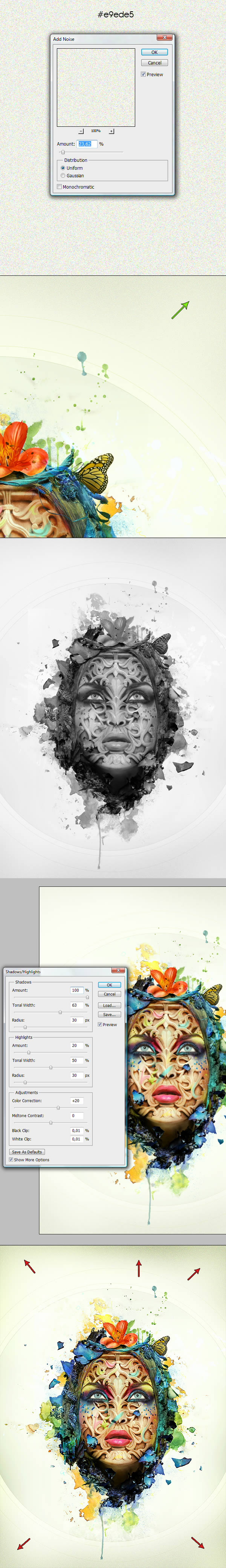
Now go to the top of Layers panel. Create a new layer, fill it with
#e9ede5 and go toFilter > Noise > Add Noise (1st image below). Those values will vary depending on how big your document is. Change this layer's Blending Mode to Multiply and go toLayer > Layer Mask > Hide All. Then use a soft white brush to reveal it in the corners of the illustration (2nd image below).
Now hit Command/Control-A (select canvas) and then Command/Control-Shift-C(copy merged) and Command/Control-V (paste). Make sure you're on the top of all layers to paste this. Next hit Command/Control-Shift-U to desaturate the pasted image (3rd image below).
Finally change its Blending Mode to Soft Light and go to Image > Adjustments > Shadows/Highlights—use similar settings to mine (4th image below). This adjusting will now work in real time (because of the Soft Light blending mode), so basically you can observe what you're doing.
The final step is optional, but if you'd like to add a little bit of a vignette effect, just flatten the overall image and grab the Burn Tool (set to Midtones) and darken all corners of the final image (5th image below).
Awesome Work, You're Now Done!
Thanks for reading this exhausting piece. Hope you made it all the way to the end and enjoyed the tutorial as well as the techniques used. Now, good luck with your own projects, and remember that each piece needs a solid sharpening before the release!


.webp)

