Create the Captain America Shield Icon in Adobe Illustrator

by
Final product image
What You'll Be Creating
For starters you will learn how to set-up a simple grid, how to create the main, four circles and how to easily place them in the center of your artboard. Using basic blending and vector shape building techniques you will learn how to add subtle shading and a simple star shape. Next, you will learn how to create a pretty simple gradient mesh. Taking full advantage of the Appearance panel and using some simple Blur effects you will add the extra highlights and textures. Finally, you will learn how to create a simple background, some Drop Shadow effects and a fading long shadow.

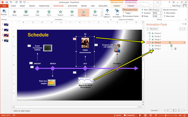
1. Create a New Document and Set Up a Grid

Hit Control-N to create a new document. Select Pixels from the Units drop-down menu, enter 600 in the width and height boxes then click on the Advanced button. Select RGB, Screen (72ppi) and make sure that the Align New Objects to Pixel Grid box is unchecked before you click OK.
Enable the Grid (View > Show Grid) and the Snap to Grid (View > Snap to Grid). For starters you will need a grid every 5px, so simply go to Edit > Preferences > Guides > Grid, enter 5 in the Gridline every box and 1 in the Subdivisions box. You should also open the Info panel (Window > Info) for a live preview with the size and position of your shapes. Do not forget to set the unit of measurement to pixels from Edit > Preferences > Units > General. All these options will significantly increase your work speed.

2. Create the Main Shapes

Step 1

Pick the Ellipse Tool (L) and focus on your Toolbar. Remove the color from the stroke then select the fill and set its color at R=228 G=23 B=28. Move to your Artboard and simply create a 290px circle.

Step 2

Disable the Grid (View > Hide Grid) and the Snap to Grid (View > Snap to Grid). In this step you need to center your red circle, so open the Align panel (Window > Align). Set the aligning to Artboard (open the fly out menu and go to Show Options if you can't see the Align To section as shown in the following image) then simply click the Horizontal Align Center and Vertical Align Center buttons. In the end things should look like in the following image.

Step 3

Make sure that your red circle is selected and go to Object > Path > Offset Path. Enter a -25px Offset and click OK.
Select the resulting shape, replace the existing fill color with white (R=255 G=255 B=255) and go again to Object > Path > Offset Path. Enter a -25px Offset and click OK.
Make sure that the resulting shape is selected, replace the existing fill color with R=228 G=23 B=28 and go one more time to Object > Path > Offset Path. Enter a -25px Offset and click OK. Select the newly created shape and replace the existing fill color with R=22 G=77 B=157.

Step 4

Go to Edit > Preferences > General and make sure that the Keyboard Increment is set at 1px. Select the largest, red circle and make two copies in front (Control-C > Control-F > Control-F). Select the top copy and move it 5px up using the up arrow button from your keyboard. Reselect both copies made in this step, open the Pathfinder panel (Window > Pathfinder) and click the Minus Front button.
Make sure that the resulting shape stays selected and focus on the Appearance panel (Window > Appearance). Set the fill color at black (R=0 G=0 B=0) then simply click on the "Opacity" piece of text to open the Transparency fly-out panel. Focus on the Blending Mode drop-down menu and set it at Soft Light.

Step 5

Reselect the largest, red circle and make another two copies in front (Control-C > Control-F > Control-F). Select the top copy and move it 10px up using that same up arrow button from your keyboard. Reselect both copies made in this step and click the Minus Front button from the Pathfinder panel.
Make sure that the resulting shape stays selected, focus on the Appearance panel and set the Blending Mode at Soft Light.

3. Create the Star Shape

Step 1

Enable the Grid (View > Show Grid) and the Snap to Grid (View > Snap to Grid). Using the Rectangle Tool (M), create a 130 x 45px shape, set the fill color at white and place it as shown in the first image.
Focus on the bottom side of this new rectangle, pick the Delete Anchor Point Tool (-) and simply click on the right anchor point to remove it. Keep focusing on the bottom side of your new shape, switch to the Direct Selection Tool (A), select the remaining anchor point and simply drag it 65px to the right. In the end things should look like in the second image.

Step 2

Using the Rectangle Tool (M), create an 80 x 125px shape, set the fill color at white and place it as shown in the first image.
Focus on the top side of this new rectangle, pick the Delete Anchor Point Tool (-) and simply remove the right anchor point. Keep focusing on the top side of your new, white shape and switch to the Direct Selection Tool (A). Select the remaining anchor point and simply drag it 40px to the right. Reselect the shape made in this step and go to Object > Path > Add Anchor Points.
Make sure that the Direct Selection Tool (A) is still active, select the anchor point highlighted in the third image and simply drag it 30px up. In the end things should look like in the fourth image.

Step 3

Reselect the two, white shapes that make up your star and click the Unite button from the Pathfinder panel.

Step 4

Make sure that your star shape stays selected, focus on the Appearance panel, select the existing stroke and set its color at black.
Keep focusing on your new stroke and simply click on the "Stroke" piece of text to open the Stroke fly-out panel. Set the Weight at 2px and check the Align Stroke to Inside button. Make sure that your stroke is still selected, lower its Opacity to 3%, change the Blending Mode to Multiply and go to Effect > Path > Offset Path. Enter a -7px Ofset and click OK. Return to the Appearance panel, select the entire path (simply click on the "Path" piece of text from the top of the Appearance panel) and go to Effect > Warp > Fisheye. Enter the properties shown in the following image and click OK.

4. Create a Radial Mesh

Step 1

Using the Ellipse Tool (L), create a new 290px circle and center it using the Horizontal Align Center and Vertical Align Center buttons from the Align panel. Make sure that this new shape stays selected, open the Gradient panel (Window > Gradient) and simply click on the gradient thumbnail to add the default black to white linear gradient.
Keep focusing on your Gradient panel, open the Type drop down menu and select Radial. In the end things should look like in the following image.

Step 2

Make sure that the circle with the radial gradient is still selected and go to Object > Expand. Check the Gradient Mesh box then click OK.
Focus on the Layers panel (Window > Layers), select the newly created group, Ungroup it (Shift-Control-G) then hit Alt-Control-7 (or go to Object > Clipping Mask > Release) to release the existing clipping mask. Return to the Layers panel and simply delete the top 290px circle (the former clipping path).

Step 3

Select your mesh and open the Transform panel (Window > Transform). Check the Constrain Width and Height Proportions button then simply enter 290 in the Width (or the Height) box.

Step 4

Disable the Grid (View > Hide Grid) and the Snap to Grid (View > Snap to Grid). Select your mesh, grab the Mesh Tool (U) and add four, new mesh points as shown in the following image.

Step 5

Pick the Direct Selection Tool (A) and focus on your mesh. Select the mesh points one by one and replace the existing colors with the ones shown in the following image.

Step 6

Make sure that your mesh is still selected, focus on the Transparency panel (Window > Transparency) and change the Blending Mode to Multiply.

5. Add Subtle Shading and Texture

Step 1

Using the Ellipse Tool (L), create a new 290px circle, set the fill color at black and center it using the Horizontal Align Center and Vertical Align Center buttons from the Align panel.

Step 2

Make sure that your black circle stays selected and focus on the Appearance panel. Select the existing fill, change the Blending Mode to Overlay and go to Effect > Path > Offset Path. Enter a -2px Offset, click OK and go to Effect > Artistic > Film Grain. Enter the properties shown in the following image, click OK and go to Effect > Blur > Radial Blur. Enter the attributes shown below and click OK.

Step 3

Reselect your front circle, focus on the Appearance panel and add a second fill using the Add New Fill button (pointed by the blue circle in the following image). Select this new fill, lower its Opacity to 70%, change the Blending Mode to Multiply and add the radial gradient shown in the following image. Keep in mind that the yellow numbers from the Gradient image stand for Opacity percentage while the white numbers stand for Location percentage. This simply means that you have to select each gradient slider, focus on the Opacity & Location boxes from the Gradient panel and enter the numbers pointed below.

Step 4

Reselect your front circle, focus on the Appearance panel and add a 1px, black stroke. Select this subtle stroke, align it to inside, lower the Opacity to 15% and change the Blending Mode to Overlay.
Make sure that your front circle stays selected, keep focusing on the Appearance panel and add a second stroke using the Add New Stroke button (pointed by the blue circle in the following image). Select this new stroke, set the color at white and the Weight at 1px, align it to inside, change the Blending Mode to Soft Light and go to Effect > Path > Offset Path. Enter a -1px Offset and click OK.

Step 5

Enable the Grid (View > Show Grid) and the Snap to Grid (View > Snap to Grid). Using the Ellipse Tool (L), create a 130 x 60px shape, set the fill color at black and place it as shown in the first image. Make sure that this new shape stays selected, lower its Opacity to 60%, change the Blending Mode to Multiply and go to Effect > Blur > Gaussian Blur. Enter a 20px Radius and click OK.

Step 6

Using the Ellipse Tool (L), create a 140 x 75px shape, set the fill color at white and place it as shown in the first image. Make sure that this new shape stays selected, lower its Opacity to 20%, change the Blending Mode to Color Dodge and go to Effect > Blur > Gaussian Blur. Enter a 15px Radius and click OK.

6. Add the Background and a Long Shadow

Step 1

Using the Rectangle Tool (M), create a new 610px square, set the fill color at R=50 G=55 B=70 and center it using the Horizontal Align Center and Vertical Align Center buttons from the Align panel.
Make sure that this new shape stays selected, focus on the Appearance panel and add a second fill using that same Add New Fill button. Select this new fill, set the color at black, lower its Opacity to 10%, change the Blending Mode to Multiply and go to Effect > Artistic > Film Grain. Enter the properties shown in the following image and click OK.

Step 2

Reselect the largest, red circle and go to Effect > Stylize > Drop Shadow. Enter the properties shown in the top, left window (in the following image), click OK and go again to Effect > Stylize > Drop Shadow. Enter the properties shown in the top, right window, click OK and go once again to Effect > Stylize > Drop Shadow. Enter the properties shown in the bottom, left window, click OK and go one more time to Effect > Stylize > Drop Shadow. Enter the properties shown in the bottom, right window and click OK.
Advertisement

Step 3

Using the Rectangle Tool (M), create a 290 x 305px shape, set the fill color at black and place it as shown in the first image. Make sure that this new shape stays selected and focus on the Appearance panel. Lower its Opacity to 15%, change the Blending Mode to Soft Light and replace the flat color used for the fill with the linear gradient shown in the following image. Don't forget that the white zero from the Gradient image stands for Opacity percentage.

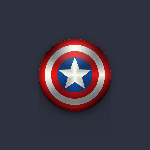
Congratulations! You're Done!

Here is how it should look. I hope you've enjoyed this tutorial and can apply these techniques in your future projects.

Play Classic Games on a Mac With OpenEmu

by
Emulation has been around for practically as long as computers themselves, it's the process of running software designed for one system on another by recreating the proper hardware on a software level.
It sounds pretty complicated, and it was until recently. Thanks to an amazing piece of software called OpenEmu, it's now possible to emulate nearly any classic console, from the NES to the Sega Master System, using your Mac, and in this tutorial, I'll show you how to do just that.

Screencast


The Legal Question

There's some good news and bad news here when it comes the legality of video game emulation. Starting with the good news, ROM's are just files and therefore are not illegal in and of themselves. In fact, the OpenEmu project provides a free ROM Starter Pack which includes homebrew ROMs for consoles ranging from the original NES to the Game Boy Advance.
From there, unfortunately, the water get significantly more murky. Although it's technically legal to have a second copy of games you own for archival purposes, it's still illegal to download ROMs of these commercial games from the internet.
For anyone familiar with the legal issues surrounding ripping DVD's, this should come as no surprise. As with DVD's, owning a copy of the games you're emulating should put you morally, if not 100% legally in the clear.
For a comprehensive overview of the legal and moral issues surrounding emulation from the perspective of the content creators, check out the Intellectual Property Rights guide from Nintendo.

The Hardware

While all the games I've played for this tutorial work just fine with a keyboard and mouse, you'll get the best experience by using some sort of controller. A quick search on Amazon will turn up an ample selection of replica controllers which work via USB.
While these are a great option, if you're looking for an emulation experience that's as authentic as possible, Amazon also stocks a variety of adapters that will allow you to hook up your original classic console controller to your Mac via USB. The adapters alone will run you around the same amount as any of the USB native replicas so this solution is only really cost effective if you already own an original controller.
A final bit of advice when it comes to selecting your controller(s) of choice: if you're looking to save money or simply consolidate the number of cords running from your Mac, aim for a controller with the most buttons.
For example, playing an NES game on a Super Nintendo controller works just fine, but doing the reverse would be nearly impossible as you would be missing the X and Y buttons in addition to both shoulder triggers.
If you're set on using multiple controllers, purchasing a USB hub and a cable management solution like this cable management box, from Ikea, will do wonders when it comes to keeping the controller mess to a minimum.

Getting Started With OpenEmu

While emulating classic consoles on your Mac used to entail installing an individual emulator for each console, an application called OpenEmu has dramatically simplified the process by consolidating around a dozen of these emulators into a single, easy to use package.

Installing OpenEmu

OpenEmu acts as a one-stop hub for everything involving emulation on your Mac, allowing you to emulate a variety of classic consoles, organize your games into collections, map your controllers, and more.


OpenEmu greets you with an easy to use setup process.

  • Visit the OpenEmu download page and download the .dmg file.
  • Navigate to the Downloads folder and open the OpenEmu .dmg file.
  • Drag the OpenEmu Application to your Applications folder.
  • Navigate to the Applications folder and launch OpenEmu.
  • After passing through the initial welcome screen, you'll be be met with a screen called System Cores Installation, that's geek speak for the consoles you want to play on your Mac. Scroll through the list and check the ones you'd like to install. Then, press Next.
  • Now, you'll be prompted to scan your Mac for any ROM files that might be on your Hard Drive. If you're not sure whether or not you have any, just check Allow OpenEmu to Scan for Games and click Next, it'll take care of the heavy lifting for you.

Setting up the Controller

While OpenEmu is working in the background on the final setup process, you can begin to customize the controls to our liking. Whether you're using a USB controller or a keyboard, OpenEmu will automatically configure many of these controllers and includes a default keyboard map familiar to any gamer.
This works as a great starting point, but OpenEmu makes it extremely easy to dive right in and fine tune the controls.
  • Navigate to Preferences under OpenEmu in the toolbar.
  • Select Controls. Select the console whose controls you wish to customize from the dropdown menu on the right.
  • You'll be prompted with a diagram of your selected controller. To the right of that diagram is a list of gameplay buttons. Select any field with your mouse and hit the button on your keyboard or controller you'd like it to correspond to.


Customizing controls is easy in OpenEmu.
To customize the controls for more than one controller, select the dropdown menu labelled Player 1 as the default option and select the player whose controls you'd like to customize. When you're finished, just exit the Preferences window and your changes will be automatically saved.
Advertisement

Ready Player 1

Now that you've got all the heavy lifting out of the way, it's time to finally play a game. If OpenEmu found any ROMs on your hard drive, they'll now be displayed in the Main Window. If you're still looking for ROMs to use, PDROMS is a wonderful site with downloads of thousands of free and legal home-brew ROMs.


The final product: OpenEmu running Super Mario Bros. 3.

  • If OpenEmu wasn't able to find the ROM you wanted to play, simply drag it to main window and it'll be automatically imported.
  • You'll notice that ROMs might not display to proper cover art, this can be easily fixed by right clicking on the title in question and selecting Download Cover Art, OpenEmu will then search the internet for the best available artwork.
  • Once that's out of the way, playing a game is as simple as double-clicking it's artwork.
  • When you've finished playing, OpenEmu supports two ways of saving your game. Firstly, through the game's built in save function, and second, by saving the emulation state at any given point. This incredibly powerful feature can be accessed by pressing Command-S at any time. The next time you open your game, it'll resume to that exact point.

Game Over

OpenEmu is an amazing tool that's made emulation available to those without bachelors degrees in Computer Science. By following the steps in this tutorial, you're now able to relive the experience of almost any classic console right on your Mac.
What games are you most looking forward to (re)playing? Let me know in the comments below.

How Macaw Helps You Build Responsive Websites

by

$30 Macaw Discount for Tuts+ Readers!

For one week only we're offering you $30 off Macaw! Simply enter the coupon code TUTS when you make your purchase. Offer ends April 5th.

Macaw's Responsive Features

Fluid layouts have been the biggest challenge for design application developers in recent times, but Team Macaw have done it right. With a small collection of tools and features, Macaw allows you to build fluid, responsive layouts, controlling breakpoints from right within the application.
Handling breakpoints is super-easy with Macaw; just add the breakpoints for whichever viewport widths you feel are necessary, then toggle between them using the Breakpoints Inspector.
Let's take a look at exactly how this works.


The Five Elements of a High-Quality Sales Technique

by
In the business world, everyone should understand the five elements of a good sales technique. Why? Shoddy sales is about using fancy closing techniques and deception just to make a buck, whereas superior sales solves problems.
Quality sales is the foundation of a strong and lucrative relationship between a supplier and its customer. Inadequate sales technique is a sure ticket to a supplier closing its doors before it gets a chance to enjoy one full year in business. When everyone can identify a sales professional with a top-notch sales technique, then it is easier to weed out the scam artists and under-performers.
If you are a company owner and you cannot identify an effective sales strategy from a poor technique, then you will not be in business for very long. A second-rate sales professional can harm your company's reputation. They are the ones on the front lines representing your company and interacting in important deals with your customers.
It's important to help sales professionals understand what they are doing wrong so they can fix it. Once the errors have been repaired, then a sales professional can focus on what is working well and amplify it.
Customers want to work with professional sales representatives, those who have determination, understanding, empathy, can solve their problems, and connect with them emotionally. These are the elements of a good sales technique.

Determination

Sales professionals should not can confuse determination for being a pest.

What is Pestering?

Pestering simply means that you are contacting a client constantly with no new information and without the client asking to be called back.
So if you are constantly calling a client to try and get a sale with the same information that has been rejected several times before, then you are pestering your client. If your client is in a buying mood but has not requested that you call back every day until they cut a purchase order, then you are being a pest.
If you put together a pitch and the client says no, then you did something wrong. Fix what you did wrong with new information before you call the client back. When the client expresses an interest in buying a product, then ask when you can call the client back. If the client invites you to call them back, then you are doing your job and not being a pest.

What is Determination in Sales?

Determination is the undying desire to improve your technique. It is also the strong sense of dedication you have towards supplying your clients with the right information. You should be determined to analyze your own technique constantly and make changes that will make your presentation smoother. You should constantly rewrite your elevator pitch and work on how you handle rejections. Most of a sales professional’s true determination is focused on themselves and not the customer.
The determination a sales professional shows towards a client is a strong need to supply the customer with the information they need to make a buying decision. That could mean that you have to go back and present new information to a client who has already rejected you, but that is all part of being a determined sales professional.
A quality sales professional is also determined to stay up to date on all product information and committed to learning new sales methodologies. You are intent to know everything there is to know about your product and the competitors’ products as well. Information is always the best sales tool available.

Understanding

Does your sales technique center around asking questions to find out what your customer wants, or are you the kind of sales professional who shoves information down a customer’s throat until the customer buys or runs away? There are plenty of sales professionals who believe that the customer will listen to whatever the pitch is and then buy the product based on the pitch. Those are the sales professionals who are struggling to make ends meet and keep sales jobs.
If you do not understand what your client wants and needs, then you cannot sell to that client. You have to ask questions, listen for the answers, and then use that information to create a winning pitch. While many elements of your pitch are rehearsed, you are still creating a customized pitch for every customer you talk to.
Successful sales is based on the personal feelings and needs of each individual customer. If you want to sell a product to a customer that will result in referrals from that customer and glowing reviews, then you have to understand what the customer wants. In order to do that, you have to include your customer in the sales process by asking questions and using that information to craft the ideal pitch.

Customer Empathy

Empathy can help you to make more sales. Remember your past, put yourself in your customer's position, and use that standpoint to sell to the client in front of you.
Recall trying to finance your first major purchase. You remember knowing that you could get the credit to buy that item, but you were unsure if you could afford it or not. Too many sales professionals get to the point of getting the customer to fill out the credit application and then hand the pen to the customer while staring at them. The next time you have a young couple or a person just starting out in their adult life trying to buy their first television from you, use your empathy to make the sale.
Ask the customer if it is their first television. It may even be the first time that the customer has ever filled out a credit application. Think back to how much easier it would have been for you if the sales professional who sold you your first television stopped to explain everything to you.
Now think about your emotional state at that time. Wouldn’t it have been great if the sales professional had put the pen down and just asked if it was your first television? A conversation would have developed that would have put you at ease and resulted in a sale you were confident with.
Not only will showing empathy help close more sales, it will also result in more referrals as well. Customer empathy is an important part of the sales process in any kind of sales. You may not have any experience as a purchasing agent, but you know what it is like trying to keep a boss happy. Always keep your customer’s situation in mind when you are selling and you will develop more lucrative relationships and sell more product.

Problem Solving

Sales people are problem solvers. Your customer has a problem and you use your product to solve that problem. That is the core of the sales process. Upselling and all of the other parts of revenue generation are only effective when you have solved the customer’s problems.
Always remember that the customer is going to be hesitant to tell you the real problems you need to solve, and there will often be more than one problem. Your customer desperately needs a new business suit for upcoming job interviews, but also has a limited budget. Not only do you have to solve the problem of needing a good interview suit, but you also have to worry about price. If you ignore the budget problem, then you won’t make the sale.
Sometimes issues such as budget or time are problems, but only in the respect that the customer has to be given a reason to spend more money or wait a little longer to get a product. You have to spend time talking to the customer and determine what the real problems are before you can make the sale.
Do uncover customer problems, but avoid stating them back to your customer. A common technique used by sales professionals is to say something such as “I’m hearing that you need a business suit, but your budget is limited.” Don’t do that. The last thing you want the customer to think is that you have turned their problems into a game that you are trying to win. Once you know the problems, just set about solving them and getting the customer what they need.

Emotional Leverage

The honest truth is that emotional leverage is extremely dangerous when used improperly. Emotional leverage is:
  • Getting information from the customer that can be used to create an emotional desire for the product.
  • Getting the customer to trust you.
  • Using the information and your status as a trusted advisor to make the sale.
Sales professionals who have no empathy or understanding for a customer’s situation will often abuse emotional leverage and leave the customer feeling cheated. But even sales professionals with good intentions can sometimes misuse emotional leverage and cause problems.
Every sales transaction is an emotional event for the customer. Whenever a customer spends money, even if it is the company’s money, it has an emotional impact on the customer. Utilizing emotional leverage helps to make the buying decision easier for the customer.
The problem is that the word “leverage” has such a negative connotation to it that people misinterpret what emotional leverage really is. When you acquire and use emotional leverage, you are putting yourself in a position to close the sale and solve the customer’s problem without putting the customer under unnecessary financial stress. If you are not really solving the customer’s problem or if you are causing the customer unnecessary financial stress by using emotional leverage to make your sale, then you are using it for the wrong reasons.
You acquire emotional leverage by asking the right questions, listening to the answers you get, and then properly interpreting the customer’s body language. It is a process that takes a few years to perfect, but it is a necessary element in the sales technique.
Advertisement

Perfect Your Technique

There is no such thing as the perfect script or template you can use to create an ideal sales method. Your technique is the result of practice, refinement, and a comprehensive understanding of the five essential elements of a good sales approach. Take the five elements and use them to create a sales approach that makes you successful.

Resources

Graphic Credit: High Five designed by Luis Prado from the Noun Project

The Quest for an "Iconic" Portrait: Editorial and Raw

by
In this tutorial, I'll continue my work to shoot an iconic portrait. When I began, I wanted two distinct yet consistent styles or outcomes from each session. In the first session, I created a look that was intimate, yet polished. In this final session, I wanted to have more editorial distance, and a more raw and real feeling.

Instrument Time

You may be wondering why I decided to shoot the bassist aspect of Brad as an entire separate session.
Honestly, I have a tendency to think that musician-with-instrument pictures tend to be a little cheesy and overdone, more along the lines of local editorial than portraiture. As far as I'm aware, the commercial music industry tends to think along these lines as well.

Speaking of mediocre shots
Speaking of mediocre photography...
However, there are always exceptions. I've seen beautiful portraits of iconic musicians with their instruments, like Clarence Clemons with his sax and Carlos Santana with his guitar. In some instances, the instrument itself might be iconic, if it's unusual, custom or vintage model.
So while there may be an overall aim, don't be closed to the possibility of subverting cliché or running with random ideas. Given the possibility of these exceptions, I wanted to at least give it a try, and hence a second session.

Pre-Planning

Since I'd already attempted the iconic portrait in the first session, but wanted that same iconic feeling to permeate the entire project, I had to determine how I was going to approach this second session to create a consistent outcome.
Initially my plan was to do the same general idea as the first session, but simply include the instrument this time. However, in my head, the slick, "lit" feel of the first go round didn't necessarily jive so much with my perception of live music. I needed something more raw, but with a degree of professional polish, since my style really isn't scenester polaroids.

I never saved the original just used it during the session but it looked something like this
I never saved the original, just used it during the session, but it looked something like this.
With this in mind, I decided a more editorial style of photography would make sense. I came up with three poses that I thought I could hang the session around. I asked Brad to bring a practice amp too. I also asked if he could bring a stack-and-head rig, just on the off-chance, but he'd just sold all his big heavy gear.
With the general thematic intent more or less solidified and a rough plan outlined, I could now start to figure out how I was going to do the lighting.

Lighting

What was different this time around? Actually, very little. The lighting itself was technically almost the same, if you look at the results of each session, but because I was now shooting more of Brad than just his head and shoulders, my gear had to change accordingly. My subject now covered a much larger area, so I need a larger light source.
In the first session, I had a 22" beauty dish a couple of feet away from Brad's face. I was relatively close, maybe two or three feet away, shooting mainly at around 50mm. This session, however, to get the framing I was looking for, I had to move back to anywhere from four feet to around maybe nine feet. If I left the beauty dish in there at a couple feet from Brad, not only would it be in the middle of the shot, but it would only be lighting part of the scene.

Trignometry says the light quality of a 2ft at 2ft  5ft at 5ft
Trignometry says the light quality of a two-foot source located two feet from the subject is the same as a five-foot source located five feet from the subject.
To get the same lighting look, I need the same size light source relative to Brad's position, but I need it at least five feet away from him so I can see around it. If I used a two-foot modifier at two feet away, then I now need five-foot light source to place it five feet away. Handily, I have a five-foot octa that did the trick.
For the rim light, I replaced the edgy spots with something a little softer to the left, a 1x4 strip that could be a seamless light, rim and fill all at once. I now had a more naturalistic setup, but still with just a hint of style.

Nice simple lighting setup Tileboard floor to kill shadows
Nice simple lighting setup with a tileboard floor to kill full-body shadows.
This was the studio setup, at least. When we ventured outside for me to get my "garage musician" shots, I primarily used natural light, sometimes with a bare speedlight mixed in at camera right for a little pop.

Collaborate!

If the person you're shooting is creative, then collaborate! Even if they aren't a visual artist, it's unlikely that they have zero sense of aesthetic. I've usually found that any form of creativity has a tendency to bleed into non-related media. Even if it's simply images they've seen and liked the look of, they may have any ideas about the overall presentation, or even particular styles of visual art that inspire them.
In other words, don't let ego waste opportunities. Harnessing your combined abilities may lead to places neither one of you might have come up with alone. The same goes for chaperones with children or makeup and hair stylists on a fashion shoot. You never know who might have a good idea.
Keeping the atmosphere positive and experimental as much as possible has made a night and day difference on the end results every time I've made a conscious effort to ensure it.

The Shoot

I decided to start with some basic editorial portraiture to form a natural bridge from the second session. This was visually simple "man and guitar" type stuff. We had some fun here, then moved on to the wider shots that I'd been planning for this session on the same set. We weren't really feeling it quite so much here, until Brad decided to jump up on the amp for this fun shot:

A subject with an outgoing personality makes your job SO easy
A subject with an outgoing personality makes your job SO easy.
Next, we headed out to the garage, which I'd already brought up at the beginning of the session that I wanted to try. After doing a fun little "traveling man" type shot using the doorway and falling snow as a huge softbox, a nod to his nationwide bookings, Brad just got to jam out while I figured out my angle and lighting, which is usually predictably beautiful in the garage.
When I felt like I'd gotten what I needed here, we headed back inside where I had a sudden visual flash into my mind that I had to try, and it came out perfectly! I can't explain the visual or where it came from, it just popped into my head after the travelling themed outdoor shots. If I had to guess, it bubbled up from my much-travelled past where a lot of time was spent sitting against walls and pillars in bus stations, train stations and airports.

First shot of the sequence Definitely promising
First shot of the sequence. Definitely promising.
Then I went for the final image that I wanted of the session, which after lots of setup and messing about with optical slave sensors, just wasn't happening.
I think I'm happier with the shot that popped out of nowhere than the other attempts anyway, since it's less about cool-factor and more about telling some kind of story related to Brad's profession. Just like you should run with a good idea even if you didn't come up with it, you can't be afraid to kill an idea that isn't working.

Image Shortlist


musicportrait2_07
This was Brads idea from somewhere hed found something similar I killed the colour and added the wide-angle cartooniness
This was Brad's idea, from somewhere he'd found something similar. I killed the colour and added the wide-angle cartooniness.
An unexpected squinch which Id been trying to pull out in the previous session
An unexpected squinch, which I'd been trying to pull out more in the previous session!
Travellin man
Travellin' man.
Jamming in the garage
musicportrait2_12
Post-RAW-adjustment version of final image

Advertisement

Post-processing


Final Image


Ok, that's it for this shoot from me. I hope this has been as interesting and enjoyable an experience for you as it has been for me. Any questions or thoughts? Hit up the comments below!

An Introduction to UIKit Dynamics

by
The new look and feel of the iOS 7 user interface relies heavily on subtle animations to help give users a stronger sense of direct manipulation. In this tutorial, I'll give you an overview of the UIKit Dynamics classes and how they work together.

1. Introduction

If you tap the camera icon on the lock screen, you'll see the screen slide up slightly to reveal the camera interface before falling back into place with a gentle bump. This interaction is a subtle hint that you can slide the lock screen up to access the camera. At the same time, it reassures you that if it accidentally slides a short distance, for example, while your phone is in your pocket or bag, you won't end up with a Camera Roll full of useless photos.
Tapping the camera icon causes the lock screen to slide up revealing that the camera is hidden behind it
Tapping the camera icon causes the lock screen to slide up, revealing that the camera is hidden behind it.
With the help of UIKit Dynamics, you can add animations to your own apps without needing to code everything from scratch. There are hundreds of versions of the Hamburger Menu on GitHub. Each one allows you to slide the screen to the side to reveal a hidden menu and many have a bounce animation on opening and closing.
However, the bounce effect has been implemented differently by each developer. Apple have made it easier for developers to add these finishing touches by providing a framework for the physical interactions of elements on the screen. With UIKit Dynamics, you only need to specify how the elements interact, not code the physics of each interaction.
There are several new classes you will need to become familiar with. Let me walk you through them in this article. In the next tutorial, I will show you how to use them in your own projects.

2. Dynamic Items

Any class you want to animate needs to conform to the UIDynamicItem protocol, which basically means that it needs to expose its bounds, center, and transform properties. UIView and UICollectionViewLayoutAttributes, and their subclasses, already conform to the protocol by default. If you just want to add animations to your existing interface, you probably won't need to interfere with the components' classes at all. If you're using something more exotic and have lots of custom classes, you need to do some extra work before you can start using UIKit Dynamics.

3. Dynamic Behavior

The way to let your application know how you want your dynamic items to interact, is to create a dynamic behavior and let it know about the dynamic items. The UIDynamicBehavior class is readily available, but it provides little functionality on it's own. You can subclass UIDynamicBehavior to tell the application how the dynamic items should interact, but you probably want to use one of the predefined subclasses which cause the dynamic items to interact in different ways.

UIAttachmentBehavior

An attachment behavior relates dynamic items to each other or to an anchor point as though they were connected by springs. When a dynamic item or the anchor point moves, the attached dynamic item also moves. The attachment behavior has several properties, which can be configured to control the behavior of the the virtual spring that connect the dynamic items.
  • Damping: Defines how quickly the spring stops bouncing after one of the items moves.
  • Frequency: Defines how quickly the spring bounces when one of the items moves.
  • Length: Defines how long the spring is once it stops bouncing.
Notice how the messages space out and bunch up together in the Messages application in iOS? The gap at 1 increases and the gap at 2 closes as the message moves down the screen.

UICollisionBehavior

A collision behavior allows its dynamic items to collide with each other or with a bounding box that you specify. A dynamic item won't collide with a dynamic item that isn't part of the same collision behavior. The collision behavior allows you to set whether the dynamics items collide with just other items, just the bounding box, or other items and the bounding box.

UIGravityBehavior

A gravity behavior causes its dynamic items to fall in the direction in which gravity is acting. By default, gravity acts downwards, but you are able to set any angle you choose by changing the angle property. You can change the gravity behavior's magnitude property to cause items to fall faster or slower.

UIPushBehavior

A push behavior applies a force to its dynamic items causing them to move in the direction of the force. You have more control over a push behavior than you do over a gravity behavior as the force applied can be continuous or instantaneous.
Tapping the lock screen camera icon prompts UIPushBehavior at 1 before UIGravityBehavior takes over at 2 and UICollisionBehavior causes the bounces at 3 and 4
Tapping the lock screen camera icon prompts UIPushBehavior at 1, before UIGravityBehavior takes over at 2 and then UICollisionBehavior causes the bounces at 3 and 4.

UISnapBehavior

A snap behavior causes its dynamic item to move to a specified point as though it were connected to it by a spring. Like the attachment behavior, a snap behavior will cause the dynamic item to overshoot the final point before springing back to it. You can set the damping property of the behavior to define how quickly the oscillations die down.

UIDynamicItemBehavior

You should use UIDynamicItemBehavior if you want to control how each dynamic item moves. You can independently add rotation or movement, and set properties to control the motion. It requires more development than the predefined behaviors, but will allow you to model much more physical scenarios if you have a specific behavior in mind.
Advertisement

4. Dynamic Animator

Once you've created some dynamic behaviors, you will need a dynamic animator to provide the context and calculations for the dynamic items you want to animate. The dynamic animator will update your dynamic items' position and rotation according to the dynamic behaviors. Create UIDynamicAnimator with initWithReferenceView: if you're going to animate individual views, or with initWithCollectionViewLayout: if you plan on animating a collection view.

Conclusion

There are new mechanisms in iOS 7 to help you implement subtle animations without requiring lots of extra work. The views you want to animate must be dynamic items, that is, they need to conform to the UIDyamicItem protocol.
You can then create one or more dynamic behaviors, instances of UIDynamicBehavior or any of its subclasses, to represent the interactions you wish to simulate. Finally, you pass the behaviors to a dynamic animator, which is responsible for updating the position and rotation of your dynamic items according to the behaviors you specified. In the next tutorial, I'll show you a concrete example of these UIKit Dynamics in action.

How to Control PowerPoint Animation with the Animation Pane

by
You already know how to add animations to objects in PowerPoint, but what if you want more control over the individual animation timing and arrangement? That's where the Animation Pane and Advanced Timeline in PowerPoint come in. These are especially useful tools when you have a lot of objects moving around and you want to sync their timing.
The Animation Pane lists of the objects on a slide that have animation applied. You can use it to reorder the animation sequence and choose options for the animations. When objects have different durations and get triggered automatically, their bars on the timeline indicate it with different lengths. The timeline vaguely resembles what you might see in a multimedia program like Adobe Flash, though it isn’t as extensive—but then, it doesn't need to be for what PowerPoint does.
In this tutorial, I'll show you how you can use the Animation Pane in PowerPoint to apply entrance, emphasis and exit effects to text, tables, shapes, images, video clips and any other objects on a slide that you can select.

Screencast


You can follow along with this tutorial using your own PowerPoint presentation if you'd like. Or if you prefer, download the zip file included for this tutorial, which contains a sample presentation called timeline.pptx.
The presentation has 4 slides and no animations or transitions applied. Play the presentation just to see how it looks. Either click the Slide Show button on the bottom of the screen (right side in Windows, left side on the Mac) or use the shortcut: F5 (Windows) or Ctrl-F5 (Mac). Then just click through or press Enter to go through the slides.

Three Stages of Animation

After you finish the slide show, go to slide 1. There are three items to animate: company name, text in the yellow box, and subtitle below the yellow box.
There are 3 available times of an object’s animation.
  1. Entrance: how the object first appears
  2. Emphasis: what the object does once it’s on the slide
  3. Exit: how the object leaves the slide
These timings can be exclusive, if you want. For example, you can have an object that has an animated exit, but not an animated entrance.

Applying Entrance Animation

Let’s apply entrance effects to all three objects. Click inside the company name (Acme Antimatter) and click the Animations tab on the ribbon. Apply animation in one of three ways, as you can see in the screen capture, below:
  1. Select an effect in the Animation section or click the More button and select an effect
  2. Click the Add Animation drop-down and select an animation
  3. Click the Add Animation drop-down, then click More Entrance Effects, then choose one from the dialog box
3 ways of choosing animation
Three ways of applying animation to an object
Notice the small “1” in the box next to it. Now apply entrance effects to the other two objects the same way. The slide should now show a “2” and a “3”, so it looks like this:
3 animated objects
Numbers attached to objects indicate the order of animation

Re-Ordering Animation in Windows

Since the yellow box text now comes in second, let’s change it so it comes in first (the company name will then come in second).
In Windows, click the Animation Pane button on the ribbon. That will display the pane on the right side, with the three objects listed.
button to display animation pane
Object animation is listed in the Animation Pane
Either drag the #2 item to the top, until you see a thin horizontal bar at the top of the stack, OR select the #2 item and click the Up Arrow on top of the stack.
change the order of animation
Re-order animation either by dragging list items in the Animation Pane or by using the Up and Down Arrows
On the slide, the company name will now show a “2” box and the yellow box text will show a “1” box. Run the slide again, and that will be the order they appear.

Re-Ordering Animation on the Mac

The steps are similar on the Mac. Click the Reorder button, and that will display the floating Custom Animation box, also with the three objects listed.
re-ordering animation on the Macintosh
On the Mac, use the Reorder button to change the order of animation
Either drag the #2 item to the top (there won’t be any thin bar to guide you), OR select the #2 item and click the Up Arrow below the stack of objects.
Now it’s the same as in Windows: on the slide, the company name will now show a “2” box, and the yellow box text will show a “1” box. Run the slide again, and that will be the order they appear.

Applying Emphasis and Exit Animation

When you apply additional animation to the same object, the timeline will display the object more than once. An object will be listed once for each stage of animation.
Let’s add an emphasis to the yellow box text. Click anywhere inside it, but if you’re using Windows, don’t just choose an animation from the main part of the ribbon, or you’ll remove the box’s original animation. We want to add an effect to the existing one, so click the Add Animation drop-down and select an emphasis animation from the list, or choose More Emphasis Effects and choose one from the drop-down.
adding an emphasis effect
To add additional animations, click the Add Animation button and choose from the list
If you’re using a Mac, you do select an emphasis effect from the list. Unlike the Windows version, this will add an animation, and not override the previous one.
Now use the same method to apply an exit effect.
The result is that the yellow box text has indicators on the slide and in the timeline showing that it’s #1, 4 and 5 in the sequence.
boxes that indicate animation order
When an object has multiple animations, they're listed in the Animation Pane
Play the presentation, and you see it comes in second, does its emphasis, then exits before the company name and Customer Support text, since they don’t have any exit effects. So two adjustments to make:
  1. Make the emphasis last longer
  2. Make all three items exit together
In the Animation Pane in the Windows version, put the mouse pointer on the end of the #4 bar so that the mouse pointer becomes a 2-headed arrow. Drag to the right, so the bar indicates that it’s now 2 or 3 seconds:
dragging a bar to extend animation time
Extend the duration of an animation by extending its bar on the timeline
If you’re using a Mac, the Animation Order box doesn’t have timing bars. To increase the time of this effect, use the Duration box on the right side of the ribbon. (See screen capture, below.)
Now click inside the Acme Antimatter text, then Shift-click inside the Customer Support Overview text, so both text boxes become selected. The same way you did before, add the same exit effect that you chose for the yellow box text.
If you run the presentation now, you’ll see that the yellow box text still exits first. We want both #6 effects in the timeline to happen concurrently with the #5 item. In Windows, either right-click it or click the drop-down arrow and select Start With Previous. You can also choose With Previous from the Start drop down on the ribbon.
starting an animation with the previous animation
Making an animation start when the previous event starts
If you’re using a Mac, select both #6 items in the Animation Order box, click the Start drop-down, then select With Previous.
starting an animation with the previous one on the Macintosh
On the Mac, you can choose With Previous from the Start drop-down on the ribbon
Now when you run the presentation, all 3 items will exit simultaneously.

Controlling the Animation of Text

When you have a placeholder of bulleted text, you can control how much of it comes in at once. Go to slide 2, which has a headline and bullets on the first and second levels.
As before, select the headline and apply an entrance effect, then do the same for the box of bulleted text. When you play the slide, you’ll see that when there are second-level bullets, they enter all at once with the first-level bullet above them. The numbering shows that will happen:
second-level bullets animating with first-level bullets
By default, sub-bullets do their animation together with the bullets above them
Let’s change that so each line comes in separately. In Windows, click anywhere in the bullet text, then in the Animation Pane, either right-click the second item or roll the mouse pointer over it and click the drop-down. From the drop-down, choose either Effect Options or Timing.
timing effect options screen
Choose Effect Options or Timing from an object in the Animation Pane to change the sequencing of bulleted text
A dialog box appears, and it has three tabs: Effect Options, Timing, and Text Animation. Click the Text Animation tab. Click the Group Text drop-down list and select By 2nd Level Paragraphs (or a higher number).
grouping by second level paragraphs
The Text Animation tab has a drop-down for "Group With" that determines how sub-bullets will be animated
Click OK, and you’ll get a preview of the animation running, with each line of text coming in separately. Run the slide show to get a better look.
This feature works mostly the same on the Mac. Instead of right-clicking the item in the Animation Order box, you twirl open the Text Animations section. The choices are the same as in Windows.
text animations screen on the Macintosh
On the Mac, you control text animation timings using the Text Animation twirl-down section of the Custom Animation dialog

Controlling the Animation of a Chart

Chart animation is similar to text animation. Go to slide 3 of the presentation, which has a simple column chart. Select the chart, then in the Animations tab of the ribbon, choose an entrance effect. You’ll see a preview of the animation, which shows the whole chart entering at once. The chart will be listed as one item in the Animation Pane.
chart gets animated all at once
Charts get animated just like text
You can make the bars enter in various orders: each group (year) entering at once, each series (set of 4 columns) entering at once, the columns of each series entering one at a time, or each column entering one at a time, from left to right.
In Windows, right-click the Chart 4 item in the Animation Pane, then select either Effect Options or Timing. In the dialog box that appears, click the Chart Animation tab. That tab has only one thing in it: a drop-down list. Click it and make a choice, then click OK. Try a few of them to see which one you like.
The Mac version also works like animating text. After applying the animation, make the adjustments in the Chart Animations twirl-down section of the Custom Animation box or with the Effect Options button on the ribbon.
chart animation options on the Macintosh
On the Mac, use the Chart Animations twirl-down section to control the timings of chart pieces

Synchronize Automatic Timings

The Animation Pane is especially helpful when object animations run automatically, rather than with a mouse click. The main difference between the Windows and Mac versions is that the Mac doesn’t display an actual timeline, with horizontal bars. Otherwise, the capabilities of the Custom Animation dialog box are the same.
Go to slide 4 of the timeline presentation. The horizontal arrow is one object, and if you click one of the thumbnail images, you’ll see it’s grouped with the description, arrow and month. We’ll apply animation to the horizontal arrow, then to each of these groups.
groups of objects in the Schedule slide
In the included sample file, the month name, description, arrow and thumbnail of each month's objects are grouped, so they will all get animated together

Animating the Horizontal Arrow

Select the horizontal arrow, and from the Animations tab, apply a Wipe transition. Click Effect Options and choose From Left. On the Mac, it’s the same thing, and you’ll find the Effect Options section as a twirl-down in the Custom Animation toolbox and also on the ribbon.
applying a direction for an object wiping in
After applying the Wipe effect to the main arrow, make it wipe from left to right
On the right side of the ribbon, note the Timing group, which has settings for Start, Duration and Delay options. For the horizontal bar, leave the default settings, which should be:
  • Start: On click
  • Duration: half second
  • Delay: none
On the Mac, these options are in the Timing twirl-down section of the Custom Animation toolbox.
Preview the slide, if you want.
Advertisement

Animating the Groups of Objects

Select the first group (“Acme Purchases Tablets”). It’s easiest to select the group by clicking the image thumbnail. On the ribbon, choose the Wipe effect, and make it wipe upwards, which should be the default direction. Use these timings:
  • Start after previous
  • Duration: half second
  • Delay: 1 second
This means that 1 second after the horizontal bar finishes, this group of objects will spend half a second wiping upwards.
A quick way of applying the same settings to the other two groups of objects that are above the bar is to use the Animation Painter. Leave the first group selected, then on the ribbon bar, double-click the Animation Painter. Now click the other two thumbnails above the horizontal bar.
Since you’re done with the Animation Painter for a moment, you need to exit it. Either press the Esc key or click the Animation Painter. The mouse pointer will become normal, again.
If you’re using the Mac, there is no Animation Painter. You have to apply the animation to the other groups manually, as you just did with the first group.
Now animate the two groups below the horizontal arrow. Select the first group, apply the Wipe effect, and have it wipe downwards from the top. Make sure it uses the same timings as the others:
  • Start after previous
  • Duration: half second
  • Delay: 1 second
In the Windows version, click the Animation Painter (only a single-click, this time), then click the Stock Fluctuations group. In the Mac version, manually apply the animation to the other groups.
The slide should now look like the screen capture below, with the timeline showing the progression of the animations. Note there is only 1 mouse icon in the Animation Pane: it shows that we have to click (or press Enter) just once. That will make the horizontal arrow come in, and everything else will follow automatically.
mouse icon in the Animation Pane
After applying animation to all the groups, the timeline shows the sequence
Preview the slide. It’s almost right, except the group below July should wipe down simultaneously with the group above July wiping up.
Click the top July item, and notice that it’s Group 6, which is 4th on the list. The bottom July item is Group 7, which is 6th (last) on the list.
group 6 and group 7 listed in the Animation Pane
When you select a group, you'll see its position in the Animation Pane
Bump Group 7 up in the Animation Pane one spot, so it’s just below Group 6. Set the timings as follows:
  • Start: with previous
  • Duration: half second
  • Delay: 1 second
In the Windows version, that makes the green bars for Groups 6 and 7 run concurrently in the timeline. But now the last group needs to be delayed for 1 second, so you can either drag its green bar to the right, or select the group and set the delay to 1 second.
Also notice that below the timeline, there is a scale of seconds. You can drag the box on this scale left or right to see all the timings.
slide with all animations applied
To change animation timings, either use the Timing controls on the ribbon, or drag and resize the horizontal bars in the timeline
Preview the slide when you’re done.

Conclusion

PowerPoint’s Animation Pane and timeline are great features that give you detailed control over object animations. Remember that to use it, you apply an animation first, then choose an option in the Animation Pane or toolbox on the Mac. And don’t forget that some of the most important features are in the third tab of a pop-up dialog box from a right-click menu.


Copyright @ 2013 Krobknea.

Designed by Next Learn | My partner