Behind the Scenes: Interview With Sarah Silver

Recently, photographer, Sarah Silver invited me into her studio to shoot some behind the scenes photos of her photo shoot with the Stephen Petronio Dance Company, for their upcoming performances at the Joyce Theater, in New York City between April 8-13. Sarah is a fashion photographer based in New York City and has worked with clients and projects such as Vogue, Tresseme, and America’s Next Top Model.
After the photo shoot, Sarah was kind enough to let me interview her about the details for this shoot and share them here on Tuts+. In this interview, Sarah and I talked about several topics from how to organize a large shoot, to the gear she used, and even some tips on how to shoot moving subjects. Let’s take a look!
Before we get into the interview, let's take a look at some of the final imagery from this photo shoot, which includes photos, and a short film.


30 In The Sky - Stephen Petronio Company


Q. I understand that you have some history with the Stephen Petronio Dance Company. Can you begin by offering us some background about this shoot? How did you meet Stephen? How many years have you been shooting his dance company?
I first met Stephen in 2000. I saw his company perform at the Joyce Theater in NYC and I was immediately captivated by him. At that time I was looking for a subject for my graduate thesis from SVA. I knew as soon as I saw him perform that my search was over. I called him, and that was the beginning of a collaboration that started with our first photo shoot in 2001.

Stephen Petronio overseeing the photo shoot. Photo by Grant Friedman.

Q. What was your inspiration for this photo shoot? Why did you choose to shoot it on a turquoise background?
This shoot was extremely special because it’s for Stephen’s 30th anniversary season. We decided to go back to our roots of 2001 and use our first shoot as inspiration. The original images used a flat turquoise background that was custom painted and was much more abstract than anything we have done since.

A flat, custom painted, turquoise background was used during the photo shoot. Photo by Grant Friedman.

Q. You mentioned that this photo shoot was inspired by the original photo shoot 13 years ago. Did you do anything differently on this photo shoot to make it unique from the original?
We took our original shoot as a jumping off point and then moved way beyond our 2001 mindset. We were trying to abstract the movement, letting body parts flow in and out of the frame organically.
Dance photography typically has all the action in the center of the image at one key point in the top most timing of a movement. Instead, in these photographs the most dynamic part of the image may be happening just off the edge of the frame.

Sarah Silver reviewing photos on a monitor. Photo by Grant Friedman.

Q. A lot of things change in 13 years. How has your photography changed since then in terms of staff (number of people on set), technology, and style?
After reading this question, I really had to think: what has changed? I always liked having a large group on set. It’s kind of like a photography party and for me, the more people means the more energy colliding, and the more emotions flying. Especially when shooting Petronio, this happens automatically because there are so many dancers in the company at the photo shoot.
I also have always been a big fan of technology, and while there are definitely a lot of changes that have taken place in the last 13 years, I always try to shoot whatever is the top of the line. I think what has changed most significantly for me is my style. When I was coming out of grad school 13 years ago, I wanted everything to have a layer of polish that gelled with my personal love of perfection.
These days I’m always trying to find ways to “mess up” or “deteriorate” the image, and I want to make “happy accidents” again. Once you learn the rules the hardest thing to do is forget them.

Sarah Silver directing the photo shoot with the camera stabilized on a tripod. Photo by Grant Friedman.

Q. From my perspective, this photo shoot seemed like a pretty big undertaking. The call sheet alone for this shoot had 22 people on it. Can you walk us through the process of organizing such a big shoot with so much talent and staff in attendance?
I think with practice, it’s actually not that difficult to produce a job of this size. And maybe since I’ve been doing it for 13 years, this type of production doesn’t seem too tough? The key is, one must be organized, but after that it's relatively simple. Basically, you make sure you have a person for each crew slot (ie: assistants, hair & makeup, talent, etc) and then you make a call sheet that lists everybody.
The call sheet is the glue that keeps the job working and allows you to see if you’re missing any of the key players. Then just make sure you have a confirmed location and food to feed everybody and at the right time.

Photo assistants Aaron Muntz, David Perkins, and Intern, James Conkle raising a 13 foot foam core tree into place. This tree bounced light back evenly onto the background to give it a relatively flat look. Photo by Grant Friedman.

Q. Can you tell us a bit about the schedule for this photo shoot? How long did you expect the shoot to take? How much time do you typically allocate for set up, hair and make up, outfit changes, and photography?
It typically takes an hour to set up a simple shoot, possibly a whole day for a more complicated set (and in that case you would allocate a day for a prelight). I also scheduled the shoot for 10 hours. Yes, in theory you can shoot for 16 hours if you really needed or wanted to, but no dancer can keep going that long.
The idea here is to maximize the amount of time you have with each dancer and not to “over shoot” them because they get tired of jumping over and over. So with the idea that we had 10 hours to shoot I allocated time for hair and makeup and then divvied up the shooting time with what was left after fast wardrobe changes and a lunch break. Special thanks to Jordana Abisdris for contributing to this answer.

It is essential that the background be as clean as possible. In this photo, Nicolette Sarsoza takes great care to keep the background free from debris. Photo by Grant Friedman.

Q. Each of the dancers had their hair and make up done before the first shot and touched up during the shoot, with at least one or two outfit changes. Did you and Stephen have any particular thoughts about hair, make up, and wardrobe before the shoot?
Stephen chose these costumes because “We [were] focusing [on] black for new costumes and wanted the contrast with set.” Makeup and hair were chosen in a similar manner – something to contrast with the set and also to accentuate the minimalist concept of this year’s shoot.

Davalois Fearon having her makeup touched up by Jen Navaro. Photo by Grant Friedman.

Q. During the shoot, you were working very close with Stephen to shoot photos in line with his/your artistic vision. How important is it to have a close working relationship with your clients on set?
You don’t have to be best friends with your client but you DO have to understand their vision and their concerns. Once you know what they want (even if they can’t directly explain what they want) you can take the shoot so much further. The ultimate goal is giving them something they always wanted but didn’t even know they wanted.

Sarah Silver and Stephen Petronio discussing the photo shoot. Photo by Grant Friedman.

Q. One of the first things that I noticed during the shoot was that you were not shooting with your Hasselblad. Can you tell us a bit about the camera you were shooting with, and why you chose it over the Hasselblad for this particular shoot? What settings did you choose to use for this shoot? What lens or lenses did you use?
I wanted to shoot video and stills for this shoot concurrently so I needed to use continuous light that would also freeze motion. Because we were limited by the light - this meant I had to shoot a high ISO. I also wanted a lightning fast auto focus and quick capture in tethered mode in Capture1. This was easiest to achieve on a Canon.
  • Camera: Canon 5D Mark III
  • Lens: 70-200 mm lens f2.8
  • ISO: 800
  • Shutter Speed: 1/200TH Second
  • Aperture: f/ 6.3

Sarah Silver attaching a lens before the shoot. Photo by Grant Friedman.

Q. During the shoot, the dancers would jump in the air, but I would only hear your shutter click once. Were you shooting on continuous, or were you only shooting one photo per movement? What auto focus mode were you using?
When I’m shooting dance I usually pre set the focus and then have the dancers move on or into my plane of focus. The light is set to be optimal in this position as well, so everything is best in this ONE place.
I also don’t shoot a continuous shutter because in my experience dance is NOT sports, there aren’t multiple beautiful moments, but carefully chosen places in the moment where the feet are pointed and the body taught.

Sarah Silver shooting photos from a low position on the floor. Photo by Grant Friedman.

Q. In addition to shooting still photos for this shoot, you also directed a film, with the help of DP Ryan De Franco. Ryan used a rare camera for this shoot. Can you tell us a bit about the camera that he used?
Ryan used the Ikonoskop A-cam dII, a 16mm digital cinema camera. The Ikonoskop uses a sensor made by Kodak. The interesting thing about it is the technology inside isn't possible to manufacture for 35mm sensors.
From a $700 DSLR to a $70,000 Arri Alexa, almost every digital movie camera uses a CMOS camera, basically a black and white sensor with a Bayer "mosaic" in front of it. With CMOS, each photosite only knows how red, how green or how blue it is, so color is always an interpretation. On the Ikonoskop, light strikes the sensor through layers of red, green and blue, much like on film. The output is 100% uncompressed RAW, so there's no compression at all -- the result is a beautiful film look that's extremely flexible in post. The camera gives you a folder full of raw stills, just like a roll of movie film.
These stills become clips when opened in software like Da Vinci Resolve, Adobe Premiere or After Effects, and the control over color and exposure is amazing. Ryan and his colorist Sanja Blau used Resolve to match the Photoshop process we used on our stills. This created a look that brought my film into the world of my still photography. Special thanks to Ryan De Franco for contributing to this answer.

Sarah Silver and Ryan De Franco shooting photos and film simultaneously. Photo by Grant Friedman.

Q. With 9 dancers to photograph, and video being shot, at the same time, you needed a pretty extensive lighting set up for this shoot. Can you tell us a bit about how you lit the scene? What type of lighting was used, and how many lights did you need?
We used 2 Kobold DW800 HMI’s on each side of the background facing 13 foot foam core trees that bounced the light back evenly onto the background to give us a relatively flat look. For the key lights we used a Broncolor Para 222 parabolic reflector with a Kobold 400 HMI head high off the ground and angled quite acutely.
The light was off to the left and cast beautiful direction light on both the subject(s) and the background. For a little fill (especially on the feet) I had a 4x4 kino on the bottom left foreground of the set.

Dancers were lit with a massive Broncolor Para 222 parabolic reflector with a Kobold 400 HMI head. Photo by Grant Friedman.

Q. Shooting tethered allowed you to monitor the photos you were taking in real-time. The set up you were using seemed rather extensive, with several monitors, and a digital tech monitoring the photos as they came in. Can you tell us a bit about the set up you were using? What hardware and software were you using?
I have a really killer digital cart that has space for two shoot computers and two monitors mounted as well as bunch of other accessories. Then I have a third monitor on a rolling stand connected to a long cord so that I can be far away from the shoot station but still see exactly what’s on the screen (especially when I’m shooting from the floor). The computer was a Mac Pro with three Eizo CG210 monitors and Phase One’s CaptureOne software. This setup is ideal for a client to watch from the shoot station on one monitor and not be standing on top of the tech who has his own monitor.

Digital Tech, Frank Thompson managing his workstation. Photo by Grant Friedman.

Q. One thing that I noticed fairly quickly was that the BTS photos that I was shooting didn’t look like the photos that you were shooting, even though our cameras, and the settings we were both using were fairly similar. I learned during the shoot that you were making some adjustments to the images in Capture One. Can you tell us a bit about the settings you were using, and why?
I like to “tweak” the images in the capture software because you have so much control and you can show the client exactly what he/she is taking home with him/her. It’s not a good idea to say “just imagine that …” and much better to just deliver to them on set what they will be having in the final images, or at least as close as possible.
And if you’re going to make any special color adjustments they see it from the beginning and are on board. Basically it makes the whole process easier when everybody is a-ok with the final product.

Minor color adjustments were made to the photos automatically in Capture One and displayed on large Eizo monitors during the photo shoot. Photo by Grant Friedman.

Q. Can you tell us a bit about what happens after a photo shoot? How much postproduction is involved with the photos and video?
Most of the time it works like this: As soon as the shoot is wrapped the rough selects are exported and then uploaded to a dropbox folder or exported to a drive/DVD that is shared with the client. The client then picks his/her favorites and those shots are sent to the retoucher along with a drive with the entire shoot.
I send everything because you never know when you need a piece from another shot. The only difference on this shoot was that the selects were made 100% on set by Stephen and the retouching passed along immediately after the shoot.

Stephen Petronio Dance Company dancer, Natalie Mackessy. Photo by Grant Friedman.

Q. What will the photos and video be used for? Will the photos and video be on display anywhere that our readers can see?
The photos will be used online and in print to promote Stephen’s 2014 Season which will premier a new work entitled Locomotor at the Joyce Theater in NYC between April 8 -13.

Stephen Petronio dancer, Jaqlin Medlock. Photo by Grant Friedman.

Q. Finally, thanks for taking the time to talk with us about this photo shoot, and thank you for allowing me on set to shoot the BTS photos for this article. Do you have any final thoughts? Is there anything about the Stephen Petronio Dance Company that our readers should be aware of? (good place to mention kickstarter project.
Thank you, Grant, we loved having you on set. I would like to tell all aspiring photographers that finding a strong collaborator is an immensely rewarding process. I can’t even guess where I would be today without Stephen and our yearly collaborations.
Working so closely with other artists really gives a photographer new perspectives, and so much of what I do first on my sets with Stephen end up in my own commercial and editorial work. It’s a great backdrop in which to try new things.

More Behind the Scenes Photos


Photo by Grant Friedman.

How to Edit PDF Documents in Microsoft Word

There are Word documents that you can edit, and then there are PDFs. PDFs are great because, like a printed piece of paper, they look the exact same, everywhere, no matter what app you view them with or what fonts you have installed. When you want to share a file and make sure it always looks the exact same, PDF is the way to go.
And yet, PDFs are some of the most difficult files to edit. Everyone has an app to preview PDFs, as viewers are built into most modern operating systems, but editing them typically requires Adobe Acrobat. It’s a great tool if you own it, but a price tag of $20/month or $300+ upfront makes it out of reach for many.
That’s ok though, because your copy of Word 2013 can edit PDFs! If you have an older version of Word, there are some free and premium tools available to get your PDFs into a format that you can work with. Let's dive in and see how this works.

Editing PDFs in Word 2013

One of the new features included in Word 2013—the copy of Word you get with Office 365 on a PC—is built-in support for importing PDFs and editing them in Word. You won’t be editing the original PDF though. Instead, Word converts the PDF to Word's native format, turning the section headers to Word styles and more so you can easily edit and reuse the document.
To get your PDF into Word, just open it inside of Word or right-click on a PDF file in Explorer and select to open it in Word. You’ll see a warning that the converted document will not be exactly the same as the original. Click OK, and after a brief pause your PDF will open in Word.
Word 2013 PDF Import
An imported PDF in Word, with the chapter heading wildly oversized
Word does a great job importing PDF documents in some ways, but messes them up terribly in other ways. If the PDF you converted used fonts that are standard on PCs, your converted document may actually be quite similar to the original PDF; otherwise, you'll likely have oversized headers, oddly spaced paragraphs, and more.
That can be relatively easily fixed, though, since Word imports the PDF text sections using Word Styles. Select a messed-up section to see what style it's using, then edit the style in Word and all similar sections will automatically update. Similarly, Word will import headers and footers correctly—even recognizing when documents use different footers for opposite pages—so you can edit them once and the changes will show up across the entire document.
Document sections in an imported PDF
Edit the footers and headers of the document the same as you would any other Word file
While Word does a good job with PDFs filled with text and simple formatting, it tends to mess things up when you import PDF forms. It won't include any data you've saved in the form text fields, and will mess up spacing, lines, text boxes, and more in the import. For most purposes, you'd be better off recreating the form than importing it via Word.
A PDF form imported into Word
Forms fare the worst in a Word import.

Converting PDF to Word Without Word 2013

Word for Mac, iPad, and Word Online, along with older versions of Word on PCs, cannot open and edit PDFs. If you’d like to edit PDFs in any of them, you’ll first need to convert them to Word format, and then open the converted file in Word.
If you have a copy of Adobe Acrobat (included with most Creative Suite and Creative Cloud subscriptions), you can use it to convert PDF documents to Word format on your Mac or PC. Its conversions are very high quality, and if your PDF document includes pictures with text, it will OCR the text so you can edit it as well. You can also use Acrobat Online to convert and OCR PDFs, though it costs $1.99/month. If you need the best PDF to Word conversion, though, it’s worth it. If you’ve scanned a document and want to convert it to Word format, it’s one of the few tools with consistently usable results.
If you’re using a Mac and have a copy of PDFPen 6, it can export PDFs to Word as well, complete with OCR. It costs $60, and includes many of Acrobat’s great editing and export features, so it's a great alternative option if you need to frequently export PDFs to Word.
Nitro Cloud
Nitro Cloud: the free PDF to Word conversion tool.
Alternatively, the next best option is a web app: Nitro Cloud. It’s free for converting up to 5 documents per month (each up to 5Mb or 50 pages long), perfect for one-off conversion needs. Just create a free account, then upload the PDF you want to convert directly from your computer or Dropbox, Google Drive, or OneDrive accounts. Then, click the Convert to Word button. After a brief pause for it to convert the document, you can download it and open it in Word on your PC or Mac or in Word Online, or in a Word alternative such as Pages or Google Docs.
A converted PDF document from Nitro
Nitro Cloud's PDF conversion isn't perfect, but it's quite nice.
Nitro Cloud’s PDF to word conversion isn’t as perfect as Acrobat’s, but it’s far better than the built-in conversion in Word 2013. You’ll still have footers and heading styles brought over as in Word, but generally closer to the original document. There will still be random font and spacing oddities, but overall, the converted document will be quite nice.
Forms are especially surprising, since Nitro converts them almost perfectly. You can quite easily get a Word document out of most forms this way and, with minimal editing, get them looking the same as the original document.
A converted form from Nitro Cloud
A nearly perfect form export from Nitro Cloud

Turn Your Document Back Into a PDF

Whether you're using Word 2013 or an older version to edit your PDF, your finished document will be a Word file by default. If you want to save your edited document as a PDF again, it's easy to do that as well.
On a PC, just click the File tab and select the Share tab, then choose PDF and save the file with the file name you want. In Word Online, click the File tab, choose Print, then save the PDF it creates to your computer instead of printing it. On a Mac, click FileSave As..., then in the Format drop-down select PDF, and add the name you'd like.

Conclusion

PDF documents don’t have to be the impenetrable documents they seem at first. Word 2013’s built-in PDF import tool makes it as simple to edit a PDF just like any other document. You won’t have the document fidelity PDFs are prided for, but you will be able to edit them without having to buy another expensive app.
If you have any trouble getting your PDFs edited in Word, or have other favorite tools for exporting PDFs, let us know in the comments below.

Gamma Correction and Why It Matters

by
If you're a game developer, you've probably heard of the terms gamma and gamma correction. You may or may not know what they mean, but they should not be lightly dismissed.
Game developers tend to ignore gamma because its effects are subtle enough to be approximately corrected by adjusting light intensities, specular intensities, and the like, but to achieve true image quality with realistic-looking lighting, it's important to understand the gamma value and steps needed to work around its presence in digital imaging, so as to receive the best possible quality. Applying proper gamma correction is one of the most effortless ways to radically improve the look of your real-time 3D graphics.

Introduction: How Monitors Work

The CRT monitors that were originally used for computer displays have a curious property: the color response on their screens is non-linear in respect to raw values passed from the graphics card.
Non-linear, in this sense, means that increases in one of your color components by a constant ratio (say, if a red component of a color becomes twice as high) will not result in an increase of the monitor-emitted light intensity by that same ratio (that means, the red light emitted from the screen will not be twice as high).
The color response of a CRT monitor is actually an exponential function. (As in all physics, this is way more complex than we're describing, but for simplicity's sake, we'll stick to this assumption.) That is, the function EmittedLight(C), where C is a color component value (red, green, or blue) ranging from 0 (no light) to 1 (full light intensity), is C raised to some power γ.
This number, γ, is called the gamma exponent or just gamma. Typical gamma values range from 2.0 to 2.4, and when dealing with gamma in the general sense, the value is agreed upon to be 2.2 as a compromise, and a lot of newer monitors are designed to have the gamma value of precisely 2.2
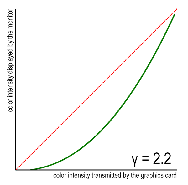
In a common scenario of gamma=2.2, this is how the monitor actually displays color intensities from your game (green curve). The dotted red line shows how a linear monitor would display the same intensities.
In practice, this means that black and white will be shown undistorted on the screen (because zero raised to any power is zero, and one raised to any power is one), but all values in between will be skewed with no reliable way to perceive this happening just by watching.
For example, if you're displaying a color that is supposedly two times darker than black—that is, RGB(0.5, 0.5, 0.5)—it will actually be shown as less than four times darker, given the common gamma value of 2.2, since 0.5 raised to 2.2 is around 0.22. Clearly, this is not what you intend, and this is not the case just with CRT monitors: LCDs, while not unintentionally having this property, are designed to be compatible with their older counterparts, and thus display your color values stretched like this.
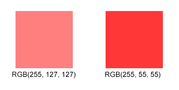
Moreover, as red, green and blue components are treated independently, the intended color tones of images can be easily mangled as intensities of the three color components will not scale uniformly. What will happen when you're displaying the color value RGB(1, 0.5, 0.5)? The red component will stay at 1, but the other ones will drop down to half their values, completely changing the tone of your color.
The second color was obtained from the first one by applying the nonlinear scale that monitors employ. Notice how not only the brightness of the color, but also its saturation, was affected by this transformation.
Now that we've seen what effects this monitor property has on the color data given to the monitor, we can see what steps there are to combat them.

What is Gamma Correction?

Gamma correction is the act of undoing the monitor's unfortunate work. Gamma-correcting an image is essentially raising its color intensities to 1/gamma, so that when the monitor in turn raises the value to gamma, these cancel out, and the result is the color we originally intended to be shown.
(Remember that A raised to B, and then raised to C, is the same as A raised to B×C, and this is why these operations will cancel out, as gamma × (1/gamma) is 1.)
Since the average user does not calibrate their monitor to have a linear response, many images they encounter are corrected so that they never feel the difference. As a convention, most image files on the Internet are distributed in what is called the sRGB color space—this means that original, intended color values are roughly raised to the power of 1/2.2 before putting them into files (although more complex equations take place in reality). This ensures that all users with conventional displays see the real colors. Scanners, cameras and a lot of digital imaging devices all take this into account, and correct their output for you when saving in conventional image formats.
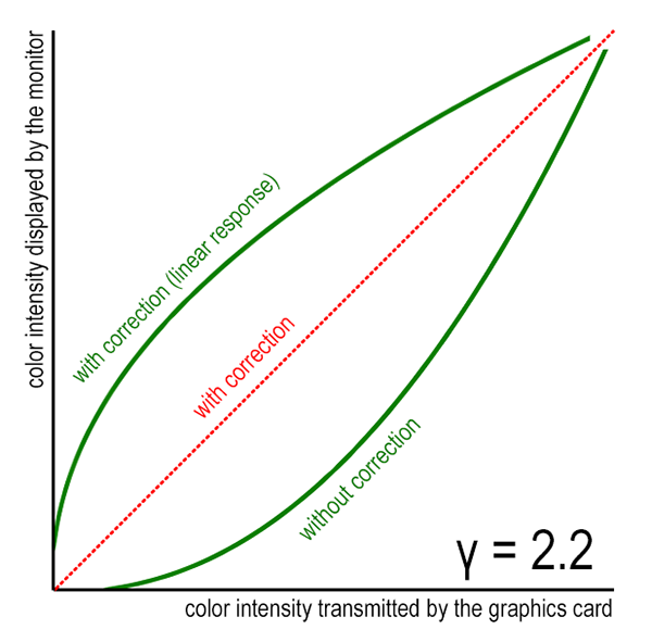
This image shows the mapping of color intensities as sent to the monitor by the graphics card, and intensities that are displayed by the monitor.
Take a look at the above image. If we do not account for gamma, the curve will be exponential (lower green curve). If we perform gamma correction the actual response will be linear, as it ought to be. For comparison, the image also shows how the graph looks when we perform gamma correction but the monitor actually has a linear response. In this case, the intensities will be distorted in the opposite fashion, and we can see that when a nonlinear monitor distorts them in turn, this cancels out, and we end up with a straight line.

When Do I Need to Worry?

So far, we have explained the theory behind these phenomena—sure, monitors are non-linear and most images are corrected so they look right on these monitors, but what seems to be the problem? Why should I, an aspiring 3D game developer, concern myself with gamma correction and do anything besides just knowing about it?
The answer is simple: as long as images are created just to be displayed, the problem actually doesn't even exist. However, as soon as you want a program to do something to these images (scale them, use them as textures, you name it), you have to take care that the program knows that the values are not real and are just corrected so that they look real on a monitor.
Particularly, this happens in a renderer when it takes texture maps, such as diffuse surfaces, as input. It does operations on them assuming their color values accurately represent light intensities; that is, assuming a linear correspondence with real-life phenomena they are representing.
But this is a fundamental error: if you want to sum color values and they are gamma-corrected (raised to 1/gamma) you get the wrong values. It doesn't take a math genius to realize that A raised to 1/gamma plus B raised to 1/gamma does not equal (A+B) raised to 1/gamma. The problem also happens when a renderer outputs some values, such as when it outputs light contributions: if it sums two light contributions but doesn't know the result will be raised to gamma when displayed on the screen, it has produced wrong values.
And this is precisely where the problem occurs: whenever a renderer assumes that the colors it gets linearly correspond to real-life phenomena when they don't, or assumes that colors it outputs will linearly correspond to light intensities on the screen when they won't, it's made quite a serious error which can affect the look and feel of images it produces.
If you don't correct any of the mistakes, don't make sure input texture colors fed into the renderer are linear, and don't make sure the renderer's output image will be linear in respect to the screen, these images will cancel each other out to some degree, much like how they cancel each out when showing precorrected JPEG files in a web browser. However, as soon as you include some intermediate calculations that assume linear correspondences, your math will be wrong.

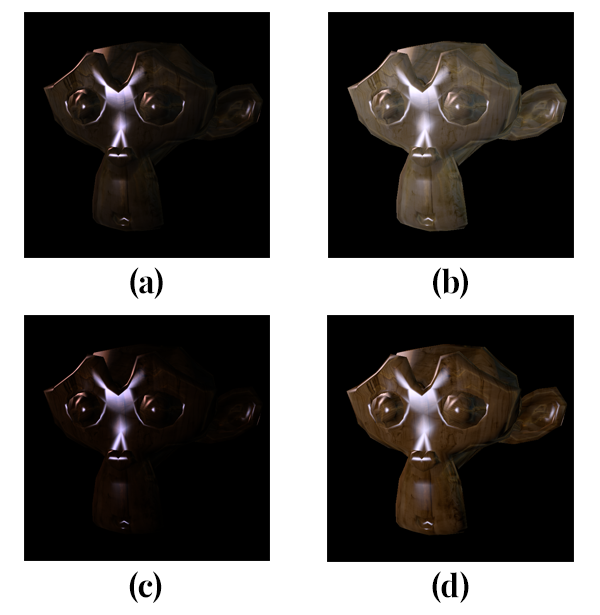
(a) Not correcting textures and not correcting the final image, (b) not correcting textures but correcting the final image, (c) correcting textures but not correcting the final image, (d) correcting both the textures and the final image.
Recall what we said about changing color tones earlier—that fact can (sometimes) help you spot non-linearity. A rule of thumb is: if, when you apply linear tweaks to parameters (such as doubling the brightness of lights in the scene), the resulting image changes not only in brightness but also in color tones (for example, an area going from a reddish-orange hue towards yellow), this means that some nonlinear intermediate process is most likely taking place.
This can happen with texture maps that were retrieved from various sources—the Internet, a digital camera that saves to sRGB JPEG, a scanner, or if the texture was painted on a monitor which was not explicitly calibrated to have a linear response or not explicitly corrected afterwards. Any math done on these texture maps will be wrong, and deviate slightly from theoretically right values. This is visible with texture filtering and mipmaps: since filtering assumes linear responses when averaging color values, you will see pronounced errors: smaller textures (distant ones) will appear noticeably darker than larger ones (that is, when they're nearer you): this is because when they're distant, the filtering algorithm averages more samples and their non-linearity affects the result more.
Illumination will also suffer from improper gamma: light contributions to surfaces sum in real world, and consequentially in a renderer, but summing is not a faithful operation if the result is non-linearly skewed. If you have complex fragment shaders doing sophisticated lighting, such as subsurface scattering or HDR, the errors become more and more pronounced, up to the point that you actually wonder what's wrong with the image, as opposed to having an uneasy feeling of "maybe kinda wrong lighting, but it's probably just me" which can also happen often. Darkening the textures or brightening the final images by a constant or linear factor don't kill the effect, because they are also linear operations, and you need a non-linear one to combat the inherent exponential response curve happening in the monitor.

How Do I Fix It?

Now, hopefully, you're fully aware of what gamma and gamma correction are, and why this is such a big deal when doing real-time 3D graphics. But, of course, there must be some way to fix these problems?
The answer is yes, and fixing gamma is a rather simple operation that doesn't require you to change anything besides adding a few lines of code, not counting additional parameter, intensity, and color tweaks you will need to perform to get right lighting if you've been setting your scenes to look good on non-linear monitors without correcting them.
There are three basic steps to ensure you stay linear as long as possible and do the correction at the right point:

1. Make Sure Your Texture Colors Are Right

You should not normally alter the source images so that they contain linear colors; having colors gamma-corrected for the typical monitor in eight-bit color fields affords you necessary added resolution in darker areas where the human eye is more sensitive to intensity variations. However, you can make sure that color values are linear before they reach your shaders.
Normally, in OpenGL, you can do this by passing GL_SRGB8 instead of GL_RGB8, and GL_SRGB8_ALPHA8 instead of GL_RGBA8, to glTexImage2D(), when specifying a texture. This will ensure that all values read from this texture through a shader sampler will be corrected back from sRGB color space to a linear one, which is precisely what we need! If you're using a rendering or game engine which does texture loading for you, it might take this into account or you might need to specify it manually; consult the documentation of the library or ask someone for help if you're unsure.
However, be sure not to erroneously do this to images that, by definition, do not represent color information, and were explicitly painted with this in mind. Examples include normal maps, bump maps, or height maps, which all encode some data other than color in the color channels of a texture and hence are not likely to need this kind of precorrection.
From the demo included in this article (some parameters swapped with their actual values for clarity):
1
2
glTexImage2D(GL_TEXTURE_2D, 0, GL_RGB8, width, height, 0, GL_BGR, GL_UNSIGNED_BYTE, data);
<br>
This will load the texture in an uncorrected color space. However, if the data in the texture file is in the sRGB color space, we ought to change the third parameter to GL_SRGB8, yielding:
1
glTexImage2D(GL_TEXTURE_2D, 0, <b>GL_SRGB8</b>, width, height, 0, GL_BGR, GL_UNSIGNED_BYTE, data);
This will ensure OpenGL corrects the texture data when we look them up.

2. Make Sure Your Output Image Colors Are Right

Now you have to apply color correction to the final output images of your renderer. Be sure not to apply correction to anything but the final framebuffer that is to be displayed on the screen. (Don't touch the intermediate buffers that are input to other post-processing shaders, as these will still expect to work with linear values.)
This can be done in OpenGL by specifying the renderbuffer (the final, non-sampleable framebuffer) to have an sRGB color encoding by passing GL_SRGB instead of GL_RGB as a parameter to glRenderbufferStorage(). After that, you have to raise the GL_FRAMEBUFFER_SRGB flag by calling glEnable. This way, shader writes to sRGB buffers will be corrected so they are displayed right on a typical monitor.
If you're using an engine or a framework, it probably includes some kind of option to create an sRGB framebuffer for you and set it up properly. Again, you can consult the documentation of the library or ask someone to clarify this for you.
In the demo, we use the GLFW library, which offers us a painless way to request an sRGB framebuffer. In particular, we set a window hint and then, later, tell OpenGL to enable the framebuffer operations to be in the sRGB space:
1
2
3
glfwWindowHint(GLFW_SRGB_CAPABLE, TRUE);
...
glEnable(GL_FRAMEBUFFER_SRGB);

3. Fix Your Tweaked Light Intensities and Color Parameters

If this is not a start of a new project, chances are that gamma-incorrect illumination and filtering have taken their toll on you. Maybe you've tweaked your diffuse reflectance colors, light intensities and whatnot in an attempt to make up for subtle nuisances that neglecting gamma has brought to you.
You need to go through these values once again and tweak them so they look right again—however, this time, your scenes will look more natural due to illumination more accurately representing real world circumstances. Corners will not look too dark so you won't need to add more intensity to lights (thereby wrecking illumination of brighter objects which will then look artificially bright for that amount of light in the scene).
This will pay off: revisiting your parameters to create a natural ambient with gamma correction will go a long way towards providing your users with an experience and brightness distribution which looks just right to their eyes, so accustomed and sensitive to how light works in real life.
Advertisement

Demo

Included with this article is a small OpenGL 3.3 demo which shows a simple scene with some textures lit by two moving light sources. It allows you to switch between several scenarios: not correcting textures but correcting the final image; correcting textures but neglecting to correct the final image; correcting both (that is, doing everything right); and failing to correct either (effectively making a double mistake).
The demo is written in C++ (with two GLSL shaders) and uses portable GLFW and GLEW libraries so it should run on a broad variety of platforms. The source code is ripe with comments so you can go about and explore every aspect of this short application.
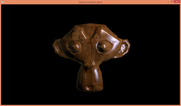
The demo in action.
Use the 1 key on your keyboard to cycle between correcting textures and not correcting textures, and the 2 key to cycle between correcting the framebuffer and not correcting the framebuffer. To cycle both of these at the same time, press 3—useful to see the difference between neglecting gamma completely (two errors that cancel each other out for the most part) and doing everything right. When the demo starts, none of these corrections are being performed, so hit 3 to see the benefits of proper gamma correction.
I have included a Microsoft Visual C++ 2013 project, compatible 64-bit versions of the GLFW and GLEW libraries, and a 64-bit Windows executable. However, you can compile this rather easily on any platform with GLFW and GLEW support: just compile main.cpp and loader.cpp together and link them against those two libraries. On Linux, installing these libraries via your package manager and passing -lglew -lglfw to g++ should do the trick. (Please note that this was not tested on operating systems other than Windows, but it is supposed to work—if you encounter any problems, please let me know in the comments and I'll fix them as soon as possible.)
As you can see when running the demo, the effects are quite noticeable even with a simple model and simple scene like this. Of course, in this simple case, you could maybe get away with tweaking the shader parameters so the image looks good when uncorrected. However, as soon as you start building up complexity in your scenes, the difference will simply be too visible to ever compensate in this way.

Conclusion

In this article we've covered terms such as gamma, gamma correction, non-linear inputs and outputs, and non-linear math. Hopefully, I've managed to convince you that you should start worrying about gamma correction right now if you'd neglected it so far, and if you've been careful with gamma before encountering this article, I just hope it's given you some new tiny piece of information to tackle the issue with.
We have, most importantly, learned how to fix problems that arise when you do incorrect manipulation on color values, assuming they're linear, and we've reviewed common pitfalls and symptoms that occur when you neglect this important aspect of computer graphics.
I hope you've had fun and learned something new while reading this article. Until next time!

Strategies For Choosing the Right Premium WordPress Theme for Your Next Project

by
As an online publisher or general web designer who is determined to succeed in your endeavors online, you will be faced with a number of difficult decisions. Your ultimate goal is to communicate with your audience and to keep them coming with your website.
Choosing to host your site on a platform such as WordPress will give you a considerable edge over your competitors. Yes, choosing the platform on which to host your site is important, but you can't discount the look, feel, and experience your site offers to your visitors.
There are literally tens of thousands of WordPress themes that could make your site more presentable and beautiful to your visitors. The options are plentiful, and sifting through the good, the bad and – let’s be honest – the downright ugly, can make your head spin.
So why not just buy the first premium theme that tickles your fancy?
While content is important, presentation will help you to draw in your audience and will ideally develop a long-term and profitable relationship with them. Though the coding that goes into creating themes might seem to be similar, each theme has its own identity, style, security and integrity.
That is to say, rather than looking for themes that have marketed themselves as the best theme for WordPress, or themes others generally consider to be the single best theme available, search for a theme that works best for the goals you aim to achieve with your site.

Core Objective of the Site

When purchasing a theme, one of the factors you should first consider is the main objectives of your website. A good theme should not distract the audience from its primary objective. Instead, it should work to help support the content that's aiming to define the main objective.
Themes that will suit corporate companies might not be similar to that of a creative agency or a non-governmental organization. That is to say, the various categories of WordPress themes require people visiting the website to identify with the brand.
Knowing what your site visitors expect on your site will help you narrow down to a particular category of themes that will best deliver the intended experiece.
Luckily, you can find theme marketplaces online that categorize each of this industries, thereby making it easy  to choose a premium theme that will easily work for you.

A Sketch of the Desired Outcome of Your Website

Before you begin searching for a premium theme, you should first have a clear idea of as to the type of experience you want your site to have when you're ready to purchase the theme.
By that, I mean that you should have a visual metaphor that pulls together all of the elements of your website. The theme that you finally choose should enhance the purpose and the content of your website.
Sketching the layout for your website can be compared to preparing a blueprint for a building. If you start with a blueprint, you will know exactly what you need at every step throughout a project's development.
A sketch of your website layout will help you know where everything will be presented. Having a good layout will make the whole process of choosing a theme much easier as you will simply narrow down the themes that go well with your intended design.
When sketching the layout, it is important to consider the style that you will use. You can choose a flat layout which is simpler and does not have any of the design tricks that help to create a three-dimensional look and feel to the website. You can decide whether the website will have a one-page layout, or whether it will have several pages. Furthermore, you can determine if you prefer a boxed layout, or a full-width layout. You can also decide whether the layout will be responsive, meaning that it is suitable for use on devices of different screen sizes. The theme marketplace will have all of these options, and it is always better to have answers to these layout questions before looking for a theme.
In addition to website layout and general website structure, your website’s organization should be on point, and that is what the navigation and the slider spaces are about. The navigation menus help guide your users where to go and what they should expect each time they click on a link. Remember that your website is all about communicating information to your audience. A cutting-edge layout combined with well-placed content will help your website to speak clearly to your visitors.
You should always keep in mind that site navigation involves more than having cool buttons on different parts of your page. It should help your audience to interact with your website and to find what it is for which they are looking.
Remember: Confusion is your enemy, and it will drive your visitors away.

Color Scheme for Your Website

Another factor that you should consider when deciding to purchase a premium theme is the color scheme that you intend to use. Color is the unsung hero in any design. A color palette that has been thoughtfully chosen will draw your audience and immerse them into your website. Color has a very emotional impact, and this makes it just as important impact as the layout and the navigation.
The premium theme that you eventually choose should suit the colors in your website and complement the overall theme of your site. Luckily, there are premium themes that are designed with different color palettes, and you can customize it so that the colors match the theme of your website.

Theme Features and Functionality

A premium theme should be beautiful yet functional, making it easier for you to set up the website with ease and for future website maintenance. Various themes come with different features that can help you to achieve your goal. Examples of features that are available in WordPress themes include page builder options, social media sharing features, e-commerce integration, SEO plugin integration, shortcodes to implement various things more easily and much more.
These add-on features will help you set up a website more easily and faster, after all, that’s why you’re buying a theme otherwise you will have either coded or paid a developer to build one for you from scratch.
It’s important to choose a theme that has a combination of features that will save on time when setting up a website and eases the pressure of having to pay someone else more cash to tweak the theme to meet your exact needs.
Also, when purchasing a theme, make sure view the theme in various browsers to confirm what the author listed is true.
Finally, you should select a theme that works with the latest WordPress version. WordPress is updated constantly so the premium theme should be able to work with the current version 3.8.1 and even with a promise of supporting coming updates of the CMS.

5-Star Support and Customer Appeal

After determining your layout, your objectives, and the functionality of your website, you can go online and look for a theme marketplace. There are online platforms, such as ThemeForest.net, where talented developers and designers showcase their best themes.
All of them have such great work that it makes it difficult to determine which ones are the best.  The reputation of the marketplace can be one of the indicators of a quality theme marketplace. There are also many design magazines that review these websites and advise their readers on which ones have great collections.
In addition to industry reviews, you should read the customer ratings and comments in each theme marketplace. The customers are the real users of these themes, and they can give a first-hand account of how useful, usable and flexible the themes are.
Furthermore, they will help you to understand the plugins and features that you will get after purchasing a theme. The comments will also give you an indicator of the support that you will get after purchasing the theme. You will also be able to know if the theme’s author releases updates that will fix any bugs that the theme has as well as add new features.

Author’s Portfolio

If a particular theme catches your eye, it is great to look at the author’s portfolio. You may love their style and you may even prefer something else that is listed on their portfolio. Furthermore, you will be able to gauge their creativity and ensure that what you are choosing is a unique theme, and not simply a generic recreation of that particular author’s work.

Conclusion

Getting a premium theme for your website is an investment that is worth every cent. Similarly, customized premium themes can be quite costly, but this should not be an issue that deters you from the investment.
After all, this is your business and your site, and you should never compromise quality, security, and functionality in exchange for something that is cheap or free. What is easy on your pocket could end up being very difficult for you and your users, and ultimately, it could cost you much more than the theme itself.


Copyright @ 2013 Krobknea.

Designed by Next Learn | My partner