
1. Working with the Pen Tool
Step 1
Let's start by sketching out a word or two. In this case, I used the Pencil Tool (N) to sketch out the word "Serenity". Group (Control-G) together the path components, Copy (Control-C) and, Paste (Control-V) the type in order to quickly add some dimension to the word.Alternatively, you can sketch out your lettering outside of Adobe Illustrator CC 2014 and import it (especially if you're not using a graphics tablet).

Step 2
Lock the sketch layer in the Layers panel so your workspace is kept tidy. Use the Rectangle Tool (M) to draw a large black rectangle covering the Artboard.Let's start tracing our letters. Use the Pen Tool (P) to trace the outline of the first letter. I like to take a small bit at a time so I have the most control over my design. See the Pen Tool in action below. Note how the tool's path is projected from each anchor point without laying the next one down.


Step 3
Continue working along the word. Note how parts of the letters connect or curve into each other. Zoom (Z) in to increase your control over the curve and shape of each path. Manipulate handles of anchor points before or after they're laid down (doing so before ensures a smooth curve, but sometimes you may want to continue to edit curves after shapes are filled).
Step 4
Note the process with the second "E": I traced around the letter, stopping at the top of the "N". From here, I'll smooth out any points as needed.If anchor point handles do not appear when using the Direct Selection Tool (A), grab the Anchor Point Tool () (formerly the Convert Anchor Point Tool) to manipulate them.
Additionally, you're now able to disconnect anchor point handles from each other and manipulate each side separately.

Step 5
When connecting the tails of one letter to another, keep in mind each section's width so they flow into each other seamlessly. Once done with your lettering, Unite the shapes in the Pathfinder panel.

2. Apply Texture in the Appearance Panel
Step 1
Select your lettering and go to Effect > Sketch > Reticulation and set Density to 35, Foreground Level to 10, and Background Level to 5.
Step 2
In the Appearance panel, change the Opacity of the previous step's effect to 44%. Add a New Fill and drag it underneath the effect fill (see below). Apply a 1pt stroke of white and lower the Opacity to 51%.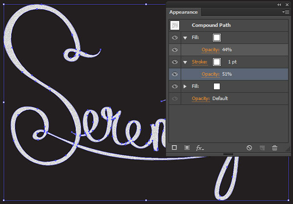
Step 3
A custom pattern will be applied to the white fill color (second fill in the Appearance panel). Use the Paintbrush Tool (B) with a round Calligraphic Brush of 1pt weight to sketch some small lines in a rectangular-like shape.Select the scribble and Make a New Pattern in the Pattern Options panel. While in Pattern Editing Mode, use the Paintbrush Tool to scribble around the edge of the pattern's bounding box in order to fill it in a bit more and be less obvious as a pattern(see below).

Step 4
As a final touch to the lettering, change the stroke to one of the chalk-like brushes found in the Brushes panel. I chose Pencil - Feather, though any of the thinner options will work well.
3. Texture the Background
Step 1
Apply subtle Radial Gradient fill in the Appearance panel to the rectangular background. Use the Gradient Tool (G) and Gradient panel in order to manipulate the gradient's shape, colors, and opacity.I set the gradient at black at 100% Opacity to 0% Opacity. It should be the very top fill (see below) in the Appearance panel.
Step 2
The second fill is a Reticulation effect with the following settings:- Density: 40
- Foreground Level: 10
- Background Level: 5

Congratulations, You've Finished!
The changes made to the Pen Tool allow mouse users more control than ever, as well as tablet users whose keyboards are inaccessible the freedom of being at a larger workstation. The technique of adding texture outlined above can be applied to all sorts of lettering designs for scalable designs that evoke that classic chalkboard style. Take the updated tools for a spin and show us your chalkboard lettering in the comments below!


.webp)

