You'll notice that most book covers will fit into a particular design template—a look or style that defines what genre of fiction they belong to. These design elements, shared in common with other books of the genre, send out a visual message to a potential customer, allowing them to assess instantly what the book will be about, and whether it's the book of choice for them.
In this tutorial, we'll be designing a cover for a historical fiction title. This is a fantastic genre for cover design; ornate borders and typefaces merge with vintage-look images and moody, romantic colors to create a nostalgic, mystical atmosphere.
We'll explore how you can create a genre-appropriate design using typefaces, tools and tips available to you in Adobe InDesign. Let's create a cover Philippa Gregory would be proud of!
1. Set Up the Layout of Your Cover in Adobe InDesign
In this tutorial, we'll be creating a cover for a paperback (softcover) book, with B-format dimensions (5.06 x 7.81 inches [198 x 130mm]) and a 16 mm spine. These are the same dimensions as used for this Winter Thriller book cover tutorial.
Note: You can adjust the width of the spine to suit your own purposes by using the Page Tool (Shift-P) to adjust the width of the document later.
Step 1
Open InDesign and select New Document from the Welcome window, or go to File > New > Document.
In the New Document window set the Intent to Print, No. of Pages to 1, and uncheckFacing Pages. From the Page Size drop-down menu select Custom... to open theCustom Page Size window.
Set the Width to 130 mm and Height to 198 mm. Type 'B-Format Paperback' into theName text box and click Add, and then OK.

Step 2
Back in the New Document window, set the Margins to 5 mm on all sides, and set the Bleed to 3 mm on all sides. Click OK.

This page is the correct size for the front of your cover only. Though we will want to submit a whole cover to the printer, complete with spine and back cover, it's a really good idea to design your front cover only at first. This allows you to judge better how the cover will look from a reader's perspective, when the book is on display in the bookshop.

We'll use the Page Tool (Shift-P) later in the tutorial to include the spine and back cover on the document. But for now, let's work on the front cover alone as it is.
From the left-hand Ruler drag a vertical guide out to 65 mm. This marks the center point of the front cover, which is helpful for when you start to place elements on the page.

2. Create a Magical Backdrop for Your Cover
Before we add any typography to the cover, we want to set up a background which will frame the text and create a beautiful foundation for the cover.

Step 1
Open the Layers Panel (Window > Layers) and double-click the default Layer 1 to open the Layer Options window. Rename the layer as Image and click OK. Lock the layer for now.
Click the Create New Layer icon at the bottom right of the panel to create a second layer. Double-click to rename the layer as Background Color.
Grab the Background Color layer and drag it downwards to sit below the Image layer.

Step 2
Remaining on the Background Color layer, select the Rectangle Tool (M) from theTools panel and drag to create a rectangle that extends from the edge of the top bleed to just over halfway down the page. Extend the right edge of the shape to the edge of the right bleed, and extend the left edge to the trim edge on the left side of the page.
From the Character Formatting Controls panel running along the top of the screen, set the Stroke Color of the shape to [None] and the Fill to [Black].

With the shape selected, go to Object > Effects > Gradient Feather. Adjust the Angleof the gradient to -90 degrees and shift the Gradient Stops into roughly the position shown below. Click OK.


Step 3
Return to the Layers panel and Lock the Background Color layer. Unlock theImage layer you also created earlier.

Select the Rectangle Frame Tool (F) and drag to create a frame the same width as, but about half the height of, the black rectangle. We'll place a suitable image in this frame. Look for something with a strong silhouette and a long, landscape shape.
An image of a mysterious ancient castle should do the trick. I've gone for this image, opening it first in Photoshop for a bit of basic editing.

I applied a Channel Mixer Adjustment Layer to the image, setting it toMonochrome to drain the photo of color. I then resaved the image.

Returning to InDesign, go to File > Place, and select the saved image. Click Open.
Arrange the image in the frame, positioning the top half of the image towards the top of the frame.

Step 4
With the image frame selected, go to Object > Effects > Gradient Feather. Adjust theAngle of the gradient to 90 degrees and shift the Gradient Stops into the position shown below. Click OK.


Step 5
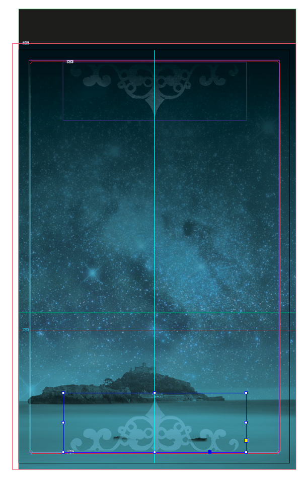
Select the Rectangle Frame Tool (F) and drag to create a frame that extends across the whole page, up to the bleed on the top, bottom and right edges, and up to the trim edge on the left side of the page.
Go to File > Place and select a second image. This image of a beautiful constellation of stars will work really well for giving depth to the cover design. Click Open.

Select the Fill Frame Proportionally icon from the top control panel to arrange the image nicely in the frame.
Drag your mouse across the top of the page to select both the background black rectangle and the new image frame, and right-click (Windows) or Control-click (Mac OS) > Arrange > Send to Back. The image of the castle will be brought to the front.

With the frame selected, go to Object > Effects > Transparency and set the Mode toSoft Light. Reduce the Opacity to 60%.

Remaining in the Effects window, navigate down to Gradient Feather from the menu on the left. Set the Angle of the gradient to -90 degrees and manoeuvre the gradient stops into position along the far right quarter of the scale. Click OK.


Step 6
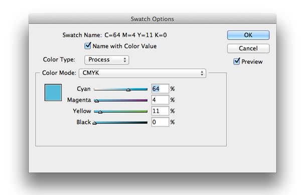
Open the Swatches panel (Window > Color > Swatches) and click the New Swatchicon at the bottom of the panel. Create a new blue CMYK Swatch, C=64 M=4 Y=11 K=0 and click OK.

Select the Rectangle Tool (M) and create a rectangle shape that stretches across the whole page, up to the trim edge on the left-hand side. Set the Fill Color to your new swatch, C=64 M=4 Y=11 K=0.

With the shape selected, go to Object > Effects > Transparency and set the Mode toMultiply.


Step 7
Remaining still on the Image layer, select the Rectangle Tool (M) and create a frame that sits snugly on the margin, which is 5 mm from the edge of the page.
Return to the Swatches panel and create a second new swatch, a paler blue, C=31 M=9 Y=11 K=0.

Selecting your new rectangular shape, set the Fill Color to [None] and the Stroke Color to the pale blue, C=31 M=9 Y=11 K=0. From the top control panel, set theStroke Weight to 1 mm, maintaining the Type as Solid.
Go to Object > Corner Options and set the Size to 1 mm on all corners of the border and Shape to Inverse Rounded. Click OK.


Finally, with the border still selected, go to Object > Effects > Transparency and set the Mode to Soft Light, which will give the border a subtle gradient effect.


3. Introduce Ornate Details
This book cover should transport the viewer to another time, so it's a great idea to introduce some elements to the design which would not have looked out of place a couple of centuries back.
Look for wrought iron details or gothic-style decorative elements which you can pull into Illustrator and trace or recolor. Here I created a simple wrought-iron-inspired flourish inIllustrator; try this for a similar look.
I set the Stroke in an artistic brush, Charcoal - Feather, and the color in C=31 M=9 Y=11 K=0, as we used in InDesign earlier. I then saved the image as an Illustrator EPS file, with a transparent background, before returning to InDesign.

Step 1
Return to the Layers panel (Window > Layers) and create a new, third layer. Rename this as Ornate Detail, and allow it to sit above the Image layer. Lock the Image layer.

Select the Rectangle Frame Tool (F) and drag to create a small frame about 90 mmin Width. Position this centrally, towards the top of the page, resting the top edge of the frame on the border/margin.
Go to File > Place and select the transparent background image, and click Open.
With the frame selected, go to Object > Effects > Transparency and set the Mode toSoft Light.

Hop down to Gradient Feather and check the box, setting the Angle to 90 degreesand moving the Gradient Stops to the far right of the slider.

You may need to Unlock the Background Color layer and extend the Height of the black rectangle upwards, to make more of the ornate detail visible on the page. Lockthe layer again once you're finished.

Step 2
Select the image frame containing the ornate detail and Edit > Copy, Edit > Paste. Then, with the pasted frame selected, right-click (Windows) or Control-click (Mac OS) > Transform > Flip Vertical and position this second image frame centrally at the bottom of the page.
4. Typography With a Historical Twist
We can now look at adding text to the front cover, and styling the text to give it a historical look.

Step 1
The first step is to pick some suitable fonts. A good tip is to go for two fonts—one of which is more traditional and plain, and a second which has a more decorative, unique look, which you can set the title of the book in.
For the traditional font, try something like Adobe Caslon Pro, Adobe Garamond Pro, or Baskerville. Here, I've chosen to use Adobe Caslon Pro.
For the decorative font, look for a typeface that embodies the dominant design style(s) of the era the story is set in. I'm imagining a Late Medieval or Tudor-period setting for this book, so I want to pick a typeface that looks appropriate for the period.
Almendra is a really lovely font, which you can download free. It references ancient calligraphic styles, but has quite a clean, modern look which will give the cover some contemporary appeal. Henry Morgan Hand is a simpler, more elegant typeface, which we can also find some use for.
Historical manuscripts are often extremely ornate, using flowers and other natural decorative elements to make the designs particularly beautiful. Download the symbol font IM Fell Flowers 2, which has lots of beautiful decorative elements, which might also be useful when designing the cover.

Step 2
Return to the Layers panel and create a new layer, above the Ornate Detail layer. Rename it as Typography. Lock the Ornate Detail layer.

Select the Type Tool (T) from the Tools panel and drag to create a text frame 120 mmin Width and 7 mm in Height. Type 'Author Name', set the Font to Adobe Caslon Pro Regular, Size 20 pt, All Caps, and set the Font Color to the pale blue swatch,C=31 M=9 Y=11 K=0.
Adjust the orientation of the text to Align Center. Increase the Tracking to 340.
Position the text frame centrally, towards the top of the page. If you have a pointed decorative element like the one I've got here, insert a few more spaces between the forename and last name of the author.

Step 3
Insert a second text frame using the Type Tool (T), and position it below the author name. This is a great place to type in a tagline, or brief summary of the story. Set theFont to Adobe Caslon Pro, Size 12 pt, Leading 17 pt and set the Font Color to the pale blue swatch, C=31 M=9 Y=11 K=0, as before. Adjust the orientation of the text toAlign Center.
Pull out any key phrases or words in the text in Bold.

Step 4
Move to the bottom of the page, and insert a third text frame, setting the Width to53 mm and positioning the frame on the right side of the page, framing the image of the castle.
Here, you can insert a quote or short summary of the book. Set the Font to Adobe Caslon Pro, Size 9.5 pt, Leading 12 pt and set the Font Color to the pale blue swatch, C=31 M=9 Y=11 K=0, as before. Adjust the orientation of the text to Align Right.
If you're inserting quotation marks, open the Story panel (Window > Type & Tables > Story) and check the Optical Margin Alignment box, which will make the quote visually neater.

Step 5
Navigate upwards to the center of the page.
Select the Type Tool (T) and drag to create a frame that extends across the page. Type 'Star'. Set the Font to Almendra SC Bold, Size 110 pt and set the Font Colorto the pale blue, as before, C=31 M=9 Y=11 K=0.
Create another separate text frame of similar dimensions, and type 'Queen'. Set theFont to Almendra SC Regular, Size 110 pt and set the Font Color to a new CMYK Swatch (add it from the Swatches panel), C=16 M=15 Y=12 K=0.

Position this frame just below the 'Queen' frame, allowing the two frames to overlap. Shift the 'Star' frame a little to the right until the 'R' lines up with the 'N'. Select the 'Star'text frame and right-click (Windows) or Control-click (Mac OS) > Arrange > Bring to Front.

Step 6
Select the 'Star' text frame and go to Object > Effects > Outer Glow. Select Screenfrom the Mode drop-down menu and reduce the Opacity to 60%. Keep theTechnique as Softer and set the Size to 3 mm. Set both Noise and Spread to 12%. Click OK.


Step 7
Create another text smaller text frame, typing 'the', and setting the Font to Henry Morgan Hand Regular, Size 70 pt, Align Center and the Font Color to C=16 M=15 Y=12 K=0. Position the frame to the left of 'Star'.

Edit > Copy and Edit > Paste the text frame, adjusting the type to read 'a novel' and reducing the Size to 58 pt. Position the frame below 'Queen', allowing the 'l' of 'novel'to touch the serif of the 'N'.
Open the Glyphs panel (Window > Type & Tables > Glyphs) and place your cursor in the text frame, in front of 'a novel'. From the Character Formatting Controls panel, select IM Fell Flowers 2 from the drop-down font menu. The font's glyphs will appear in the Glyphs panel.

Select a small star/flower symbol and double-click it to insert it in the text frame. Reduce the Size of the glyph to 21 pt and increase the Baseline Shift to 4 pt. Edit > Copyand Edit > Paste the glyph into the same text frame, but this time to the right of 'novel'to frame the text.

Step 8
As a final touch for the title, create another text frame and position this over the 'Q' of'Queen'. Insert a star/flower glyph from the IM Fell Flowers 2 set (Window > Type & Tables > Glyphs), setting the Size to 50 pt and the color to the pale blue, C=31 M=9 Y=11 K=0.

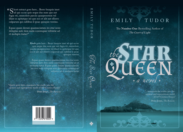
The front of your book cover is finished—great work! Now is the time to make any minor adjustments to the layout, until you're happy with the outcome. Once you're happy, you can start putting together the rest of the cover.
5. Expand the Width of Your Cover
Step 1
It might be a good idea to duplicate Page 1 of your document in order to keep a copy of the front cover alone.
To do this go to the Pages panel (Window > Pages) and click and drag the Page 1icon down to the bottom of the panel, dropping it onto the Create New Page icon to make a copy of the page.
Double-click Page 2 of the document to bring it up on screen.
Select the Page Tool (Shift-P) from the Tools panel and click once on Page 2 of the document to select it. Now, navigate up to the left-hand side of the top control panel and adjust the Width of the page to 276 mm. This will allow for a back cover at the same width as the front cover (130 mm), plus a 16 mm-width spine.

Unlock all the layers in the Layers panel. Shuffle the content along to the right until it meets the bleed edge on the right-hand side.

Step 2
From the left-hand ruler, pull out a vertical guide to 130 mm, to mark the left edge of the spine. Pull out a second guide to 65 mm, marking out the center point of the back cover.

You can also pull out guides to 138 mm and 125 mm, to mark out the center point of the spine, and the right-hand margin of the back cover.

6. Design the Spine
Step 1
Return to the Layers panel and Unlock the bottom layer, Background Color.
Drag your mouse across the right side of the page to select the black rectangle. Go toEdit > Copy and Edit > Paste. Reduce the Width of the shape to fit the dimensions of the spine (16 mm), and position centrally on the page.

Lock the Background Color layer and Unlock the Image layer. Drag your mouse across the top section of the page to select the starry image and the pale blue frame. Holding down Shift, deselect the border. Go to Edit > Copy and Edit > Paste. Reduce the Width of both the elements to 16 mm and position on the spine.

Lock the Image layer and Unlock the Typography layer.
Step 2
Select the 'Author Name' text frame on the front cover and Edit > Copy, Edit > Paste.Reduce the Font Size to 12 pt and adjust the orientation to Align Left. Select the frame and right-click (Windows) or Control-click (Mac OS) > Transform > Rotate 90 degrees CW.
Position the text frame centrally on the spine, towards the top of the page, as shown.

Step 3
Edit > Copy and Edit > Paste the text frame you've just created to create a second rotated text frame. Adjust the text to read 'The Star Queen' and set the Font to Henry Morgan Hand Regular, Size 35 pt and reduce the Tracking to 20. Set 'The' and'Queen' in the beige swatch, C=16 M=15 Y=12 K=0.
You can also place another text frame with a small glyph from the IM Fell Flowers 2 set, over the 'Q', to mimic the front cover.

As a final touch, place a single glyph in IM Fell Flowers 2 towards the bottom of the spine.


7. Design the Back of the Cover
Step 1
Lock the Typography layer and Unlock the Background Color and Image layers. Drag your mouse across the top half of the front cover to select the black rectangle, starry image, pale blue rectangle and border. Go to Edit > Copy and Edit > Paste.
Move them over to the left-hand side of the page. Ensure the border sits neatly on the left, top and bottom margin.

Extend the left edges of all elements, except the border, to meet the edge of the bleed on the left.
Pull the right-hand edges of the elements a little to the left until they meet the left edge of the spine.

Step 2
Lock the Background Color and Image layers and Unlock the Typography layer. Create three new text frames using the Type Tool (T) and position them in a scattered layout across the back cover.

You can insert the blurb of the book, as well as critic's quotes and an author biography, in these text frames. Set the Font in Adobe Caslon Pro Regular, and vary the Sizefrom 11 pt to 10 pt. Set the text frame on the right side of the back cover to Align Right.

Step 3
You can also introduce a barcode to the cover. Create a white frame using theRectangle Frame Tool (F) and File > Place a generated barcode image. Ensure the barcode image is large enough to be scanned with ease, and don't crop the code too closely around the edges in case any of the code's data becomes illegible.
I also created a second frame just below the barcode, set in C=31 M=9 Y=11 K=0. This is a suitable place to insert pricing for the book using the Type Tool (T).

8. Export Your Book Cover for Print
Fantastic work—your cover artwork is finished, and it looks awesome!
Now all that's left to do is to export the artwork to PDF, ready for printing.
Step 1
Go to File > Export... to open the Export window. Select Adobe PDF (Print) from theFormat drop-down menu. Name the file and click Save.
In the Export Adobe PDF window select Press Quality from the Adobe PDF Presetdrop-down menu. In the Pages section, under Range, type 2, if you've kept a copy of only your front cover on Page 1.

Step 2
Under the Marks and Bleeds section, click to select All Printer's Marks under theMarks menu and click to select Use Document Bleed Settings under the Bleed and Slug menu. Click Export.


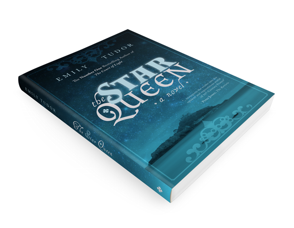
Congratulations! You now have your book cover ready to be sent to the printers. You can choose to print your cover on coated or uncoated paper stock, both of which have their own unique look and tactile feel. Get in touch with your printer before you send the artwork to print, to receive samples and get their recommendations for paper stock and weight.

In this tutorial, you have learned how to design an atmospheric, mystical cover, which would be suitable for the Historical Fiction genre. The traits of cover design for this genre include atmospheric, nostalgic images, hazy gradients, ornate or vintage-style details, and ornate, period-appropriate typography. Why not try creating your own version of a historical fiction cover, keeping these style traits in mind?


.webp)

