In this last "Mastering Calligraphy" lesson, we're going to apply all that we've learned to create our own font. No more following the rules! It's all up to you! I'll walk you through the basic questions you need to answer before you start and then show you how to make an alphabet that feels cohesive.
What You'll Need

- Pencil (optional)
- Eraser (optional)
- Black Ink (preferably Speedball or Higgins waterproof ink)
- Practice sheet
- Pen holder (the black part of the pen above)
- Flat tipped pen nib
- Pointed pen nib
1. Choose Your Pen Tip
Before we even begin putting pen to paper, you need to decide what pen type you'd like to use.Step 1
Test out a phrase using the pointed pen nib.
Step 2
Test out a phrase using the flat-tipped pen nib.
2. Choose Serif or Sans Serif
Okay, now you have your pen tip and you're ready to go! We have two more decisions to make before we start making the alphabet. One big dividing factor in fonts is serif vs. sans serif. Serifs are the fancy additions at the tops and bottoms of letters. For example, Times New Roman is a serif font while Comic Sans is a sans serif font.Step 1
Choose whether you're going to make a serif or sans serif font.
3. Choose Connecting or Not Connecting
All right, we have the pen tip and the type of font decided. The last thing to decide is whether your letters will connect, as they do in cursive letter, or not connect.Step 1
Choose whether you are going to make connecting or not connecting letters.
4. Start on the Lowercase Alphabet
Now it's time to dive into making your own lowercase alphabet. I'm going to show you how determining what two letters will look like helps you write out the rest. I would recommend using a pencil first to figure out how you want your letters to look.Step 1
Make your own lowercase letter 'e'. I've made several below to give you an idea of what sorts of variations there are to choose from.
Step 2
The lowercase letter 'e' is very similar to the letters 'c', 'o', 'g', and 'd'. Thus once you have your 'e' decided, you can make these other letters because the way you drew the curve of the 'e' will match how you draw other curves in the alphabet. Whether the connecting line in the 'e' is drawn as a straight line or a curve will determine the straight lines of the rest of the letters. Below I've put a few examples showing what letters like the 'e' will look like.
Step 3
Make your own lowercase letter 'h'. I've made several below to give you an idea of what sorts of variations there are to choose from.
Step 4
The lowercase letter 'h' is very similar to the letters 'b', 'k', 'l', and 't'. Thus once you have your 'h' decided, you can make these other letters because the way you drew the straight line of the 'h' will be similar to how you draw the straight line of the others.Plus, the curve or linear nature of the hump of the 'h' will determine how you make the humps and curves of other letters. Below I've put a few examples showing what letters like the 'h' will look like.

5. Write Out the Full Lowercase Alphabet
Step 1
Now that you have quite a few of the letters down, it's time to write out your whole lowercase alphabet! I've put two examples below. The first is more curlicue and the second much more like printed text you'd find in an old book.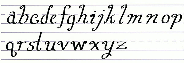

6. How Fancy?
Step 1
We're moving on to creating uppercase letters for your alphabet now and the big decision you have to make is how fancy do you want it to be?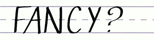


7. Start on the Uppercase Letters
Step 1
Now that you know how fancy your letters will be, it's time to start! Just like with the lowercase letters, we're going to begin with the letter 'c' because how you make that letter determines the shape of many more. Below I've put a few examples of ways to make a unique capital letter 'c'.
Step 2
The uppercase letter 'c' is very similar to the letters 'a', 'g', 'e', and 'o'. Thus once you have your 'c' decided, you can make these other letters because the way you drew the curve of the 'c' will match how you draw other curves in the alphabet. Then the ends of your 'c' will determine the ends of your other letters. Below I've put a few examples showing what letters like the 'c' will look like.
Step 3
Make your own uppercase letter 'L'. I've made several below to give you an idea of what sorts of variations there are to choose from.
Step 4
The uppercase letter 'l' is very similar to the letters 'd', 'f', 'h', and 'p'. Thus once you have your 'l' decided, you can make these other letters because the way you drew the straight line of the 'l' (such as the angle) will be similar to how you draw the straight line of the others. Plus, the ends of the 'l' will determine how you make the ends of other letters. Below I've put a few examples showing what letters like the 'l' will look like.
8. Write Out the Full Uppercase Alphabet
Step 1
Now that you have quite a few of the letters down, it's time to write out your whole uppercase alphabet! I've put two examples below. The first is more curlicue and the second much more like printed text you'd find in an old book.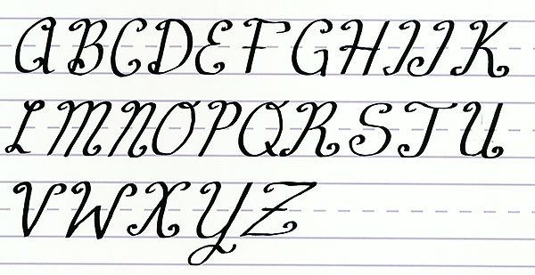

9. Putting it All Together
Step 1
Now that you have a whole alphabet of your own creation, let's put it all together! Write out something meaningful to you, perhaps a poem or an inspirational quote. I wrote mine using two different fonts just for fun.


.webp)

